Storybook
A Frontend Component Library
Our Agenda
What is a Frontend Component Library?
What is Storybook?
1
What
Why use it?
Why Storybook over the pre-built?
2
Why
How do we at Healthie use it?
How can it better help in other product workflows?
3
How

Frontend Component Library
A collection of pre-designed building blocks (like buttons, cards, input fields) that developers can reuse to create consistent and good-looking designs.
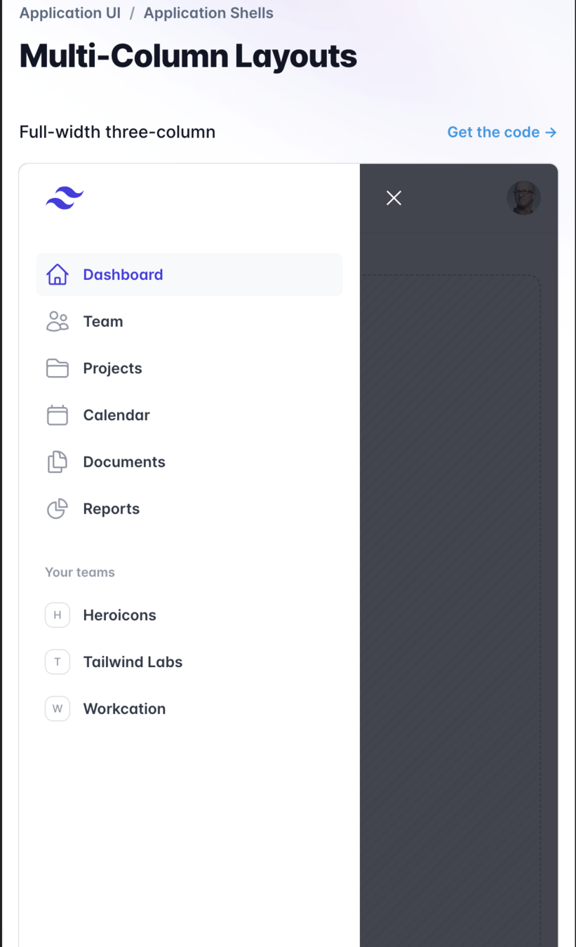
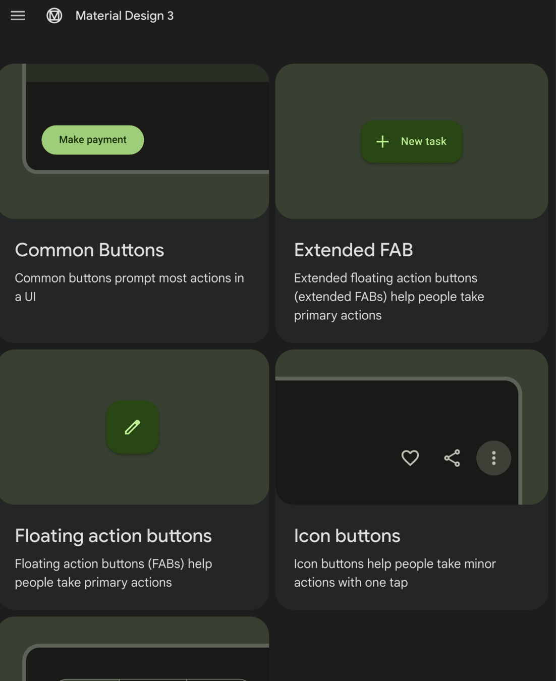
Some popular libraries
Storybook
Storybook is a tool that lets developers create Frontend component libraries... Plus more
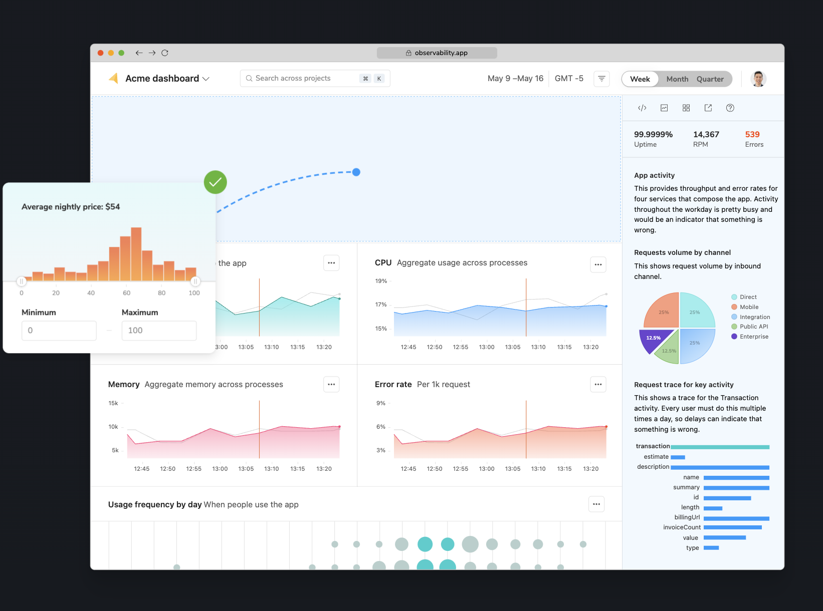
- Component Isolation
- Component Showcase
- Interactive Development
- Testing
- Documentation
Plus More
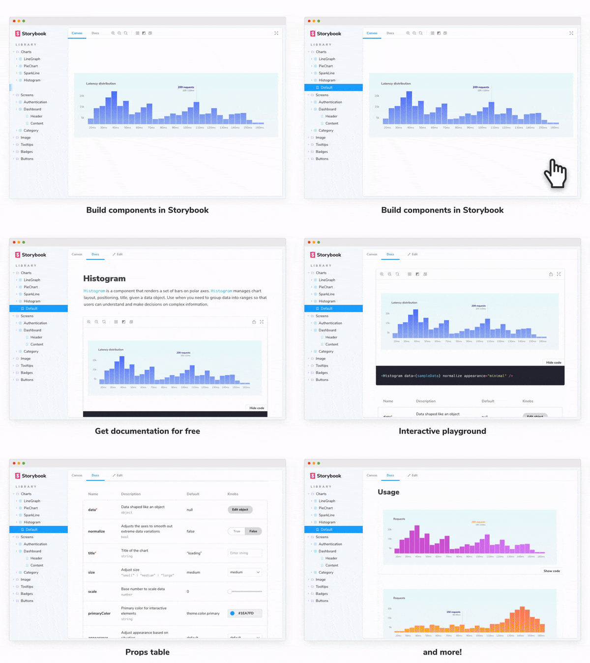
Why use Storybook
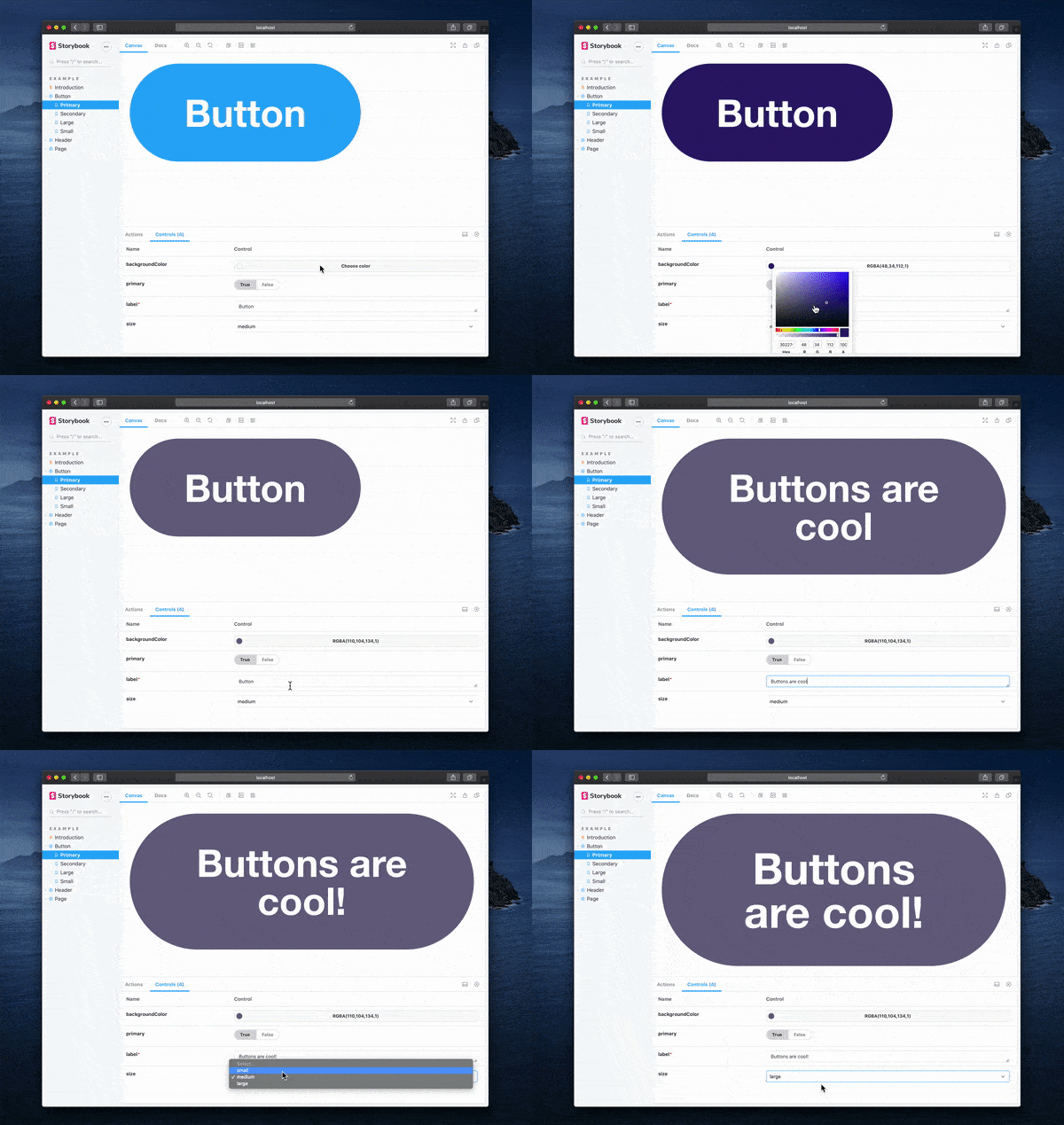
Component Isolation
Storybook lets developers work on a component without it affecting the whole application. This is useful for testing and developing components without needing to go through the whole application.
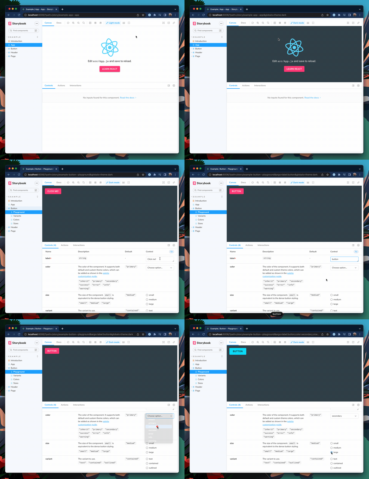
Component Showcase
Developers can create a showcase of components with different variations and states. This is a living style guide, making it easy for designers, developers, and other stakeholders to see how different components look and behave.
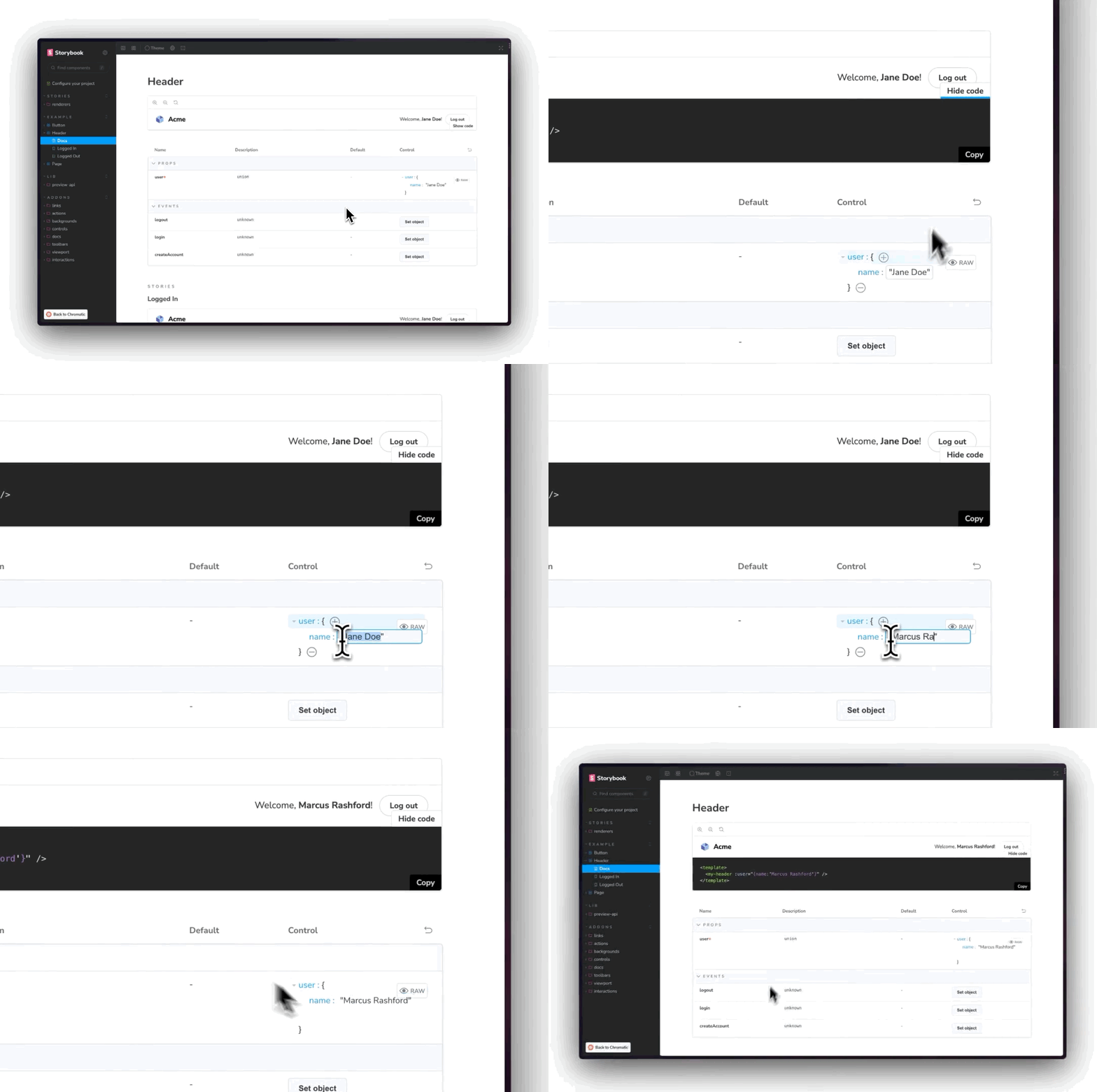
Interactive Development
The interactive development environment allows developers to tweak component props and see the changes in real time. This helps in quickly iterating and fine-tuning components.
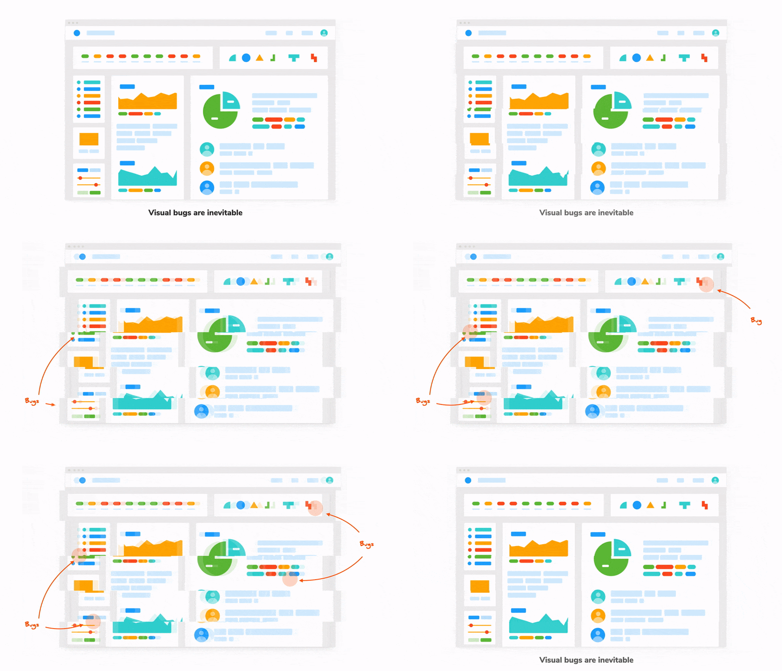
Testing
We can test for visual changes in the component.
Storybook also allows developers to write and run test cases directly within the Storybook interface. This helps catch UI bugs and ensures that components function correctly in different scenarios.
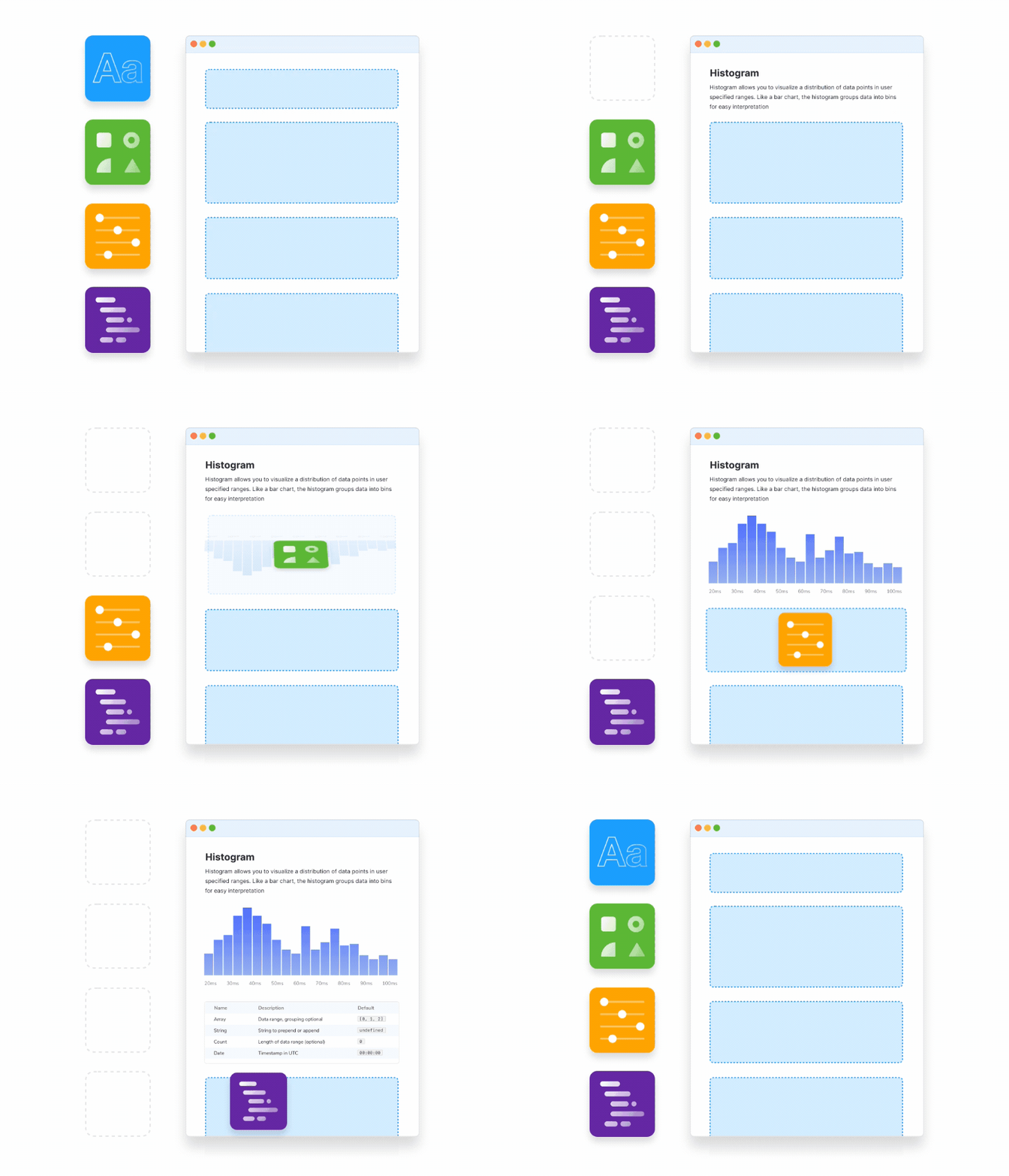
Documentation
Storybook makes writing documentation for components easy. Developers can add notes, examples, and guidelines directly within the Storybook interface.
It can read the code and automate the creation of docs to make it easier for others to read.
- Not dependent on third party for core business.
- Build functionality specific for our users with fewer compromises.
- Easier to create new features without fighting the library.
Storybook
Pre-built Libraries
- Not easy to customize pre-built components
- The design can be cookie-cutter.
- New features could be blocked if prebuilt library doesn't support functionality
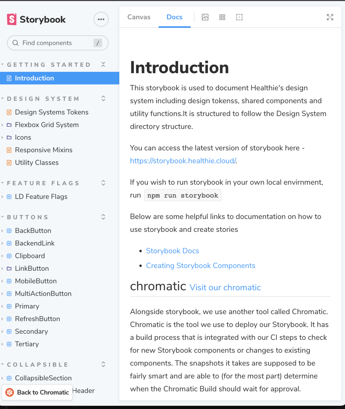
How does Healthie use Storybook?
We have our own setup of Storybook to document shared components. The Frontend Platform team maintains it.
