Basics of web design

Teacher Juan Romero Luis
Apr 7, 2025
Unit 5
Responsive web design
(I)
bit.ly/BWD24U5
Introduction to responsive web design
bit.ly/BWD23U5
Introduction to responsive web design
What is responsive design?
Responsive web design is a design approach that aims to make websites look and function well on a variety of devices, including desktops, laptops, tablets, and mobile phones. It relies on flexible layouts, flexible images, and CSS media queries.
Introduction to responsive web design
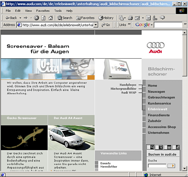
The first “partially responsive” website?
N
Source: webdesigmuseum.org.
The basics to create a responsive web
The basics to create a responsive web
The viewport meta tag
<!DOCTYPE html>
<html>
	<head>
		<meta name="viewport" content="width=device-width, initial-scale=1.0">
    </head>
	<body>
	   <!-- The content of the document... -->
	</body>
</html>
- The
width=device-widthpart sets the page width to follow the screen-width of the device, which varies. - The
initial-scale=1.0part sets the initial zoom level when the page is first loaded by the browser.
N
Basics of web design
Teacher Juan Romero Luis
Apr 8, 2025
Unit 5
Responsive web design
(II)
bit.ly/BWD24U5
The basics to create a responsive web
Basic recommendations
N
Do NOT use large fixed-width elements. For instance, an image displayed at a width wider than the viewport can cause horizontal scrolling. Ensure to adjust this content to fit within the viewport width.
Do NOT let the content rely on an absolute viewport width (eg. px) to render well. It is better to use relative units.
Use CSS media queries to apply different styling for small and large screens. (we’ll se that in a few classes).


The basics to create a responsive web
The grid view
8.33%16.66%25%33.33%41.66%58.33%66.66%75%83.33%91,66%100%50%The basics to create a responsive web
The grid view
<header>
(100%)
<aside>
(25%)
<main>
(75%)
The basics to create a responsive web
The grid view
The basics to create a responsive web
The grid view
Box-sizing property
ensures the padding and border of an element are included in its total width and height, rather than added on, which can often cause layout issues.
👉
* {
  box-sizing: border-box;
}
The basics to create a responsive web
The grid view
Float property
allows elements to be positioned horizontally next to each other, instead of stacking vertically which is the default behavior of block-level elements.
👉
.column1 {
  float: left;
  width: 50%;
}

.column2 {
  float: right;
  width: 50%;
}
Basics of web design
Teacher Juan Romero Luis
Apr 22, 2025
Unit 5
Responsive web design
(III)
bit.ly/BWD24U5
One
Three
Two
PopQuiz!!
bit.ly/BWD23U5
IMPORTANT DATES
Final project submission:
May 8th


Final exam:
May 22th
Project presentation:
May 6th

The basics to create a responsive web
Media query
is technique used to allow the application of different style rules to different devices based on their characteristics, such as screen size, resolution, and orientation.
@media screen and (max-width: 600px) {
  body {
    background-color: lightblue;
  }
}
@media screen and (max-width: 900px) and (min-width: 600px) {
  body {
    background-color: purple;
  }
}
@media only screen and (orientation: landscape) {
  body {
    background-color: lightblue;
  }
}
The basics to create a responsive web
Creating breakpoints
You can create multiple media queries for different viewport widths, which are known as breakpoints.
/* Extra small devices (phones, 600px and down) */
@media only screen and (max-width: 600px) {...}

/* Small devices (portrait tablets and large phones, 600px and up) */
@media only screen and (min-width: 600px) {...}

/* Medium devices (landscape tablets, 768px and up) */
@media only screen and (min-width: 768px) {...}

/* Large devices (laptops/desktops, 992px and up) */
@media only screen and (min-width: 992px) {...}

/* Extra large devices (large laptops and desktops, 1200px and up) */
@media only screen and (min-width: 1200px) {...}
The basics to create a responsive web
Using media queries in grid-based websites
Basics of web design
Teacher Juan Romero Luis
Apr 28, 2024
Unit 5
Responsive web design
(IV)
bit.ly/BWD24U5
Responsive images
Responsive images
Ceating responsive images in CSS involves ensuring that your images can adjust in size to fit a variety of screen sizes.
/* The image will not scale up beyond its original size */
img {
  max-width: 100%;
  height: auto;
}
/* The image will scale up to fit its container width and, thus, could scale up beyond its original size */
img {
  width: 100%;
  height: auto;
}
Responsive images
Background images
reating responsive images in CSS involves ensuring that your images can adjust in size to fit a variety of screen sizes.
.hero {
  background-image: url("images/background.jpg");
  background-color: #cccccc;
  background-position: center;
  background-repeat: no-repeat;
  background-size: cover;
}
.hero {
  background-image: url("images/background.jpg");
  background-color: #cccccc;
  background-position: center;
  background-repeat: no-repeat;
  background-size: cover;
}
Responsive images
Background images
background-color property
👉
is used to set the background color of an element.
.hero {
  background-image: url("images/background.jpg");
  background-color: #cccccc;
  background-position: center;
  background-repeat: no-repeat;
  background-size: cover;
}
Responsive images
Background images
background-position property
👉
sets the initial position. Possible values are top, bottom, left, right, and center, percentages (% the top left corner is 0% [horizontal] 0% [vertical]) or absolute values (0px 0px).
.hero {
  background-image: url("images/background.jpg");
  background-color: #cccccc;
  background-position: center;
  background-repeat: no-repeat;
  background-size: cover;
}
Responsive images
Background images
background-repeat property
👉
controls how a background image is repeated or tiled in an element's background. Possible values are repeat, repeat-x, no-repeat, space, and round.
N
.hero {
  background-image: url("images/background.jpg");
  background-color: #cccccc;
  background-position: center;
  background-repeat: no-repeat;
  background-size: cover;
}
Responsive images
Background images
background-size property
👉
specify the size of the background images. Possible values are auto, length (50px 100px), percentage (50% 100%), cover, and contain.
N