Fix your god damned typography!


#hailtothechefbaby
Makers of a sustainable future

👋
Background
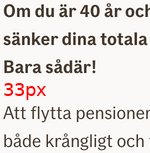
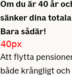
The first "normal" paragraph should have 24px under the lead paragraph
- Font-size 18px
- Line-height 28px
- Margin-bottom 24px
.lead{
  font-family: "If Sans Bold", Arial, sans-serif;
  font-weight: normal;
  font-variation-settings: 'wght' 126;
  font-size: 18px;
  line-height: 28px;
  letter-spacing: normal;
  margin-bottom: 24px;
}
LGTM!
Or?
~ 20%
// Two figures with speech bubbles

1: Parlez vouz REM?
2: Que?
Developers and designers often speak different languages
CSS gives us the illusion that it understands design
.heading{
  font-size: 18px;
  line-height: 28px;
}
It looks pretty easy?
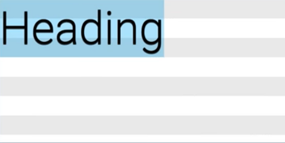
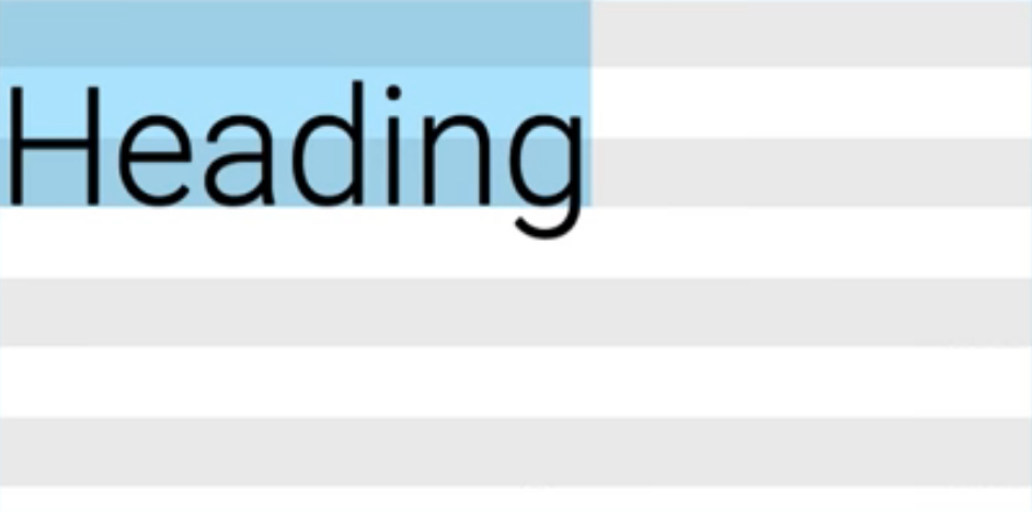
CSS
Design
To the left, what CSS does. To the right is what the designer is expecting to see. CSS centers the text in the line-height. The designer align it to the baseline, the bottom of the line-height.
Developers are left tweaking the CSS until it looks good
1
.paragraph{
  margin-bottom: 24px;
}
.paragraph{
margin-bottom: 20px; /* match "best" */
}2
.paragraph{
  /* but still, depends on font and line-height.. */
  margin-bottom: calc(24px * 0.8);
}
3


Basekick
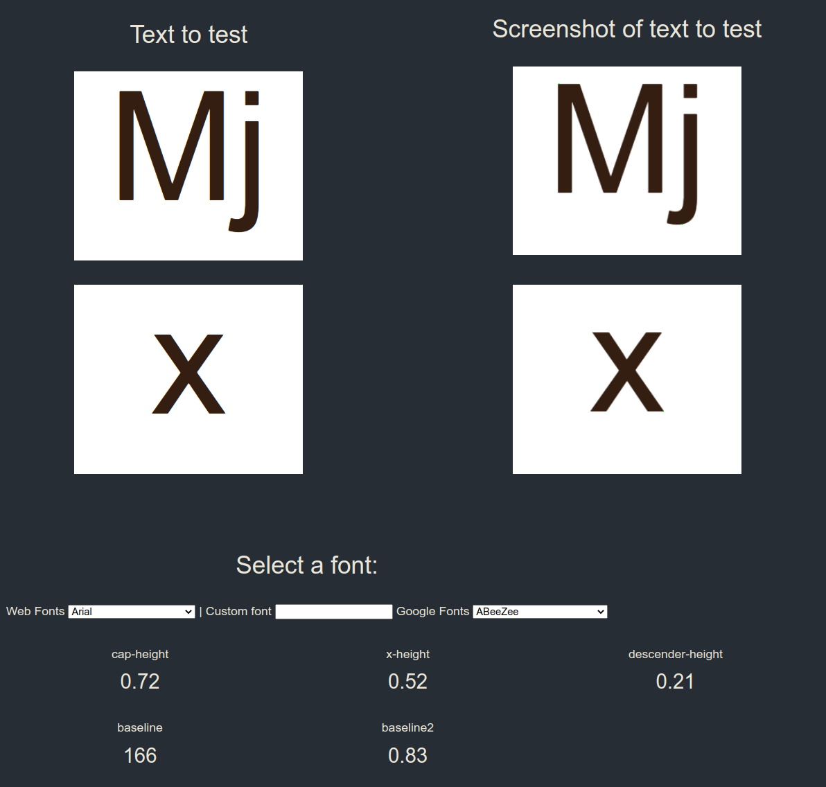
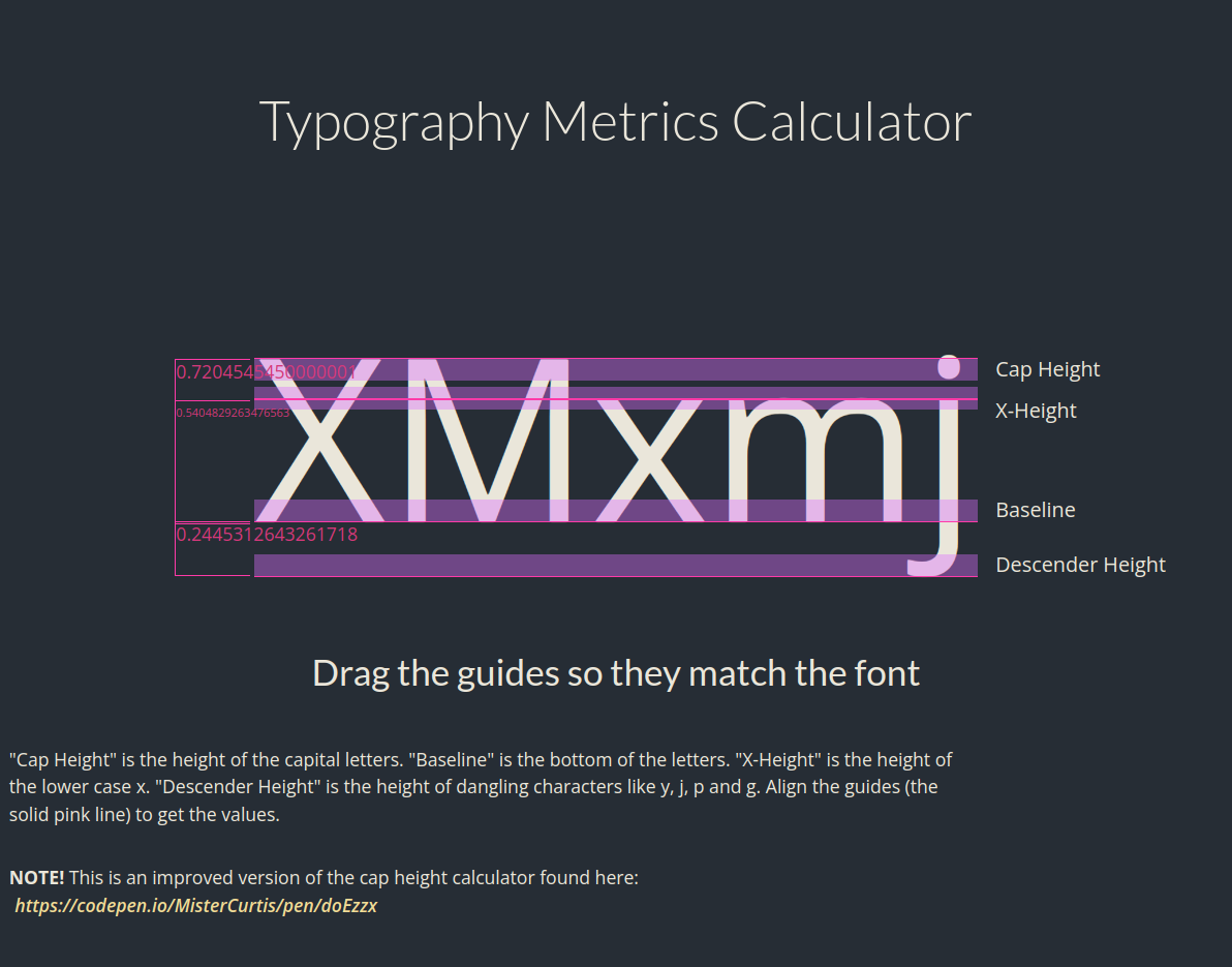
Some versions of typography metrics calculators to find the metric (the dimensions and properties)

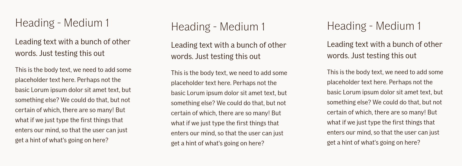
From left to right: 1. nothing is done 2. with basekick 3. Normalized, with adjusted line-heights based on baseline grid (4px/8px)
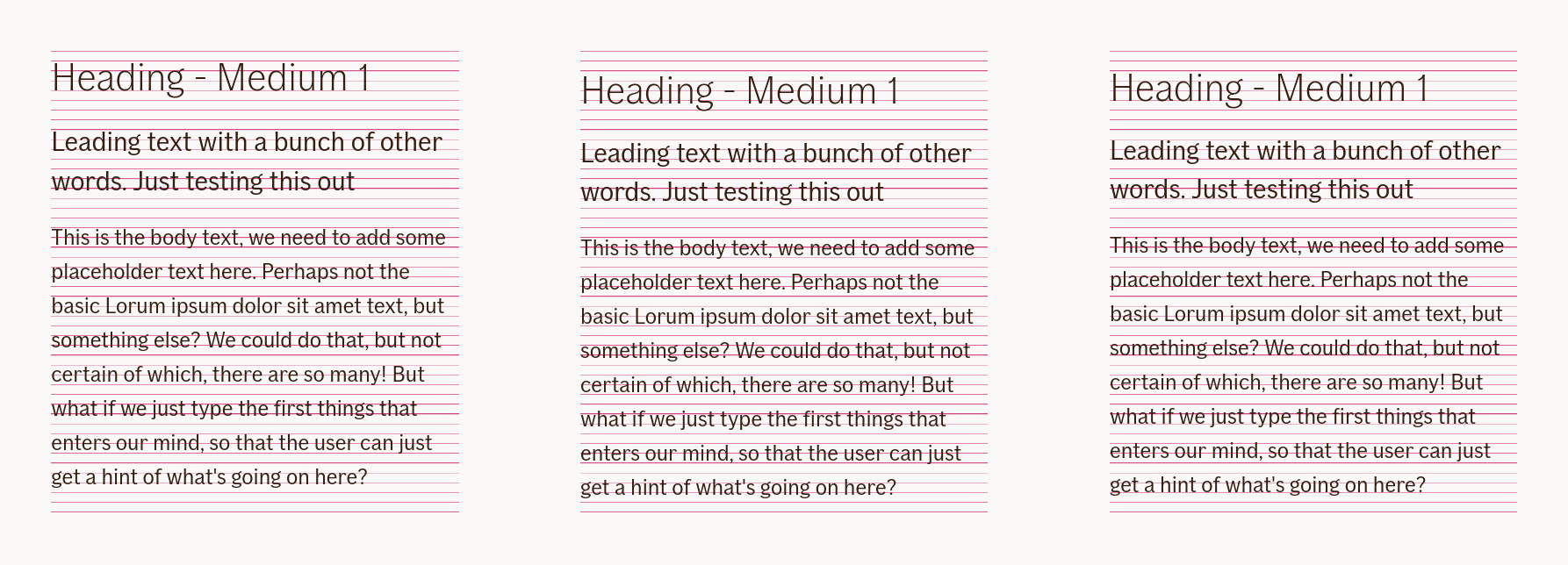
From left to right: 1. nothing is done 2. with basekick 3. Normalized, with adjusted line-heights based on baseline grid (4px/8px)
Font Metrics API
4
F*ck it
Thanks for listening!
Alexander Vassbotn Røyne-Helgesen
Principal Engineer, Knowit, Oslo, Norway