The technical perspective of communicating design with a design system

Alexander Vassbotn Røyne-Helgesen

Manager, Front-end Developer @ Bekk

8
10
40+
400+
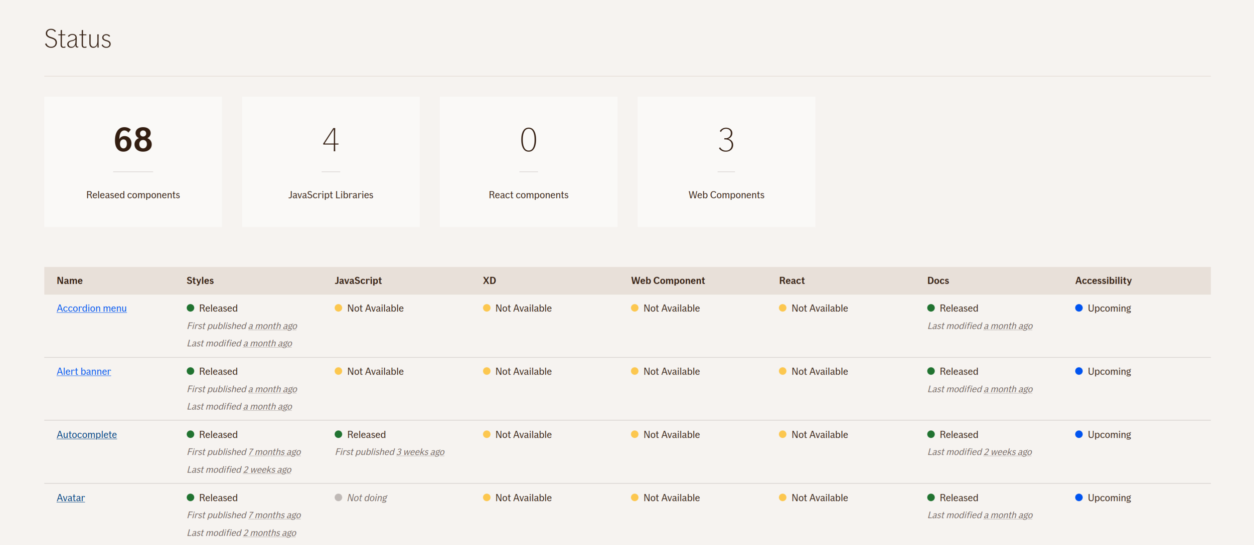
What we deliver
Code
Documentation
Design
Patterns


@if-design-system

if-design-system

Monorepo
packages
├── …
├── alert-banner
├── autocomplete
├── autocomplete-js
├── …
├── datepicker
├── datepicker-webcomponent
├── …
├── faq
├── faq-js
├── faq-webcomponent
├── …
├── help-tooltip
├── help-tooltip-webcomponent
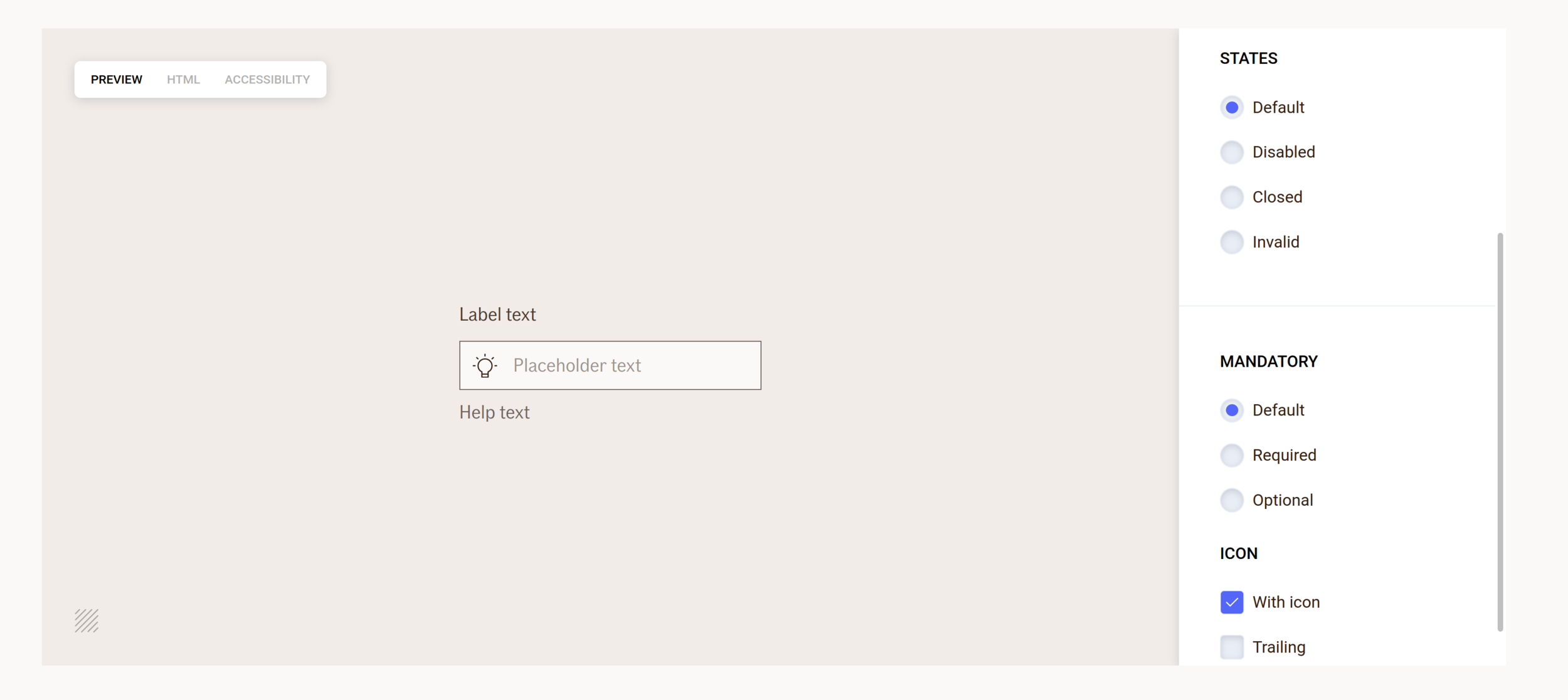
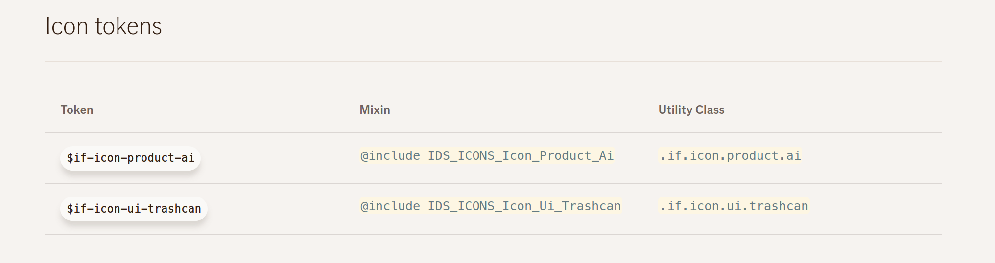
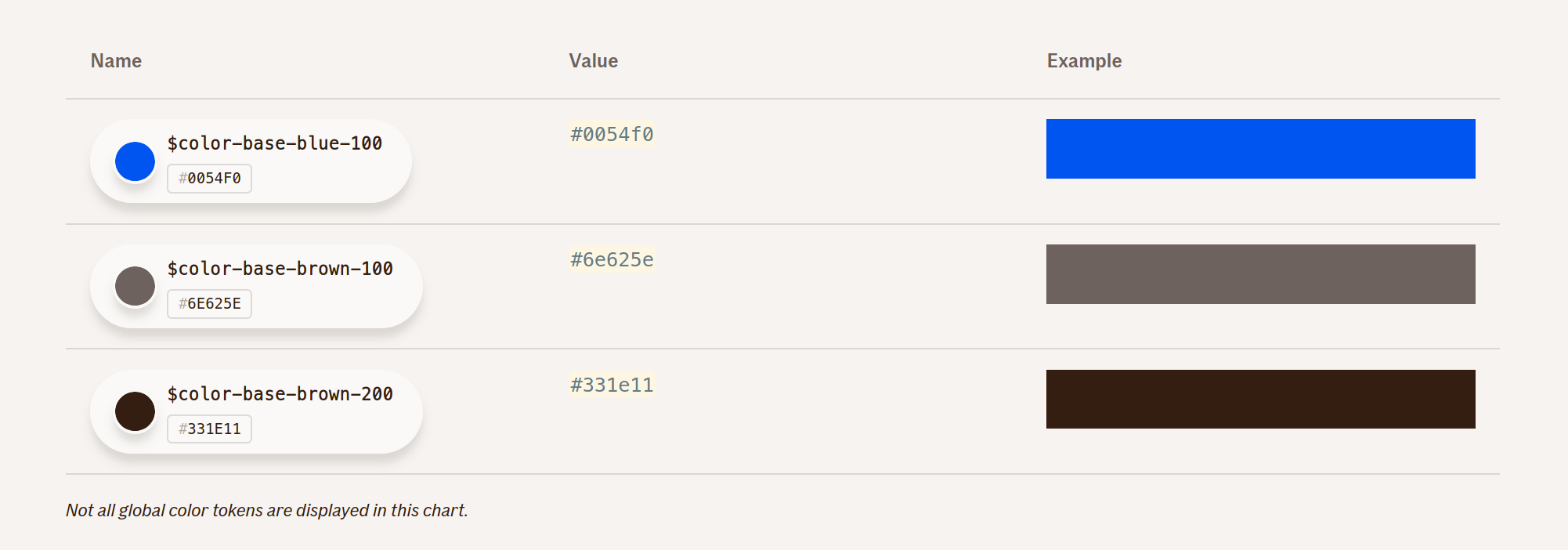
├── …Design Tokens
... is a central location to store design related information such as colors, fonts, animations and so on. These raw values can then be transformed and be formatted to fit the needs of any platform.”
With design tokens, you can capture low-level values and then use them to create the styles for your product or app. You can maintain a scalable and consistent visual system for UI development.”
- Color
- Spacing
- Size
- Icons
- Typography
- Shadow
- Opacity
- Z-index
- Animations
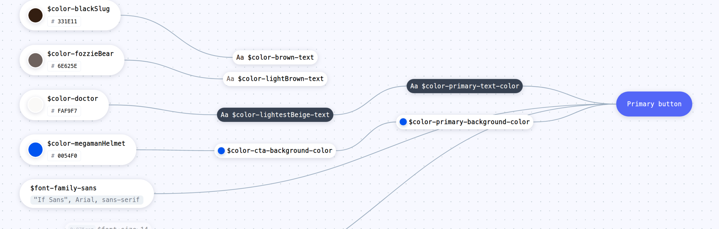
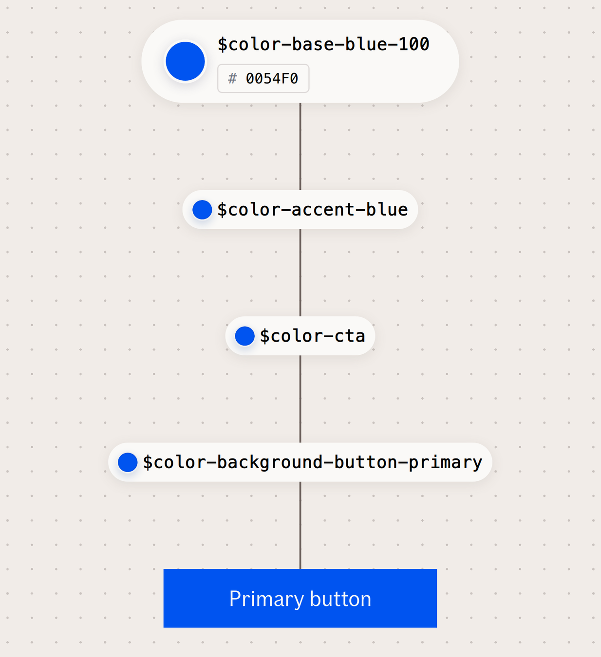
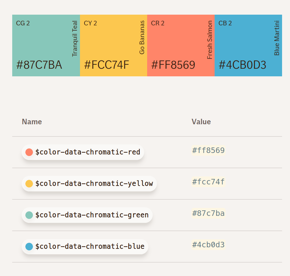
props:
  - blue:
    value: 'rgb(0,84,240)'
    hex: '#0054f0'
    realName: 'megamanHelmet'
    name: 'color-blue-accent'
    stylus: '$color-blue-accent'
    scss: '$color-blue-accent'
    less: '$color-blue-accent'
    versionName: 'blue'
    boldName: BL 1
    rgb: 'rgb(0,84,240)'
global:
  type: color
  category: accent
- SCSS
- LESS
- Stylus
- JS modules
- XML
- JSON
- Dart
- Swift
@import '@if-design-system/color/accent.less';

a {
  color: @color-blue-accent; /* #0054f0 */
}
import React from 'react';
import accentColor from '@if-design-system/color/src/accent.js'
const Button = ({...props}) => (
<button
type="button"
onClick={...}
onKeyPress={...}
style={{
backgroundColor: accentColor.blue.rgb
}}
>
{title}
</button>
)Documentation
Clear examples
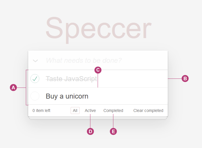
https://github.com/phun-ky/speccer
npm i --save @phun-ky/speccer$ratio = 7
getCorrectContrastColor($bgcolor)
if(contrast($bgcolor, $white).ratio > $ratio){
color $white
} else if(contrast($bgcolor, $darkerGrey).ratio > $ratio){
color $darkerGrey
} else {
color $darkerSlate
}
Accessibility
Design
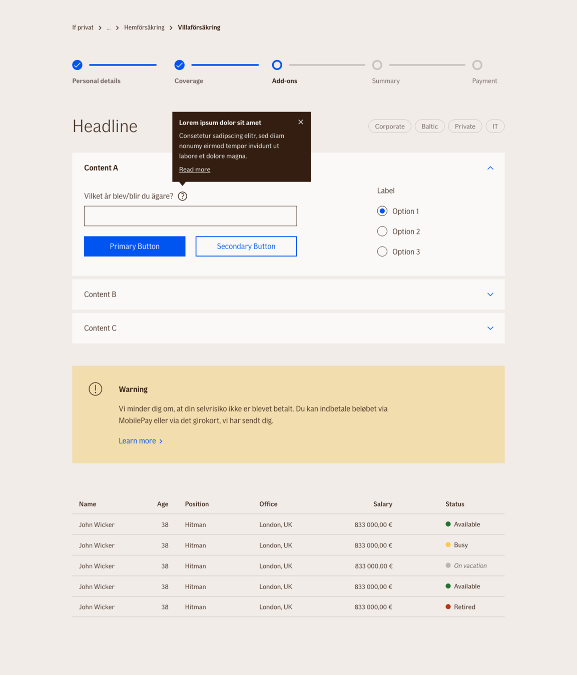
UI Kits for XD
Patterns
Sugaring