Double Page Spreads
What Did I Do?
The past few weeks were spent creating different designs for my double page spread. In the end I created three designs which are equally following conventions of hip hop magazine double page spreads.
Examples
There are many hip hop magazines who create amazing double page spreads. Here are a few that I learnt from and helped me to create the best double page spread to represent my genre of hip hop music.
XXL magazine
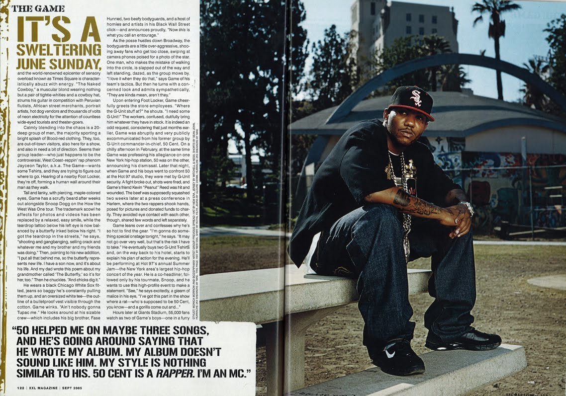
From this double page spread I am going to take notes of the use of conventions such as a pull quote, the main image not having to break the fourth wall and how the image is positioned on one of the pages. I will also revise where this magazine has placed their text and how they have placed the text.
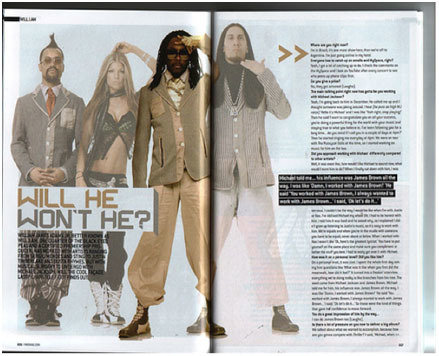
Vibe magazine
Vibe magazine created a very synced double page spread with elegant pages of colour coordination. From this magazine I learnt how to use colour coordination, which made me think more about the types of colours I would like to see on my double page spread in order for my magazine to be synchronised entirely.
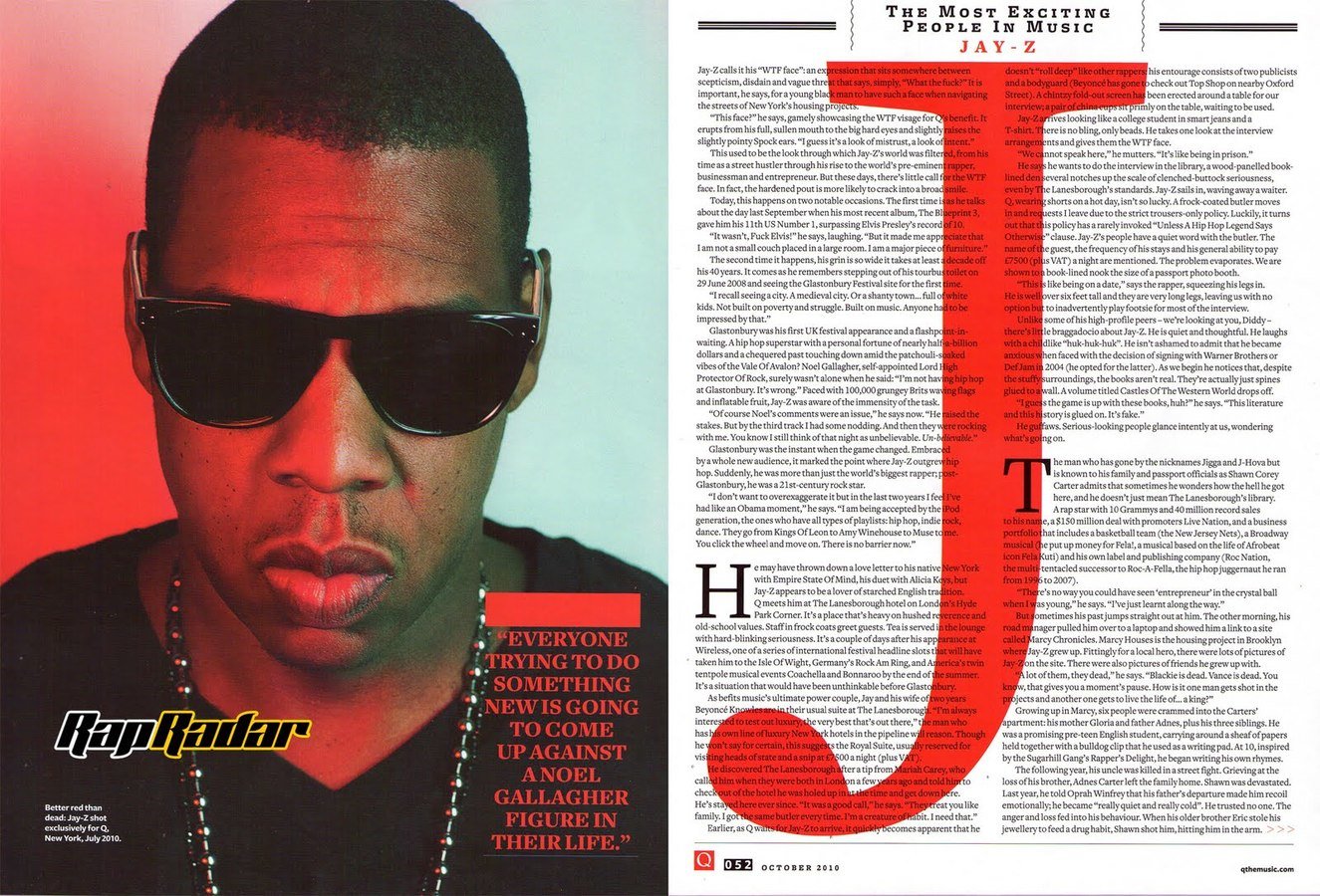
Q magazine
Although this magazine is not fully related to hip hop music, the double page spread article in one of their issues, featured a hip hop star. The magazine adapted the double page spread to fit in with the conventions of hip hop double page spread; for example the colouring of the background and text, and also how the full quote has been placed. I will also trial the idea of initials in the background.
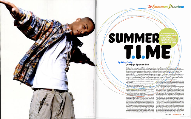
Billboard magazine
Billboard magazine is also another magazine which does not associate absolutely with hip hop music, however the double page spread article relating to rapper T.I shows hip hop magazine style. For example a whole page is used for the image of the rapper, and a lot of space is taken up by the title of the page.
From looking at these...
I have created the following double page spreads which fit conventions a lot but also the use of development of conventions and challenging conventions.
My first double page spread
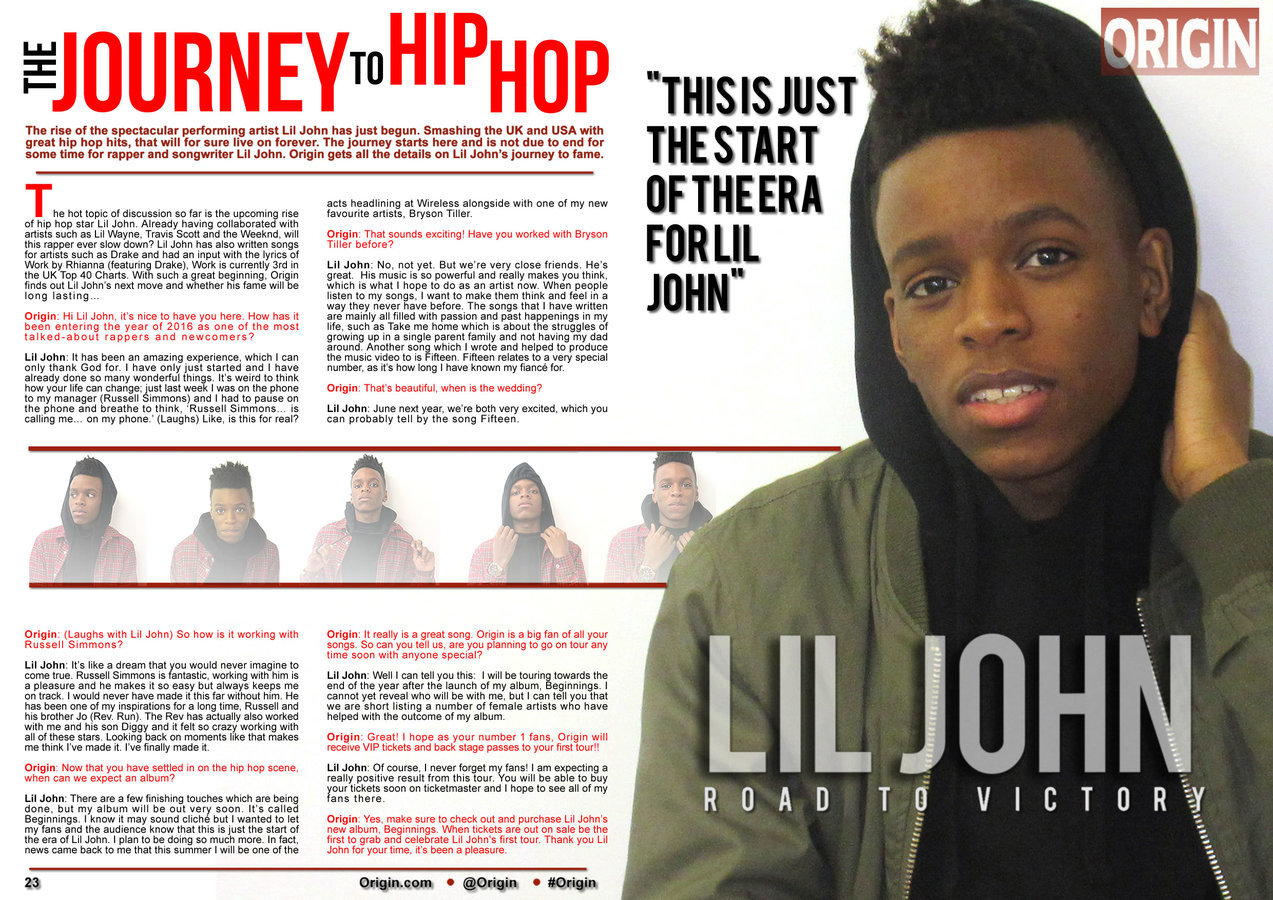
My First Double Page Spread
With this double page spread I created a page just for the main image just like most hip hop magazine have done. This helps the audience to be able to see a full photo of what the music artist looks like and also the audience is able to clearly link both the article to the music artist easily.
I have created a strip of pictures of the artist, this adds a range of fun photos which will attract my younger audience and also draw them more in to wanting to read the article.
The article is easy to read for my audience as it is split into equal columns and paragraphs and also colour coordinated to who is speaking in the interview.
My second double page spread
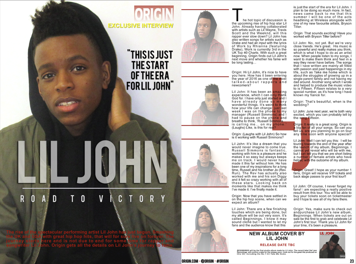
My second double page spread
My second attempt at creating my double page spread included the use of the initials of the artist behind the written article, I sued this from one of the feature double page spreads which has already been created, by doing this it added flavour and created a sense of innovation.
Another element of my second double page spread is that I have used the masthead in the to corner of the page, this will remind readers what magazine they are reading. There is also the social medias at the bottom of the page which helps to relate to the magazine further. The audience are able to connect with the magazine and remember what magazine they are reading from.
My third double page spread
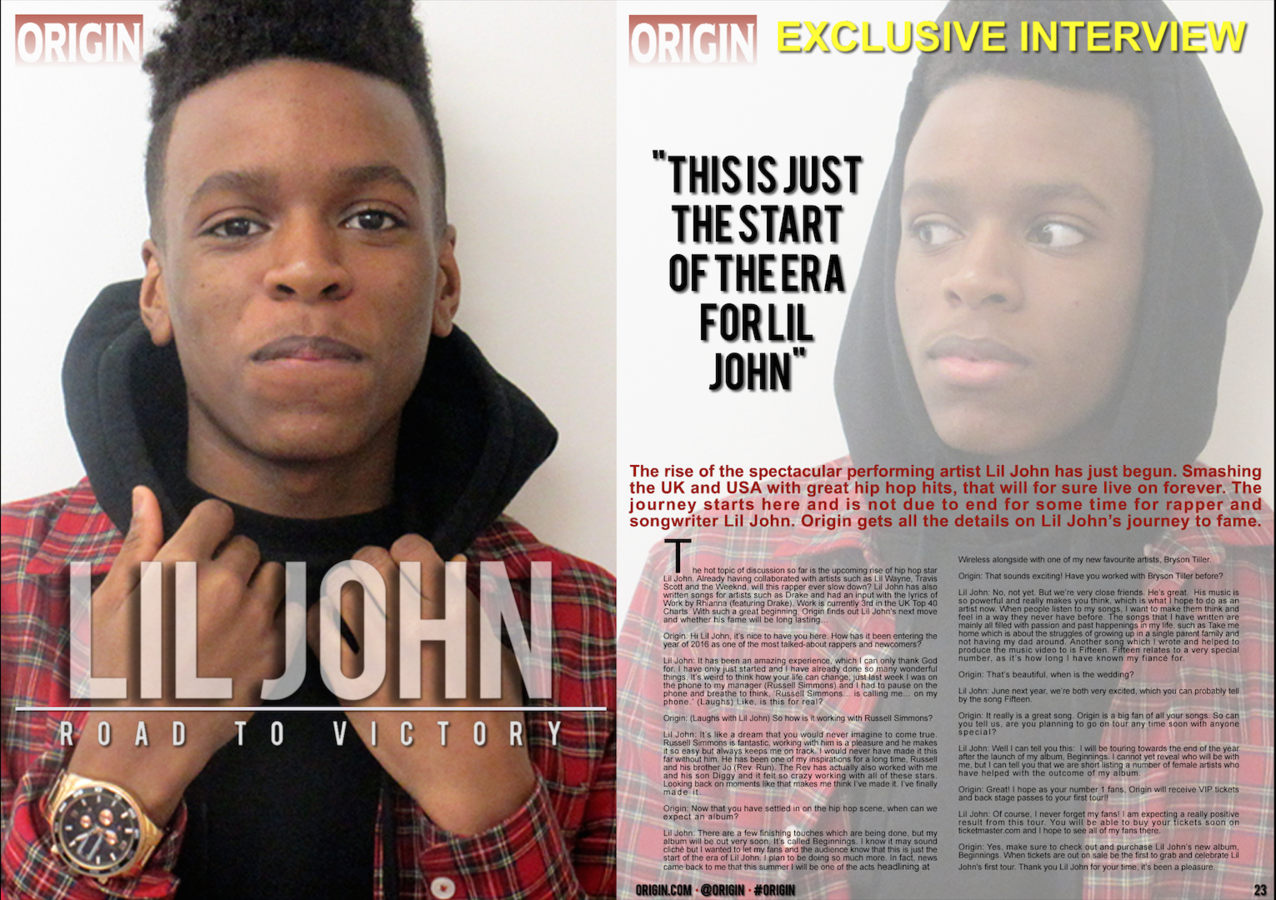
My third double page spread
The last double page spread which I created was a little less innovative, although it did use various skills which were enhanced on Adobe Fireworks. I faded images in order for the pictures to look slightly different and original. The way the pictures are positioned on the page help the audience to draw in closer to the artist.
I kept continuity by having the same