The 5 W's of Accessibility
What Accessibility?

The power of the Web is in its universality. Access by everyone regardless of disability is an essential aspect.
– TIM BERNERS-LEE, Creator of World Wide Web
Who Accessibility


Why Accessibility
- Good for people
- They can access your awesome website
- They can do their work

Why Accessibility
- Good for business
- More customers
- Less legal liability
The most important blind visitor to your website is Google! In the same way that creating accessible web pages helps disabled person access your content, it also helps Google index your pages so that the right people can find your service or product.
– JIM BYRNE, Founder of Guild of Accessible Web Designers
Why Accessibility
How Accessibility
- Follow web best practices
- WCAG standards (A, AA, AAA)
- Allow a bit of extra time and training


- Design phase
- Development
- Usability study
When Accessibility
When Accessibility
- Design phase
- Development
- Usability study


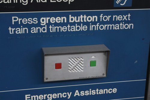
Press the Green Button to continue


Press the Green Button to continue


Press the Left Button to continue


Poor colour contrast


Good colour contrast


- Design phase
- Development
- Usability study
When Accessibility


Closed Captions

Screen reader

<img src="logo.png"
     alt="company name"
/>


<img src="hero.jpg" alt="">

<header>  <nav>

<main> <h1> .. <h6>

<aside>  <footer>

<label for="input_id">
<input id="input_id">
<p role="alert">

<div role="tooltip">

<pre role="math">

<input aria-required="true">
- Design phase
- Development
- Usability study
When Accessibility

Jesse Hemmant
39 years old
Redbank, QLD
Court reporter
Diagnosed with Dyslexia
Feedback
Font was difficult to read
Not enough time to read/complete instructions

Intellectual/developmental disability Considerations
Easy to read sans-serif fonts
Option to extend time on count downs
Glossary for difficult words

Brooke Buring
32 years old
Sanderston, SA
Press relations specialist
Diagnosed with
forearm fracture
Feedback
Hard to press/touch the links
Can't get to parts using keyboard
(mouse hand is injured)

Motor impairment Considerations
Larger touch areas and scroll areas for mobile device
(40 x 40)
Keyboard and mouse controls

Luke McGillivray
51 years old
East Seaham, NSW
Electrician
Diagnosed with hyperopia (long sighted)
Feedback
Had to zoom in to read the text and it broke the layout
Also didn't work on my mobile
(large font option on)

Vision impairments Considerations
Large clear font
Responsive design and units
Test to 200% zoom
Thanks!


Thanks to our Sponsors
Tools
- Fangs (Firefox only)
- Screenreaders
- NVDA (Windows only)
- VoiceOver (Mac only)
- Accessibility checker
- Colour checker

