




Hi again, Bert here. Welcome to part 2 of the case study.


Yes, that's right... Another sequel 🤷♂️

We covered a lot of ground in the last part. Let's explore the remaining points!
CASE STUDY
OVERVIEW
1. Friction and Fuel Framework

2. Getting Subscribers

3. Overcoming Choice Overload

4. Getting you to binge
Part 2
Part 1


Did you miss Part 1 of the case study?

Remember our contenders from last time? Here they are again with their grades from part 1.


C-
Grade:


B-
Grade:
B
Grade:
Disney+ had a fairytale beginning, HBOmax, not so much... 🤦


C-
Grade:


B-
Grade:
B
Grade:
We have previously explored how our contenders get people to subscribe.
VISIT LANDING
PAGE
SUBSCRIBE
(Acquisition)



This time we'll see how they move us to the initial step of binging: watching that first video....
VISIT LANDING
PAGE
SUBSCRIBE
(Acquisition)
WATCH FIRST VIDEO
(Activation)


...and keep on watching the next one!
And the next, and next... 😅
VISIT LANDING
PAGE
SUBSCRIBE
(Acquisition)
WATCH FIRST VIDEO
(Activation)
KEEP WATCHING
(Retention)


Let's get ready to roll.


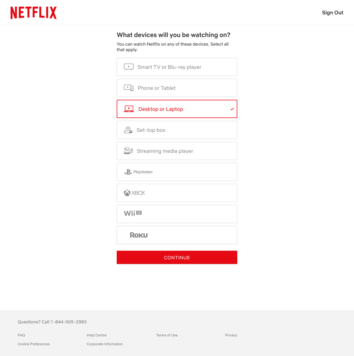
So here's the first step right after we finished the sign-up process for our first contender, Netflix.




We'll now have a Binge Mode Meter 😎 to guide out analysis. Every time a behavior change tool is used to add fuel to a target behavior, the meter will go up. Opposite happens if friction is added. The higher the meter, the more likely that I'll start watching (and never stop).





Binge Mode
Meter 😎
Remember, when you see the magnifying glass, take a moment to look at the screen and tap on the components where you think the service provide friction or fuel for the target behavior.


Alright, I spy with my little eye a bit of friction here...



APPEAL
Transparency
Knowing what is expected and what will happen next can be important in deciding whether an action is worth taking.


Binge Mode
Meter 😎
I'm a laptop person and all, but what if I want to watch it on my (future) PS5? Would be nice to know why I have to set this up now and whether I can add new devices later...


APPEAL
Transparency
Knowing what is expected and what will happen next can be important in deciding whether an action is worth taking.


Binge Mode
Meter 😎
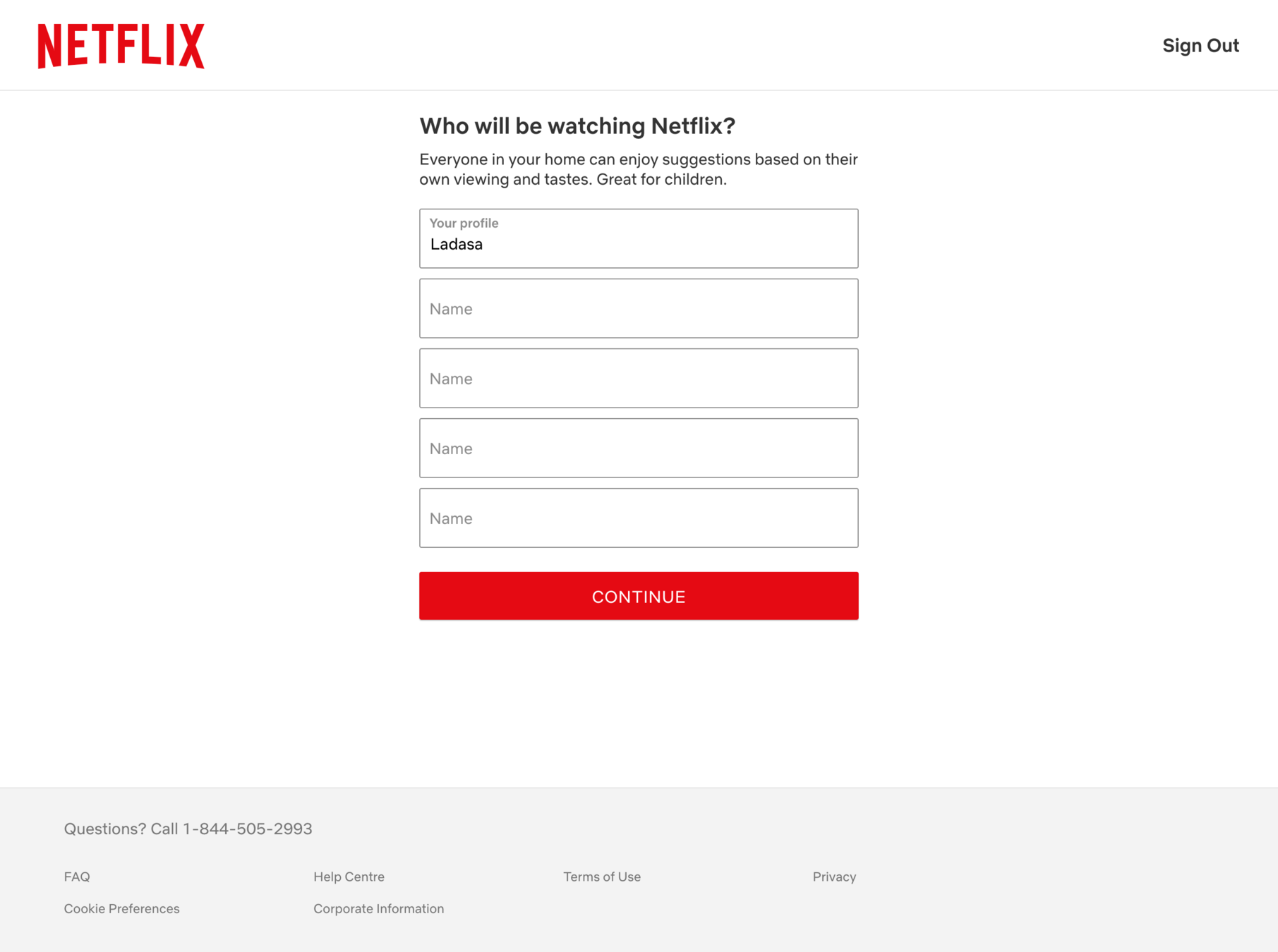
How about here?


Bert

APPEAL
Chunking
Chunking (or breaking down) tasks or information into smaller chunks can make the task feel less overwhelming


Binge Mode
Meter 😎
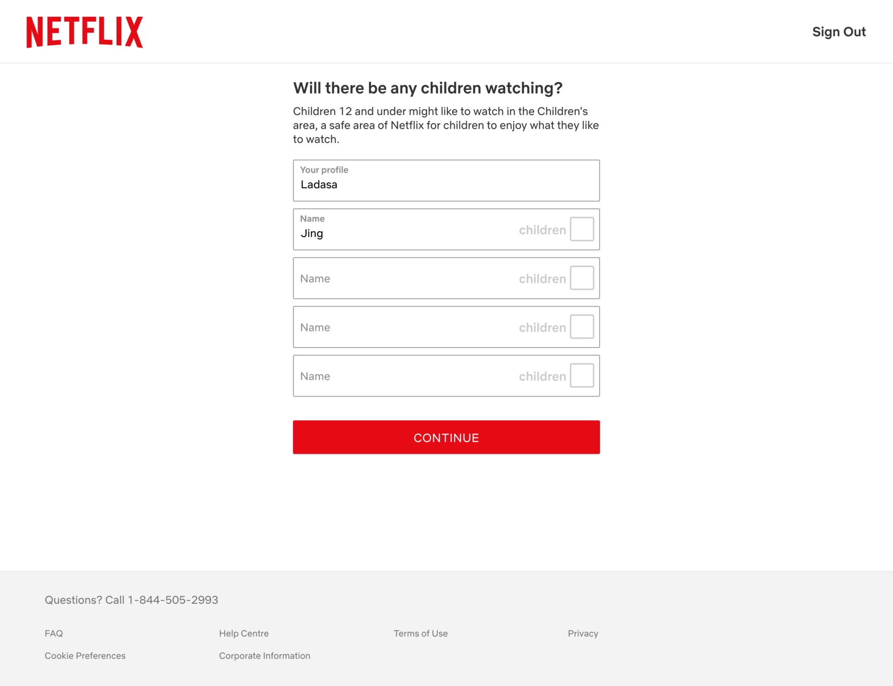
Netflix knows many of their users share their accounts with their friends and family. Chunking the steps together makes it easy for user to add the profiles all at once. Smart move!


Bert

APPEAL
Chunking
Chunking (or breaking down) tasks or information into smaller chunks can make the task feel less overwhelming


Binge Mode
Meter 😎
However, it would better if Netflix tells me whether I can add more user profile later. Right now, I want to skip to the content...


Bert

APPEAL
Transparency
Knowing what is expected and what will happen next can be important in deciding whether an action is worth taking.


Binge Mode
Meter 😎

I hate when my autonomy is limited. It feels like I'm in a damn IKEA warehouse.


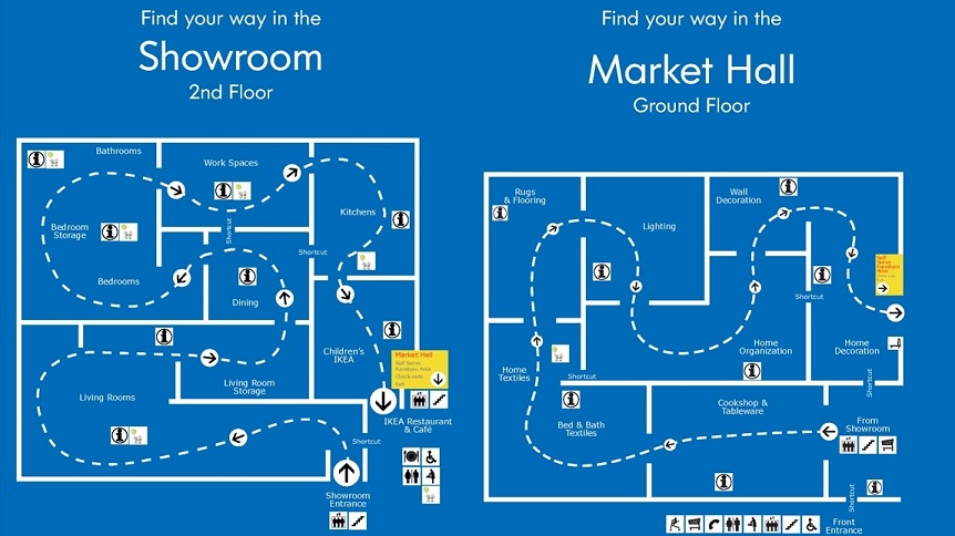
Alright, looks like I'll need to add Mrs. Bert right here and now... Oh, what do we have here?


Bert
Mrs. Bert


Binge Mode
Meter 😎
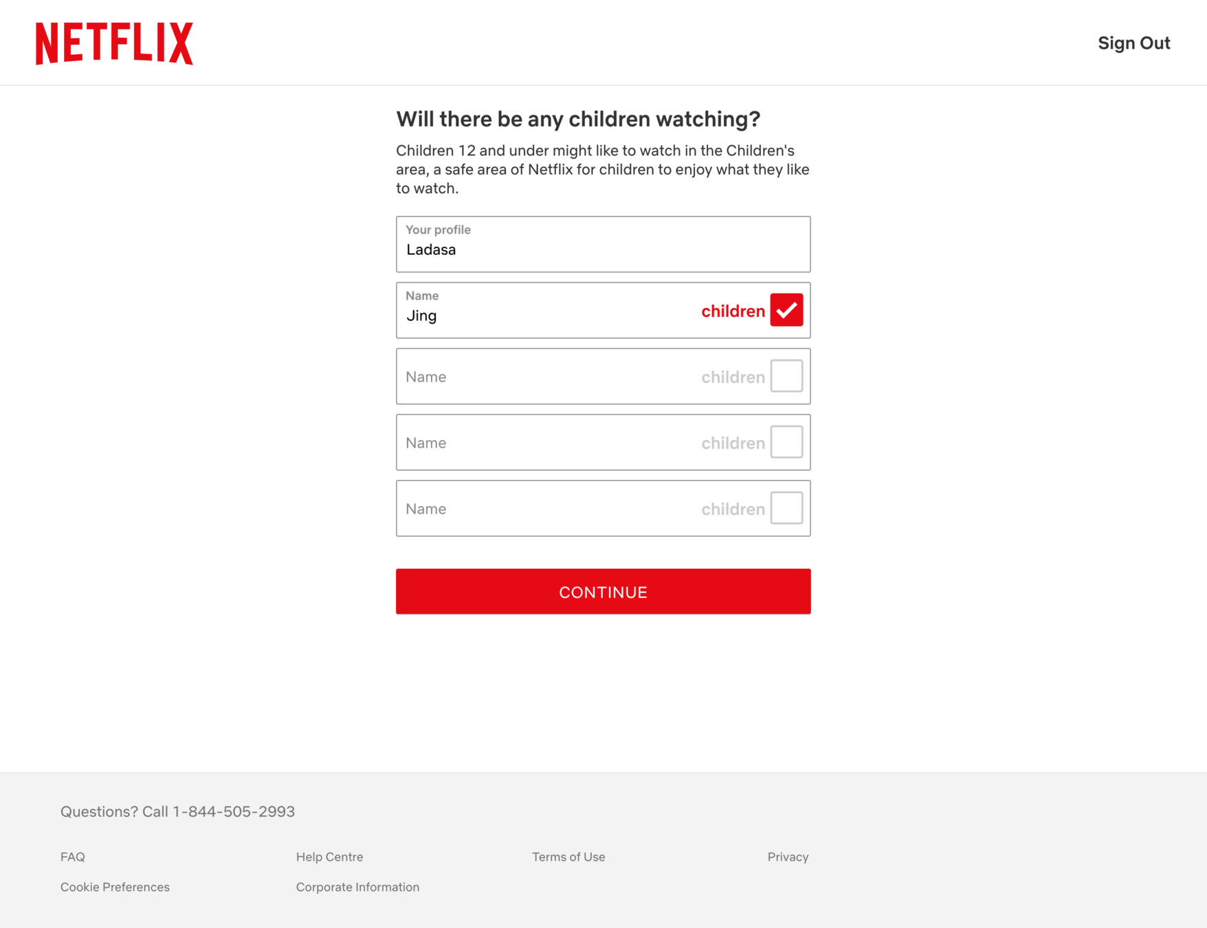
A quick and easy prompt to select which accounts belong to young audiences – nice! Mrs. Bert and I would certainly want our little Bert Jr. to browse safely.


Bert

Mrs. Bert
Bert Jr.



Binge Mode
Meter 😎

Next step! I bet you know the type of friction we'll highlight here...



BIAS
Cognitive Overload
Providing too much information can make one feel too overwhelmed


Binge Mode
Meter 😎
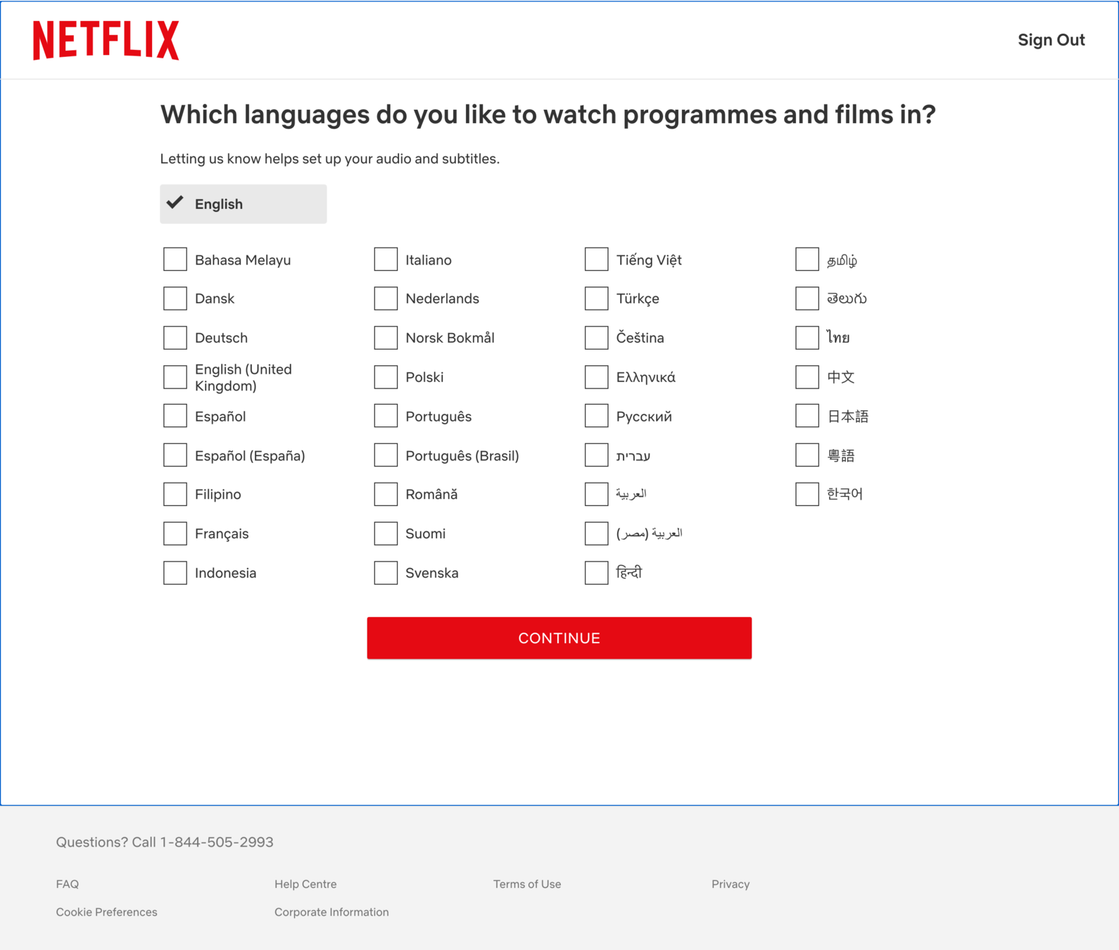
Yes, looks like we have a bit of a cognitive overload situation here, don't we?


BIAS
Cognitive Overload
Providing too much information can make one feel too overwhelmed


Binge Mode
Meter 😎
True, Netflix has a diverse set of users, but bombarding users with all these language options certainly makes me feel a bit overwhelmed...


Binge Mode
Meter 😎
BIAS
Cognitive Overload
Providing too much information can make one feel too overwhelmed

Could this be simplified?
Here's my quick attempt using my paint skills...


Other languages


Binge Mode
Meter 😎

Even better, could Netflix perhaps prompt user to set the language the first time they watch a video? That way the prompt is more timely and relevant.

I hope we're almost there... hmm what's this?


BIAS
Choice Overload
We struggle with making decisions when there is an overload of information. This might lead us to second guess ourselves or postpone the decision.


Binge Mode
Meter 😎
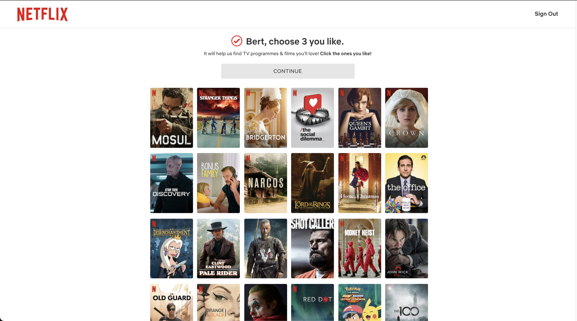
Wait, Choice Overload again?! I don't know, it seems like we're a bit too quick to play this card. Are we really sure that less is more in every context?


BIAS
Choice Overload
We struggle with making decisions when there is an overload of information. This might lead us to second guess ourselves or postpone the decision.


Binge Mode
Meter 😎

Hold up, we need to get to the bottom of this. Let's put Netflix onboarding to the side for now. It looks like...


...we have a case to solve.



To understand choice overload, there's only one place to start... Have you heard about the "Jam Study"?


Basically, the Jam study* provided shoppers with either 6 or 24 options of jams when they visited the supermarket and studied the effects.


*Iyengar, Sheena & Lepper, Mark. (2001). When Choice is Demotivating: Can One Desire Too Much of a Good Thing?. Journal of personality and social psychology. 79. 995-1006. 10.1037/0022-3514.79.6.995.
VS
The result? The second, larger selection of options attracted more traffic. But the smaller version with six options led to 10x times more purchases (!). Clearly, a good argument for why less is more!


*Iyengar, Sheena & Lepper, Mark. (2001). When Choice is Demotivating: Can One Desire Too Much of a Good Thing?. Journal of personality and social psychology. 79. 995-1006. 10.1037/0022-3514.79.6.995.

So less is always more? Nope. If it was, Tim Harford and others have wondered how that explains why Starbucks boasts 80,000+ drink combinations or the seemingly infinite flavors of Ben & Jerry's? Spoiler: it doesn't.


The simple answer is that choices are complex and often guided by context. We might want a handful of options when grabbing a quick lunch, but enjoy browsing long menus over a candle lit dinner.


Not to mention that people's individual preference can differ greatly on these questions. Depending on your product or service, you might have many users with a preference for many choices (hello streaming sites 👋).


A recent meta study on choice overload indeed tells us that "studies fail to come together into a cohesive understanding of when large assortments can benefit choice and when they can be detrimental to choice". Still, there is hope!


*Chernev, Alexander & Bockenholt, Ulf & Goodman, Joseph. (2015). Choice Overload: A Conceptual Review and Meta-Analysis. Journal of Consumer Psychology. 25. Pages 333–358. 10.1016/j.jcps.2014.08.002.
The good news is that the same meta-study identified the following four key factors that moderate the impact the number of items have on choice overload.
CHOICE FACTOR #1
Choice set complexity
How big is the difference between options? This includes presence of a dominant option and how complementarity the options are to each other.
CHOICE FACTOR #2
Decision task difficulty
How does external factors impact the decision? This includes time constraints, and number of attributes describing each option and how options are presented.
CHOICE FACTOR #3
Reference uncertainty
How easy is comparing alternatives?
The degree to which the users understand the benefits of the different options and easily compare the pros and cons.
CHOICE FACTOR #4
Decision goal
Do users have a preference for choice? The degree to which users want to minimize the cognitive effort involved in making a choice among the options.


We can simplify these four factors into a simple 5-item checklist to guide us in evaluating scenarios when choice overload could be a big risk.
Is there one option that the user sees as clearly better than the others?
Are options and their attributes presented in a simple way that is easy to see?
Does the user have time to make the decision?
Does the user have the knowledge to easily compare the alternatives?
Does the user explicitly aim to minimize the effort of making a decision?
1. Easy to choose best option
2. Options are well presented
3. User have enough time
4. User can easily compare options
5. User preference for many options


Case solved. Let's get back now and look at the Netflix screen that started this inquiry.


Back to this page. Let's now review it using our handy Choice Overload Checklist. Firstly, is it easy for users to select the 3 best options?


1. Easy to choose best option
2. Options are well presented
3. User have enough time
4. User can easily compare options
5. User preference for many options
Choice Overload Checklist


Difficult to say... which should probably count as a no. However, many of these titles (think The Office) should be assumed to be recognizable by most users. What about the presentation of options?


1. Easy to choose best option
2. Options are well presented
3. User have enough time
4. User can easily compare options
5. User preference for many options

Choice Overload Checklist


1. Easy to choose best option
2. Options are well presented
3. User have enough time
4. User can easily compare options
5. User preference for many options

Choice Overload Checklist

I like it. Why you ask? Well, this is a fairly manageable subset of the complete library and most are used to browse covers of films (and magazines, albums, etc).
We can also assume most users have enough time.


1. Easy to choose best option
2. Options are well presented
3. User have enough time
4. User can easily compare options
5. User preference for many options

Choice Overload Checklist

The main problem here is that it's quite hard to compare and filter options. Just highlighting and sorting based on the genre would go a long way.


Drama
Comedy


1. Easy to choose best option
2. Options are well presented
3. User have enough time
4. User can easily compare options
5. User preference for many options

Choice Overload Checklist

Lastly, we can safely assume that users have a strong positive preference for exploring the Netflix library. This screen offers a nice middle ground of presenting the highlights. And yes, mostly Netflix originals. No surprise: Once you start watching them, you can't access them anywhere else 😄


And there we go! We can conclude that this screen is unlikely to cause significant choice overload, and perhaps could even reduce it!


Binge Mode
Meter 😎

Alright, I've made my three choices. Now, let's finally continue past this screen. Figuring that one out took some time... Let's speed things up!


Binge Mode
Meter 😎
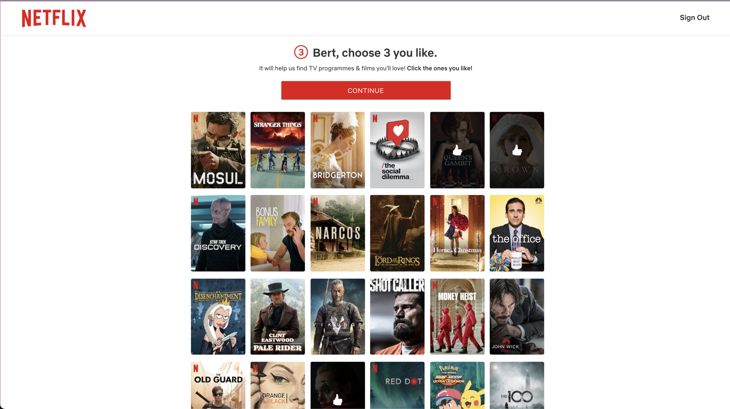
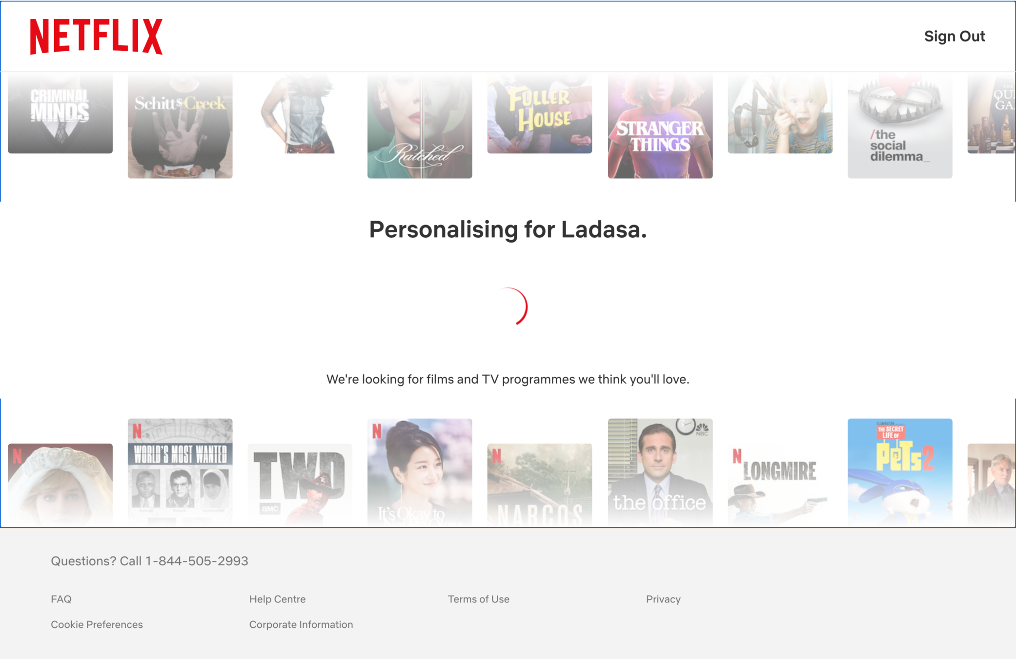
Hmm, or maybe not... This is taking a lot of time, must mean they are working hard on personalizing my content, right?



APPEAL
Labor Illusion
Making people wait can rather than giving something instantly can create the perception that the system is working for them.

Personalising for Bert


Binge Mode
Meter 😎


APPEAL
Labor Illusion
Making people wait can rather than giving something instantly can create the perception that the system is working for them.

Wrong. It's 2021 and things happen in nanoseconds. This is a great example of the Labor Illusion, and some product designers are likely to blame for the delay (not the programmers). I'll admit that my anticipation just increased!

Personalising for Bert


Binge Mode
Meter 😎
Okay, we're (finally) in!
I see something clever here!


BIAS
Choice Overload
We struggle with making decisions when there is an overload of information. This might lead us to second guess ourselves or postpone the decision.


Binge Mode
Meter 😎
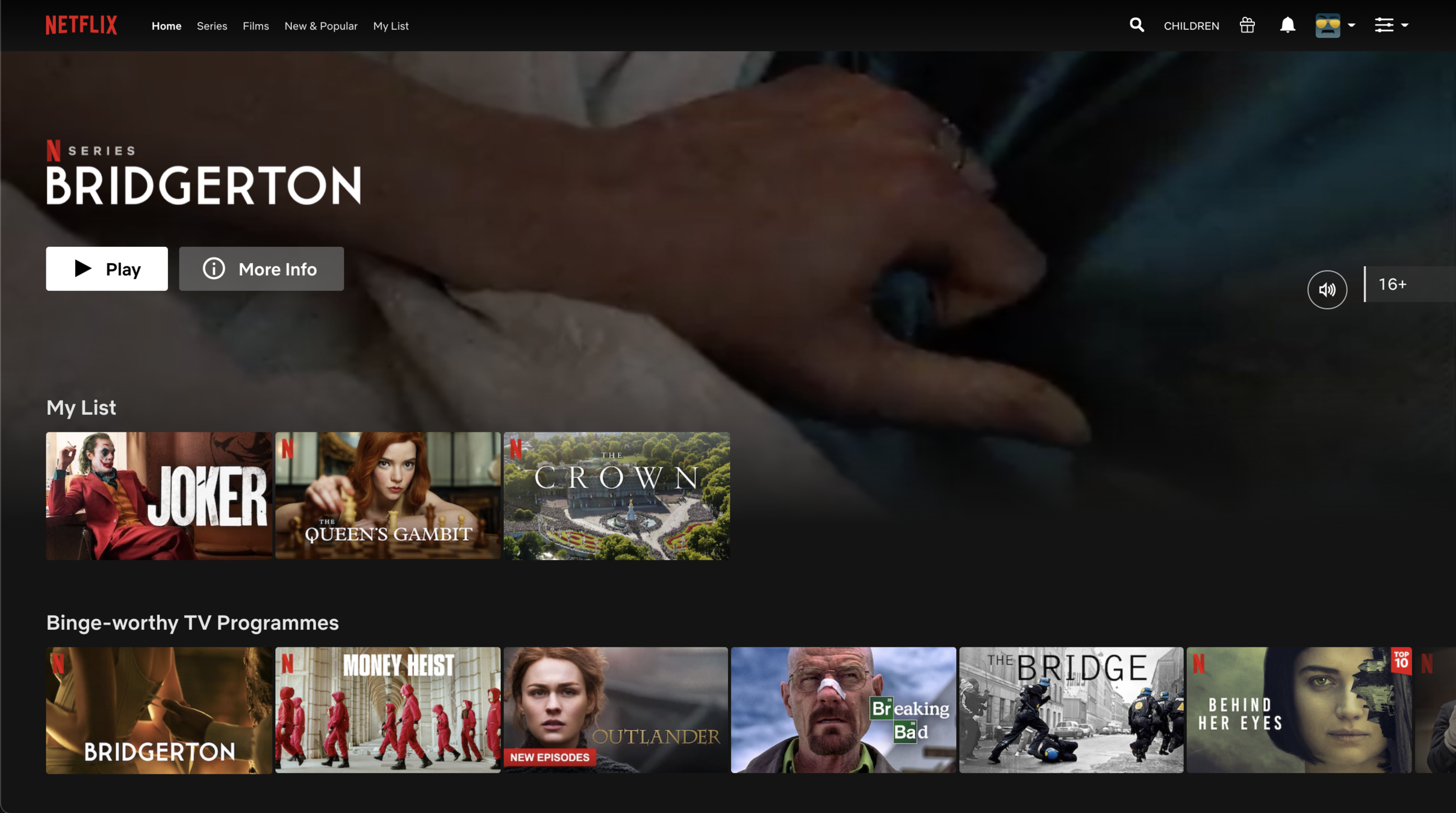
That extra step of choosing a few shows and films actually helps the user curate the first thing to watch right away.
A clever way to reduce choice overload!


BIAS
Choice Overload
We struggle with making decisions when there is an overload of information. This might lead us to second guess ourselves or postpone the decision.


Binge Mode
Meter 😎


We don't need a checklist to determine that having my
pre-selected list of 3 options makes it easier to decide.
Alright, this Bridgerton trailer is getting racy, time for me to choose, perhaps something more conservative!


Binge Mode
Meter 😎


I know the Crown is quite a hit...
Oh what do we have here when I hover over the show...


APPEAL
Personalization
Personalising the experience or intervention can help meet user's specific needs, goals, and preferences.


Binge Mode
Meter 😎
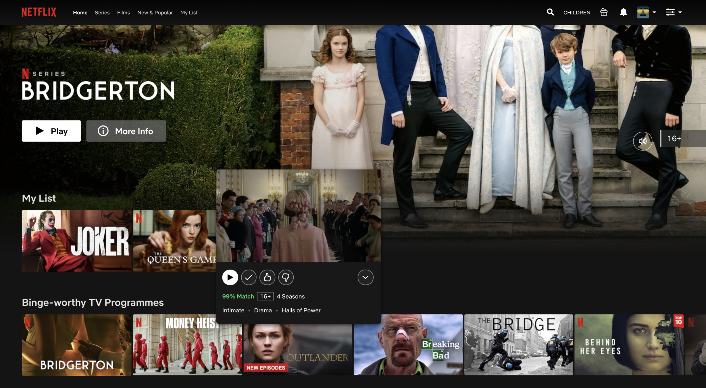
99% Match? I like it! Let's ignore that this is based on my selection on the previous page. It still helps to confirm my pick.


APPEAL
Personalization
Personalising the experience or intervention can help meet user's specific needs, goals, and preferences.


Binge Mode
Meter 😎


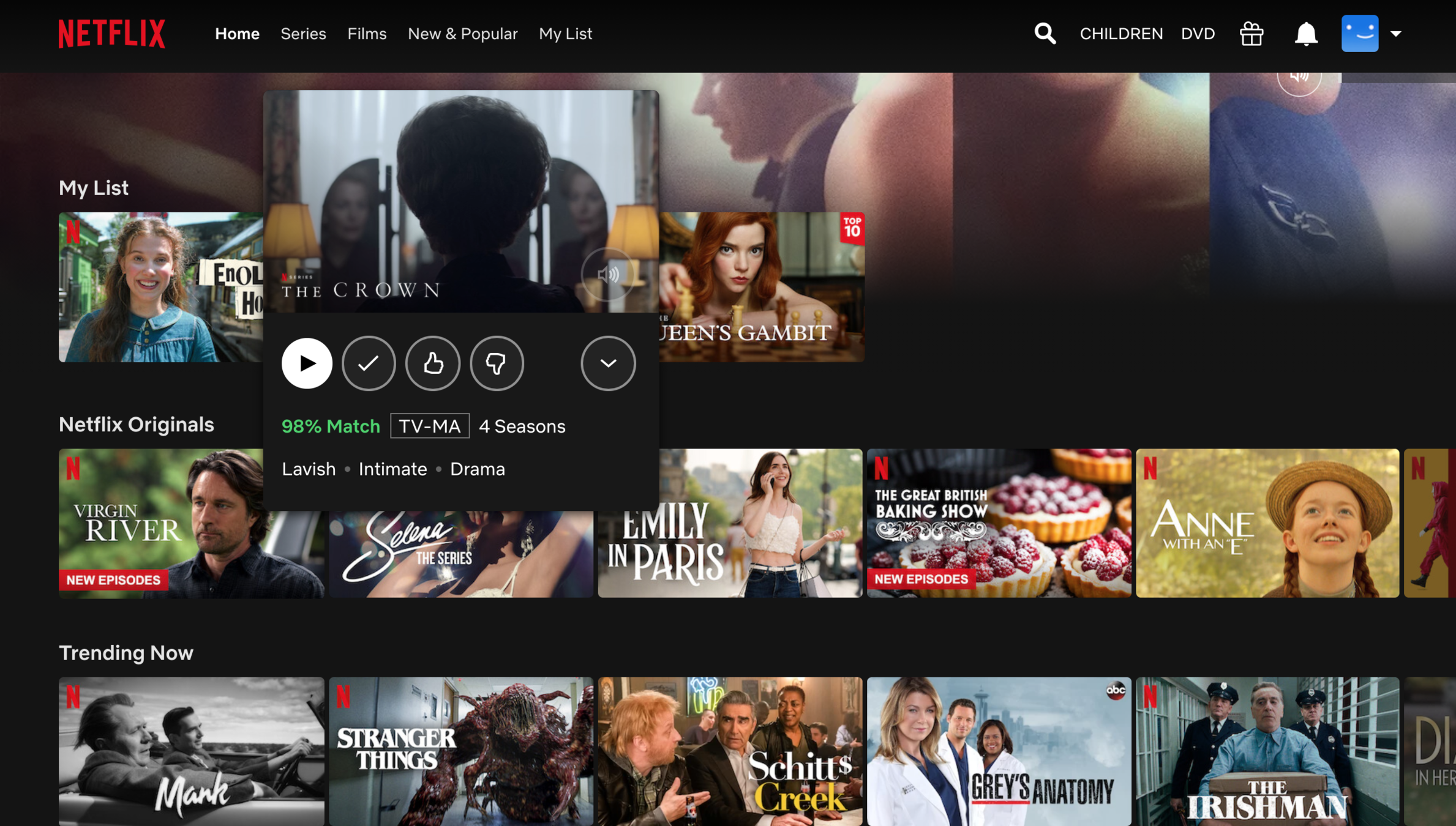
Note to mention, I'm definitely liking this one-click play. How easy can it get to watch a show straight from the landing page?



VISCERAL
Prompt to Action
Providing an effective call to action helps users know what they should do next.


Binge Mode
Meter 😎
Alright, here we go!


Binge Mode
Meter 😎
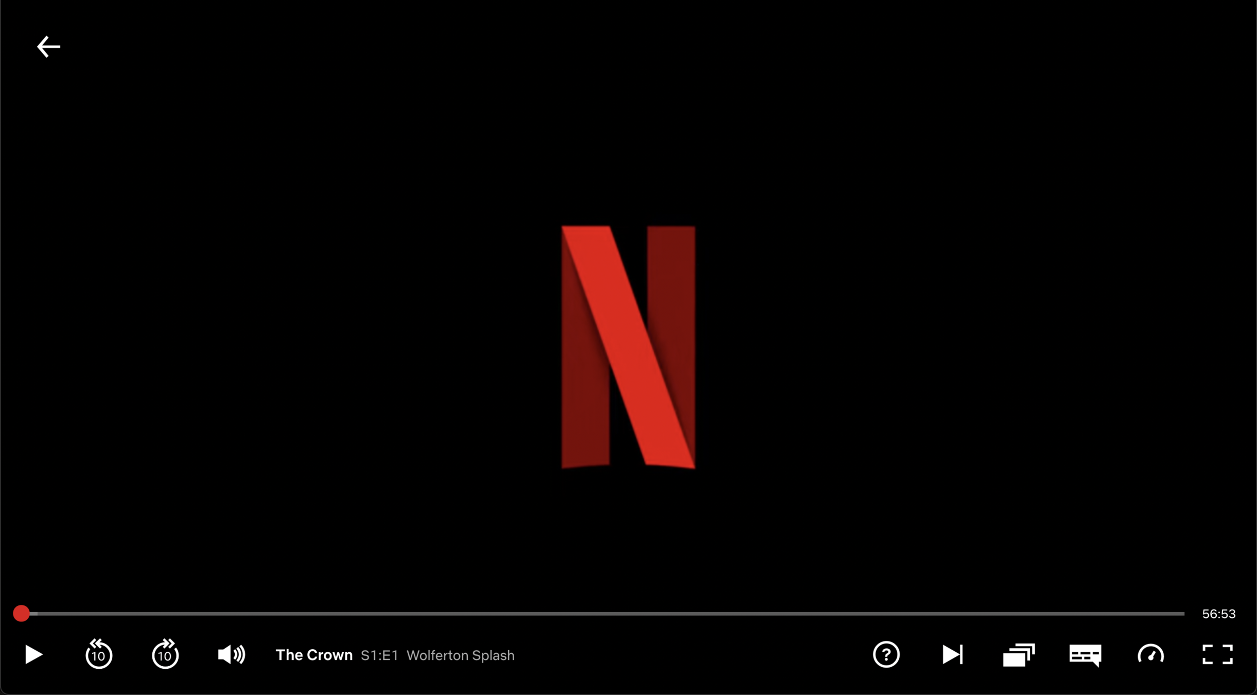
The first episode has bit of a slow start, but really high-quality production I'll say...


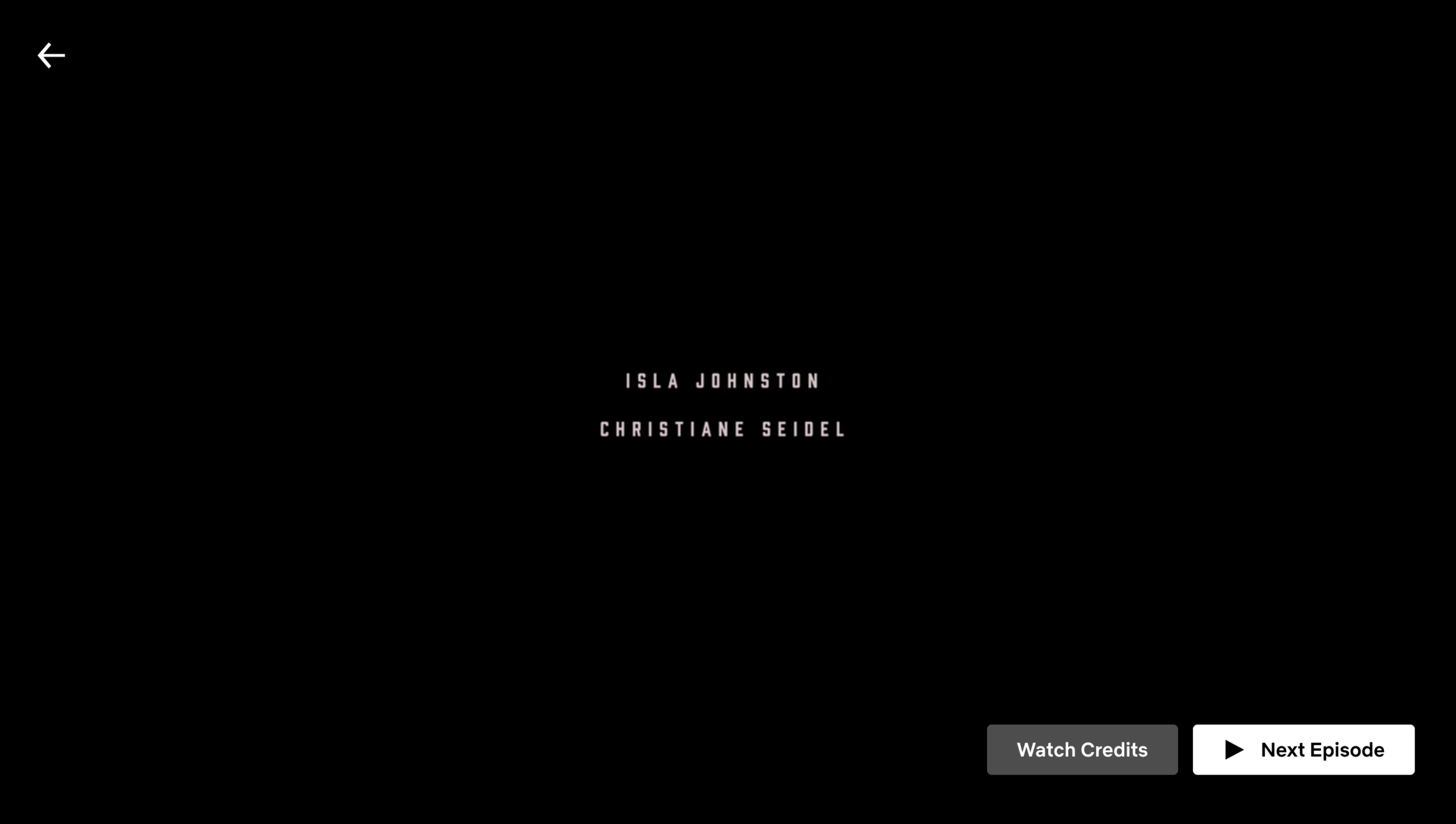


HABITS
Defaults
Preselected options tend to remain selected because of the effort required to modify them. The default is the course of action that occurs if nothing is specified by the decision maker.


Binge Mode
Meter 😎
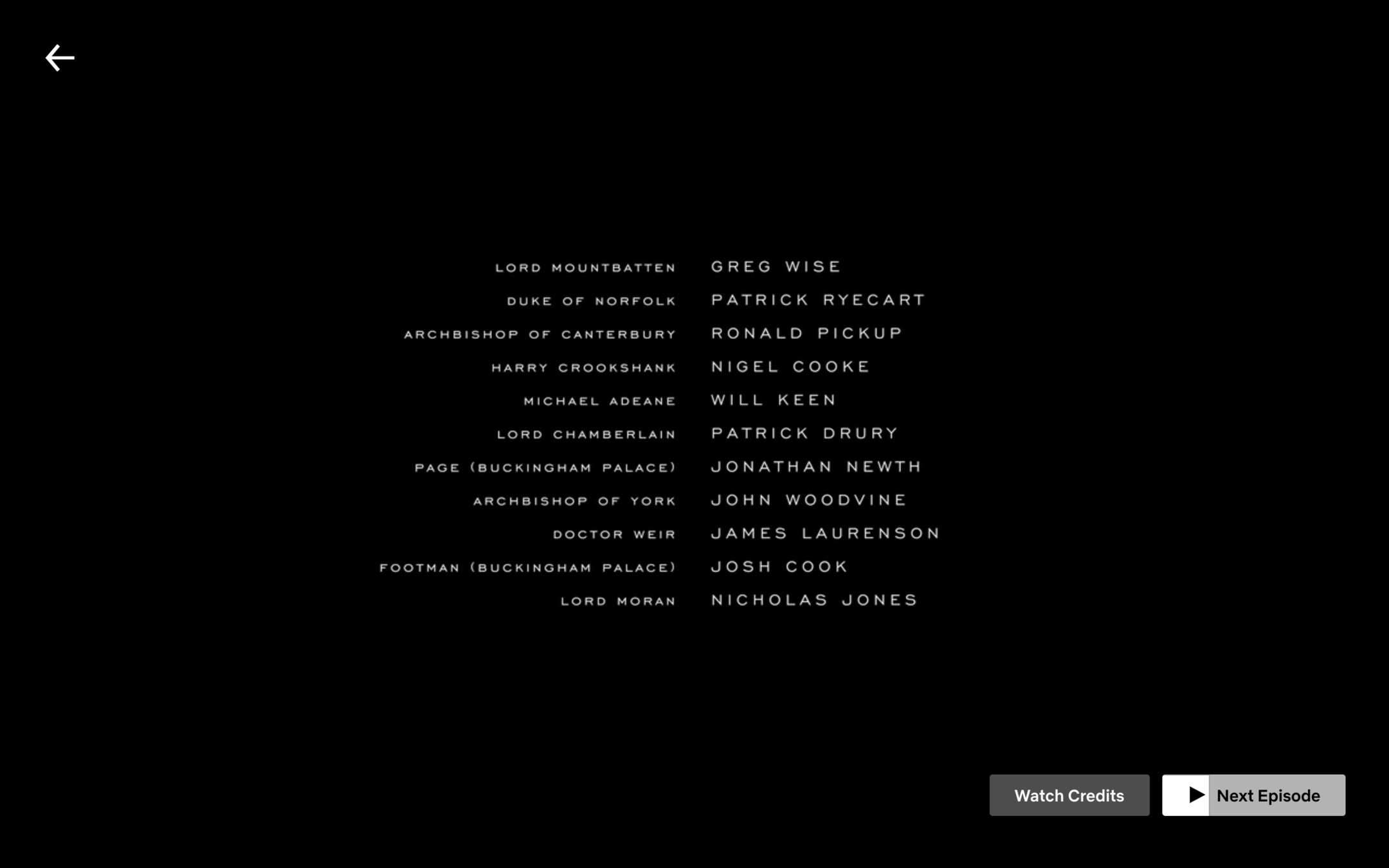
Hmm, but the next episode is already starting... maybe I'll just watch one more.


HABITS
Defaults
Preselected options tend to remain selected because of the effort required to modify them. The default is the course of action that occurs if nothing is specified by the decision maker.


Binge Mode
Meter 😎


[4 seasons later...] Oh, Diana. So sad indeed.
I give Netflix credit for providing a timely prompt for me to continue, but I think I'll call it a day here.


Binge Mode
Meter 😎
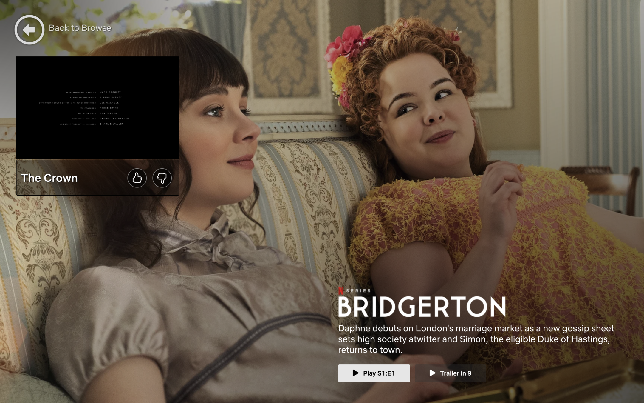
VISCERAL
Prompt to Action
Providing an effective call to action helps users know what they should do next.

Let's wrap this up quick before that Bridgerton trailer starts playing again!


HABITS
Defaults
Preselected options tend to remain selected because of the effort required to modify them. The default is the course of action that occurs if nothing is specified by the decision maker.


Binge Mode
Meter 😎
While Netflix had a slow start, it did use my initial peak in motivation to get all of the setup completed. Once that was done, it was easy sailing and auto-play all the way.
A strong Grade B+ to Netflix!


B+
Grade:


Binge Mode
Meter 😎
It's getting a bit late... but I take this task seriously. Let's continue to our next contender, shall we?


So right after we signed up for HBOmax, we land on this page...


Bert
Binge Mode
Meter 😎


Nice to see that they got my name right! Must be from the step I criticized in the previous study.


Bert
Binge Mode
Meter 😎


APPEAL
Talk to Me
Communicate to people by mentioning their name to draw their attention.

Nice to see that they got my name right! Must be from the step I criticized in the previous study.


Binge Mode
Meter 😎


Alright, let's go in!


Bert
Binge Mode
Meter 😎


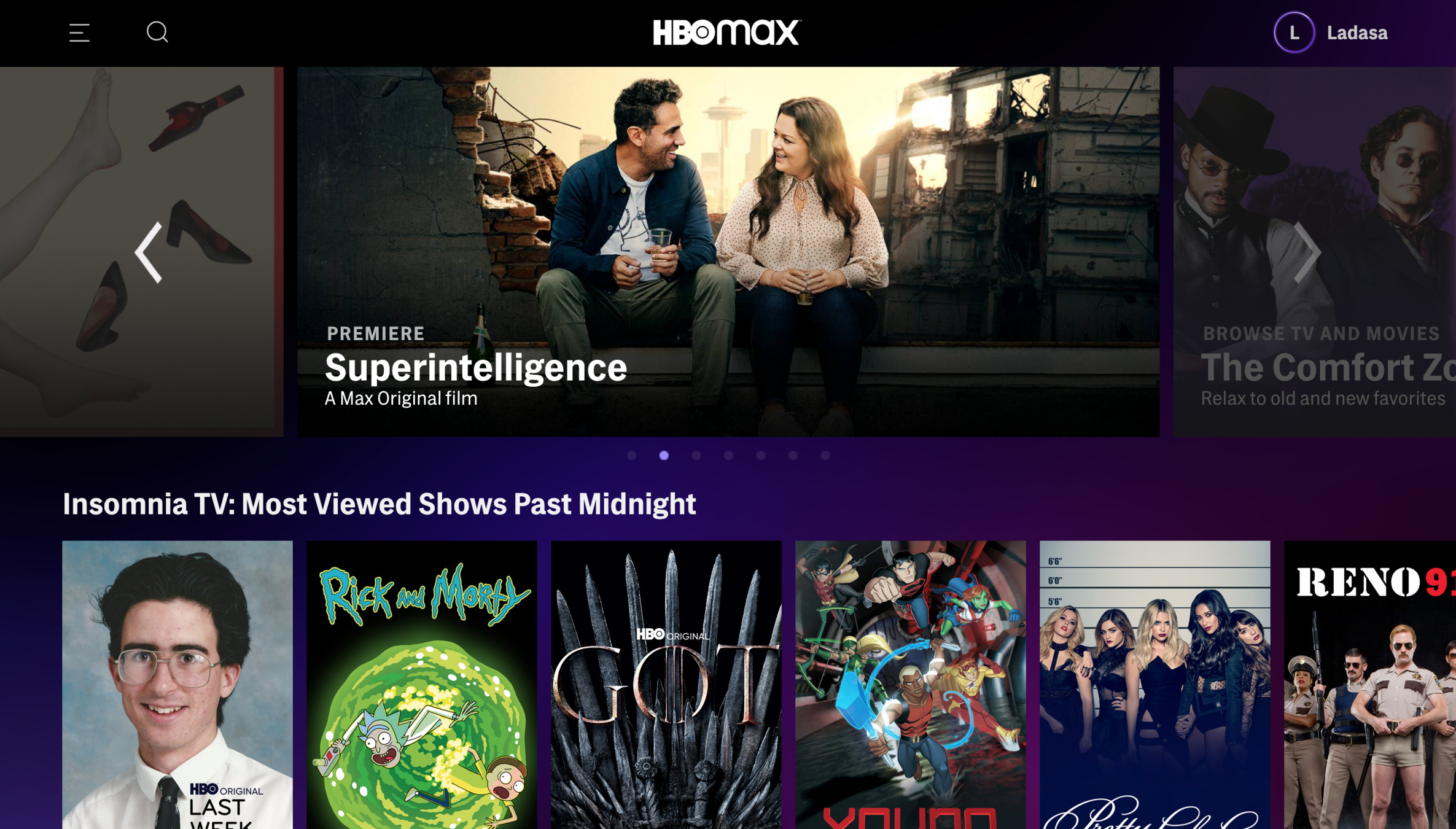
Woah, I'm straight in.
That was quick! Especially compared to Netflix...


Binge Mode
Meter 😎


Binge Mode
Meter 😎


What should I watch, hmm...


APPEAL
Personalization
Personalising the experience or intervention can help meet user's specific needs, goals, and preferences.

OTHERS
Social Proof
People tend to follow the action of the masses, thinking it must be the correct behavior.

Binge Mode
Meter 😎


Binge Mode
Meter 😎


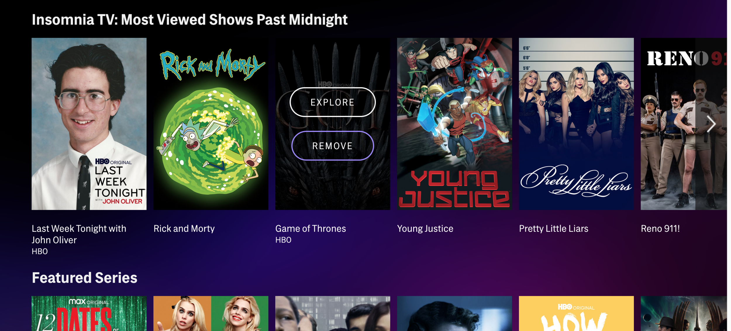
Insomnia TV?
Sounds just like me!


APPEAL
Personalization
Personalising the experience or intervention can help meet user's specific needs, goals, and preferences.

OTHERS
Social Proof
People tend to follow the action of the masses, thinking it must be the correct behavior.

Binge Mode
Meter 😎


Let's see... I'm a little late to the Game of Thrones party, but let me see what this is all about...



Binge Mode
Meter 😎


ADD
EXPLORE
HABIT
Reduce steps
Lower friction by reducing the required steps to achieve the goal.


Explore and Add...
No one-click play here, eh?


HABIT
Reduce steps
Lower friction by reducing the required steps to achieve the goal.

Binge Mode
Meter 😎


ADD
EXPLORE
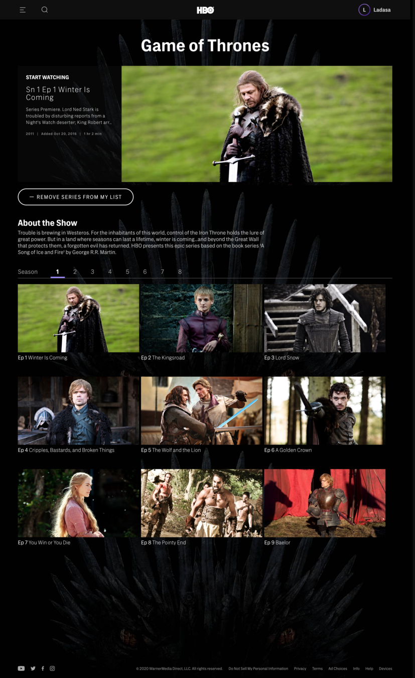
After selection "Explore", I have arrived on series main page...



VISCERAL
Promp to Action
Providing an effective call to action helps users know what they should do next.

Binge Mode
Meter 😎


Wait. How do I play? Gosh, I heard I would have to wait for dragons, but I didn't expect to have to wait this long for the play button to appear!


Binge Mode
Meter 😎


VISCERAL
Promp to Action
Providing an effective call to action helps users know what they should do next.

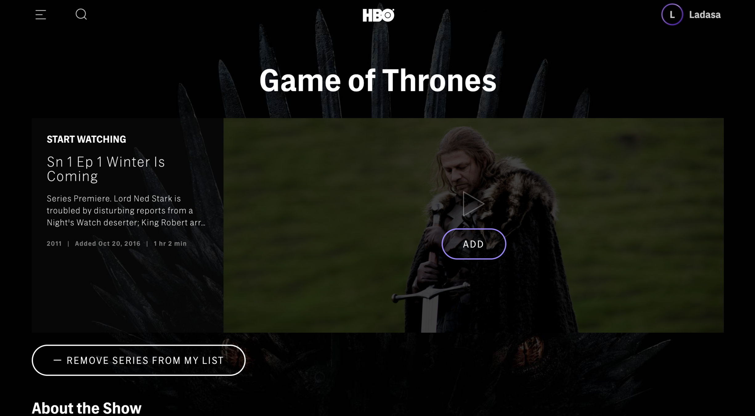
Oh there we go, I'll need to hover over the show image. Pretty well hidden, huh?



Binge Mode
Meter 😎


BIAS
Salience
Information that is novel or stands out is more likely to influence us

I still have to choose between play and add? I've already added the show, why should I even add this episode?


Binge Mode
Meter 😎


BIAS
Salience

Information that is novel or stands out is more likely to influence us
My two cents here is that people would expect to see only the play button and it would be better if that "add button" is moved elsewhere. Anyway, let's click play and get the show started!


Binge Mode
Meter 😎


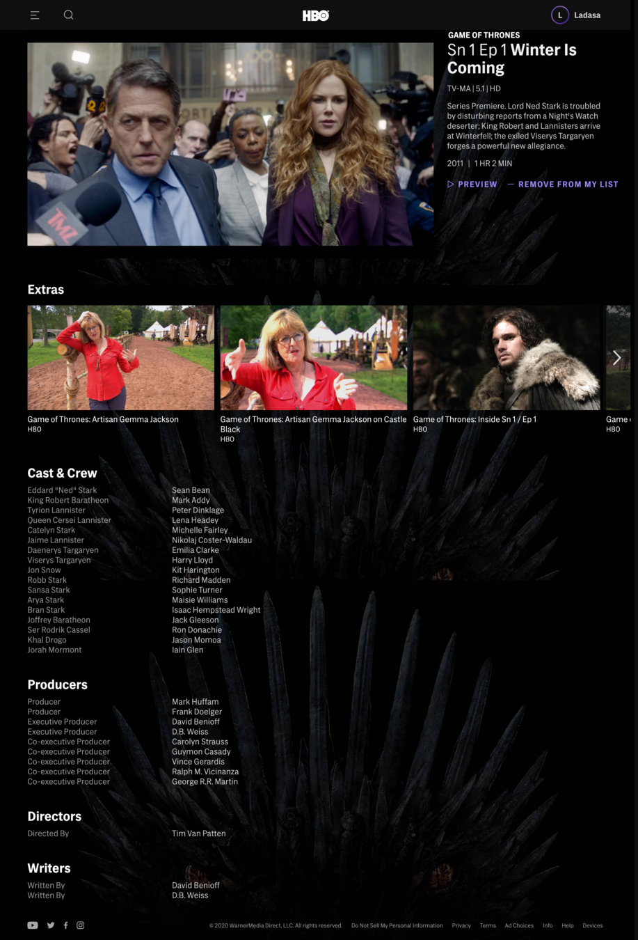
Alright...wait, what??



APPEAL
Personalization
Personalising the experience or intervention can help meet user's specific needs, goals, and preferences.

Binge Mode
Meter 😎


Ads? Hugh Grant? Really? I'm more of a Sean Bean guy... The HBOmax recommendations highlight how little they know about me. Maybe Netflix longer onboarding had some purpose after all...


Binge Mode
Meter 😎


APPEAL
Personalization
Personalising the experience or intervention can help meet user's specific needs, goals, and preferences.

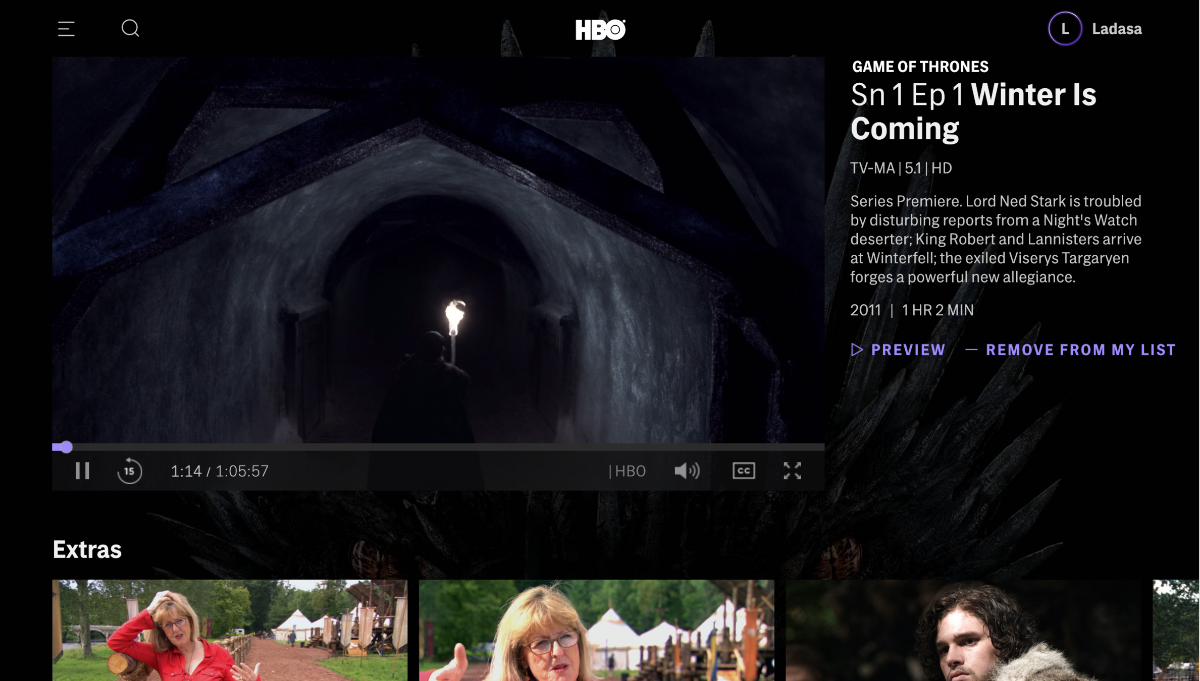
No way, do I really need to make an extra click for full-screen? C'mon... I'm not one to usually complain, but this is ridiculous.



Binge Mode
Meter 😎


Okay... let's finally see what the Game of Thrones hype is all about!


Binge Mode
Meter 😎



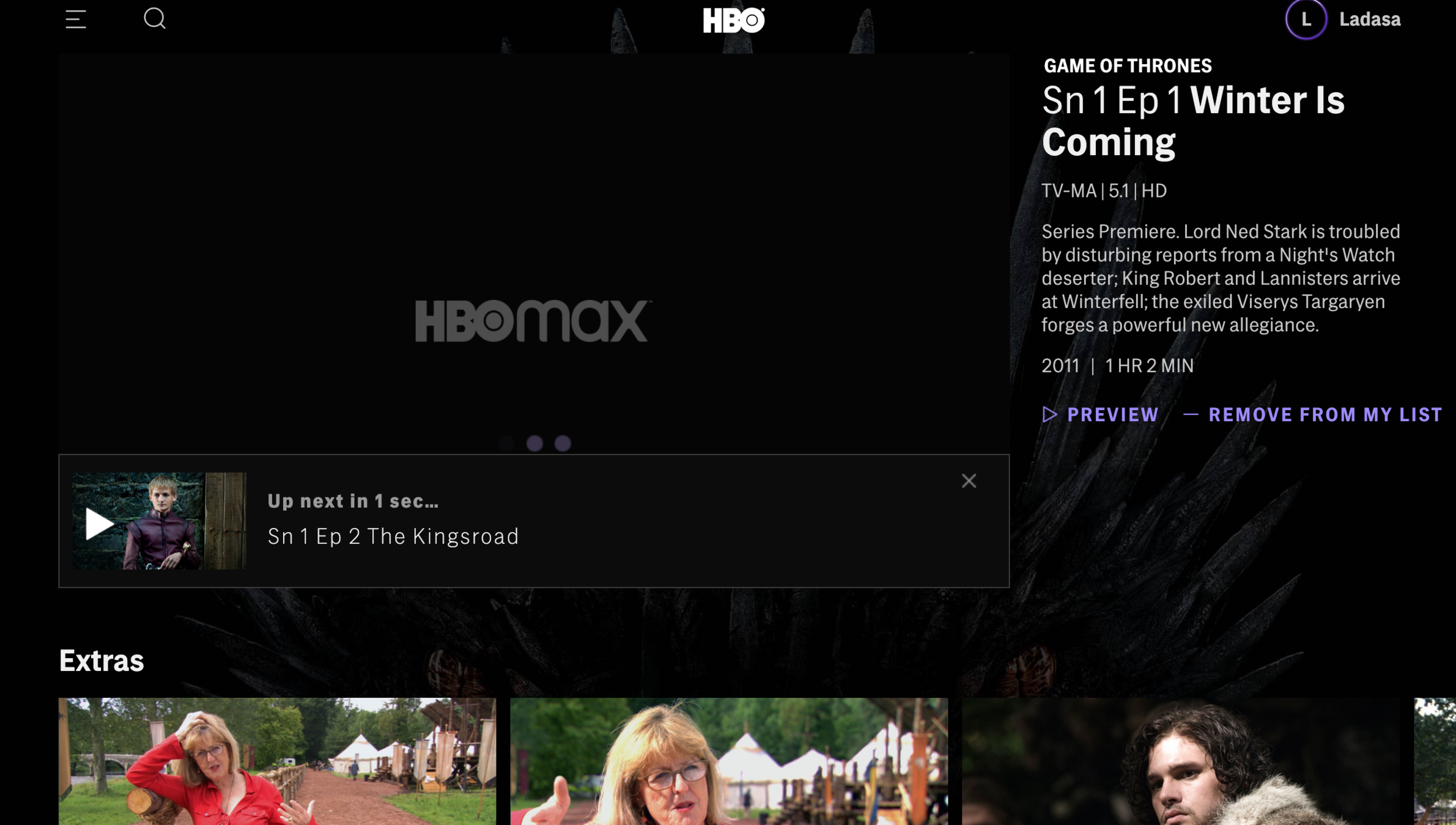
Alright, I'm already hooked.



HABIT
Defaults
Preselected options tend to remain selected because of the effort required to modify them. The default is the course of action that occurs if nothing is specified by the decision maker.


Binge Mode
Meter 😎


And I trust in the auto-play...


HABIT
Defaults
Preselected options tend to remain selected because of the effort required to modify them. The default is the course of action that occurs if nothing is specified by the decision maker.

Binge Mode
Meter 😎


Again, HBOmax with a good start that is quickly squandered. Although getting to start watching included quite a bit of friction, Game of Thrones definitely got me hooked... Grade D to the design, but A to GOT (at least for the first season...).


D
Grade:

Binge Mode
Meter 😎


The Night has ended, but not my Watch... Let's move to our last contender – Disney+!


Here's where we land right after we finish signing-up...


Binge Mode
Meter 😎
BIAS
Choice Overload
We struggle with making decisions when there is an overload of information. This might lead us to second guess ourselves or postpone the decision.

Disney+ knows they have very segmented user groups. Grouping shows by these categories on top certainly makes it easier for each user segment finds what they want to watch!


Binge Mode
Meter 😎
BIAS
Choice Overload
We struggle with making decisions when there is an overload of information. This might lead us to second guess ourselves or postpone the decision.

Let's see what should I watch...
Maybe let's focus on my personal recommendations.


Binge Mode
Meter 😎
These seems to be all-over the place and certainly doesn't feel personalized. Simpsons? Yes, I'm yellow but who still watches that? Same for Home Alone. Frozen II? No way...


Binge Mode
Meter 😎

APPEAL
Personalization
Personalising the experience or intervention can help meet user's specific needs, goals, and preferences.


Luckily, the Mandalorian actually happen to be another series people have been recommending. Guess I'll have to see what the fuzz is all about!


Binge Mode
Meter 😎

Just for the record. It should be clear by now that anyone who said keeping up with the latest show is easy hasn't spent a week in my boxer shorts...

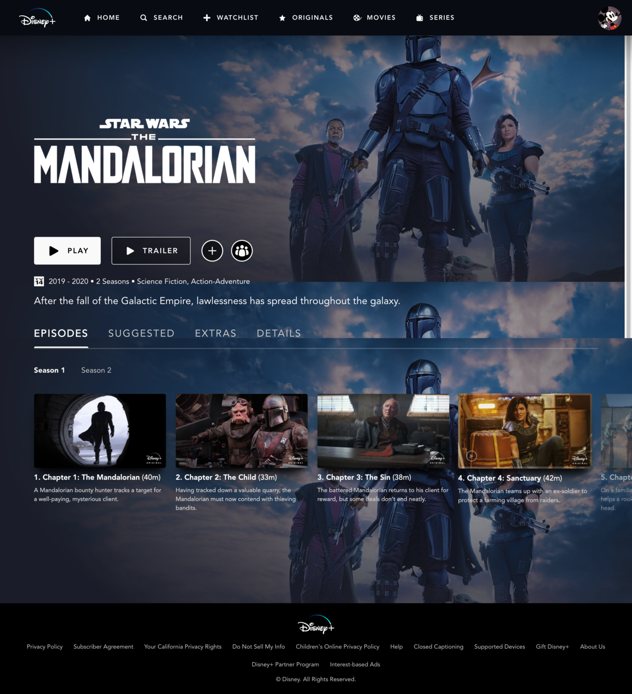
Alright, we're on the shows main page...



APPEAL
Salience
Information that is novel or stands out is more likely to influence us

APPEAL
Prompt to Action
Providing an effective call to action helps users know what they should do next.


Binge Mode
Meter 😎
Although there's extra step, the play button is visible and clear on the series main page. This seem almost too obvious to reward, but then again we just saw HBOmax missing this...


APPEAL
Salience
Information that is novel or stands out is more likely to influence us

APPEAL
Prompt to Action
Providing an effective call to action helps users know what they should do next.


Binge Mode
Meter 😎

..and immediately we go to full-screen!
Two clicks from landing page to watching Star Wars - not bad!


Binge Mode
Meter 😎
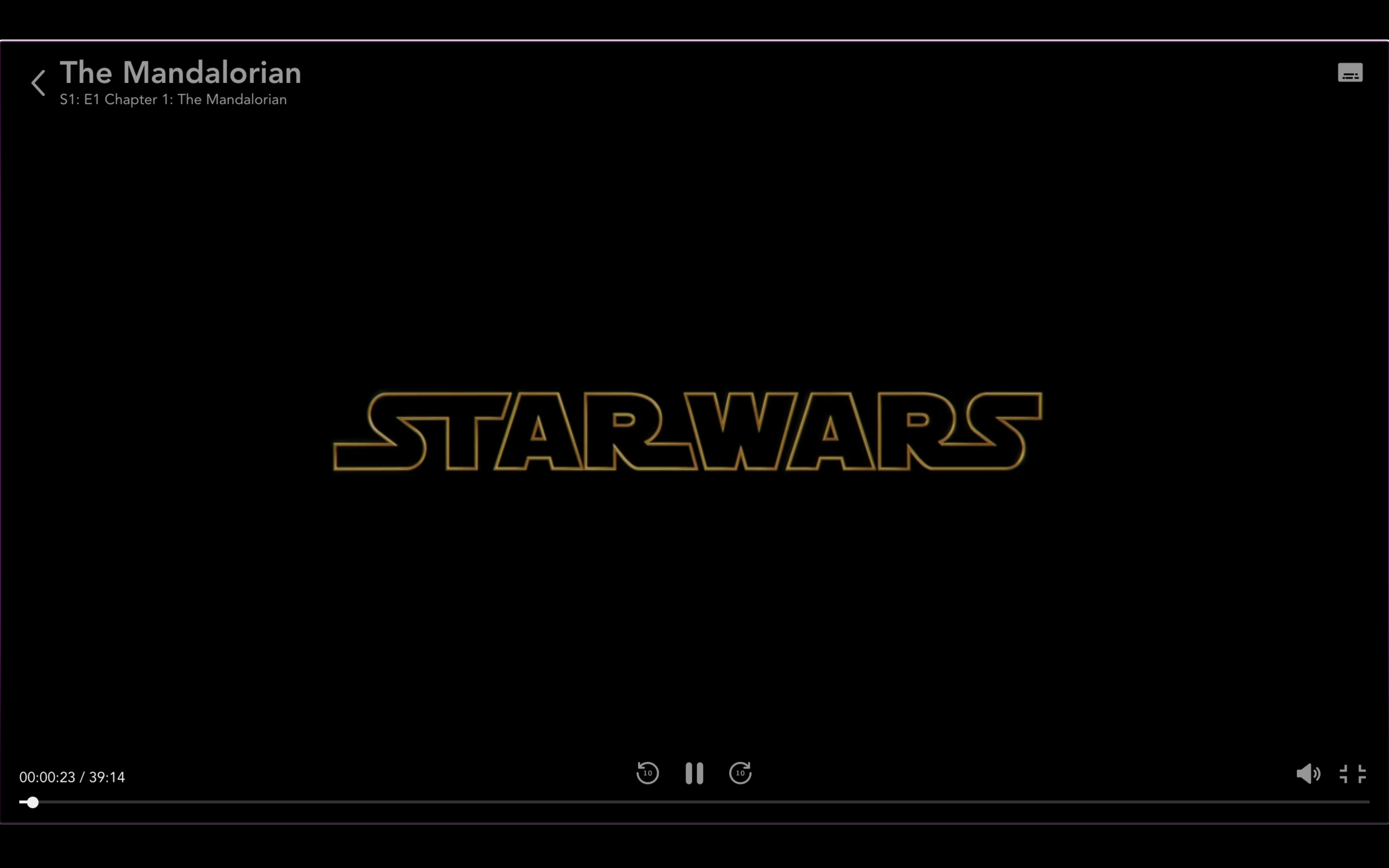
Just finished the first episode. I need to see more of that Baby Yoda!


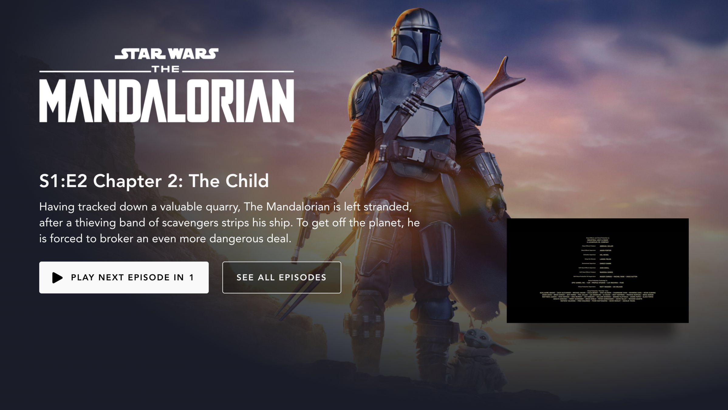

APPEAL
Defaults
Preselected options tend to remain selected because of the effort required to modify them. The default is the course of action that occurs if nothing is specified by the decision maker.


Binge Mode
Meter 😎
Right to the next episode we go!


APPEAL
Defaults
Preselected options tend to remain selected because of the effort required to modify them. The default is the course of action that occurs if nothing is specified by the decision maker.


Binge Mode
Meter 😎
Wow, lucky that was only two seasons, otherwise I'd be stuck binging for days. Great show! And nice recommendation at the end.


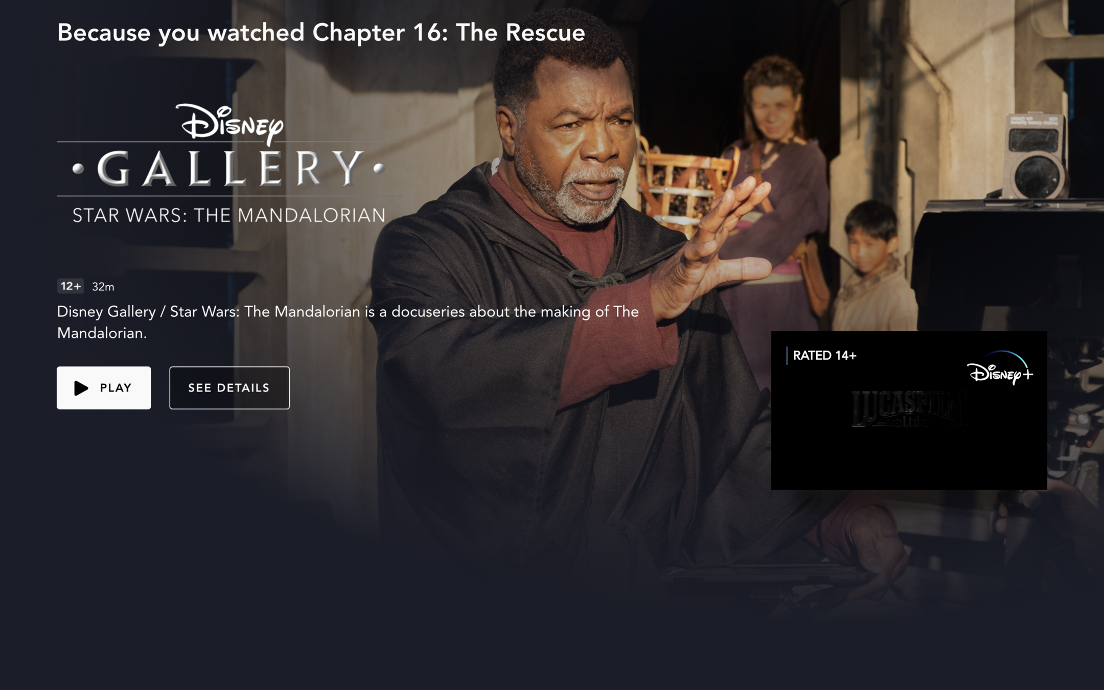
APPEAL
Personalization
Personalising the experience or intervention can help meet user's specific needs, goals, and preferences.


Binge Mode
Meter 😎
I'll be nice and not penalize them for this, but as you can see, I literally have no other choice then pressing play! 😂 You'd expect I could at least choose to go back to the dashboard...


Binge Mode
Meter 😎
Who says you can't go far keeping it simple? While certainly the personalization could be improved, Disney+ was pretty smooth sailing. Well done, Mickey!


B
Grade:


Binge Mode
Meter 😎
Alright, I have spent a bit too much time on these streaming services... This has truly been a long binge war. Ready to see who won this part?


Alright! The winner is....


NETFLIX!


CASE STUDY COMPLETED


Well done, you've now completed part 2 of this case study! 🎉

THE BINGE WAR
PART #2


Who did you think was the winner overall?
Share your pick in the Behavior Slack! 🏆

This case study was created by Sam & Ladasa (while I was busy watching TV shows).
Click on their pictures to give them some love.


Ladasa is a graduate of the Master of Behavioral and Decision Sciences program from University of Pennsylvania and currently a Product Manager at JPMorgan Chase & Co.
Samuel you probably know by now, he's the founder of Habit Weekly and works with supporting value-driven organizations to apply behavioral science.
Please complete this 1-min survey to help us further improve these case studies. Thanks! 😊

