

Hello and welcome.


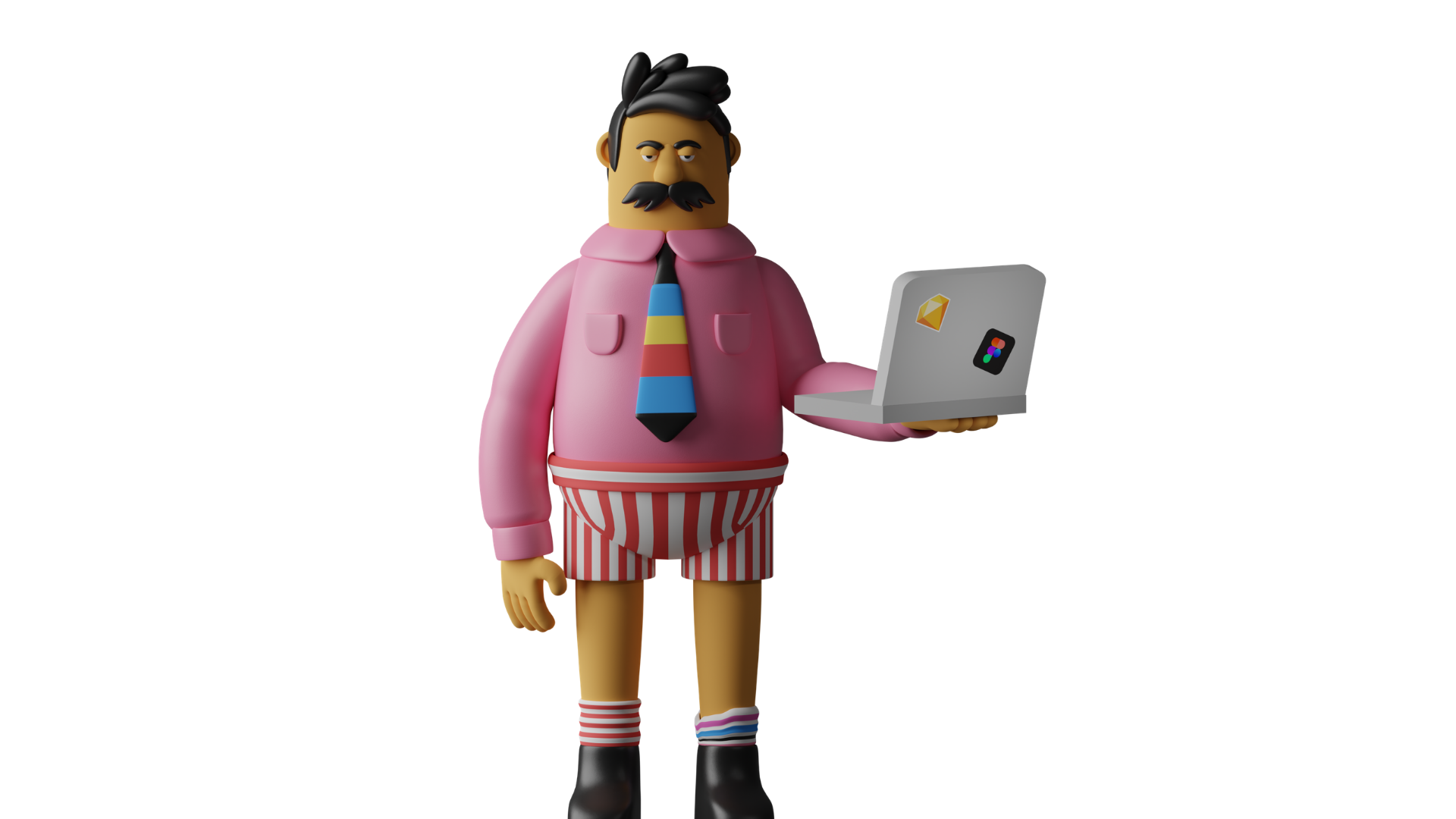
My name is Bert.


I was chosen to run this case study as I'm a real-life binging expert....


True story.


Anyway, hands up if you've been guilty of binging on your favorite streaming platform throughout the past year of lockdowns...


I certainly have! And it's not just the content that made me go "just one more episode..."



I'll walk you through how the design of these streaming platform influence our screen-time choices (not to mention making me forget to change my underwear for the past week...).


These guys here, you see, they're the three leading streaming platforms... We're gonna go through their behavioral designs and uncover their secrets.



And here's the overview of how we're going to approach this mission.
CASE STUDY
OVERVIEW
1. The Contenders

2. Friction and Fuel Framework

3. Getting Subscribers

4. Getting you to binge

5. Getting you to come back

Part 2
Part 1


First up, let's get to know our contenders....


We have to start with Netflix when discussing streaming services. You know, the one with House of Cards!


No, not that one... The better version with weird masks.



That's the one! Anyway, where was I...


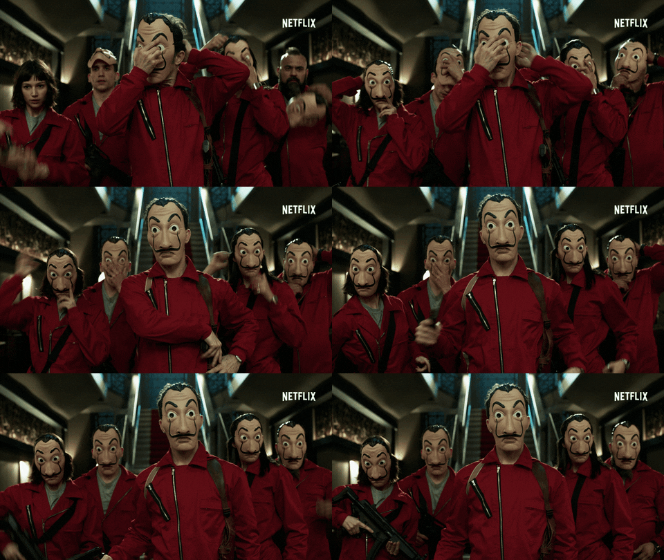
Right, introducing Netlflix – this Blockbuster slayer first offered an online streaming service in the 2007 and claimed to have over 195.5 million paid subscribers worldwide as of Q3 of 2020.


THE
GRANDMASTER
-
First offered online streaming service 2007
-
195.15 million paid subscribers worldwide as of Q3 2020


Next up, we got Disney Plus.


Here's some of the many Disney owned brands... What!? [Spits out coffee] 🥸
Mickey mouse owns Star Wars? That's a bigger plot twist than what happened in Empire Strikes Back!






I'm lost for words.


Disney
Star Wars,
Alright, it's safe to say the happiest place on earth has also expanded its presence onto the online world. 🌈 🏰
Launched in November 2019, Disney+ has already gained over 86.8 million paid subscribers in just a year.


the
Happiest Place Online
Launched November 2019
86.8 million paid subscribers worldwide as of Dec. 2, 2020

Lastly, we cannot forget Good Ol' HBO (max). Goddamn I love the Sopranos!


The long time cable TV dominator launched its streaming service in May 2020 in the midst of the pandemic, gaining over 12.6 million activated users as of early December 2020. This does not include users from AT&T partnership.


Good old
HBO
-
12.6 million activated users as of early December 2020
-
Launched May 2020

That's the contenders, so how do we evaluate their use of behavioral design (other than my extensive research exploring their offerings)?


To analyze these streaming services, we'll throughout the user journey use the Friction & Fuel Framework developed by the Center for Advanced Hindsight.


The framework is based on the idea that there are two forces influencing our behaviors (which we can think of as a rocketship).


We can consider anything that gets in the way of the target behavior, like obstacles or some biases, FRICTION.

FRICTION 🚧
Anything that gets in the way of the target behavior


Conversely, FUEL is anything that makes the target behaviors more appealing.

Anything that makes the target behaviors more appealing
FUEL ⚡️


There are many behavior change tools and techniques we can use to add fuel or remove friction for our desirable behaviors.
Anything that makes the target behaviors more appealing
FUEL ⚡️

FRICTION 🚧
Anything that gets in the way of the target behavior


To make it easy, we can use the BEHAVIOR acronym to remember these components.

B
E
H
A
V
I
O
R

Learn more about the the BEHAVIOR acronym below!

Here is what each letter in the BEHAVIOR acrynom stands for. You'll become more familiar with this as we uncover these behavior change tools throughout the case study.

Bias
Ego
Habits
Appeal
Visceral
Incentives
Others
Reminders
Anything that makes the target behaviors more appealing
FUEL ⚡️
FRICTION 🚧
Anything that gets in the way of the target behavior

However, you and I both know that we need to first define our target behaviors before we start conducting this type of analysis... We might both be sitting in just our underwear, but we're not amateurs!


Corresponding to these target behaviors, people in product usually look at various product metrics in order to evaluate how well their products perform with respective to various goals.


And they tinkle with the product to optimize for those metrics.
PS. I approve of this gif.


So target behaviors and product
metrics for streaming services could look something like this.

VISIT LANDING
PAGE
SUBSCRIBE
(Acquisition)
WATCH FIRST VIDEO
(Activation)
KEEP WATCHING
(Retention)




In other words, streaming platforms want that 1) user visits the service, 2) subscribes to the service, 3) watch the first video, and 4) frequently comes back to the platform to watch more videos.


VISIT LANDING
PAGE
SUBSCRIBE
(Acquisition)
WATCH FIRST VIDEO
(Activation)
KEEP WATCHING
(Retention)


So for our first round, we are going to look at how well our contenders nudge their users to subscribe.

LANDING
SUBSCRIBE
(Acquisition)



This case study is interactive and you will need to be attentive in order to uncover all behavior change tactics. Time to clean off your popcorn fingers and roll up your sleeves. Ready?


Every time you see the magnifying glass, please take a moment to look at the screen and tap on the components where you think is where the service provides friction or fuel for the target behavior.


Let's try finding one now, shall we?
Hint: Which component attracts your attention most?

APPEAL
Framing
Choices can be presented in ways that highlight certain aspect of decision, influencing their perceived attractiveness


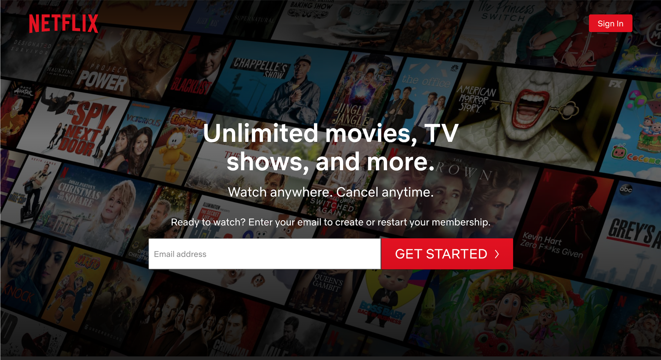


Hover & tap on the friction / fuel for the target behavior.

Well done, you found your first behavior change technique! Not bad. So what can we learn from this?

APPEAL
Framing
Choices can be presented in ways that highlight certain aspect of decision, influencing their perceived attractiveness


Instead of "signup" or "join", the call-to-action (CTA) here is framed as "get started". Pretty smooth!
Bonus point for being a salient CTA, I'd be able to see it even if I couldn't find my reading glasses.


APPEAL
Framing
Choices can be presented in ways that highlight certain aspect of decision, influencing their perceived attractiveness


Here's the Subscription Meter 🚀 - every time a behavior change tool is used to add fuel to a target behavior, the meter will go up. Opposite happens if friction is added. The higher the meter, the more likely that I'll buy and keep my subscription.





Subscription
Meter 🚀
Alright, next one! Any fuel or friction here?

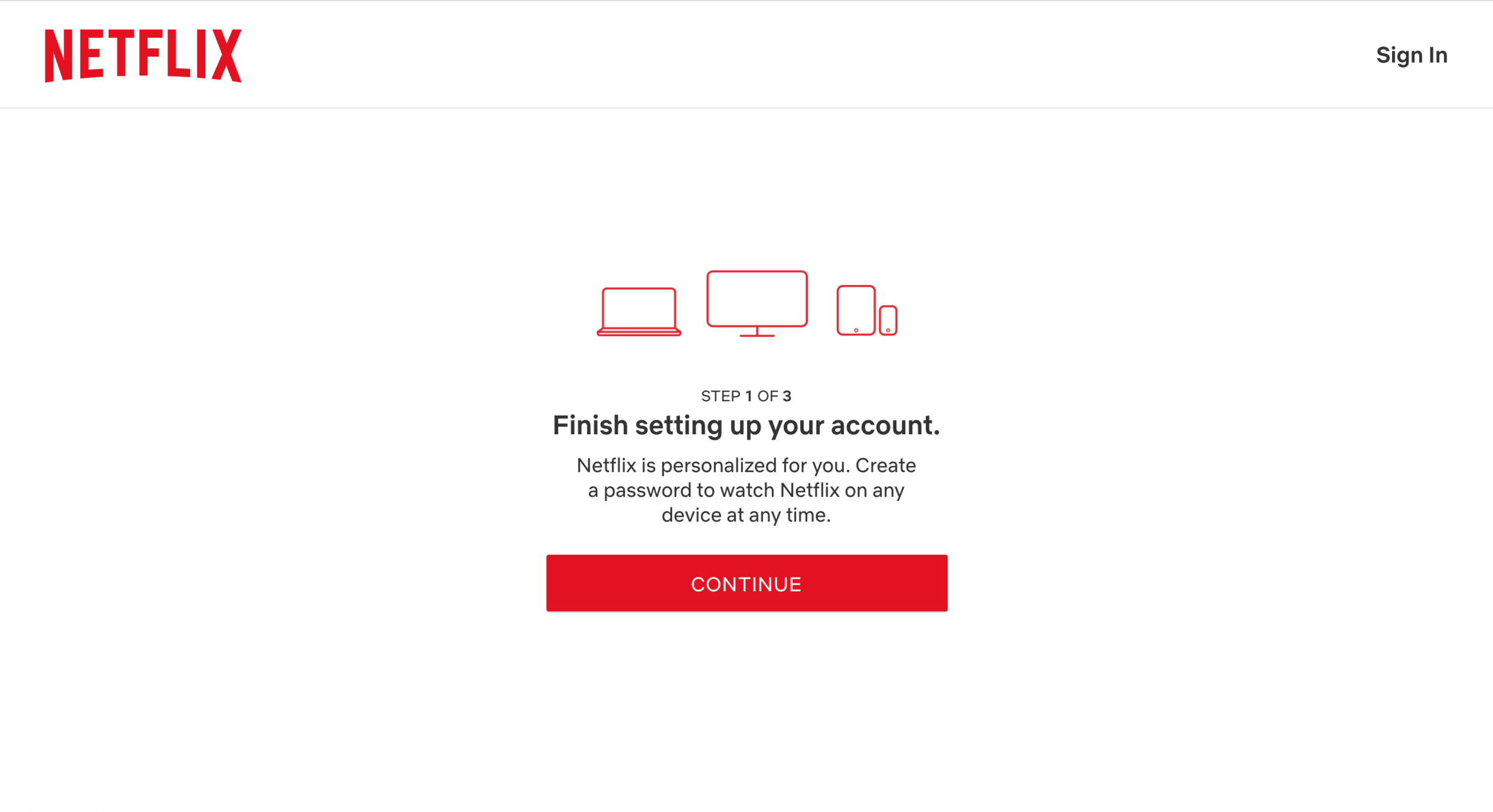

APPEAL
Transparency
Knowing what is expected and what will happen next can be important in deciding whether an action is worth taking.


Subscription
Meter 🚀


I don't know about you, but if I'm told there's only three steps, I'll be more likely to go "I can do that."


Subscription
Meter 🚀
APPEAL
Transparency
Knowing what is expected and what will happen next can be important in deciding whether an action is worth taking.


Alright, notice any fuel here?

APPEAL
Goal Gradient
The closer a person is to achieving their goal, the more effort they exert in attempting to reach the goal.


Subscription
Meter 🚀
nick.offerman.wannabe37@gmail.com


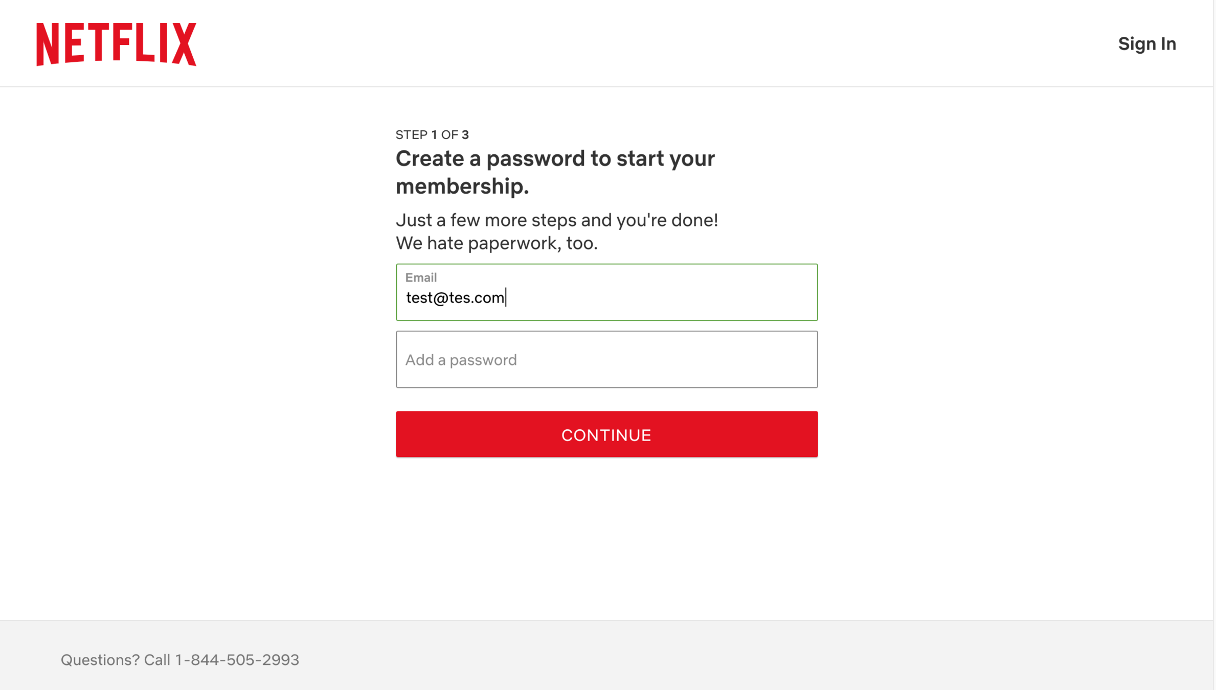
By hinting that there's only a few more steps left, I know I'm on the home stretch and close to the finish line. And I do hate paperwork! Great example of how to provide some relatable humor 👍


Subscription
Meter 🚀

APPEAL
Goal Gradient
The closer a person is to achieving their goal, the more effort they exert in attempting to reach the goal.


nick.offerman.wannabe37@gmail.com


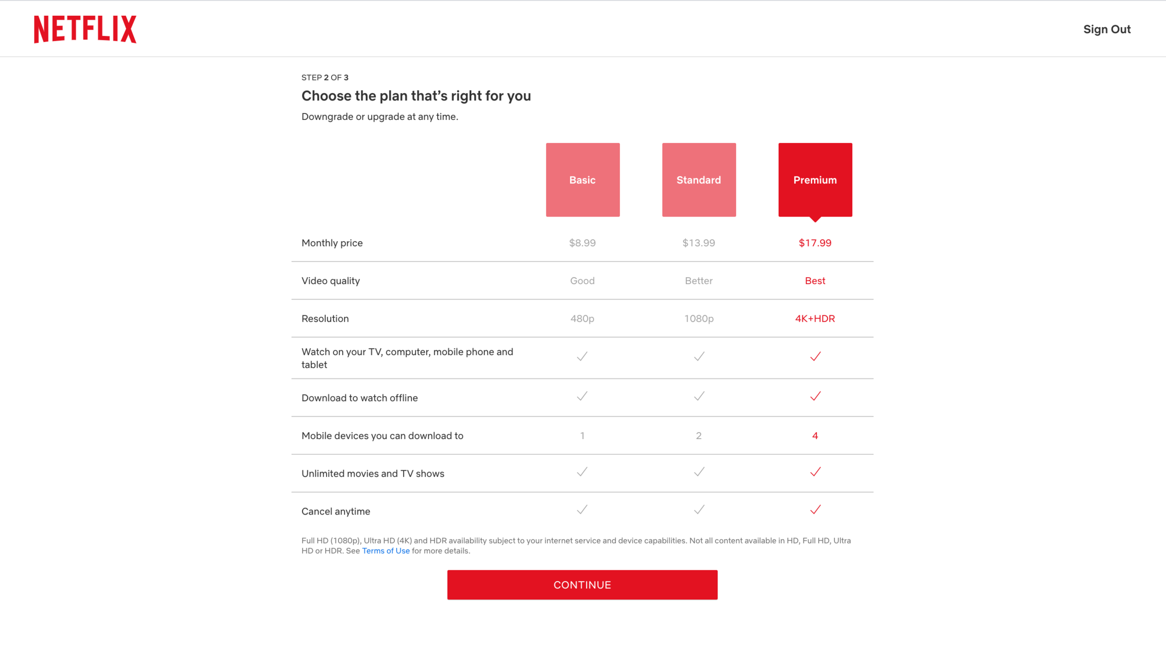
Oh no, there are options? I hate navigating these screens! I just want to watch some binge-worthy shows. Just give me the option that will do that job...



BIAS
Information Overload
We struggle with making decisions when there is an overload of information. This might lead us to second guess ourselves or postpone the decision.



Subscription
Meter 🚀
Well, if we zoom in, there are some commonly used behavior change tactics here to support my choice.
Can you find the two in question?


APPEAL
Relativity
Options are context-dependent, evaluated in comparison to a salient reference point


APPEAL
Framing
Choices can be presented in ways that highlight certain aspect of decision, influencing their perceived attractiveness


Subscription
Meter 🚀


People often judge things relatively. Framing options by putting them next to each others helps highlight certain aspect of the decision. If we know there are "better" options, why shouldn't we go for the "best"?


Subscription
Meter 🚀

APPEAL
Relativity
Options are context-dependent, evaluated in comparison to a salient reference point


APPEAL
Framing
Choices can be presented in ways that highlight certain aspect of decision, influencing their perceived attractiveness


This also tells me more about video quality than "480p" vs "4K+HDR" – what the heck does that mean?! Sounds like R2D2 trying to speak!


Subscription
Meter 🚀



Alright, there's another one here. This one is obvious!


APPEAL
Defaults
Preselected options tend to remain selected because of the effort required to modify them. The default is the course of action that occurs if nothing is specified by the decision maker.


Subscription
Meter 🚀


"Premium" is set as the default option! We know what usually happens to the default....

APPEAL
Defaults
Preselected options tend to remain selected because of the effort required to modify them. The default is the course of action that occurs if nothing is specified by the decision maker.


Subscription
Meter 🚀


That's why I set "camera off" as default on my Zoom settings. I'm pretty smart! Or at least I learn from my mistakes... Anyway, where were we?


Right, we're on the third and final step! What can you see here?

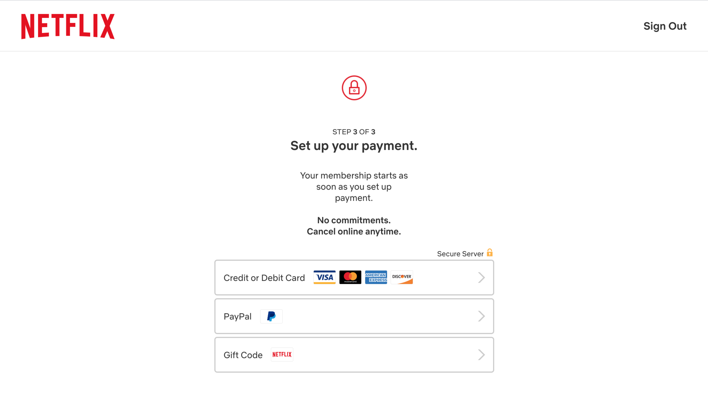

BIAS
Pain of Paying
When payment is concrete and coupled with an experience, it is more painful.


Subscription
Meter 🚀


Ugh, there is no getting around it. Reaching for your credit card sucks!

BIAS
Pain of Paying
When payment is concrete and coupled with an experience, it is more painful.


Subscription
Meter 🚀


At least they're doing something to mitigate this... can you see it?


BIAS
Pain of Paying
When payment is concrete and coupled with an experience, it is more painful.


Subscription
Meter 🚀


Logging into my PayPal is definitely less painful than putting down my credit card number. Also, knowing there are no commitments and it's easy to cancel definitely removes most of my concerns ✅

BIAS
Pain of Paying
When payment is concrete and coupled with an experience, it is more painful.


Subscription
Meter 🚀


Alright, I've painfully paid for the basic plan and we're in. But wait! I spy something interesting!


Subscription
Meter 🚀
APPEAL
Surprise & Delight
We love a pleasant surprise. Adding an unexpected gift or reward at the end of an experience can make a big difference.

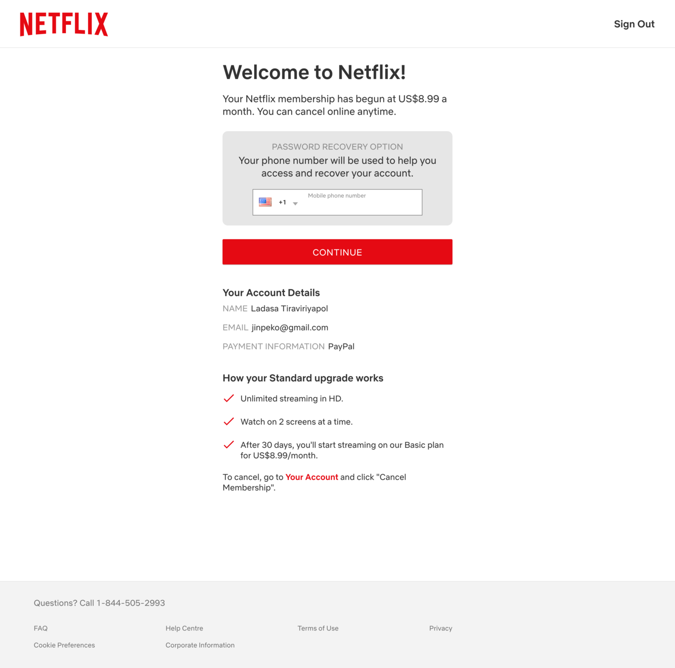

I got an upgrade! I love free upgrades. In fact, who doesn't? The only odd thing is, Netflix could have framed this better...


Subscription
Meter 🚀
APPEAL
Surprise & Delight
We love a pleasant surprise. Adding an unexpected gift or reward at the end of an experience can make a big difference.


There's many ways to improve this frame, but here is one version that better emphasize the benefits.
It might still need some tweaking to remove worry about getting stuck in the upgraded plan.


Subscription
Meter 🚀


Free upgrade on us! 🎉
You've got a free upgrade to try HD for one month. Don't worry, it's on us!
How your Standard upgrade works
Old vs. New Frame
But darn, if I get used to watching my movies in full HD, I know I could never downgrade from that... SD will look terrible in comparison!


BIAS
Hedonic Adaptation
Something that was once new and exciting will dull over time as we get used to it


Subscription
Meter 🚀

That's right. Netflix aren't doing this for charity. They know that luxuries becomes necessities as we adapt to them over time. What do you think, is this smart or unethical behavioral design?


BIAS
Hedonic Adaptation
Something that was once new and exciting will dull over time as we get used to it.

Smart or Unethical?
Vote by clicking one of the options below.
Smart! ✅
Unethical! 🙅♂️


Subscription
Meter 🚀
Thanks for voting! So, let's see how Netflix did in the first round. In short: Pretty good! While they utilized several behavior change tools, we care about quality and not quantity. Also, the friction was undeniable!


B-
Grade:


Subscription
Meter 🚀
Next up! We got HBO Max. I see one powerful behavioral tool right on the landing page.

INCENTIVE
Power of Free
The price of zero is psychologically alluring. Due to present bias we tend to focus on the immediate benefits and neglect future costs.


Subscription
Meter 🚀
Seven days free trial? Why not? The power of FREE gives HBOmax a huge boost here, I'll say.

INCENTIVE
Power of Free
The price of zero is psychologically alluring. Due to present bias we tend to focus on the immediate benefits and neglect future costs.


Subscription
Meter 🚀
I don't know about you, but I mostly let my future self deal with the consequences of my actions (like joining free trials). I live in the moment. Carpe diem 🧘


Time to create an account. However, I sense friction here...


APPEAL
Chunking
Chunking (or breaking down) tasks or information into smaller chunks can make the task feel less overwhelming


Subscription
Meter 🚀
First name, last name, email address AND password, all in one go? Dang, they might as well ask for my mother's maiden name....


APPEAL
Chunking
Chunking (or breaking down) tasks or information into smaller chunks can make the task feel less overwhelming


Subscription
Meter 🚀
This is an example of high perceived friction and a missed opportunity. Chunking the steps would make it seem easier and people would be more likely to fill in the information.


Subscription
Meter 🚀
APPEAL
Chunking
Chunking (or breaking down) tasks or information into smaller chunks can make the task feel less overwhelming

Uh oh, my friction-sense is tingling again....

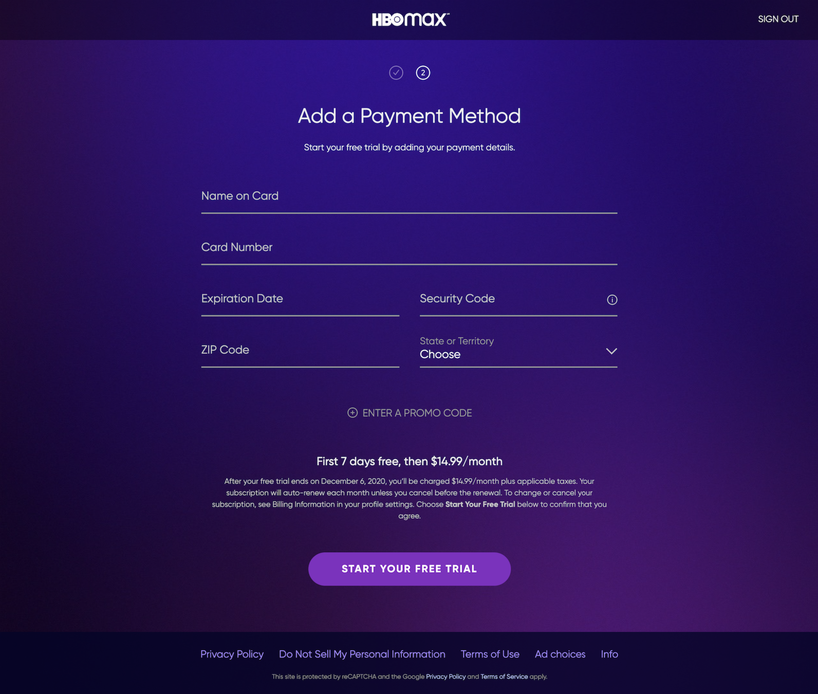

BIAS
Pain of Paying
When payment is concrete and coupled with an experience, it is more painful.


Subscription
Meter 🚀
Putting down your credit card information is the perfect example of the pain of paying. Not to mention that you might not have the card on you!
Providing less-hassle payment methods like Apple Pay or PayPal (like our other contender) would've been smart.


BIAS
Pain of Paying
When payment is concrete and coupled with an experience, it is more painful.


Subscription
Meter 🚀
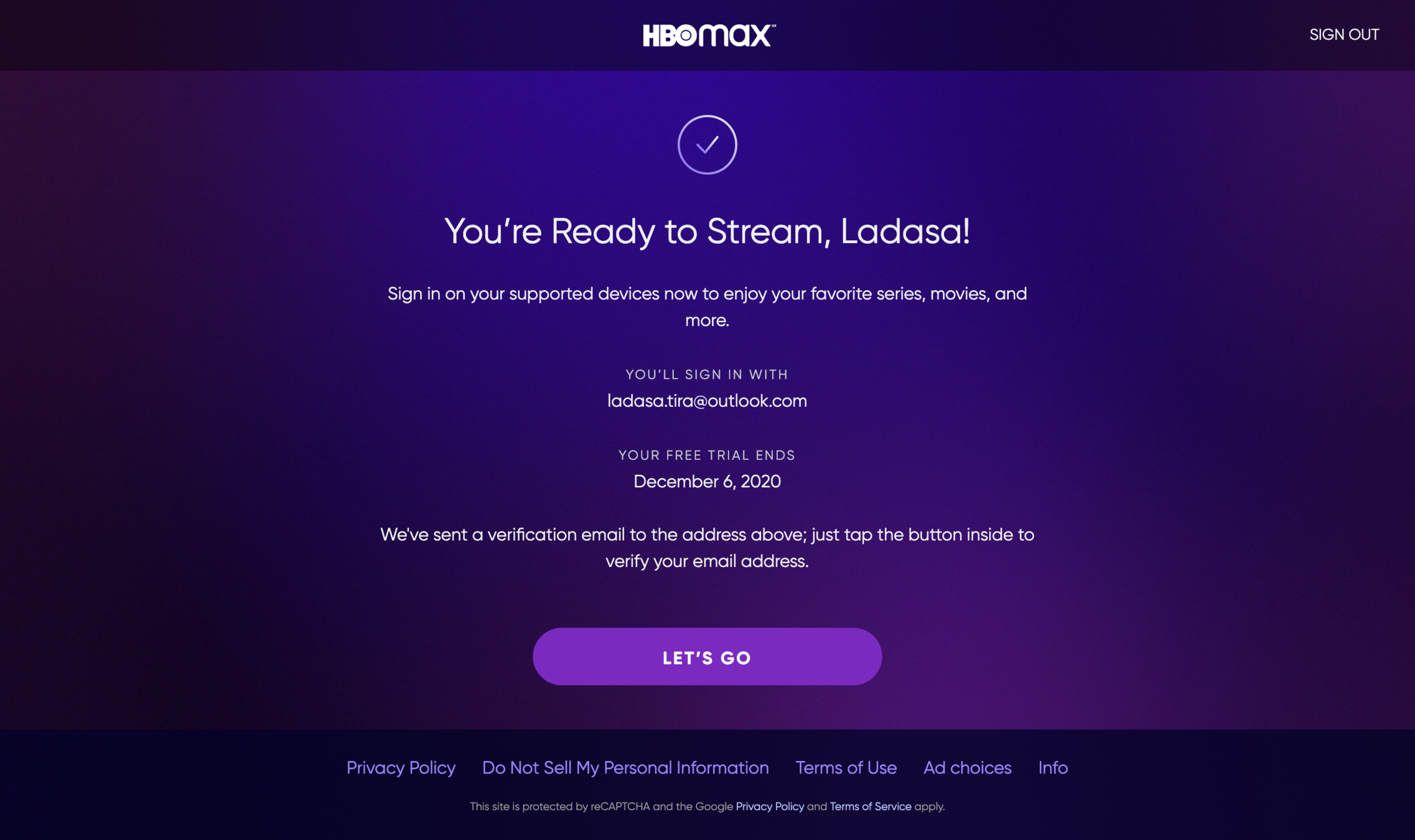
Alright! We're ready to roll on HBO max now!




Subscription
Meter 🚀
Bert!

bert.the.hunk4real@gmail.com

Very average grade for HBOmax, and it's sad as it was off to such a great start! What the heck happened? Well, friction happened. The greatest nemesis for all behavioral designers.


C-
Grade:


Subscription
Meter 🚀

My nemesis? Tom Selleck.
I hate that guy.



Next up we got Disney Plus!

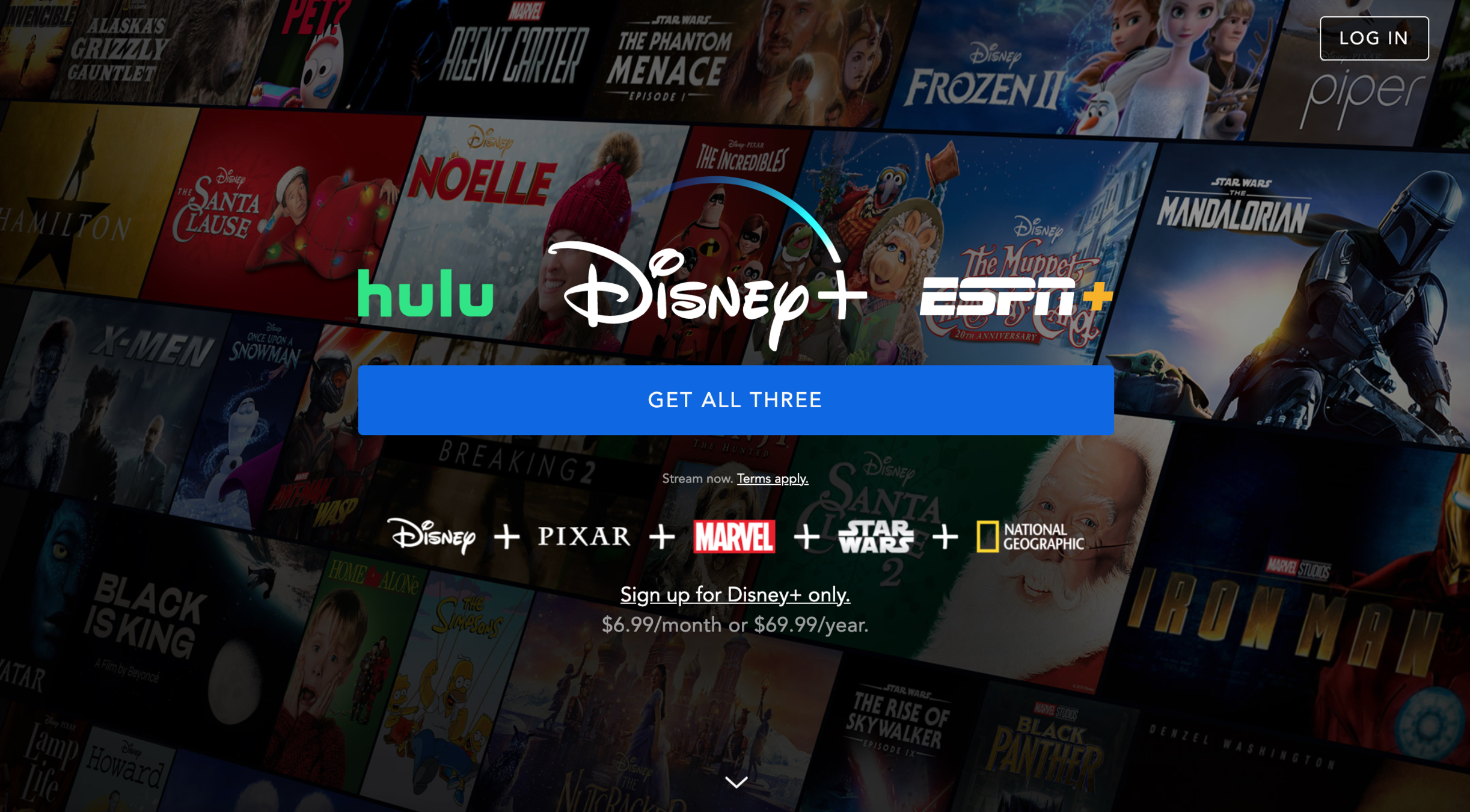

APPEAL
Salience
Information that is novel or stands out is more likely to influence us


Subscription
Meter 🚀
Boy, that button is definitely screaming at me. Difficult to find a more salient call-to-action (CTA) than that.


APPEAL
Salience
Information that is novel or stands out is more likely to influence us


Subscription
Meter 🚀
I see another sneaky trick here as well...


APPEAL
Salience
Information that is novel or stands out is more likely to influence us


BIAS
Pain of Paying
When payment is concrete and coupled with an experience, it is more painful.


Subscription
Meter 🚀
Yes, they're making that option less salient. And adding dollar sign there makes it even less desirable. If nothing else, this definitely makes me curious to explore the first option just to find out the price.


Subscription
Meter 🚀
APPEAL
Salience
Information that is novel or stands out is more likely to influence us

BIAS
Pain of Paying
When payment is concrete and coupled with an experience, it is more painful.


This is definitely an example of aggressive choice architecture. What say you, smart or unethical behavioral design?


Subscription
Meter 🚀
Smart or Unethical?
Vote by clicking one of the options below.
Smart! ✅
Unethical! 🙅♂️
Thanks for voting! Now to the first step...


Subscription
Meter 🚀


EGO
Cognitive Overload
Providing too much information can make one feel too overwhelmed

Providing this information is good from an ethical perspective. The user is nudged to at least read some of the terms of conditions. BUT, it's impossible to get away from the fact that this adds friction.


Subscription
Meter 🚀


EGO
Cognitive Overload
Providing too much information can make one feel too overwhelmed

There are some ways to avoid this by simplifying the language and using bullet-points to make it easier to read. Still, it's often difficult to find a good balance between doing what's right and maximising short-term business goals.


Here's where Netflix placed their terms and conditions. You missed it? I'm sure Netflix are shocked – not...🤦♂️
Less friction, yes – but at what cost?


Anyway, step two is up! Notice anything here?


Subscription
Meter 🚀

APPEAL
Chunking
Chunking (or breaking down) tasks or information into smaller chunks can make the task feel less overwhelming

mustache_man54@gmail.com

Step one: Email. Step two: Password.
One screen. One action. Breaking down tasks into smaller achievable steps do make things look much simpler!

APPEAL
Chunking
Chunking (or breaking down) tasks or information into smaller chunks can make the task feel less overwhelming


Subscription
Meter 🚀

mustache_man54@gmail.com

Seems like someone heard my HBO rant 😅

APPEAL
Chunking
Chunking (or breaking down) tasks or information into smaller chunks can make the task feel less overwhelming


Subscription
Meter 🚀

mustache_man54@gmail.com

I spy something that attracts my eyes!

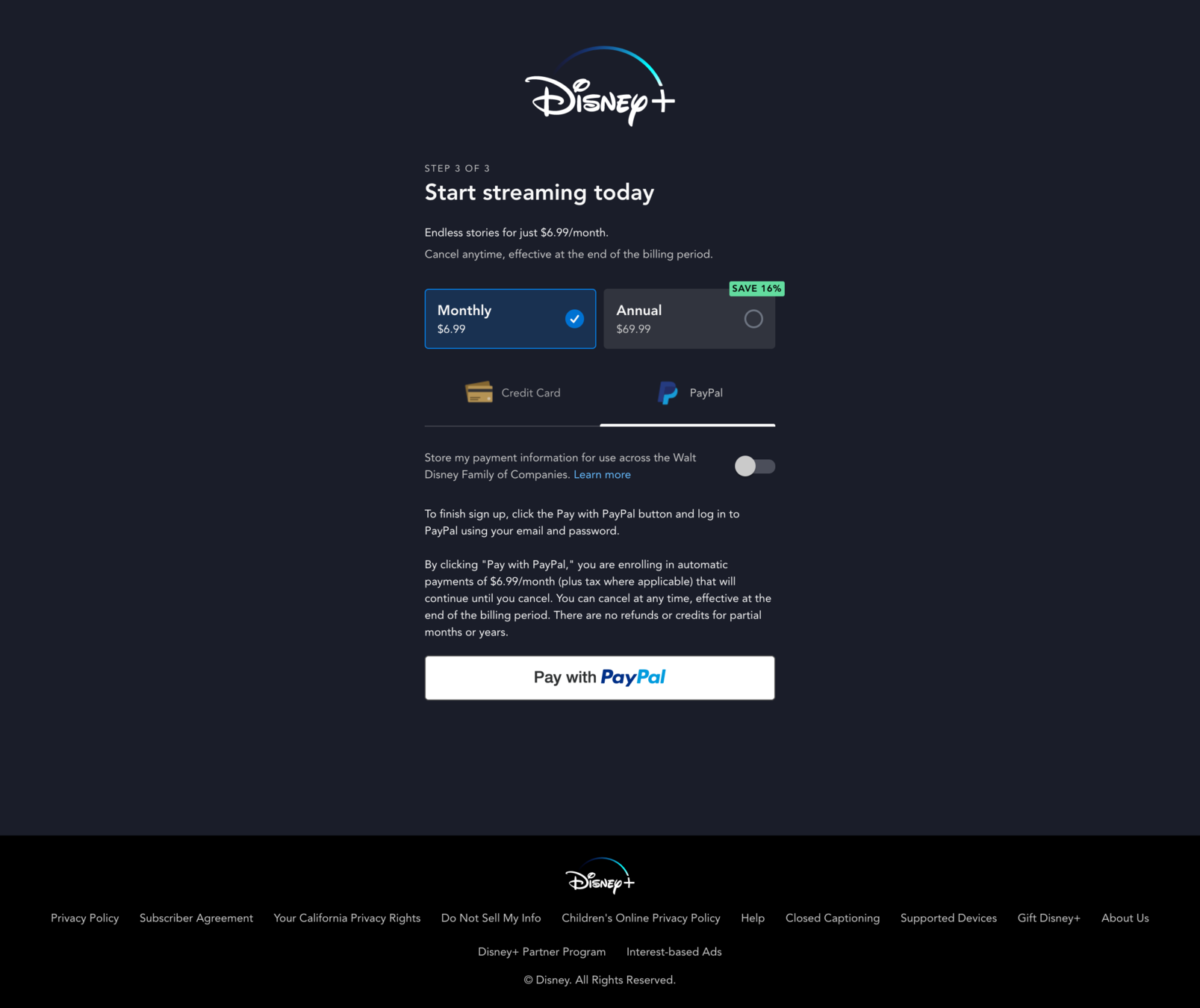

APPEAL
Salience
Information that is novel or stands out is more likely to influence us


Subscription
Meter 🚀
I like the green color here as a prompt. When it comes to financial decisions, green often indicate a successful investment decision.*


APPEAL
Salience
Information that is novel or stands out is more likely to influence us


Subscription
Meter 🚀
*At least in the west, not always the case in Asia.
Hmm.. this is something you rarely see!


APPEAL
Defaults
Preselected options tend to remain selected because of the effort required to modify them. The default is the course of action that occurs if nothing is specified by the decision maker.


Subscription
Meter 🚀
A business that doesn't default to the annual option! 😱 Maybe not the best for the bottom line, but Disney built trust with me here ✅.


Subscription
Meter 🚀
APPEAL
Defaults
Preselected options tend to remain selected because of the effort required to modify them. The default is the course of action that occurs if nothing is specified by the decision maker.


Subscription
Meter 🚀
APPEAL
Defaults
Preselected options tend to remain selected because of the effort required to modify them. The default is the course of action that occurs if nothing is specified by the decision maker.

BIAS
Pain of Paying
When payment is concrete and coupled with an experience, it is more painful.

And one more thing!


Subscription
Meter 🚀
APPEAL
Defaults
Preselected options tend to remain selected because of the effort required to modify them. The default is the course of action that occurs if nothing is specified by the decision maker.

BIAS
Pain of Paying
When payment is concrete and coupled with an experience, it is more painful.

Double hit just at the buzzer! First, default is set to PayPal. Less risk of paying pain, check ✅
This also sets up for the potential for just one CTA at the end. Imagine that? Well done, Disney!

(I'll be nice and ignore the massive block of terms & conditions text)

Alright! The winner for this round is....


DISNEY!!


Grade B is not bad. However, while Disney have won the first battle, the binge war has yet to be won.


Subscription
Meter 🚀
B
Grade:
We'll see who's going to be the winner in the next part of this case study. As they say in Hollywood...



CASE STUDY COMPLETED


Well done, you've now completed the first part of this case study! 🎉

THE BINGE WAR
PART #1

This case study was created by Sam & Ladasa (while I was busy watching TV shows).
Click on their pictures to give them some love.


Ladasa is a graduate of the Master of Behavioral and Decision Sciences program from University of Pennsylvania and currently a Product Manager at JPMorgan Chase & Co.
Samuel you probably know by now, he's the founder of Habit Weekly and works with supporting value-driven organizations to apply behavioral science.
Please complete this 1-min survey to help us further improve these case studies. Thanks! 😊




Press play to access part 2 of the Binge Wars! ▶️ 🍿🍿

