Previous student ancillary work
Video 12
Strengths
There is clear synergy of the hat used throughout the digipak and advert. However, the rest of the outfits that are used with the hat are not used on the digipak nor the advertisement. The digipak has an urban feel and we can see the incorporation of the urban grafitti wall. The digipak follows conventions with the record label, track listing and bar code etc. The advert also follows conventions such as ratings, the album cover displayed and platforms of where to buy the song promoted.
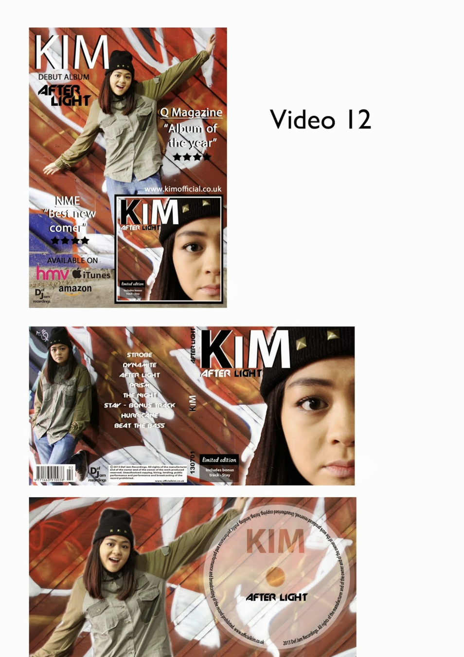
Video 12
Weaknesses
Whilst the hat is a form of synergy the outfit is not entirely the same. The location is also not the same or used in the video at any point prominently. This means that the synergy of location has not been included. The colour palette is not really predominantly used in the music video. Across the digipak there is a certain font which is a strong point but in the advert, there are too many fonts and the artist logo is different. The advert does not have the convention of the release date presented.
Video 11
Strengths
Synergy of greenery is incorporated to an extent. The guitar is the most prominent use of synergy and is the same guitar from the music video, alongside the exact same costume that the artist was wearing too. This shows clear use of synergy across both platforms of the digipak and the advert. The font is the same and used throughout and the artists's name is clearly displayed to us. The digipak follows conventions of the track listing and the record labels etc. and the advert includes the dates, ratings and other information necessary for authenticity and convention.
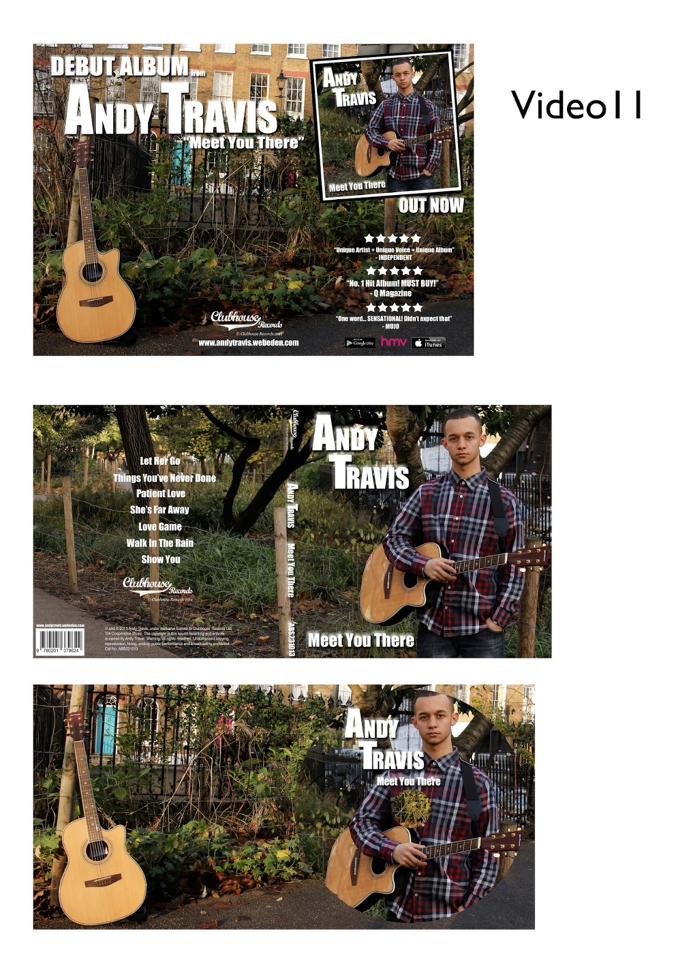
Video 11
Weaknesses
The greenery is not the same in the video, it looks to crowded and dull in comparison to the lush fields used in the video. This makes the general aesthetic more urban. The same image is used constantly, there is no other images used that show variety and meticulous planning. With the digipak, there could have been more than one font and picture used as there are lots of panels to fill. The advert could have used a better image for the background as the buildings make it look urban and the framing is off, this makes the promotional advertising and packaging look sloppier than the video that was much better executed