In what ways does your media product,use develop or challenge forms and conventions of real media products?
When creating the final piece for our music magazine, my aim was to include different features and aspects of a popular music magazine in order to produce a professional look. When starting to make my magazine I started by creating mock products before completing the final piece. I was inspired by other popular brands which lead to me assessing what attracts their readers and how their styles may look on my magazine.
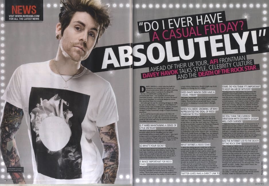
For the front cover, I was originally inspired by Kerrang! magazine, this magazine is a british rock magazine which intends to bring rock music into the main media. The image on the cover fits the expectations of a real magazine as it is an low angle shot of an artist featured within the issue, the shot of the model is clear and eye catching which attracts the consumers. Additionally another smaller photo has been added to show the consumer what is featured inside the magazine.
When choosing and editing my cover image, I decided to feature the same style shot as the main subjects looks very clear. Furthermore the low angle style is not commonly featured on many front covers. I thought that it best presented the rock style of the magazine as this is very attractive towards the young age range of my target audience. In addition I also liked how the use of a prop (guitar) was highlighted.
This fit well with the style of magazine and didn’t stand out in an odd way.
Moreover, Kerrang! magazine features a bold unique title. In the design of my cover,
I also chose to make my title bold and unique by overlapping to colours of text to create a 3D effect.
Therefore my cover title features an expectation of music magazine’s as shown through Kerrang!
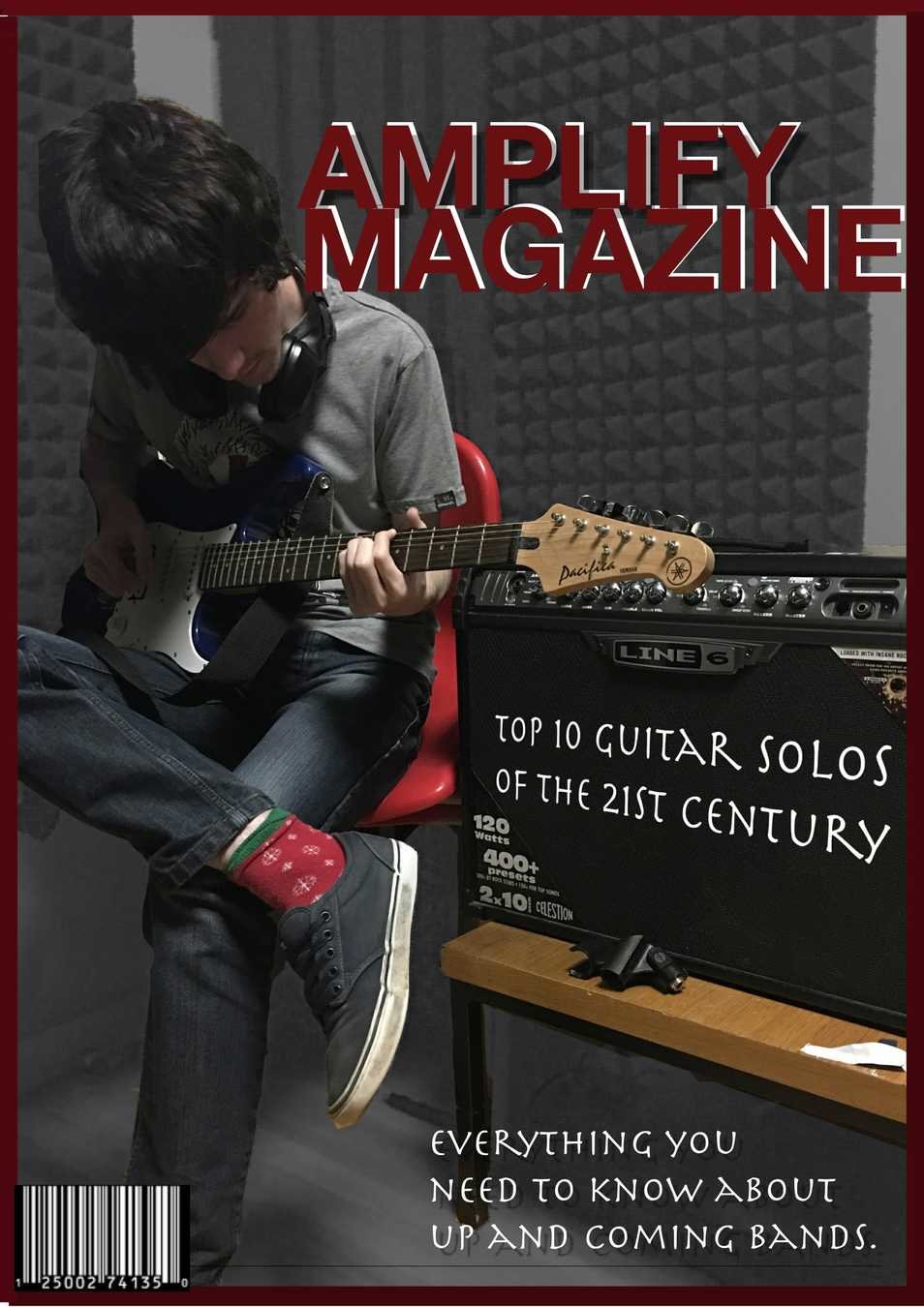
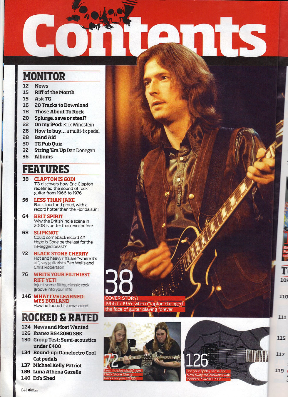
When making my contents page I was inspired by the conventions presented in TotalGuitar magazine. I thought the idea of having the main image to one side with the text on the other was a good idea as this made the page easy to read. Additionally it also made the page look simple yet still eye-catching.
I decided to use this layout when it came to making my own contents page. However I decided to switch the text and photo around as I thought it was easier for the reader. By having the photo and text separated it made the layout easy to follow. It also kept focus on the main image as the page wasn't cluttered with text. Another thing I was inspired by was the simple use of colours. I decided to also use a hint of read on my page as well as white. This makes the page look put together as it follows the theme of my front cover. By doing this I think I have kept to the style of rock well, as well as using a layout that is similar to other genre's. I also chose not to include smaller images at the bottom of the page as
I wanted the main focus to be on my main image as it related to information on the double page.
To differentiate my contents page to the inspired version I chose to use a different style font.
I chose a more handwritten style as I thought this would add uniqueness to my magazine. This follows conventions as the highlighted text and simple layout is very common of a real publication.
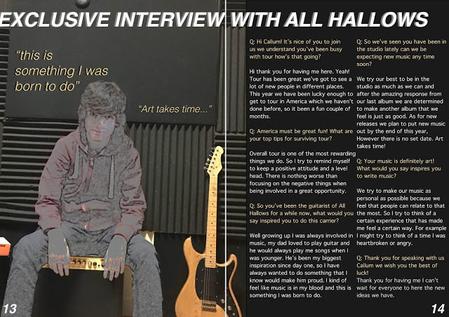
When making my double page I was inspired by the conventions presented in Kerrang! I liked the idea of having a question and answer style interview that highlighted the questions in a different colour. By doing this each question stands out and draws the reader in. Not only does it catch the eye, it also allows the entire page to look put together as I was able to pick out colours from the main image to use to colour the text. When all the colours fit each other it makes the double page look aesthetically pleasing.
I also chose to use the idea of having the image on one side and the interview on the other. Therefore making my double page spread out and readable. I decided not to edit a boarder around my page as I thought it would make the page too distracting and look cluttered. However I did use the idea of selecting important quotes and placing them around the main image. I chose to feature them around my main subject as well as add a 3D effect to fit with the font theme that ran through out my magazine. This magazine fits conventional themes as it features a similar interview and key quotes as seen in a professional magazine.