CSS Grid
Why we need to kill flexbox
Boring nerdy stuff for boring nerdy developers
Exciting life-changing information for
Amazing (Pretty) Designers

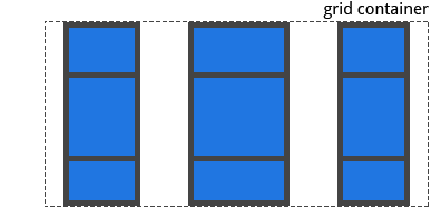
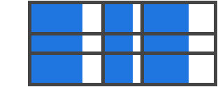
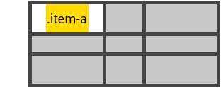
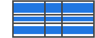
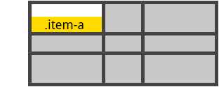
How many flexboxes vs grids?
Flexboxes:
Grids:
1
1
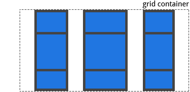
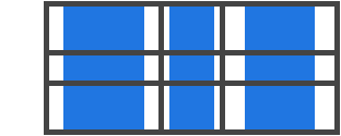
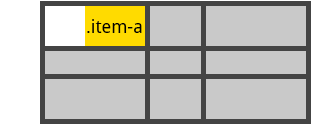
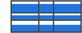
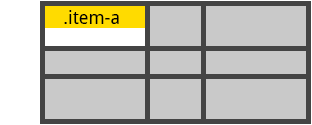
How many flexboxes vs grids?
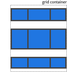
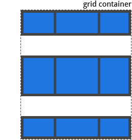
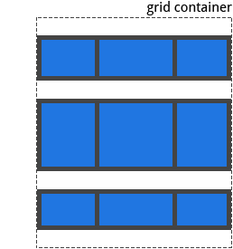
Flexboxes:
Grids:
3
1
*Plus you can't let elements flow between those rows with flexbox method
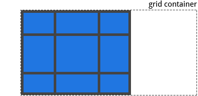
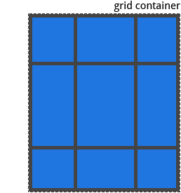
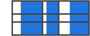
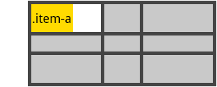
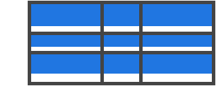
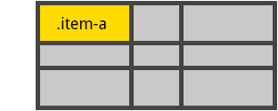
How many flexboxes vs grids?
Flexboxes:
Grids:
2
1
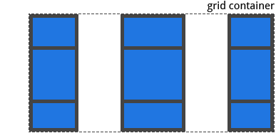
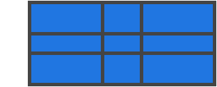
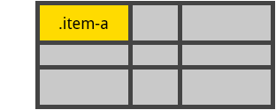
How many flexboxes vs grids?
Flexboxes:
Grids:
4
1
It adds up.
Think 3D.
Think layers. Think whitespace.
Think teleportation.
Followers
Profile
Details
Trending
Gallery
Timeline
News
Trending
Profile
Details
Gallery
News
Timeline
Followers
What about ?


ಠ_ಠ
Solution?
Design accessible, mobile-first experiences that look good on a wide screen
Use feature queries to test for current grid spec.
@supports (grid-area: auto) { ... }
2. Think teleportation
1. Think 3D (layers + whitespace)
3. Design widescreen-friendly
mobile experiences (for IE)
1
1
2
4
3
2
5
3
4
6
5
Track
(Col)
Cell
Lines
Grid Terminology
Area
Gap
Gap
Container
Item
(Component, e.g. footer, gallery, message)
How to Grid
1. Make grid
2. Put items in grid
3. Alignment
4. Implicit grids
Grid properties hierarchy
display: grid|inline-grid|
subgrid|contents

grid:
|-- grid-template
|   |-- grid-template-rows
|   |-- grid-template-columns
|
|
|-- grid-gap
|   |-- grid-row-gap
|   |-- grid-column-gap
|
|-- grid-template-areas
grid-area:
|-- *<template area name>
Container
Items
alignment
item positioning
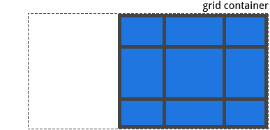
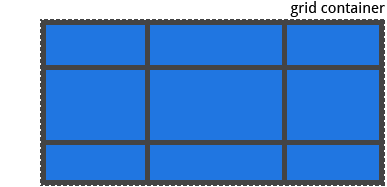
explicit grid
implicit grid
|-- *grid-template-areas
|-- grid-auto-flow:    row|column dense
|-- grid-auto-rows
|-- grid-auto-columns
justify-items:   start|end|center|stretch
align-items:     start|end|center|stretch
justify-content: start|end|center|stretch|space-around|space-between|space-evenly
align-content:   start|end|center|stretch|space-around|space-between|space-evenly
order: _
justify-self: start|end|center|stretch
align-self:   start|end|center|stretch
|
|-- grid-row
|   |-- grid-row-start
|   |-- grid-row-end
|
|-- grid-column
    |-- grid-column-start
    |-- grid-column-end
How to Grid
1. Make grid
2. Put items in grid
3. Alignment
4. Implicit grids
Step 1. Make grid
Subgrid:
Copies parent grid layout (rows/columns/gap)
display: grid|inline-grid|subgrid|contents
Nested grid - contents:
Treats item's contents as part of grid
Used on nested grids
(grid items that are also grids)
1A. Display grid
grid:
|-- grid-template: grid-template-areas grid-template-rows / grid-template-columns;
|-- grid-gap:      grid-row-gap grid-column-gap;
1B. Draw the grid
Dev tips (templating)
2. Use fr over %
iv) Units: fr|px|vw|vh|vmin|vmax|rem|em|%|auto
grid-template-columns: 100px 1fr 2rem 4em 20%;
- % overlooks gaps; fr doesn't
1. Think lines, not cells
grid-template-rows: 100px 1fr 2rem;
grid-gap: 10px 20px;
Line 1
- In a space fight, fr beats auto
2
3
4
5
6
grid:
|-- grid-template: grid-template-areas grid-template-rows / grid-template-columns;
|-- grid-gap:      grid-row-gap grid-column-gap;
1B. Draw the grid
Dev tips (templating)
2. Use fr over %
iv) Compound units:
minmax(__, __), min-content, max-content,
fit-content(__)
minmax(min track size, max track size)
- min-content == size when soft wrapped
max-content == size when not wrapped
1. Think lines, not cells
3. Use minmax() or fit-content for variable track size
fit-content(value) ==
minmax(auto, the smaller of (A) content's width & (B) value)
grid:
|-- grid-template: grid-template-areas grid-template-rows / grid-template-columns;
|-- grid-gap:      grid-row-gap grid-column-gap;
1B. Draw the grid
Dev tips (templating)
2. Use fr over %
iv) repeat(__, __), auto-fill, auto-fit
repeat(int|auto-fill|auto-fit, track size)
- When
(A) AND
(B) 1 grid row is wide enough to include all items
4. Use repeat(auto-fit, __) to
duplicate tracks
- auto-fill & auto-fit auto creates tracks to fill grid
repeat(auto-fill|-fit, minmax( , fr)
1. Think lines, not cells
auto-fill will squeeze in empty tracks
auto-fit will spread out existing tracks
3. Use minmax() or fit-content for variable track size
5. Try auto-fit, then auto-fill
grid:
|-- grid-template: grid-template-areas grid-template-rows / grid-template-columns;
|-- grid-gap:      grid-row-gap grid-column-gap;
1B. Draw the grid
Dev tips (templating)
2. Use fr over %
iv) Name your lines (optional)
grid-template-rows: [header-start] 200px
                    [header-end main-start] 1fr
                    [main-end footer-start] 400px
                    [footer-end]
4. Use repeat(auto-fit, __) to
duplicate tracks
- Useful for manually positioning items in grid
1. Think lines, not cells
3. Use minmax() or fit-content for variable track size
5. Try auto-fit, then auto-fill
All together now
grid-template-columns: [col-line-1] 30%
                       [col-line-2a col-line-2b] repeat(auto-fit, [col-line-3] 200px)
                       minmax(min-content, max-content);
grid-template:         [row-line-1] 20vh [row-line-2] 2fr [row-line-3] 1fr
                       [row-line-4] /
                       [col-line-1] 30%
                       [col-line-2a col-line-2b] repeat(auto-fit, [col-line-3] 200px)
                       minmax(min-content, max-content);
row-line-1
row-line-2
row-line-3
row-line-4
col-line-1
col-line-2a
col-line-2b
col-line-3
col-line-3
col-line-3
col-line-3
col-line-4
scss doesn't like [linenames], so don't use them yet.
How to Grid
1. Make grid
2. Put items in grid
3. Alignment
4. Implicit grids
2. Put items in grid
Step 2. Put items in grid
2A. Positioning using area names
grid:
|-- grid-template: grid-template-areas grid-template-rows / grid-template-columns;
i.) Naming template areas
- Can't use fancy repeat, minmax(), fit-content, etc.
grid-template: 150px 2fr 1fr / 400px 1fr 2fr;
grid-template: "a a d" 150px
               "b b d" 2fr
               "c c d" 1fr
             / 400px 1fr 2fr;
Cons of using grid-template to name areas instead of grid-template-areas:
grid-template: [row-line-1]  "a a d" [row-line-2a] 150px
               [row-line-2b] "b b d" [row-line-3]  2fr
                             "c c d" [row-line-4]  1fr
                           / 400px 1fr 2fr;
- Remember SASS doesn't like [linenames]
2A. Positioning using area names
Dev tips (positioning)
ii) Assigning items to template areas
.container {
    grid-template-areas: "header header  sidebar"
                         "main   gallery sidebar"
                         "footer footer  footer";
}
1. Use grid-template-areas
over grid-template if you
want variable track sizes
CONTAINER
grid:
|-- grid-template-areas
ITEM
grid-area: <template area name>
.item {
grid-area: header;
}
2B. Manually positioning items
Dev tips (positioning)
i) Why manually position?
grid-column: 2 / 4;
- Useful if item doesn't fall neatly into a specific template area
1. Use grid-template-areas
over grid-template if you
want variable track sizes
ITEM   grid-area:       grid-row-start / grid-column-start / grid-row-end / grid-column-end;
       |-- grid-row:    grid-row-start / grid-row-end;
       |-- grid-column: grid-column-start / grid-column-end;
Line 2
4
- Negative values are simply lines counted from the grid end
ii) Multiple template areas
grid-column: col-line-2 / col-line-4;
grid-column: header / sidebar;
iii) By grid lines
=
grid-column: 4 / 2;
=
grid-column: -4 / -2;
=
grid-column: header-start / sidebar-end;
First header line
Last sidebar line
2B. Manually positioning items
Dev tips (positioning)
2. Use span to position by
distance; lines to position
by fixed points
iv) By span
- Use span if items should be x number of tracks long/tall,
and not between two specific lines.
1. Use grid-template-areas
over grid-template if you
want variable track sizes
ITEM   grid-area:       grid-row-start / grid-column-start / grid-row-end / grid-column-end;
       |-- grid-row:    grid-row-start / grid-row-end;
       |-- grid-column: grid-column-start / grid-column-end;
grid-column: 2 / span 2;
v) All together now
grid-area: -3 / 4 / span 2 / 2;
|-- grid-row:    -3 / span 2;
|-- grid-column: 4 / 2;
How to Grid
1. Make grid
2. Put items in grid
3. Alignment
4. Implicit grids
3. Alignment
3A. Grid alignment
CONTAINER
justify-content: start|end|center|stretch|space-around|space-between|space-evenly
align-content:   start|end|center|stretch|space-around|space-between|space-evenly
justify-content (x)
align-content (y)
start
end
center
stretch
space-
around
space-
between
space-
evenly
justify-content (x)
align-content (y)
3B. Item alignment
CONTAINER
justify-items: start|end|center|stretch
align-items:   start|end|center|stretch
justify-items (x)
align-items (y)
start
end
center
stretch
ITEM
justify-self: start|end|center|stretch
align-self:   start|end|center|stretch
justify-self (x)
start
end
center
stretch

align-self (y)
3C. Recap
Dev tips (alignment)
1. Justify x; align y
CONTAINER
justify-content: start|end|center|stretch|space-around|space-between|space-evenly
align-content:   start|end|center|stretch|space-around|space-between|space-evenly
justify-items:   start|end|center|stretch
align-items:     start|end|center|stretch
2. *-items aligns items
*-self aligns 1 item
*-content aligns the grid
ITEM
justify-self:   start|end|center|stretch
align-self:     start|end|center|stretch
How to Grid
1. Make grid
2. Put items in grid
3. Alignment
4. Implicit grids
4. Implicit grids
Step 4. Implicit grid
4A. Ordering auto-placed items
ITEM order: __
- Grids are automatically positioned in HTML DOM order
- You can change an item's automatic position with `order` (initial value: 0)
CONTAINER
grid
|-- grid-auto-flow:    row|column dense
|-- grid-auto-rows
|-- grid-auto-columns
4B. Auto-placing items in rows|columns
row
column
grid-auto-flow
Arrange items by
row
column
Auto creates ... for excess items
rows
columns
Control auto-created track sizes with ...
grid-auto-rows
grid-auto-columns
Initial value (default)?
CONTAINER
grid
|-- grid-auto-flow:    row|column dense
|-- grid-auto-rows
|-- grid-auto-columns
4C. Control auto-created
track sizes
- Use grid-auto-rows|column to change the track sizes of auto-created implicit rows|column
- grid-auto-rows|columns is nearly identical to grid-template-rows|columns:
i) grid-auto-rows|columns
fr|%|px|vh|vmin|vmax|rem|em
min-content|max-content|auto
minmax()
repeat(__, __)
- grid-auto-rows|columns can be used alongside grid-template-rows|columns
.grid {
    grid-template: repeat(2, 200px)
                   / repeat(3, 200px);
    grid-auto-rows: 100px;
}
// After the first 2 200px rows,
// rows will be 100px
CONTAINER
grid
|-- grid-auto-flow:    row|column dense
|-- grid-auto-rows
|-- grid-auto-columns
4C. Control auto-created
track sizes
-
When repeat(auto-fit|-fill) for rows doesn't work:
(1) use grid-auto-rows OR
(2) grid-auto-flow: column & set a height
Dev tips (implicit grid)
1. You typically want
repeat(auto-fit|auto-fill, __)
for columns;
grid-auto-rows for rows
-
doesn't work by default (doesn't auto-create required tracks)
grid-template-rows: repeat(auto-fill|auto-fit, ___)
row
column
For auto-fit|-fill to work on:
grid container has
height|max-height
grids-auto-flow
row
(default)
column
width|max-width
(screen width)
ii) auto-rows vs. repeat(auto-fit|auto-fill)
CONTAINER
grid
|-- grid-auto-flow:    row|column dense
|-- grid-auto-rows
|-- grid-auto-columns
4D. Fill grid whitespaces
- dense: Breaks grid order to fill empty spaces
Dev tips (implicit grid)
1. You typically want
repeat(auto-fit|auto-fill, __)
for columns;
grid-auto-rows for rows
How to Grid?
1. Make grid
2. Put items in grid
3. Alignment
4. Implicit grids

Resources
CSS Grid
By Stephen Koo