OOCSS, LESS, BEM
et autres pratiques du quartier*
*On ne peut pas comprendre si on ne connaît pas la filmo de Pedro Almodovar

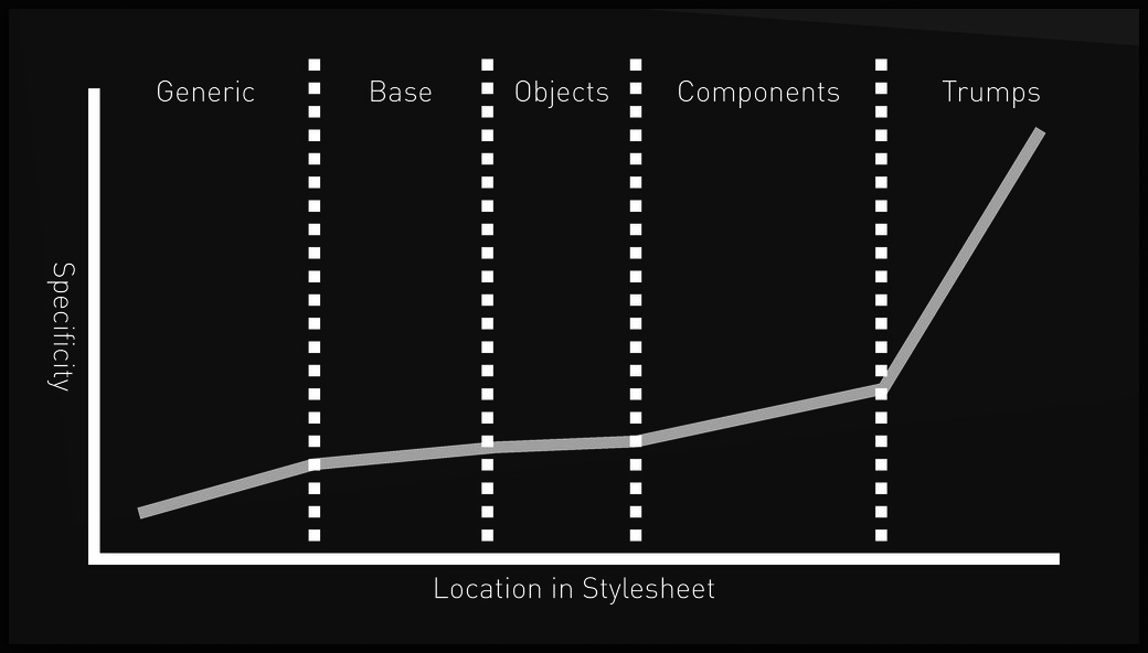
Début de projet

Taille des
fichiers sources
Avancement du projet
Legacy
- Où ?
- Répétitions
- À la fin

Taille des
fichiers sources
Avancement du projet
- Standard ouvert
- contenu / forme
- W3C
- CSS 1 : 12/1996
- CSS 2.0 : 05/1998
- CSS 2.1 : 06/2011
- CSS 2.2 : 2016
- CSS 3 : modules
- CSS 4 n'existe pas
- Règle
- Sélecteur(s)
- Déclarations(s)
- Déclaration
- Propriété
- Valeur(s)
/* Règle */

.classe { /* Sélecteur */

  background-color: #555; /* Déclaration */

  /* propriété: valeur(s); */

  background: #555 url(/chemin/de/croix.png) no-repeat center center;
}
Sélecteurs
/* Sélecteur universel */
*

/* Sélecteurs de type */
div

/* Sélecteurs descendants */
div span

/* Sélecteurs d'enfant */
ul > li

/* Les sélecteurs adjacents */
h2 + p

/* La pseudo-classe */
li:first-child

/* Les pseudo-classes de lien */
a:link
a:visited

/* Les pseudo-classes dynamiques */
a:active
a:hover
a:focus

/* La pseudo-classe :lang() */
h1:lang(fr)
/* Sélecteurs d'attribut */
abbr[title]
fieldset[foo="warning"]
label[foo~="warning"]
aside[lang|="en"]
/*************************
* Seulement en HTML *
*************************/
/* Sélecteurs de classe */
/* Identique à [class~="warning"] */
.warning
/* Sélecteurs d'ID */
#myid
/* Les pseudo-éléments */
:first-line
:first-letter
:before
:after Spécificité
/* 1 */
a {
    background-color: yellow;
}
/* 2 */
#content p a {
    background-color: red;
}
/* 3 */
p #wannabee-black {
    background-color: green;
}
/* 4 */
#wannabee-black {
    background-color: black;
}
/* 5 */
a.perfect-color {
    background-color: blue;
}
/* 6 */
div.main p a.perfect-color {
    background-color: orange;
    /* which is the new black */
}
<body>
<div class="main" id="content">
<p>
This is <a id="wannabee-black" class="perfect-color">fun</a>!
</p>
</div>
</body>
Quelle sera la couleur de fond
du mot "fun" ?

Inline
ID
Classe
et pseudo-classe*
et attribut**
Type
(= balise)
0
2
3
1
header #better #faster .stronger .work-is-never:hover
a { /* 0,0,1 */
    background-color: yellow;
}

#content p a { /* 1,0,2 */
    background-color: red;
}

p #wannabee-black { /* 1,0,1 */
    background-color: green;
}

#wannabee-black { /* 1,0,0 */
    background-color: black;
}

a.perfect-color { /* 0,1,1 */
    background-color: blue;
}

div.main p a.perfect-color { /* 0,2,3 */
    background-color: orange;
    /* which is the new black */
}
<body>
<div class="main" id="content">
<p>
This is <a id="wannabee-black" class="perfect-color">fun</a>!
</p>
</div>
</body>
Quelle sera la couleur de fond
du mot "fun" ?
a {
    background-color: turquoise !important;
}
#iron-born p a {
    background-color: aqua;
}
p .dothraki {
    background-color: darkkhaki !important;
}
#tyrion {
    background-color: crimson;
}
a.lewis-carroll {
    background-color: aliceblue;
}
div.main p a.lewis-carroll {
    background-color: mistyrose;
}
<body>
<div class="main" id="tirion">
<p>
This is
<a
id="iron-born"
class="darkkhaki lewis-carroll"
style="background: yellow"
>
really
</a>
fun!
</p>
</div>
</body>
Quelle sera la couleur de fond
du mot "really" ?
Inline
ID
Classe
et pseudo-classe*
et attribut**
Type
(= balise)
Déclarations sans !important
Déclarations avec !important
Inline
ID
Classe
et pseudo-classe*
et attribut**
Type
(= balise)
Nesting
Complexité cyclomatique
- Mesure de complexité
- Dépend du nombre de chemins
(if, else, elseif et autres while)
        process.argv.forEach(function (val) {
            if (val === 'prod' || val === 'express:prod') {
                app.set('env', 'production');
            } else if (val.indexOf('port=') > -1) {
                try {
                    var serverPort = parseInt(val.split('=')[1], 10);
                    app.set('serverPort', serverPort);
                    winston.info('Server port = ' + serverPort);
                } catch (e) {
                    winston.warn('Cannot parse server port');
                }
            } else if (val.indexOf('apiHost=') > -1) {
                try {
                    apiHost = val.split('=')[1];
                    winston.info('Api host = ' + apiHost);
                } catch (e) {
                    winston.warn('Cannot parse "--apiHost=X.X.X.X"');
                }
            } else if (val.indexOf('login=') > -1) {
                try {
                    login = val.split('=')[1];
                    winston.info('login = ' + login);
                } catch (e) {
                    winston.warn('Cannot parse "--login=lorem.ipsum"');
                }
            }
        });
- difficile à comprendre
- augmente points d'erreurs potentielles
- plus facile d'avoir des effets de bords
- plus difficile à modifier
- plus difficile à tester

header #better #faster .stronger .work-is-never:hover {
    (...)
}
@if isMouseOver() and isElementWithClass(work-is-never) {
@if insideElementWithClass(stronger) {
@if insideElementWithId(faster) {
@if insideElementWithId(better) {
@if inside(header) {
(...)
}
}
}
}
}"That's what they say... That's not what they mean"*
Say:
*Jack Shephard dans "Lost" à propos de ses tatouages
Mean:
Tight coupling
header {

    #better {

        #faster {

            .stronger {

                .work-is-never:hover {

                    (...)
                }
            }
        }
    }
}
<html>
<head>
</head>
<body>
<header>
<div id="better">
<div id="faster">
<div class="stronger">
<a class="work-is-never">
</a>
</div>
</div>
</div>
</header>
</body>
</html>- modification HTML ==> modification CSS
- modification du CSS ==> modification HTML
- Non réutilisables
- Augmente répétitions
#edit-reco-popup {
    (...)
    .parameters-container {
        (...)
        .parameter-list-container {
            (...)
            .scrollable {
                (...)
                .nano > .nano-content {
                    (...)
                    .parameters {
                        (...)
                        .parameter-item {
                            (...)
                            .input-container {
                                (...)
                                .input {
                                    display: inline-block;
                                    vertical-align: top;
                                    border: none;
                                    outline: none;
                                    line-height: 30px;
                                    height: 30px;
                                    min-width: 200px;
                                    padding: 0 @gutter;
                                    overflow: hidden;
                                }
                                .personalization-field {
                                    vertical-align: top;
                                    height: 30px;
                                    width: 30px;
                                    cursor: pointer;
                                    background-color: @grey2;
                                    border-left: 1px solid @grey5;
                                    .border-radius(0 2px  2px 0px)
                                }
(...)
#edit-video-popup {
(...)
#video-popup-container {
(...)
#video-settings {
(...)
.input-container {
(...)
.input {
display: inline-block;
vertical-align: middle;
border: none;
line-height: 28px;
height: 28px;
outline: none;
min-width: 300px;
}
.personalization-field {
vertical-align: middle;
background-color: @grey2;
height: 30px;
width: 30px;
cursor: pointer;
border-left: 1px solid @grey5;
.border-radius(0 2px 2px 0px)
}
(...)
Efficacité
- ID : #stronger
- Class : .promo
- Type : header
- Adjacent : h2 + p
- Enfant : ul > li
- Descendant : ul a
- Universel : *
- Attribut : [type="text"]
- Pseudo-classes/-elements, : a:hover
#edit-video-popup #video-popup-container #video-settings #embedded-video-menu #video-formats .radio-button.ok:after {

  (...)

}
#toast-container .ng-toast__list .alert.toast-warning .toast-title + .toast-message > div:not(:empty) {

  (...)

}
OOCSS
Penser "objet" en CSS
- réutilisation de code
- feuilles de styles plus efficaces
- plus facile à maintenir
- Structure / Apparence
- Conteneur / Contenu
/* BAD! */
#widget-popup button {
	width: 200px;
	height: 50px;
	padding: 10px;
	border: solid 1px #ccc;
	background: linear-gradient(#ccc, #222);
	box-shadow: rgba(0, 0, 0, .5) 2px 2px 5px;
}

#widget-popup .box {
	width: 400px;
	overflow: hidden;
	border: solid 1px #ccc;
	background: linear-gradient(#ccc, #222);
	box-shadow: rgba(0, 0, 0, .5) 2px 2px 5px;
}

#widget-popup .tooltip {
	width: 500px;
	min-height: 200px;
	overflow: auto;
	border: solid 1px #ccc;
	background: linear-gradient(#ccc, #222);
	box-shadow: rgba(0, 0, 0, .5) 2px 2px 5px;
}
/* GOOD! */
.button {
width: 200px;
height: 50px;
}
.box {
width: 400px;
overflow: hidden;
}
.tooltip {
width: 500px;
min-height: 200px;
overflow: auto;
}
.sf-default-theme {
border: solid 1px #ccc;
background: linear-gradient(#ccc, #222);
box-shadow: rgba(0, 0, 0, .5) 2px 2px 5px;
}/* BAD! */
#sidebar h3 {
font-family: Arial, Helvetica, sans-serif;
font-size: .8em;
line-height: 1;
color: #777;
text-shadow: rgba(0, 0, 0, .3) 3px 3px 6px;
}#sidebar h3, #footer h3 {
font-family: Arial, Helvetica, sans-serif;
font-size: 2em;
line-height: 1;
color: #777;
text-shadow: rgba(0, 0, 0, .3) 3px 3px 6px;
}
#footer h3 {
font-size: 1.5em;
text-shadow: rgba(0, 0, 0, .3) 2px 2px 4px;
}#sidebar h3.alternative {
font-size: .9em;
color: #45a;
}<div class="media">
<a href="http://twitter.com/sormieres" class="img">
<img src="sormieres.jpg" alt="me" width="40" />
</a>
<div class="bd">
@smartfocus 9 minutes ago
</div>
</div>.media {
margin: 10px;
}
.media,
.bd {
overflow: hidden;
_overflow: visible;
zoom: 1;
}
.media .img {
float: left;
margin-right: 10px;
}
.media .img img {
display: block;
}Bootstrap est un peu OOCSS
-
.row et .col-*-*
- .btn et .btn-primary ,etc.
- .clearfix
-
.text-left, .text-center, etc.
- .table, .table-striped
BEM
- Block
- Element
- Modifier
.block {}

.block__element {}

.block--modifier {}

.block__element--modifier {}
.person {}
.person__hand {}
.person--female {}
.person--female__hand {}
.person__hand--left {}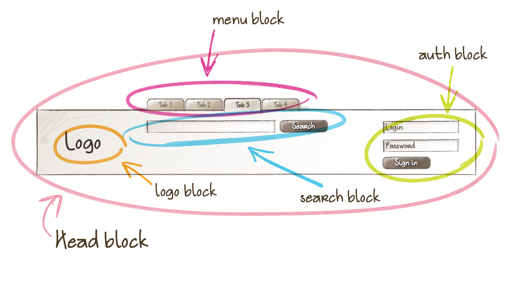
.media {}

.media__img {}

.media__img--rev {}

.media__body {}
Grille CSS version BEM (CSSWizardry)
.o-layout {
    margin-left:-$base-spacing-unit;
    list-style:none;
    margin-bottom:0;
}

.o-layout__item {
    display:inline-block;
    width:100%;
    padding-left:$base-spacing-unit;
    vertical-align:top;
}

.u-1\/2 {
    width: 50% !important;
}

.u-1\/3 {
    width: 33.333% !important;
}

.u-2\/3 {
    width: 66.666% !important;
}

(...)

.u-1\/10 {
    width: 10% !important;
}

(...)
<ul class="o-layout">
<li class="o-layout__item">
Toute la largeur du parent
</li>
<li class="o-layout__item u-1/2">
La moitié de la largeur du parent
</li>
<li class="o-layout__item u-1/2">
La moitié de la largeur du parent
</li>
<li class="o-layout__item u-1/3">
Un tiers de la largeur du parent
</li>
<li class="o-layout__item u-2/3">
Deux tiers de la largeur du parent
</li>
</ulNesting 2.0
.input-container {

    (...)

    &__input {

        (...)

        &[disabled] {
            color: @grey6;
            background-color: @grey3;
        }
        &--left {
            .border-radius(2px 0 0 2px);
        }
        &--right {
            .border-radius(0 2px 2px 0);
        }
        &--middle {
            .border-radius(0);
        }
    }

    &__icon {

        (...)

        &--left {

            (...)

        }

        &--perso {

            (...)

        }

    }

}
.input-container {
(...)
}
.input-container__input {
(...)
background-clip: padding-box;
}
.input-container__input[disabled] {
color: #969696;
background-color: #e9e9e9;
}
.input-container__input--left {
border-radius: 2px 0 0 2px;
}
.input-container__input--right {
border-radius: 0 2px 2px 0;
}
.input-container__input--middle {
border-radius: 0;
}
.input-container__icon {
(...)
}
.input-container__icon--left {
(...)
}
.input-container__icon--perso {
(...)
}
SMACSS
Scalable and Modular Architecture for CSS
SMACSS
- Base - HTML elements & defaults (reset / normalize + nos styles basiques)
- Layout - Structure de la page
- Module - Blocs de code réutilisables (objets)
- State - Actif/Inactif etc
- Theme - Polices, couleurs, ombres, bordures...
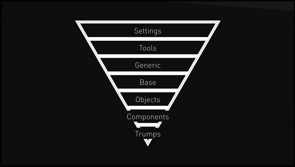
ITCSS
- Settings : Variables globales & configuration, couleurs récurrentes
- Tools : Default mixins & functions
- Generic Normalize, resets, box-sizing
- Base : HTML elements (sélecteurs de type)
- Objects : Objets sans skin
- Components : Composants avec skin, parties d'UI
- Utilities : Helpers & overrides
/* object.sass : classes, peu spécifique */

.ui-list {
    margin: 0;
    padding: 0;
    list-style: none;

    &__item {
        padding: @spacing-unit;
    }
}
/* components.sass : classes, plus explicite */

.carousel {

    height: 32px;
    max-height: 32px;
    vertical-align: middle;

    &__item {
        margin: 0px 7px;
        color: #BCBCBC;
        cursor: pointer;
        transition: color 200ms ease 0s;
    }
}
/* utilities.sass : seul endroit avec !important */
.u-1\/2 {
width: 50% !important;
}
.hidden {
display: none !important;
}
Où ?RedondanceSpécificité
- Blocs / éléments
- Sélecteurs : une classe
- Parenté explicite
- Imbrication intelligente
- Organisation des sources
One more thing
CSS-in-JS
Pourquoi je ne suis pas
(encore)
convaincu
- Augmente la stack
- Nouvelle(s) syntaxe à apprendre
- En JS vraiment, et donc pas de stylelint
- Difficile à debuguer
Glamor
import { css } from 'glamor'

// make css rules
let rule = css({
  color: 'red',
  ':hover': {
    color: 'pink'
  },
  @media(min-width: 300px): {
    color: 'green',
  }
})

// add as data attributes
<div {...rule} {...another}> zomg</div>

// or as classes
<div className={`${rule} ${another}`}> zomg</div>

// merge rules for great justice
let mono = css({
  fontFamily: 'monospace'
})

let bolder = css({
  fontWeight: 'bolder'
})

<div {...css(mono, bolder)}>  bold code!</div>
Glamor
Good
- Simple
- media queries
- pseudo-classes
- pseudo-elements
- Integration react
- Integration jsx
- Integration aphrodite
Bad
- En JS :
linting - Nom de classe entièrement généré :
'css-1pyvz' : difficile à lire/debuguer depuis les dev-tools
JSS
import jss from 'jss'
import preset from 'jss-preset-default'

// One time setup with default plugins and settings.
jss.setup(preset())

const styles = {
  button: {
    fontSize: 12,
    '&:hover': {
      background: 'blue'
    }
  },
  ctaButton: {
    extend: 'button',
    '&:hover': {
      background: 'black'
    }
  },
  '@media (min-width: 1024px)': {
    button: {
      width: 200
    }
  }
}

const {classes} = jss.createStyleSheet(styles).attach()

document.body.innerHTML = `
  <button class="${classes.button}">Button</button>
  <button class="${classes.ctaButton}">CTA Button</button>
`
JSS
<head>
  <style type="text/css">
    .button-123456 {
      font-size: 12px;
    }
    .button-123456:hover {
      background: blue;
    }
    .ctaButton-789012 {
      font-size: 12px;
    }
    .ctaButton-789012:hover {
      background: red;
    }
    @media (min-width: 1024px) {
      .button-123456 {
        min-width: 200px;
      }
    }
  </style>
</head>
<body>
  <button class="button-123456">Button</button>
  <button class="ctaButton-789012">CTA Button</button>
</body>
JSS
Good
- media queries
- pseudo-classes
- pseudo-elements
- noms de classes préservés, suffixés
Bad
- En JS :
linting - Augmente la stack : jss, jss-preset-*, react-jss
- Beaucoup de "cérémonies" :
import jss from 'jss'
import preset from 'jss-preset-default'

// One time setup with default plugins and settings.
jss.setup(preset())

const {classes} = jss.createStyleSheet(styles).attach()
JSS
Styled-Components
import styled from 'styled-components'

const Title = styled.h1`
  font-family: Comic Sans MS;
  color: blue;
`


<Title>Kill Bill</Title>
Styled-components
Good
- media queries
- pseudo-classes
- pseudo-elements
- simple
- vrai CSS (pas des objets)
- utilisation possible de variable JS dans la template string
- styles composables
Bad
- React-only
- nom de classes générés entièrement : 'sc-Xdlen eyLrmN'
- sélecteurs spécifiques : difficile à intégrer avec une CSS globale (à l'ancienne)
- Alourdi grandement le code de React dev tools
- on indique d'abord le nom de la balise
Styled-components
Glamourous
= styled-components with objects
Aphrodite
import { StyleSheet, css } from 'aphrodite'

const styles = StyleSheet.create({
  title: { ... }
})

const Heading = ({ children }) => (
  <h1 className={css(styles.heading)}>{ children }</h1>
)
Aphrodite
import { StyleSheetServer } from 'aphrodite';

const { html, css } = StyleSheetServer.renderStatic(() => {
  return ReactDOMServer.renderToString(<App/>);
});

// Get the critical CSS directly

const criticalCSS = `
  <style data-aphrodite>
    ${css.content}
  </style>
`;
Good
- media queries
- pseudo-classes
- pseudo-elements
- nom de classes préservés, suffixés
- Critical CSS "dans la boîte"
Bad
- En JS :
linting - Un peu cérémonieux aussi
- Pas de sélecteur descendant (sauf hack mega-beurk)
Aphrodite
Mais bon...
Références
- https://github.com/stubbornella/oocss/wiki
- https://en.bem.info/
- http://getbem.com/
- https://smacss.com/book
- http://cssguidelin.es
- http://csswizardry.com
- https://css-tricks.com/
- https://css-tricks.com/specifics-on-css-specificity/
- http://csswizardry.com/2015/04/cyclomatic-complexity-logic-in-css/
- https://speakerdeck.com/dafed/managing-css-projects-with-itcss
- http://www.smashingmagazine.com/tag/css/
- http://clubmate.fi/oocss-acss-bem-smacss-what-are-they-what-should-i-use/
- http://www.alsacreations.com/article/lire/1641-bonnes-pratiques-en-css-bem-et-oocss.html
- http://designshack.net/category/articles/css/
- https://developer.mozilla.org/fr/docs/Web/CSS/Specificity