

Infographics and
Data Visualization
for Research Communication
Effective Knowledge Visualization and Knowledge Sharing Tools
Laura Navarro & Eli Vivas (Storydata)


10/26/2021

- What is Data Visualization
- Types and Basic principles of Data Visualization
- Exercise with Piktochart
- Maps
- Types and Basic principles of Infographics
- Individual Exercise: creating a data visualization and/or infographic
with Piktochart
STRUCTURE
- Surrounded by data
- Used in all fields
- Sight: a powerful sense


Infographics and Data Visualization


WHAT IS
DATA VISUALIZATION?
Translation of raw data to a visual context
Infographics and Data Visualization
BRIEF HISTORY

Charles Minard, 1869
Infographics and Data Visualization
DATA VISUALIZATIONS
=!
INFOGRAPHICS

DATA VISUALIZATION
Infographics and Data Visualization


Infographics and Data Visualization
INFOGRAPHICS

Adolfo Arranz


Germanwings flight-Inconsolata
Infographics and Data Visualization

INFOGRAPHICS
DATA VISUALIZATION
PRINCIPLES
Infographics and Data Visualization
Types of
Data Visualizations
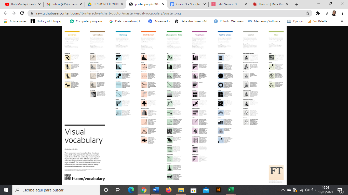
https://ft-interactive.github.io/visual-vocabulary/
What do I want to say?

- Focus on the key concepts
- One graph, one idea
- Interview your data
Infographics and Data Visualization
1. HIGHLIGHT
- No more than seven colors in a chart
- Grey, your best friend
- Use intuitive colors (but avoid stereotypes Men-Women)
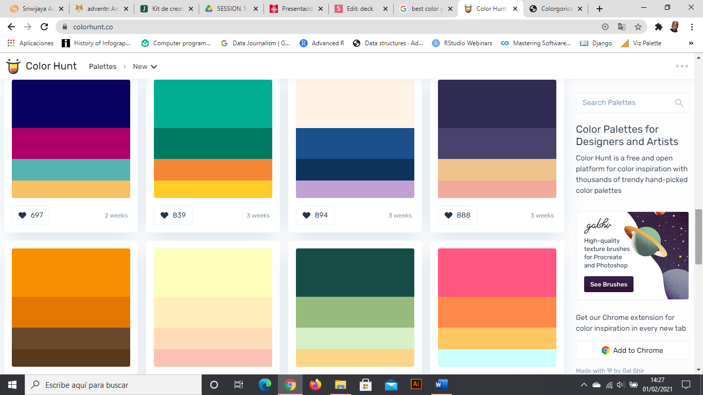
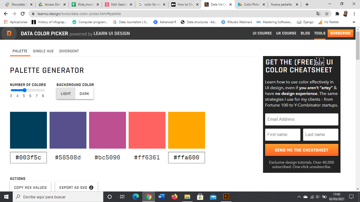
- Use color palettes, they work


Infographics and Data Visualization
2. USE COLORS
Infographics and Data Visualization
2 4 3 5 6 4 3 7 6 5 3
4 3 4 5 4 1 3 2 8 9 7
5 4 6 7 2 1 5 0 6 5 4
2 6 7 8 9 3 1 2 4 0 1
5 3 4 0 9 2 5 4 7 7 2
5 4 1 1 2 0 9 0 9 5 6
2 4 3 5 6 4 3 7 6 5 3
4 3 4 5 4 1 3 2 8 9 7
5 4 6 7 2 1 5 0 6 5 4
2 6 7 8 9 3 1 2 4 0 1
5 3 4 0 9 2 5 4 7 7 2
5 4 1 1 2 0 9 0 9 5 6
2 4 3 5 6 4 3 7 6 5 3
4 3 4 5 4 1 3 2 8 9 7
5 4 6 7 2 1 5 0 6 5 4
2 6 7 8 9 3 1 2 4 0 1
5 3 4 0 9 2 5 4 7 7 2
5 4 1 1 2 0 9 0 9 5 6
Infographics and Data Visualization

Infographics and Data Visualization
3. RESPECT TYPOGRAPHY
Awesome title
Subtitle that contextualizes
Axis text
Axis text
Axis text
Axis text
Axis text
Axis text
Axis text
Caption with the source and who created the chart. Notes if necessary
Legend text
Legend text
Legend title
Axis y title
Axis x title
Infographics and Data Visualization
4. DON'T FORGET ANY PART

Infographics and Data Visualization
4. DON'T FORGET ANY PART
Source: Google News Timeline
Public fears in the media
Swine Flu
Bird Flu
Killer Wasps
Apocalypse
2000
Infographics and Data Visualization
4. DON'T FORGET ANY PART
100%
0%
50%
"Think about subway maps, which are abstracted from the complex shape of the city and are focused on the rider’s goal: to get from one place to the next"
Visualizing Data by Ben Fry
Infographics and Data Visualization
5. KEEP IT SIMPLE

Medium Infogram
Infographics and Data Visualization
5. KEEP IT SIMPLE


Medium Infogram
Infographics and Data Visualization
6. START AXIS IN 0

Infographics and Data Visualization
7. ORDER
(If you can)

2021
54,8%
2013
16,2%
Mobile phone web traffic:
Infographics and Data Visualization
8. MOBILE FIRST
NO CODING & FREE & EASY
NO CODING & FREE &
NOT THAT EASY


CODING & FREE & DIFFICULT


Infographics and Data Visualization

ONLINE TOOLS

Infographics and Data Visualization
· Statistics Division of the UN:
http://data.un.org/
· Google Dataset Search:
https://datasetsearch.research.google.com/
· WHO Database:
https://www.who.int/data
· National Stastistics Institute:
https://www.ine.es/
· Kaggle:
https://www.kaggle.com/
DATA SOURCES
Infographics and Data Visualization
exercise
Data: National oceanic and atmospheric administration (NOAA)

Infographics and Data Visualization
MAPS

Infographics and Data Visualization
MAPS
types
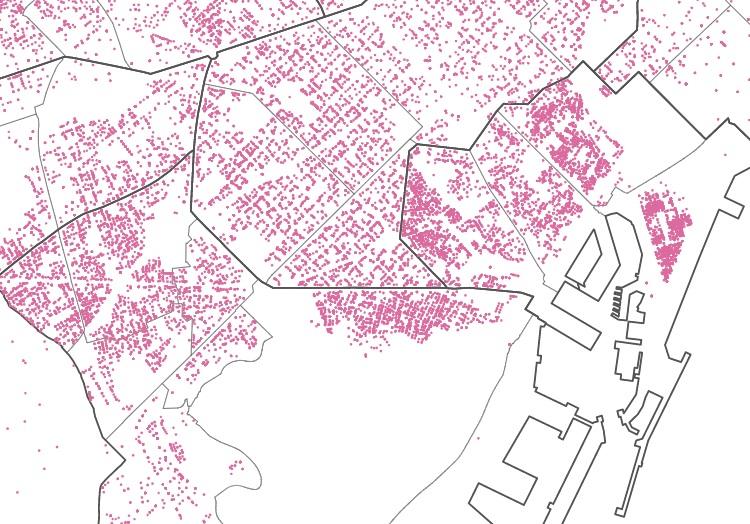
DOTS

CHOROPLETH
BUBBLE

HEAT


FLOW

HEX BINING
Infographics and Data Visualization
MAPS
[18:00]
Infographics and Data Visualization
MAPS
| Latitude | Longitude | name |
|---|---|---|
| 42.061201860 | -0.490321024 | point1 |
| 38.887787884 | -1.537996281 | point2 |
| 38.696322447 | -9.137571576 | point3 |
| geometry | name |
|---|---|
| polygon | region1 |
| multipolygon | region2 |
| polygon | region3 |
Infographics and Data Visualization
MAPS
Geospatial data draws dots or shapes, and they store information for each one of these points or regions

Infographics and Data Visualization
MAPS
· The World Bank
https://maps.worldbank.org/
GEOSPATIAL DATA
· Map SVG:
https://mapsvg.com/maps/world
· Geographical Institutes websites / Open Data:
http://centrodedescargas.cnig.es/CentroDescargas/index.jsp
Infographics and Data Visualization
Types
Basic principles
Start to think about your infographic
INFOGRAPHICS

INFOGRAPHICS
- Guide the eyes through the page
- Visually appealing
- Respect the theme
- Convey the message
- Extract important insights
INFOGRAPHICS
- Guide the eyes through the page
- Visually appealing
- Respect the theme
- Convey the message
- Extract important insights

Infographics and Data Visualization
INFOGRAPHICS
Qualitative
Quantitative
Hybrid
1
2
3
4
52,9%
1
2
3
Infographics and Data Visualization
INFOGRAPHICS
Title
Body
Footer
Infographics and Data Visualization
INFOGRAPHICS
Beggining
Middle
Ending
ch.1
ch.2
ch.3
Infographics and Data Visualization
INFOGRAPHICS
FOOTER
Tap water in Peru
TAP WATER IN PERU
drinking water in Peru
drinking water in the world
WORLD MAP
Which are the problems
INFOGRAPHICS
statistical


Annals of Surgery
INFOGRAPHICS
statistical


INFOGRAPHICS
statistical
Fundaciones Alternativas

Timothy Dole
INFOGRAPHICS
timeline
INFOGRAPHICS
timeline

Yaroslav Kirsanov - Toni Sailer Bio

goodwaydesign
Reuters
INFOGRAPHICS
process

Reuters
INFOGRAPHICS
process

Oriol Vidal
INFOGRAPHICS
informative
Reuters
INFOGRAPHICS
informative

Fundaciones Alternativas
INFOGRAPHICS
comparison
INFOGRAPHICS
comparison

David McCandless

Vincenzo Castro
INFOGRAPHICS
biographical
INFOGRAPHICS
list

Infographics and Data Visualization
INFOGRAPHICS
TOOLS


Infographics and Data Visualization
INFOGRAPHICS
Infographics and Data Visualization
INFOGRAPHICS
Identify
your topic
Audience
Structure
Information
Add value
Design


HOW TO START
Infographics and Data Visualization
your turn

KEEP LEARNING
· Dessart, L., (2016) ‘From paper to picture: creating an infographic from your research’, Journal of Marketing Management (https://www.jmmnews.com/paper-picture-creating-infographic-research/)
· Elsevier (2017) Graphical abstracts available at https://www.elsevier.com/authors/journal-authors/graphical-abstract
· Krauss, Jane (2012) 'More Than Words Can Say' (https://eric.ed.gov/?id=EJ982831)
· McCandless, D., (2009) Information is Beautiful, London: William Collins
· Cool Infographics (https://coolinfographics.com/)
Infographics and Data Visualization
navarrosolerlaura@gmail.com
thank you!
eli@storydata.cat