Storytelling &
Data Visualization
Posgrado en Data Analytics


Eli Vivas
eli@storydata.cat
Twitter @eli_vivas | @storydatabcn
IG @storydata
Infografía vs Dataviz
Definición infografía
-
Infografía
De Infographie®, marca reg.
1. f. Técnica de elaboración de imágenes mediante computadora.
2. f. Imagen obtenida por infografía.
3. f. Representación gráfica que apoya una información de prensa.
Real Academia Española
Storytelling and Data Visualization
Infografía


Germanwings flight-Inconsolata
Storytelling and Data Visualization

Storytelling and Data Visualization
Visualización de datos
A graphical representation of data or concepts, which is either an internal construct of the mind or an external artifact supporting decision making
C. Ware 2000
Storytelling and Data Visualization
Visualización de datos


Translation of raw data to a visual context
Storytelling and Data Visualization

Charles Minard, 1869
Storytelling and Data Visualization
Visualización de datos


Storytelling and Data Visualization
Visualización de datos

Storytelling and Data Visualization
Visualización de datos
¿Para qué sirve?
- detectar patrones
- interacción
- explorar
- personalizar
- analizar en profundidad
Storytelling and Data Visualization
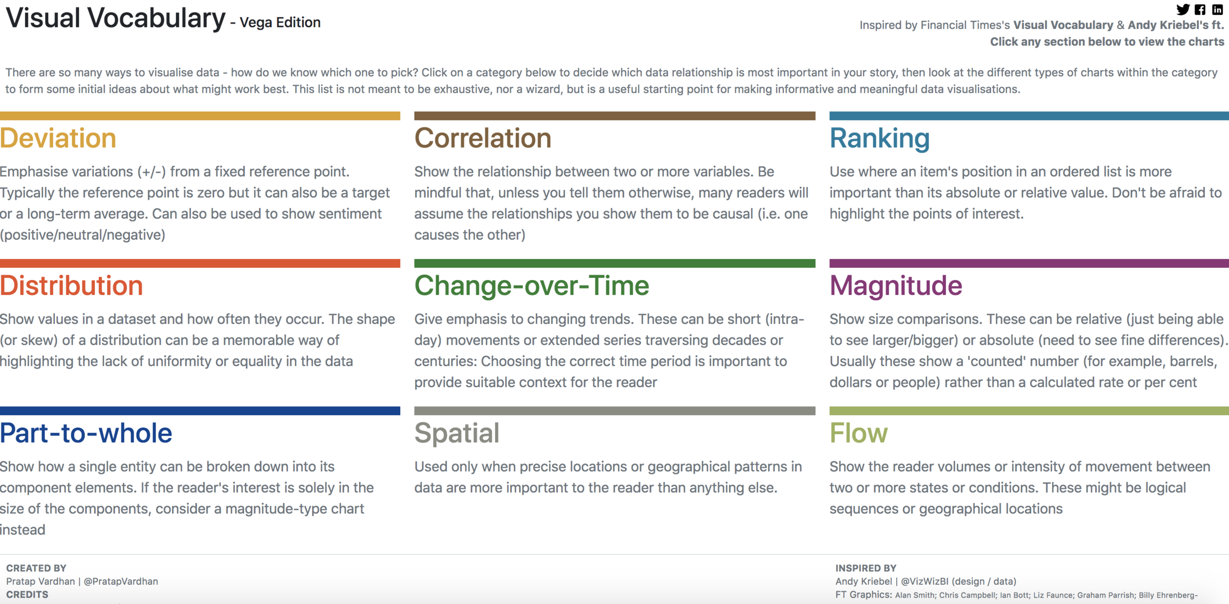
1.- Tipos de
Data Visualizations
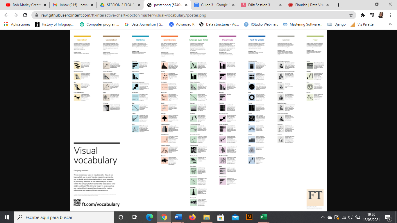
Storytelling and Data Visualization
1.- Tipos de
Data Visualizations
Storytelling and Data Visualization
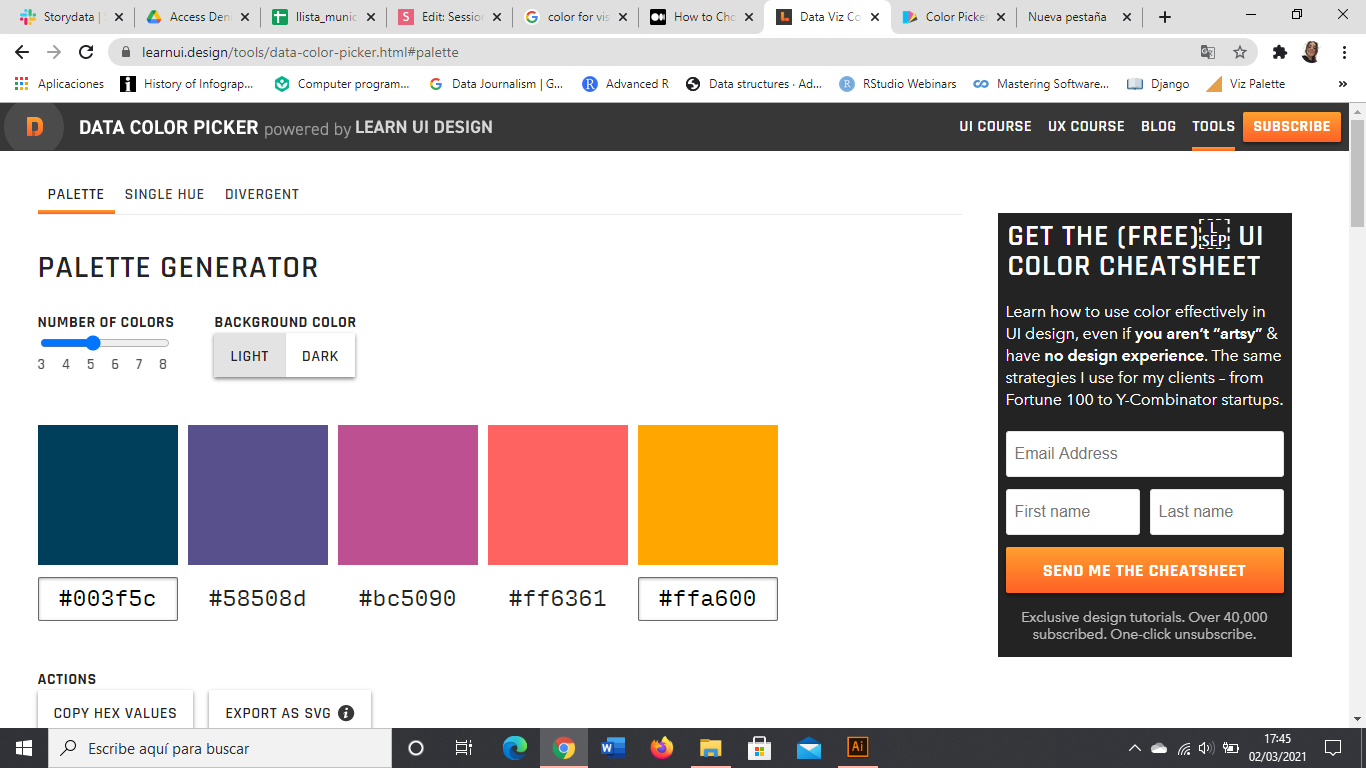
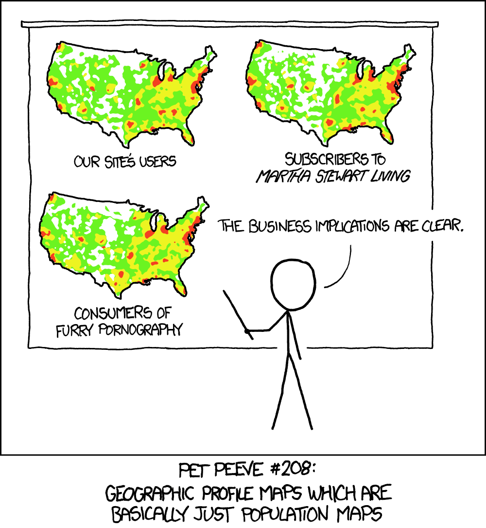
2. Color (existe otro código, y no es un lenguaje de programación)
Storytelling and Data Visualization
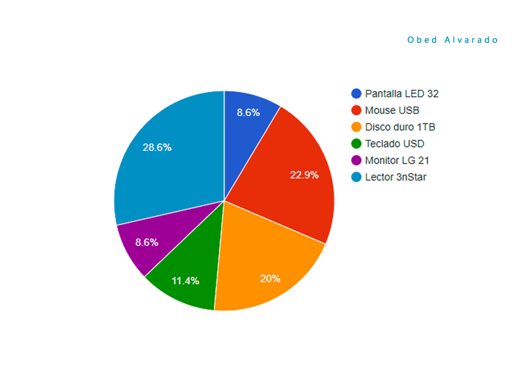
- No más de 7 colores en un chart
- El gris, tu mejor amigo
- Usa colores intuitivos (pero huye de los estereotipos Men-Women)
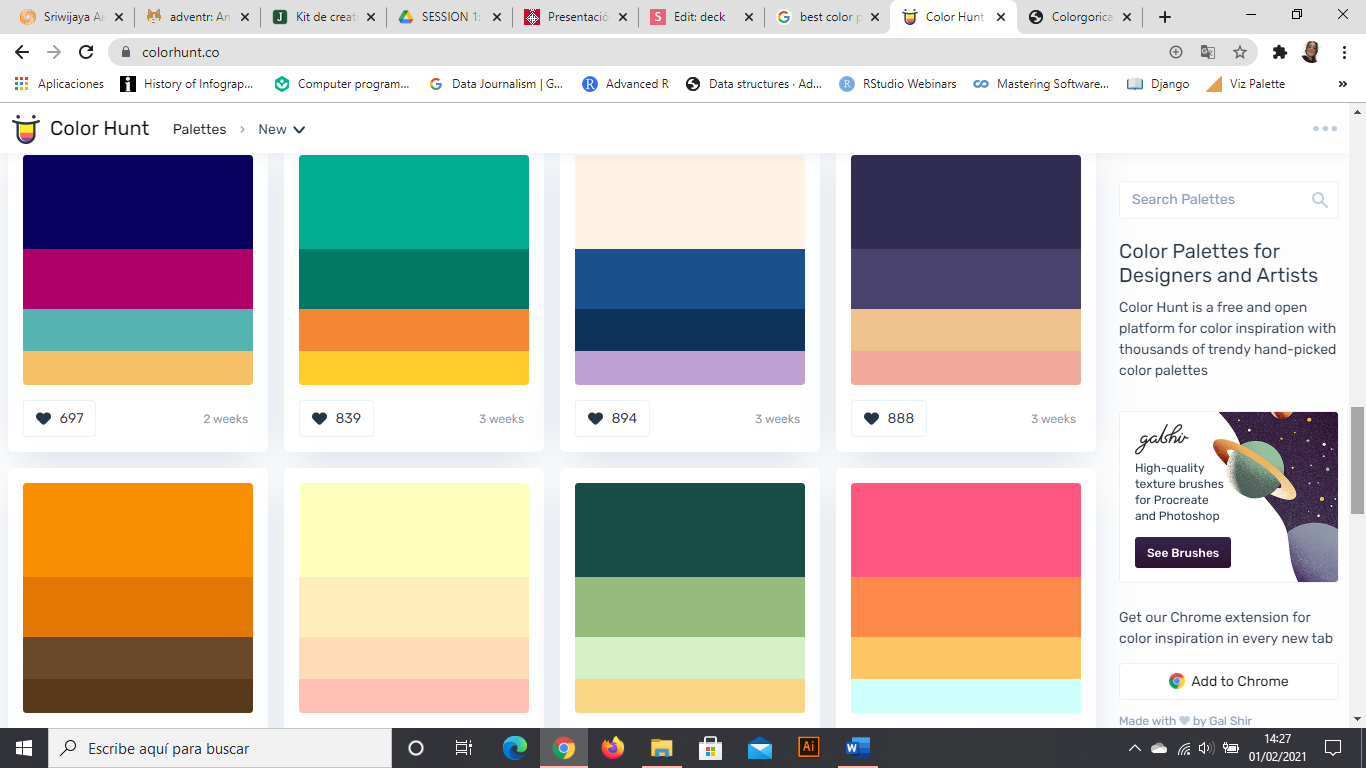
- Usa paletas de colores; funcioan


2. USO DEL COLOR
Storytelling and Data Visualization
Infographics and Data Visualization
2. USO DEL COLOR
3. Resalta lo importante
(quieres explicarlo todo, pero no satures al personal)

Storytelling and Data Visualization
Storytelling and Data Visualization
2 4 3 5 6 4 3 7 6 5 3
4 3 4 5 4 1 3 2 8 9 7
5 4 6 7 2 1 5 0 6 5 4
2 6 7 8 9 3 1 2 4 0 1
5 3 4 0 9 2 5 4 7 7 2
5 4 1 1 2 0 9 0 9 5 6
2 4 3 5 6 4 3 7 6 5 3
4 3 4 5 4 1 3 2 8 9 7
5 4 6 7 2 1 5 0 6 5 4
2 6 7 8 9 3 1 2 4 0 1
5 3 4 0 9 2 5 4 7 7 2
5 4 1 1 2 0 9 0 9 5 6
2 4 3 5 6 4 3 7 6 5 3
4 3 4 5 4 1 3 2 8 9 7
5 4 6 7 2 1 5 0 6 5 4
2 6 7 8 9 3 1 2 4 0 1
5 3 4 0 9 2 5 4 7 7 2
5 4 1 1 2 0 9 0 9 5 6
Título (descripcion del gráfico)
Subtítulo (años, medidas)
Fuente. Autor. ** Notas
3. No te olvides nada
Storytelling and Data Visualization

Awesome title
Subtitle that contextualizes
Axis text
Axis text
Axis text
Axis text
Axis text
Axis text
Axis text
Caption with the source and who created the chart. Notes if necessary
Legend text
Legend text
Legend title
Axis y title
Axis x title
Storytelling and Data Visualization

4. Añade contexto
Storytelling and Data Visualization
4. Añade contexto
Source: Google News Timeline
Miedos públicos en los medios
Swine Flu
Bird Flu
Killer Wasps
Apocalypse
2000
Storytelling and Data Visualization
5. Juega con la tipografía (pero hasta cierto punto)
- Define UNA tipografía (o habla con el jefe de diseño)
- Juega con los estilos para fijar LA ATENCIÓN
- Jerarquiza la información por el tamaño
Storytelling and Data Visualization
Storytelling and Data Visualization
"Think about subway maps, which are abstracted from the complex shape of the city and are focused on the rider’s goal: to get from one place to the next"
Visualizing Data by Ben Fry
5. Haz lo complejo, simple
Storytelling and Data Visualization

Medium Infogram
5. Haz lo complejo, simple
6. Alinea todo con todo
(y ordena, ordena, ordena)

Storytelling and Data Visualization
...si puedes
6. Alinea todo con todo
(y ordena, ordena, ordena)
Storytelling and Data Visualization

...si puedes


Medium Infogram
7. EMPIEZA EL AXIS EN 0
Storytelling and Data Visualization

via Víctor Pascual
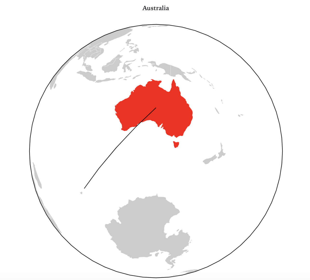
8. ¡OJO CON LAS COMPARACIONES!
Storytelling and Data Visualization

via Víctor Pascual
Storytelling and Data Visualization

via Víctor Pascual
Storytelling and Data Visualization

via Víctor Pascual
Storytelling and Data Visualization

via Víctor Pascual
Storytelling and Data Visualization
Storytelling and Data Visualization

2022
66%
2013
16,2%
Tráfico para móbil:
9. MOBILE FIRST
SIn código & gratis & fáciles
NO CODING & FREE &
NOT THAT EASY


con código & gratis & difíciles


10.-Herramientas

Storytelling and Data Visualization

ESTUDIO DE CASO
Storytelling and Data Visualization
¿De dónde partimos?
NECESITO UN TRASTERO
AUDITORÍA INVERSORES
¿Por dónde empezamos?

Geolocalización

Vídeo en motion graphics
ESTUDIO DE CASO
Storytelling and Data Visualization
ESTUDIO DE CASO
Storytelling and Data Visualization
ID AL SLIDE 43
Y MIRAD EL VÍDEO DE PRINCIPIO A FIN.
¿QUÉ DIFERENCIAS ENCONTRÁIS CON LAS VISUALIZACIONES DEL PROGRAMA EXPLORA
Y LAS DE LOS INFORMES?
ESTUDIO DE CASO
Storytelling and Data Visualization
No hay marcha atrás. De repente, te vuelves imprescindible....
ESTUDIO DE CASO
Storytelling and Data Visualization
NECESITO UN TRASTERO
AUDITORÍA INVERSORES
¿Hasta dónde les llevamos?
¿Y esto, cómo se hace?
1 ejercicio
Loguéate en Datawrapper
Storytelling and Data Visualization
Storytelling and Data Visualization
Si lo prefieres más fácil
La solución está aquí debajo
(no hagas click -si puedes- hasta que acabes)
Storytelling and Data Visualization
Gráficos con Flourish
Storytelling and Data Visualization
TU RETO ESTA SEMANA
· Open data Barcelona
https://opendata-ajuntament.barcelona.cat/data/es/dataset/cens-activitats-comercials
· Barcelona Dades:
https://ajuntament.barcelona.cat/estadistica/catala/index.htm
Fuentes de datos
Storytelling and Data Visualization
- ¿En qué lugar de Barcelona o España ubicarías una franquicia o una delegación de Necesito un Trastero o de cualquier otro negocio?
- ¿Qué visualizaciones te ayudarían a mostrarlo?
- ¿Qué variables has usado?
· Barcelona Dades:
https://ajuntament.barcelona.cat/estadistica/catala/index.htm
Presentaciones
MAPAS
TIPOS
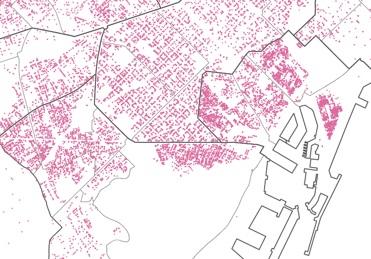
PUNTOS

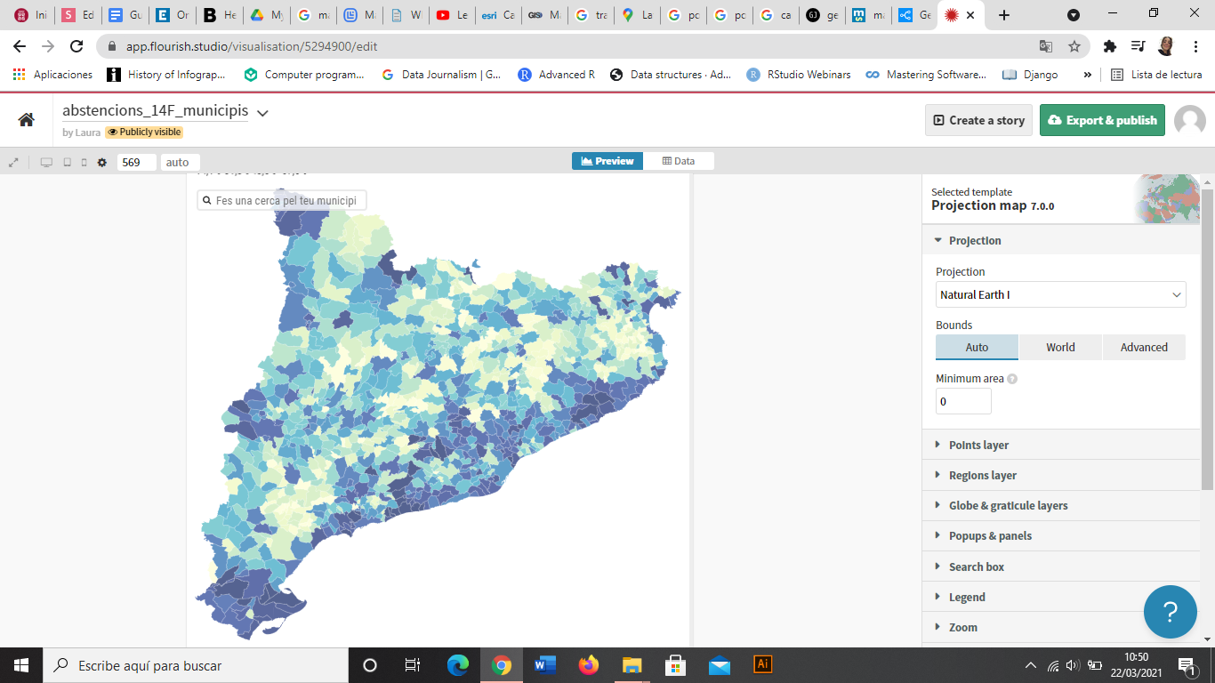
COROPLETAS
BURBUJAS

CALOR


FLUJOS

HEX BINING
Storytelling and Data Visualization
MAPAS
| Latitude | Longitude | name |
|---|---|---|
| 42.061201860 | -0.490321024 | point1 |
| 38.887787884 | -1.537996281 | point2 |
| 38.696322447 | -9.137571576 | point3 |
| geometry | name |
|---|---|
| polygon | region1 |
| multipolygon | region2 |
| polygon | region3 |
Storytelling and Data Visualization
Storytelling and Data Visualization
MAPAS
Los datos geoespaciales dibujan puntos o formas, y almacenan información para cada uno de estos puntos o regiones

Storytelling and Data Visualization
PROYECCIONES
Puntos
Storytelling and Data Visualization
Geolocalizar
- Latitud
- Longitud
Storytelling and Data Visualization
Complementos cuando no hay datos geolocalizados
- Geocode cells
- Zgeocode
- =CONCATENATE(
Storytelling and Data Visualization
Prueba con las direcciones de los animales domésticos de Gavà
Coropletas
Storytelling and Data Visualization
Geoportal
Geoportal

Ejercicios
Fusión de tablas 1 y mapas
Terrazas bbdd
https://public.flourish.studio/visualisation/13158801/
PUNTOS
Estáticos
Ilustrator
Formatos
- .ai
- .svg
- .png
- .jpg
Estáticos

Transformar para móvil (svg)


Otros recursos
· Statistics Division of the UN:
http://data.un.org/
· Google Dataset Search:
https://datasetsearch.research.google.com/
· WHO Database:
https://www.who.int/data
· National Stastistics Institute:
https://www.ine.es/
· Kaggle:
https://www.kaggle.com/
Fuentes de datos
Storytelling and Data Visualization
· The World Bank
https://maps.worldbank.org/
Datos geospaciales
· Map SVG:
https://mapsvg.com/maps/world
· Geographical Institutes websites / Open Data:
http://centrodedescargas.cnig.es/CentroDescargas/index.jsp
Próxima sesión
Resolución + Looker Studio
-
Al final de la sesión seréis capaces de:
-
Importar archivos de diferentes formatos y diferentes fuentes a Google Data Studio
-
Aprender a hacer gráficos y mapas con Google Data Studio
-
Hacer dashboards y storytelling.
-
Publicar
Gracias
eli@storydata.cat
Twitter @eli_vivas | @storydatabcn
IG @storydata
Storytelling & Dataviz Eada
By Storydata


