Research Into Magazine Adverts
ELLIE GOULDING


This is a magazine advert for Ellie Gouldings 'Halcon Days' which is advertising her tour dates around the UK. The magazine advert is similar to her Digi-pack with the fading color change of dark blue, fading to indigo and becoming a bright magenta color at the bottom. In the picture of Ellie on the Advert she frames her face as a main focal point with her hands to create a nice head shot. All the writing on the page is in bold white writing which is very clear to the viewer along with her logo at the top of the page. The writing inside the box is slightly darker to take the focus else where as it is showing the dates which are sold out. Ellie isn't looking directly into the camera which makes her look less intimidating to the audience.
The font used in this advert is the same as what is used in her album 'Halcon Days' which creates cohesion through her promotion and merchandise. The picture's in both the Digi-pack and the advert are similar so the fans would recognize them to be taken within the same shoot.
Links to external websites and numbers are added at the bottom of the advert which is where we would instinctively look for this type of extra information.
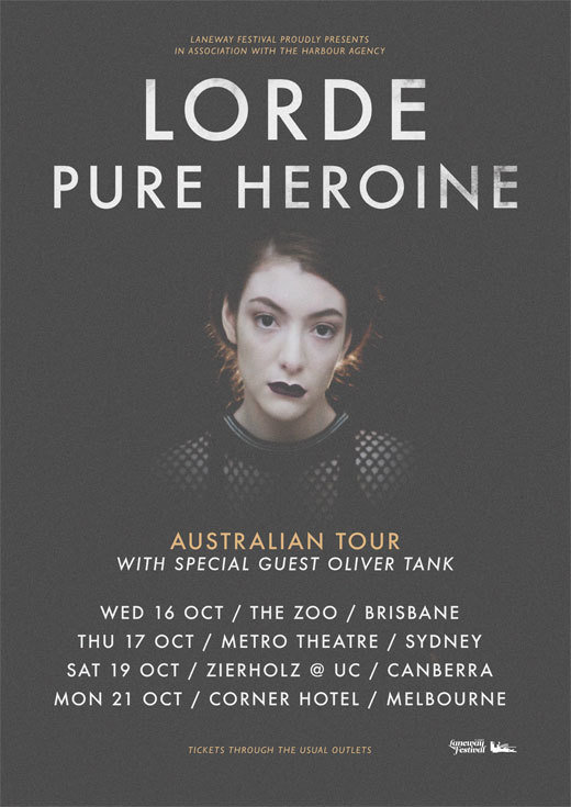
LORDE

This is a magazine advert for 'Lorde's' tour dates around Australia based on her album 'pure heroine'. Her magazine advert is similar to her album cover with the same use of white bold font and a dark background which connotes power and independence. The picture of Lorde makes her look heavenly as oppose to the dark back ground. Although, the over all feeling of the image is quite negative due to the dark colour tones it does make her seem superior. The close up of Lorde is in the center of the the advert which makes her stand out. She is using direct address by looking into the middle of the camera. Usually, this would make the artist look very intimidating, however in this advert she has a neutral look on her face which makes her look appealing to the audience along with her dark features.
The only colour used in this image is yellow. This is shown in the image through the editing of highlighting her hair line so it separates the image of her face from the back ground. Also the small print at the top and bottom of the pace is in yellow so it is easier to read along with 'Australian tour' so the people looking at the advert are clear to where the tour is being held. Also, Lorde is consistent with her white font throughout the advert and the CD cover to show where and when her concerts are being held which is clear to the viewer.


ED SHEERAN
This is magazine advert of Ed Sheeran's tour dates for October 2014 in support of his second studio album 'X'. This picture of Ed Sheeran in the advert is a basic mid shot and is portrayed as quite laid back as he is wearing a basic black t-shirt, with scruffy hair and he isn't looking at the camera. It could be argued that he is trying to make himself look welcoming by showing he is like any average person which is shown through his clothing and tattoos. He isn't trying to live up to his fame and this is appealing to the audience.The picture of Ed Sheeran is in colour but has been edited to a more vintage tone. The advert links to the CD cover of the album 'X' through the colour theme alone. Any regular fan of Ed Sheeran's would know that the advert is about the album 'x' because he has defined it using the colour green. Ed Sheeran tends to use a similar font throughout many of his albums and the colour's of white and green on the magazine advert make the information stand out. The general information is shown in green such as his tour dates and related websites. However, the month and year of the tour and the fact that his album is now available to purchase is shown in white writing so it is clear to the viewer. His logo of a paw print is also shown on the advert which is consistent throughout most of his advertisement.
EMELI SANDE


This is Emeli Sande's magazine advert for her album 'Our Version Of Events' which is advertising her tour dates in 2012 around the UK. The advert holds a lot of similarities with her CD cover as the monochrome colour's of black and white are consistent in both. Also the images used in both pieces of advertisement are similar and would make the audience think that the pictures were taken within the same shoot. It is effective to use images from the same shoot as the album cover for her tour dates advert as the audience can immediately relate the tour advert to the album. The image of Emeli Sande in the magazine advert is effective as it hides her identity which makes her look in control and independent. The only difference between the two sources of advertisement is the difference in font. In the magazine advert bold white writing is used throughout which makes the key dates of the tour stand out. External links to websites and are at the bottom of the page in small white print which is where the viewer would instinctively look for this information.