
http://bit.ly/2VIOyOp
Link to slides:


Angular


Agenda

Presenters


CSS is the easiest and fastest launching point for rendering animations on websites and web-applications.
Compared to JavaScript-level animations, CSS has pros & cons.
Wins

- Benefits entirely from CSS (the cascade, specificity)
- All CSS code can be placed into stylesheets
- Easy to mix together with media queries
- Consistent API across all major browsers (transitions and keyframes)
- Good for simple animations
Cons:

And the following cons:
- Very difficult to sequence animations across multiple elements
- CSS state across classes/elements is difficult to intercept and manipulate through JavaScript
- Dynamic heights, positions and display values are not the same in transitions vs keyframes

CSS transitions are animating the visual change between element style states. Just about all properties are supported, and it is fully supported through all browsers.
button {
  background:blue;
  color:white;
  padding:50px;
  font-size:50px;
}

button:active {
  background:green;
}
There are two states in this example and the background color is changing between the states. To animate this change we can add in a transition in between the two:

button {
  background:blue;
  color:white;
  padding:50px;
  font-size:50px;
}

button:active {
  background:green;
}
button {
/* same as before */
}
button:active {
transition:300ms ease-in;
background:green;
}button {
background:blue;
color:white;
padding:50px;
font-size:50px;
/* animation css here */
transition:300ms ease-in;
}
button:active {
background:green;
}
button:hover {
background:orange;
}The transition can also be placed into the starting CSS state value and now every state change will render a 300ms effect.

Example 1: Simple CSS Transition

Example 1: Simple CSS Transition

Any CSS transition change can happen if and when the styles on an element change. This can be the result of:
Triggering Transitions
CSS class or attribute on an element
Media query changes
Inline styling being applied

You can also specify the exact properties you want to animate:
Define what gets animated:
.my-class {
  /* animate specific properties */
  transition:1s width;
  transition:1s width, 2s height;

  /* animate with easing */
  transition:1s all ease-out;
  transition:1s all ease-in-out;
}
Note: that no transition will take place if there is no styling change.

.my-class {
  /* animate specific properties */
  transition:1s width;
  transition:1s width, 2s height;

  /* animate with easing */
  transition:1s all ease-out;
  transition:1s all ease-in-out;
}
Define what gets animated:
button {
  background:red;
  transition:300ms ease-out;
}

button:hover {
  background:red;
}
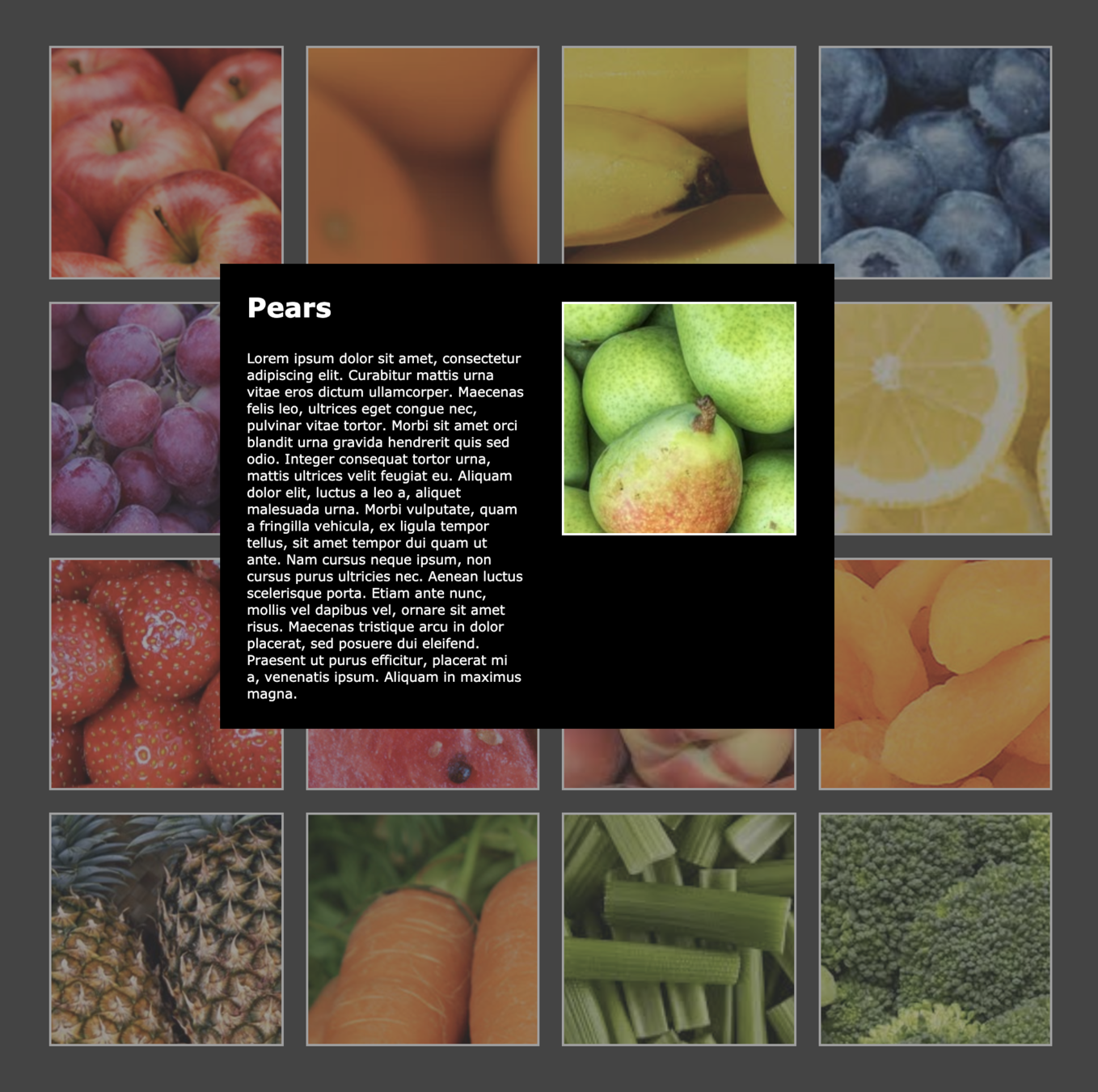
Example 2: Grid Animations
In the example below, we animate when three (3) different things happen:
- the element’s :hover state is activated
- a class called .active is added to an element
- the page size change causes a media query to fire
.gallery-entry .picture {
  transition:300ms ease-out;
}

.gallery-entry:hover .picture {
  transform:scale(1.2);
}

.gallery-entry.active .picture {
  transform:scale(1.3);
}

#gallery {
  transition:500ms all;
}

@media only screen and (max-width: 600px) {
  #gallery {
    height:calc(200vh - 100px);
    grid-template: repeat(2, 50fr);
  }
}
Example 2: Grid Animations
CSS Keyframe animations are another option to animate styling using CSS. They are designed to be reusable and are not tied to the state of the DOM. Instead, they are activated once the animation style on an element is assigned.
@keyframes fadeIn {
  from { opacity:0; }
  to { opacity:1; }
}

.some-class-with-animations {
  animation: fadeIn 1s;
}
CSS Keyframe animations are supported in all browsers and can be used together with class-changes, attribute mutation, inline styles and media query changes.

CSS Keyframe Animations

Example 3: Loading Animation
This loading indicator is used in the following way:
<div class="loading-indicator"
     style="--width:100px; --height: 100px; --border:20px">
</div>
.loading-indicator {
/* CSS variables are used here so we can easily change
* values without having to rewrite everything... */
--width: 100px;
--height: 100px;
--border: 20px;
position:relative;
height:calc(var(--height) + var(--border) * 2);
width:calc(var(--width) + var(--border) * 2);
}
.loading-indicator:before {
content:"";
top:0;
left:0;
position:absolute;
border:var(--border) solid transparent;
border-top-color:rgb(248, 73, 73);
border-bottom-color:rgb(248, 73, 73);
border-radius:var(--width) var(--height);
width:var(--width);
height:var(--height);
}
Example 3: Loading Animation
Now let’s add the rotation animation:
.loading-indicator:before {
  animation:1s linear rotate;
}

@keyframes rotate {
  from { transform: rotate(0deg); }
  to { transform: rotate(360deg); }
}
Example 3: Loading Animation
@keyframes colorCycle {
  0% {
    background:red;
  }
  20% {
    background:purple;
  }
  40% {
    background:brown;
  }
  60% {
    background:maroon;
  }
  80% {
    background:blue;
  }
  100% {
    background:red;
  }
}
Multiple KeyFrame Animations
CSS Keyframes can be set between 0% and 100%.

Example 4: Multiple Keyframes
Add a Hover animation to the button to scale the button size and change the button background color.
Use the :hover pseudo selector and define a scale transformation on the `.loading` class
On the `.loading` class, use transitions to add scale transformation.
Define a keyframe animation that changes the background color from red to blue
Step 2:
Step 1:
Step 3:

Coding Lab


Challenge: Button Hover Effect

SOLUTION
SOLUTION Button Hover Effect
JavaScript
with GSAP


Why GSAP
for HTML5 Animation?
- More control than CSS Animations
- More intuitive than CSS Animations
- Animation Anything
- Faster than CSS3 animations and transitions
- Build Complex Choreographies
- SVG Wizardry
- Solve browser compatibility issues
- 20x faster than jQuery
- 7 million sites use GSAP
Animation Anything
with GSAP
- DOM elements? Canvas library objects? Generic JS objects? No problem.
- You're not locked into building your whole UI in a highly opinionated, proprietary API.
- Colors, complex values like boxShadow, and almost any css property
- Properties or methods
- Interpolate units
- Animate a single object, arrays, or selector objects containing any number of elements
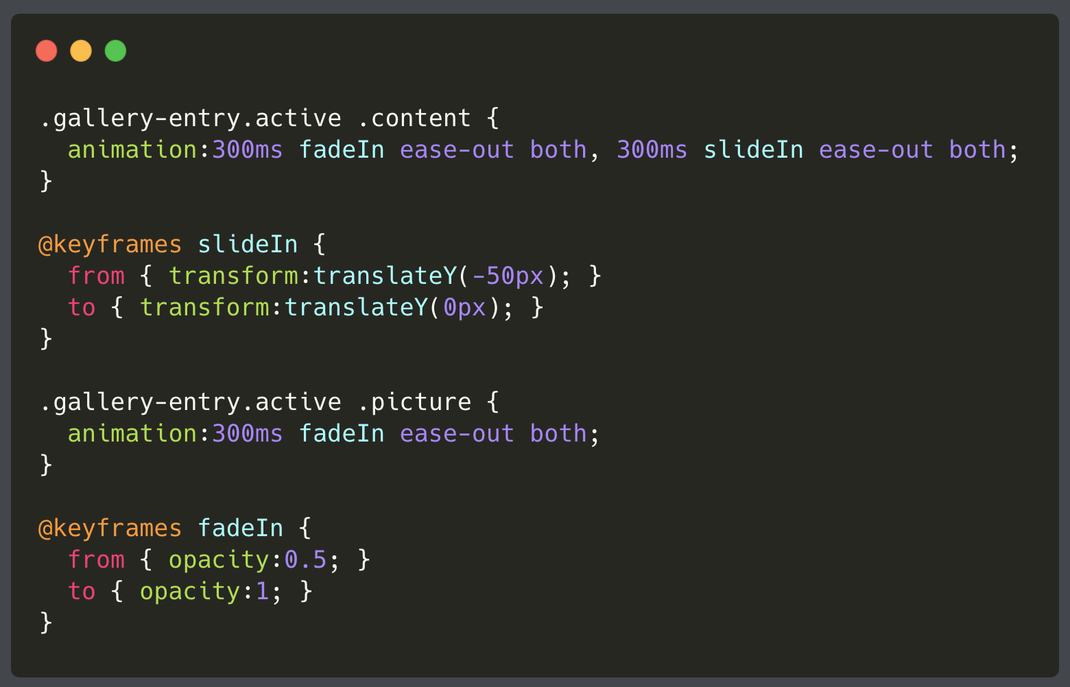
- Cannot control the entire animation.
- CSS animation code is not maintainable
- CSS animation code is often LARGE
With CSS3 Animations

CSS3 Animations GSAP
- Remove KeyFrame Animations
- Implement Animations in TypeScript

- Clean UI Code
- CSS used for layouts and styling (not animations)
- Animation code specific to UX desired
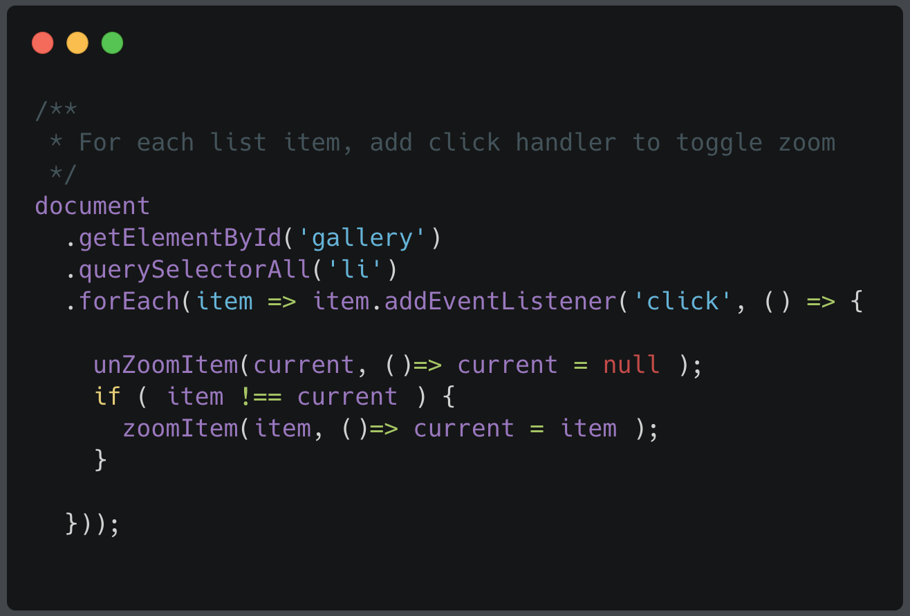
- GSAP used to choreograph zoom and unzoom
- GSAP animates DOM elements directly
Animations with GSAP Timelines
Quickly build sequences, stagger start times, overlap tweens, experiment with eases, leverage various callbacksand labels, and create concise code.
Animation choreography is in the TypeScript layers.
With GSAP


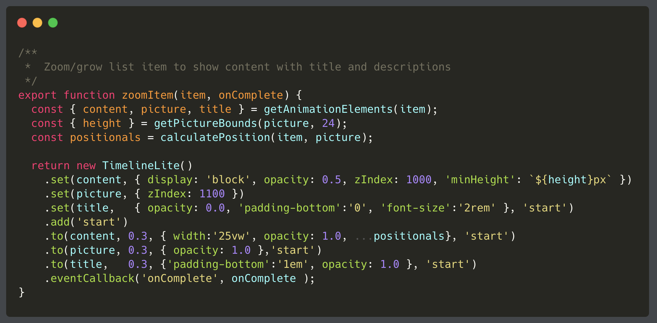
Declarative Timelines
Demo: Click Animations

Add a Hover animation to the list item image which is to scale the button size and change the title text color.
Get a reference to 'div.picture img' DOM element
Add a hover event listener that will create a new new Timelinelite()
In the hover timeline change the title text color to red
Step 2:
Step 1:
Step 3:

Coding Lab
Challenge: Image Hover Effect
SOLUTION Image Hover Effect
SOLUTION


GSAP Issues
-
Manipulates DOM elements directly
- Angular abstracts/hides DOM elements
- Not Angular Native
- Not aware of Router and transitions
- Not aware of ngIf, ngFor, ngSwitch
Why Animations
in Angular
- Angular can make use of CSS transitions and keyframes to better improve the experience of animations. It can also allow developers to tap
- Animation DSL which can be used to orchestrate animations across multiple elements and components.
In angular, CSS transitions and keyframes can be used in order to trigger animations/transitions when there are attribute or class binding changes.
Let’s imagine we have an open-close container that looks like:
CSS Transitions/Keyframes

<div class="open-close-container"
     [style.background]="isOpen ? 'yellow' : 'red'"
     (click)="isOpen = !isOpen">
     <span>The box is now {{ isOpen ? 'Open' : 'Closed' }}!</span>
</div>
When clicked, the box will set the background color of itself (which implies an open/closed state).
CSS Transitions/Keyframes

<div class="open-close-container"
     [style.background]="isOpen ? 'yellow' : 'red'"
     (click)="isOpen = !isOpen">
     <span>The box is now {{ isOpen ? 'Open' : 'Closed' }}!</span>
</div>
.open-close-container {
transition: background .3s ease;
}This improved with refactoring to a
css class:
CSS Transitions/Keyframes

<div class="open-close-container"
     [class.opened]="isOpen"
     (click)="isOpen = !isOpen">
     <span>The box is now {{ isOpen ? 'Open' : 'Closed' }}!</span>
</div>
.open-close-container {
transition: background .3s ease;
background: red;
}
.open-close-container.opened {
background: yellow
}
Demo #1
Animate with Class/Style Changes
Once sequencing and multiple states come into the picture, CSS does not have the power to easily do this work.
Thankfully, the functional API provided by the @angular/animations module provides a domain-specific language (DSL) for controlling animations in Angular applications and creating sophisticated animation sequences.
Animation DSL

- @Triggers
- State
- Transition
When it comes to Angular Animations, all animations take place inside of an animation trigger definition.
Whenever the trigger changes value its state is updated. When state changes then an animation can take control and handle the state change in a transition arc.
All animations live in a component metadata inside of the animation: block.
Animation @Triggers

@Component({
  animations: [
    trigger('myAnimation', [
      //...
    ])
  ]
})
Animation @Triggers

@Component({
  animations: [
    trigger('myAnimation', [
      //...
    ])
  ]
})
And the trigger can be referenced directly inside of the template code or host binding code:
<div [@myAnimation]="myValueExpression"></div>Animations + State

// this is inside of @Component.animations...

trigger('myAnimation', [
  state('open', style({
    height: '200px'
  })),
  state('closed', style({
    height: '0px'
  }))
})
An animation trigger can have various state values. A state is a partial styling representation of the component in a specific state
Animations + Transition

transition('open => closed', [

  // this will animate everything that has
  // changed between the two styles.

  animate('.5s ease')

])
Now for the actual transition (between the states): much like CSS transitions, Angular animation transitions will animate the stylistic difference between the states.
Animations + Transition

trigger('openClose', [
  state('open', style({
    height: '200px',
    opacity: 1,
    backgroundColor: 'white'
  })),
  state('closed', style({
    height: '*',
    color: 'white',
    backgroundColor: '#3F51B5'
  })),
  transition('open => closed', [
    animate('.5s ease')
  ]),
  transition('closed => open', [
    animate('.2s ease')
  ]),
])
Let’s see an example of a closed/open box animation:

Demo #2
Open/Close Box Animation

Add a disabled state to the open + closed Animations
Implement the open/close animation
Add an animation state to openClose for disabled that will change the color and background color to grey.
Setup a transition for open to disabled and closed to disabled and reverse and animate the change
Step 2:
Step 1:
Step 3:
Coding Lab

Change the cursor on the box to react to the disabled state using the style/class binding
Step 4:
Challenge: Add a Disabled State
SOLUTION Add Disabled Effect
SOLUTION
One of the major challenges with animation on the web is detecting when elements have been inserted and removed from the DOM.
Angular is able to detect and intercept this effect with the following directives:
Enter/Leave Animations

<div *ngIf="myExpression"></div>
<div *ngFor="myExpression"></div>
<div *ngSwitch="myExpression"></div>
We can add an animation to any of these directives with an animation trigger. Let’s do this with *ngIf
<div *ngIf="myExpression" @myAnimation></div>To tap into the enter and leave animations for this, we use the void and * animation states:
Enter/Leave Animations

trigger('myAnimation', [
  state('void', style({
    height: '0px',
    opacity: 0,
  })),
  state('*', style({
    height: '*',
    opacity: '*',
  })),
  transition('open <=> closed', [
    animate('.5s ease')
  ]),
])
<div *ngIf="myExpression" @myAnimation></div>
Demo #3
Enter/Leave Animation

Add a Enter and Leave animations
Look inside of the demo at the contentAnimation trigger.
Build animations inside of the enter and leave animations (look at the comments) and make it expand/collapse in height and fade in and out
Step 2:
Step 1:
Coding Lab

Challenge: Enter + Leave Animations
SOLUTION Enter + Leave Animations
SOLUTION
Sequencing animations is one of the hallmark features of angular. What this feature does is allows for an animation trigger to query for elements and orchestrate a multi-element animation using the same body of code (a trigger).
Multiple-Element Animations

trigger('myMultiElementAnimation', [
  transition('* => start', [
    query('.some-class', [
      animate(...)
    ])
  ])
])
By collecting the elements, we can animate changes on each one that was collected.

Demo #4
Multiple-Element Animation
Router Animations

Now with our home page and profile page animations we can start to orchestrate a router-level animation. The steps that need to be done for this to work are the following:
- Setup a <div class="router-container"> element around the <router-outlet></router-outlet>
- Create a new animation trigger called @routerAnimation and attach that to the newly created router-container div
- Setup a transition to animate between the home <=> profile pages
- Animate both the enter and leave animations for both pages
Router Animations

Most of our animation work here is already done since we have the enter/leave animations already defined for both the home and profile pages, but now we are going to have an animation take place on a higher level.
<div class="router-container"
 [@routerAnimation]="prepareRouteState(outlet)"
 (@routerAnimation.start)="scrollToTop()">
  <router-outlet #outlet="outlet"></router-outlet>
</div>- The @routerAnimation will drive the page state change
- Once started then we will call a component method to scroll the page to the top
- We also grab access to the outlet instance so we can figure out what the next route will be when a change occurs
Router Animations

The prepareRouteState method will provide the @routerAnimation trigger with the state of the next page. In the case of the routes, we’ve defined each route to include some extra data with some animation information
// routes.ts
export const ROUTES = [
  {path:'', component: HomePageComponent, data: { animation: 'home' } },
  {path:'profile/:id', component: ProfilePageComponent, data: {animation: 'profile'} },
]
Notice the animation: information?
Well this is exactly what’s provided back into the router state change. This state change will then be picked up by the trigger and a transition will occur.
Router Animations

// app.component.ts
@Component({
  //...
  animations: [
    trigger('routerAnimation', [
      // this will fire when the home page changes to the profile page and vice versa
      transition('home <=> profile', [
        style({ position: 'relative' }),
        // the new routed page is first hidden
        query(':enter', [
          style({position:'absolute', opacity:0, top:'-100%' })
        ]),
        // then we animate away the old page
        query(':leave', [
          style({ position: 'absolute', top:0 }),
          animateChild(),
          style({ opacity:0 }),
        ]),
        // then we animate back in the new page
        query(':enter', [
          style({opacity:1, top:'0%'}),
          animateChild()
        ]),
      ])
    ])
  ]
})
class AppComponent {...}
Router Animations

The example code is designed to animate away the old page (via :leave) and then animate in the new page (via :enter).
The styling that takes place is used to adjust both pages in an absolute way so that they sit on top of each other.
But what about the actual animations?
Well those animations are child animations and they are fired via animateChild().
