Tim Carlson
Winter 2024
CSS Frameworks: Bootstrap
View of the Day
-
Q&A
-
Bootstrap Demo (code together!)
Project: Draft 1
The complete HTML & CSS. A static "screenshot" of what your app will look like.
- Include all of your "pages"!
- Can include just a single example of a "details" page
- May need to copy/paste shared elements (navbars) for now
- Include all sections and components (forms, etc)
- Skip user login forms; we'll provide that through a library
- Be clear what the user will "do" with your app -- where do instructions/etc go?
Project Draft 1
Code requirements:
- Well-written, semantic HTML
-
Significant CSS & styling
- Must include a flexbox or grid (Bootstrap is okay)
-
Accessible
- Check your alts and headings!
-
Responsive
- Must include a meaningful media query!
Project Draft 1
Working as a group:
- All group members are responsive for all aspects of the project. Projects are graded as a single piece of work.
- Do not divide up work by language -- everyone needs to contribute to both HTML and CSS
- Everyone needs to check everything. Don't think of it as "Eddy's page" or "Megha's page". It is your group's project
- Must use git to code collaboratively. We will be checking for commits from all group members.
- Each individual needs to demonstrate understanding of the material.
Q&A / Review
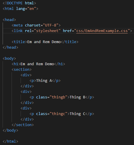
Reminder: What size are em and rem?
They are relative sizes calculated
- EM: From the Parent
- REM: From the Root
Thing B = 50 x .5 = 25px
Thing C = 40 x 1 = 40px
Index.html
style.css
Other questions...
Project Phase 1:
- How much commenting should we do in the code?
- How many lines of code should phase 1 include?
- Can we use bootstrap?
- Do I have to implement the topic I chose from the proposal?
- When to use class vs ids vs tags
Other questions...
Project Phase 1:
- What is @media and how do we use it?
- For our projects do we design for smaller screens?
Updating Lecture Code
Get the starter code from the starter branch, but do all of your work on main.
# switch to starter branch to get new starter code
git checkout starter

# download new starter code
git pull

# switch back to main branch for coding
git checkout main

# merge in new starter code (use default msg)
git merge starter --no-edit

# code and enjoy!
Demo

Link the Framework
<head>
  <!--... other elements here...-->

  <!-- link Bootstrap -->
  <link href="https://cdn.jsdelivr.net/npm/bootstrap@5.3.2/dist/css/bootstrap.min.css"
  		rel="stylesheet" >

  <!-- link own stylesheets AFTER framework -->
  <link rel="stylesheet" href="css/my-style.css">
</head>
minified CSS file!
Let's look at the file!
Non Minified version
Just by linking...
<head>
  <!-- link Bootstrap -->
   <link href="https://cdn.jsdelivr.net/npm/bootstrap@5.3.2/dist/css/bootstrap.min.css"
  		rel="stylesheet" >
  <!-- link own stylesheets AFTER framework -->
  <link rel="stylesheet" href="css/my-style.css">
</head>
Before
After
Bootstrap provides rules that apply to particular classes. Give an element that class in order to style it in a certain way.


Utility Classes Colors
Utility Classes - Spacing
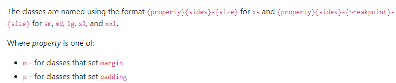
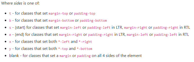
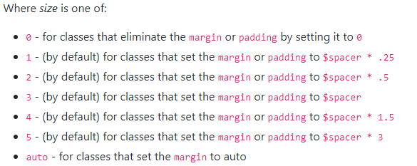
Utility Classes - Spacing
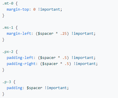
margin top of 0
margin side of 1
padding on left and right of 2
padding of 3
Levels of size range from 0 to 5
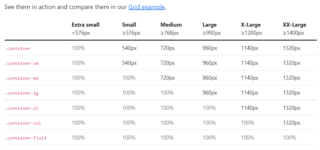
Layout Containers
Components
Buttons, Cards, Carousel, Dropdowns, Navbar, Spinners, etc...
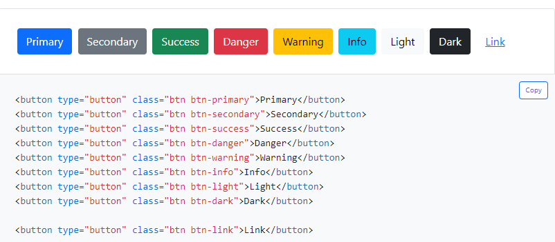
Button example
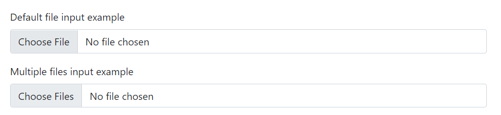
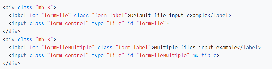
Form Controls
Utility Classes - Display
Utility Display Classes
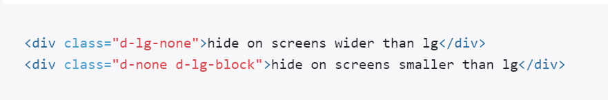
Example:
Syntax
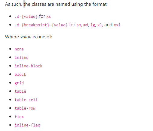
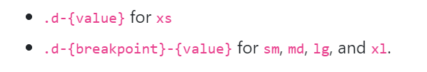
The media queries effect screen widths with the given breakpoint or larger.
Utility Classes
We tend to write the responsive utility classes left to right:
<div class =d-none d-sm-block d-md-none">
Within the HTML brackets '<' '>' the order doesn't matter. Bootstrap has the media query ordered in the CSS file smallest to largest.
Make sure to put link your stylesheet further down in the html file than bootstrap to override bootstrap classes
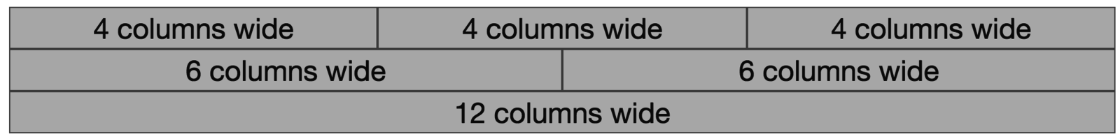
Bootstrap Grids

row
row
column
column
column
Grid Columns
There are 12 columns in the grid
Elements can take up many columns
Row 1:

Row 2:
Row 3:
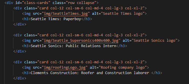
Specify columns based on screen-size

Smaller screen display
A Row:
Example Grid Row
- On xsmall screens, each take up (12/12) whole row.
- On small screens all 5 items have default of (12/6) 2 columns
- On medium screens, (12/4) 3 cols
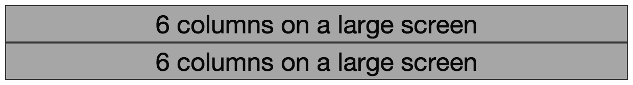
- On large screens, (12/3) 4 cols
- On xl screens, (12/2) 2 columns
Interactive Widgets
Bootstrap provides interactive "widgets" you can use without writing JavaScript code, by using specific HTML attributes.
https://getbootstrap.com/docs/5.3/getting-started/introduction/
<!-- include Bootstrap library (before your script!) -->
<!-- copy script tag from the Bootstrap home page -->
<script src="https://cdn.jsdelivr.net/npm/bootstrap@5.3.2/dist/js/bootstrap.bundle.min.js" </script>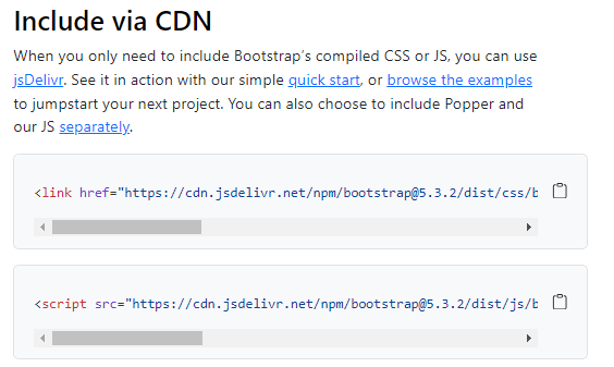
Example: Collapsables
As a simple example, you can make an element "collapsable" so that it disappears with a button click!
<button class="btn btn-primary"
        data-bs-toggle="collapse"
        data-bs-target="#collapseExample"
        aria-expanded="false" aria-controls="collapseExample">
   Button with data-bs-target
</button>


<div class="collapse" id="collapseExample">
    Some placeholder content for the collapse component. This panel is
    hidden by default but revealed when the user clicks the toggler.
</div>
aria for screen-readers
Example: NavBar
See https://getbootstrap.com/docs/5.3/components/navbar/ for an example of a NavBar with a collapsible "hamburger menu"
Action Items!
-
Read: through Chapter 10
-
Now is a good time to catch up!
-
-
Problem Set 04 due Friday
- Project Draft 1 due week from Monday
Next: JavaScript!!