COMP 126: Practical Web Design & Development for Everyone
THE CSS GRID
What and why?
-
The CSS grid is a system of layout properties that allows us to stack and line up content in columns and rows
-
Flexbox allows rows or columns; grid allows rows and columns
-
Areas within your grid are containers for your content
-
Containing elements placed within your grid can be turned into sub-grids or flex boxes
A GRID IS A BUNCH OF BOXES
AND YOU PUT CONTENT IN THOSE BOXES
components of a grid layout
CSS grid terms
-
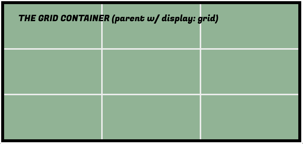
grid container: just like in flexbox: the containing unit
-
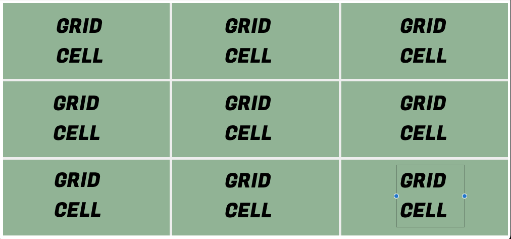
grid item: any DIRECT child element of the grid container
-
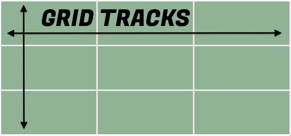
grid track: column or row within the grid container
-
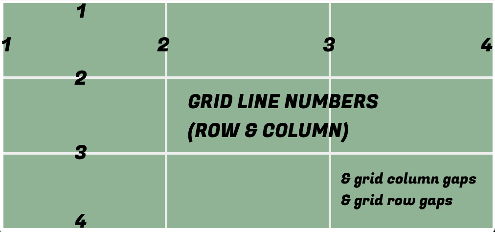
grid lines: the lines bounding each side of a grid track: starts at far left-hand border and ends at far right-hand border
-
grid cell: the space made up by two adjacent row and column grid lines
-
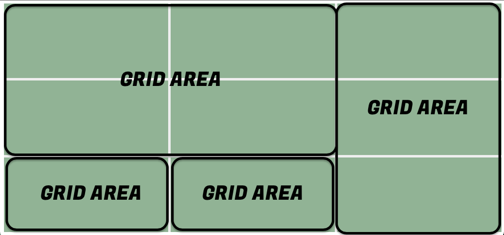
grid area: rectangular area comprising one or more grid cells
-
grid-gap: the gutter/space between rows/columns
-
row axis: the x axis (always, not like in Flexbox)
-
column axis: the y axis (ditto)
in short:
-
A CSS grid is made up of rows and columns
-
A full row or column in a grid is called a grid track
-
The lines at which rows and columns meet are called grid line numbers
-
The cells formed when rows and columns meet are called grid cells
-
Grid cells can be combined to create larger grid areas, which function as containers/organizers for content elements (p, h1, img, etc.) or containing elements (div, header, main, aside, footer, nav, etc.)
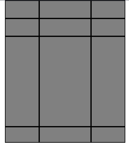
three equal rows, three equal columns
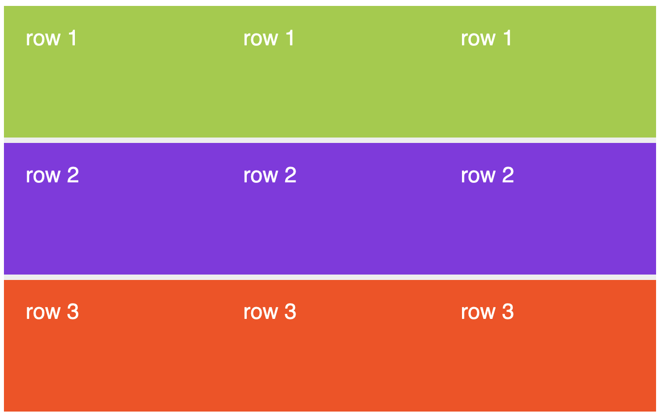
three equal rows, three equal columns
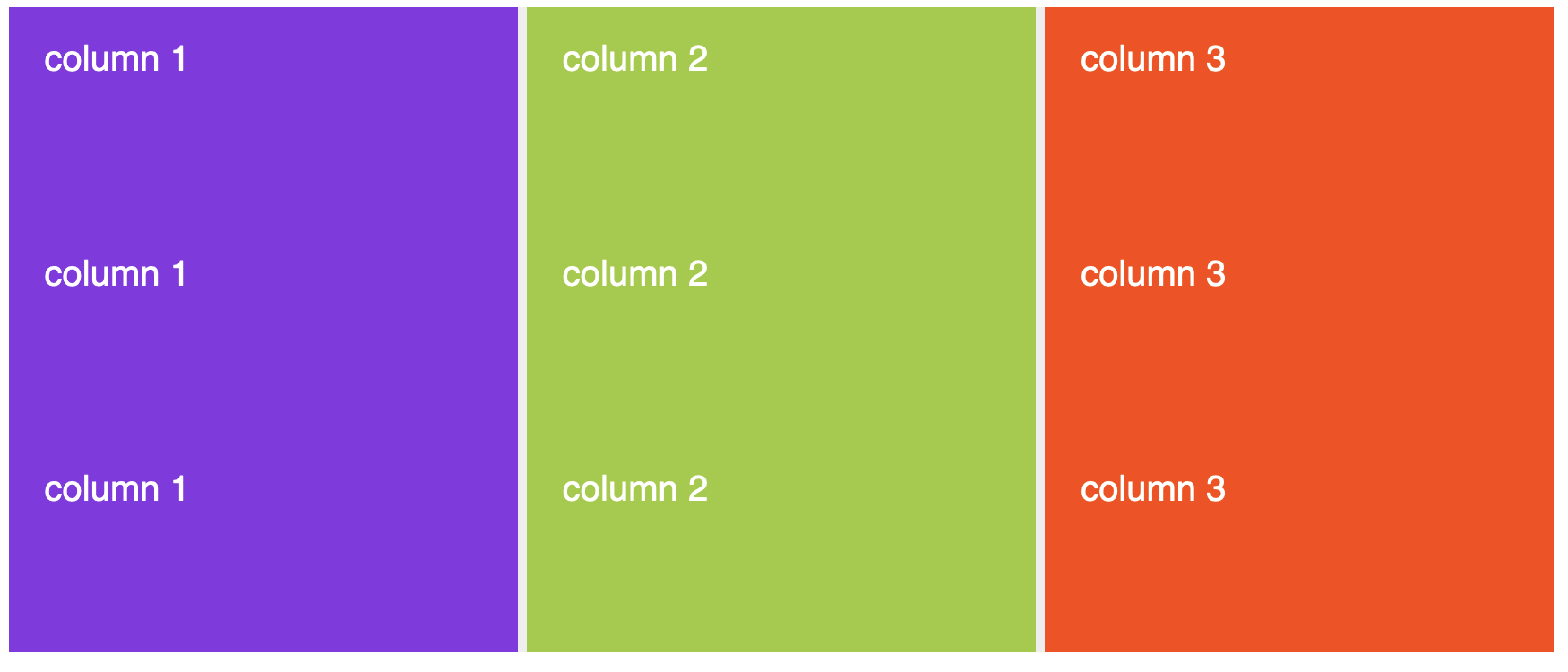
three equal rows, three equal columns
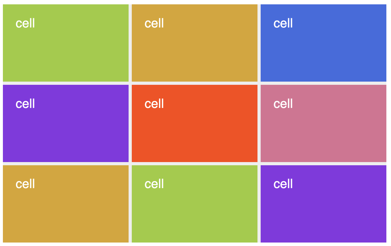
cells can be grid areas, or multiple can be combined into larger grid areas
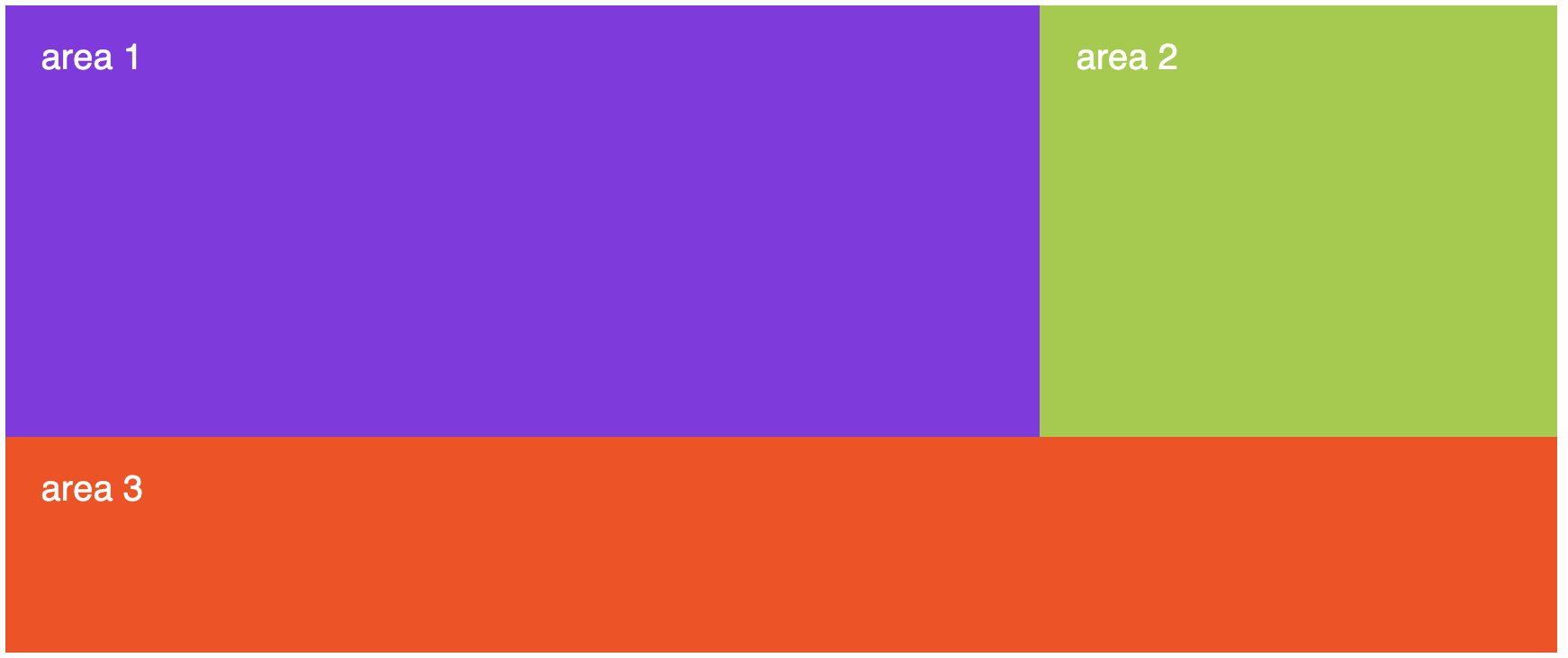
& the areas become containers for content
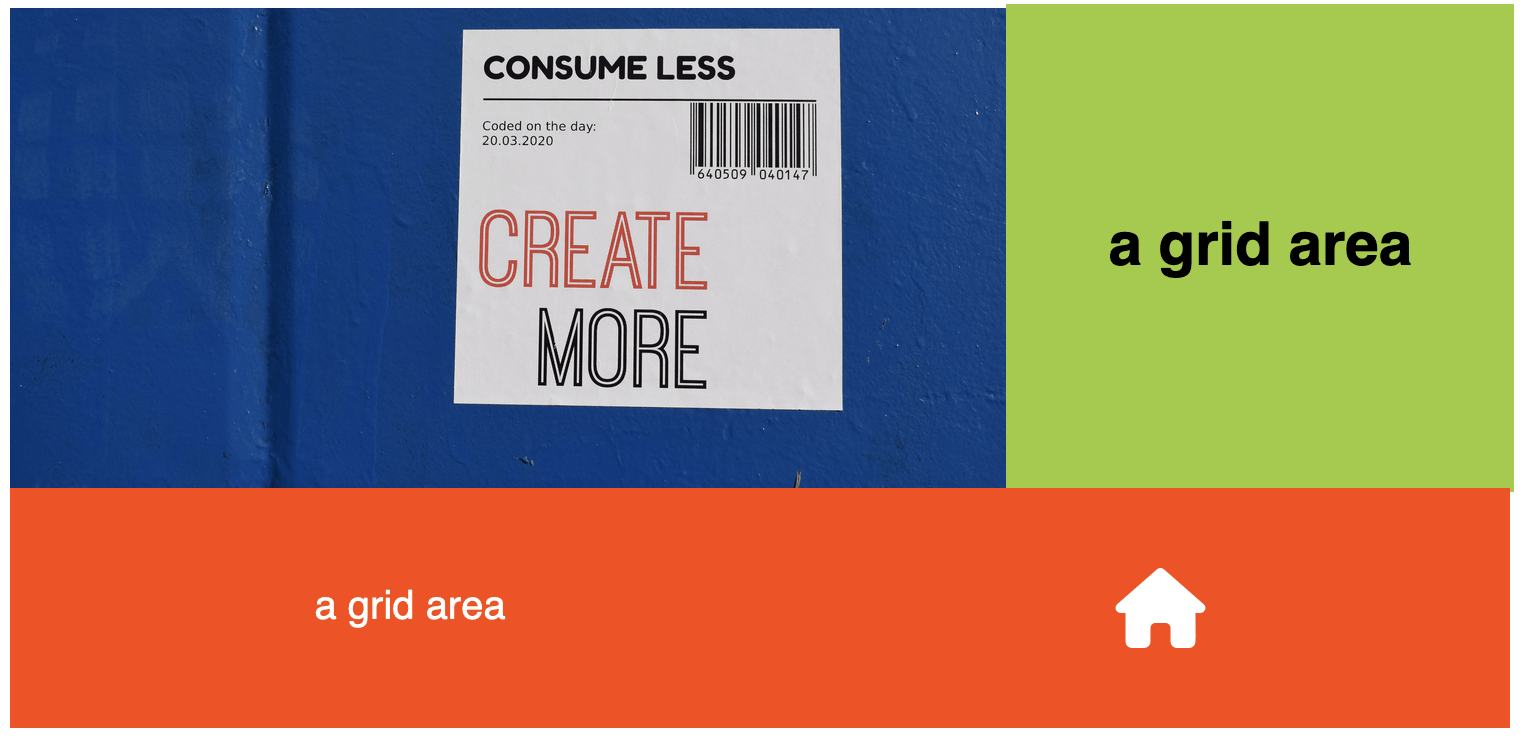
the grid is still there...
you just can't see it
1. come up with the design you want to build
planning your grid
2. sketch out a grid that would provide useful container elements for the design you want--so maybe like this...
planning your grid
...or something like this that could be adapted for use across several different pages...
planning your grid
.grid-container {
  display: grid;
  background-color:grey;
  width: 80%;
  height: 100vh;
  margin: 0 auto;
}
<div class="grid-container">
</div>BUILDING your grid
1. create a grid container with your chosen proportions and measurements

.grid-container {
  display: grid;
  grid-template-columns: 1fr 1.5fr 1fr;
  grid-template-rows: 1fr 1fr 5fr auto;
  background-color:grey;
  width: 80%;
  height: 100vh;
  margin: 0 auto;
}
<div class="grid-container">
</div>BUILDING your grid
2. define columns and rows with the desired measurements/proportions to match your sketch (the lines that you see in the image to the right will be invisible, but they'll be there)
.grid-container {
  display: grid;
  grid-template-columns: 1fr 1.5fr 1fr;
  grid-template-rows: 1fr 1fr 5fr auto;
  background-color:grey;
  width: 80%;
  height: 100vh;
  margin: 0 auto;
}
<div class="grid-container">
<header></header>
<div class="description">
</div>
<main></main>
<footer></footer>
</div>BUILDING your grid
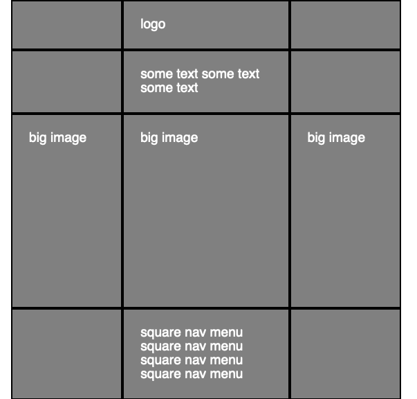
3. add containing elements to the areas where you want them using any of the grid placement methods
<div class="grid-container">
  <header>
    <div class="logo">
      <img src="logo.jpg" alt="logo">
    </div>
  </header>
  <div class="description">
    <div class="intro-text">
      <h2>
        text text text
      </h2>
    </div>
  </div>
  <main>
    <img class="big-img" alt="big image">
  </main>
  <footer>
    <aside class="left-aside"></aside>
    <nav class="subgrid-menu">
    <ul>
      <li></li>
       <li></li>
       <li></li>
       <li></li>
       <li></li>
       <li></li>
      </ul>
    </nav>
    <aside class="right-aside"></aside>
  </footer>
</div>
populating your grid
add content to the containers!
the implicit grid
quick exercise 1: the implicit grid
quick exercise 2: alignment in grid
populating the grid: the grid line numbers method
short exercise 3: grid line numbers
populating the grid: grid template areas method
span
You can tell an element to start at a particular grid line and span a specified number of columns/rows
repeat()
- use the repeat() function on rows and/or columns to create repeating grid tracks
- generally used in situations with many items of equal or similar sizes
redefine the grid for different viewports with media queries
minmax()
use the minmax() function to set parameters for grid tracks