The Speedy Shiba's Guide to Images
on the JAMstack
by Jessica Parsons, with help from Monty and Petunia

Why does it matter?
Photo credits:
All images are my own unless otherwise specified.

Areas for Improvement
- Better image files
- Code for responsiveness
- Server settings
- Workflow & services
File-Level Improvements
- Choose the right format
- Optimize compression
- Choose the right size
Choosing the Right Format
- Depends on image content
- Features vary
- Balance file size vs. quality
- Newer formats change the game
Photos ➔ JPG



JPG - 77 KB
PNG - 77 KB
PNG - 240 KB
Fancy JPEGs
JPEG 2000 - Safari ✓ only
Firefox ✗ Chrome ✗ Opera ✗
- Better quality JPEGs with smaller file size
- No plans to support by other browsers
A cooler JPEG...
(This image is just a regular jpeg)
JPEG XR - IE/Edge ✓ only

Someday maybe:
Screenshots ➔ PNG


PNG - 3.7 KB
JPG - 3.7 KB
JPG - 13 KB
...unless the screenshot is photo-like
Image credit:
Screenshot from Silent Hill 2, published by Konami.
Displayed under fair use.
Animations ➔ GIF


GIF - 4800 KB
JPG - 48 KB
Handy tool: ezgif.com
Someday maybe:
APNG: Animated PNG
Firefox ✓ Safari ✓
Chrome ✗ (coming in v59) Edge ✗ Opera ✗
- The advantages of PNG over GIF, plus animation:
- smaller file size
- more colors
- transparency
- Shows single frame where unsupported
- Demo by Mozilla

More than you expected...
(This image is not an APNG)
What about <video> ?
MP4 - 455 KB
<video width="320" height="240" autoplay loop muted>
  <source src="dogeluge.mp4" type="video/mp4">
  <source src="dogeluge.ogg" type="video/ogg">
  Your browser does not support the video tag.
</video>
Transparency ➔ PNG


JPG - 26 KB
GIF - 111 KB
PNG - 72 KB

But that's not the whole story...
Icons (and many logos) ➔ SVG
SVG - 0.3 KB
PNG - 4.3 KB
SVG - 0.3 KB
PNG - 2.5 KB
PNG - 2.5 KB
Handy tool: vectormagic.com
Bonus: SVG Photo Masks
Handy tool: clippingmagic.com
Taylor Ho: Using SVGs for Transparent Raster Images

WebP
Google's Jack of All Trades
Firefox ✗ Safari ✗ Chrome ✓ Edge ✗ Opera ✓
- Lossless like PNG
- Lossy like JPG
- Animates like GIF
- Does it all in less space
- Some criticize quality
- Info by Google
Like an image format clown car!
(This image is not a WebP)

Someday maybe:
BPG
Better Portable Graphics
Firefox ✗ Safari ✗ Chrome ✗ Edge ✗ Opera ✗
- Aims to do everything WebP does, but better
- Patent-encumbered
- Info by inventor
This smile's worth paying for, right?
(This image is not a BPG)

(now pay up)
Someday maybe:
FLIF
New Kid on the Block
Firefox ✗ Safari ✗ Chrome ✗ Edge ✗ Opera ✗
- Free Lossless Image Format
- Only 17 months old
- Claims to be even better at everything
- No (known) patents
- Info by inventor
Seventeen months old, and already awesome
(This image is not a FLIF)
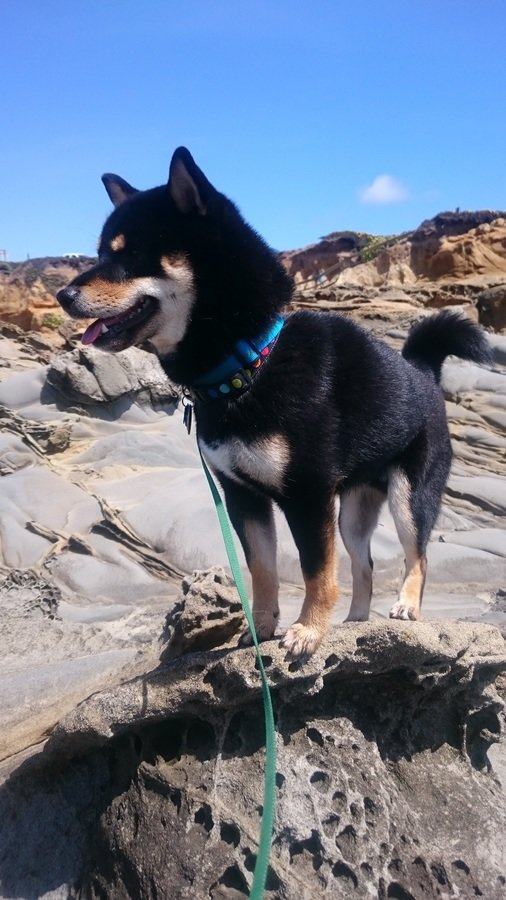
Someday maybe:
Optimization Tools
- JPG: tinyjpg.com
- PNG: tinypng.com
- SVG: SVGO and friends
- Pagespeed Insights

Choose the Right Dimensions
- Don't make browsers download more pixels than they need - save at proper size to fit layout
- What about flexible layouts?
- Not an issue with SVG - infinitely scalable
- Raster images: save multiple versions
handy tool: responsivebreakpoints.com



Code Improvements
- Responsive image dimensions
- Modern formats with fallbacks
- Lazy loading with JavaScript
Responsive Image Loading
with srcset and sizes attributes
<img
  sizes="(max-width: 700px) 100vw, 700px"
  srcset="
    monty_100.jpg 100w,
    monty_350.jpg 350w,
    monty_509.jpg 509w,
    monty_638.jpg 638w,
    monty_700.jpg 700w"
  src="monty_700.jpg"
alt="Monty curled up in bed">- Detailed explanation by Eric Portis at SFHTML5
- Basic template:
handy tool: Responsive Image Linter
What about CSS background images?
Use traditional media queries
.shiba-slide {
    background-image: url("pet-woods_400.jpg");
    background-size: cover;
}

@media (min-width: 401px) {
  .shiba-slide {
    background-image: url("pet-woods_800.jpg");
  }
}
Note: This doesn't always work as you might expect
(see Jake Archibald's talk)
possible future option: `image-set` property
Loading Modern Image Types
Use the <picture> element and type attribute
<picture>
  <source srcset="fancy-doge.webp" type="image/webp">
  <img src="fancy-doge.jpg" alt="Petunia looking very fancy">
</picture>
Can even combine with sizes and srcset!
<picture>
  <source
    sizes="(min-width: 640px) 60vw, 100vw"
    srcset="fancy-doge_200.webp 200w,
      fancy-doge_400.webp 400w,
      fancy-doge_800.webp 800w,
      fancy-doge_1200.webp 1200w"
    type="image/webp">
  <img
    src="fancy-doge_400.jpg" alt="Petunia looking fancy"
    sizes="(min-width: 640px) 60vw, 100vw"
    srcset="fancy-doge_200.jpg 200w,
      fancy-doge_400.jpg 400w,
      fancy-doge_800.jpg 800w,
      fancy-doge_1200.jpg 1200w">
</picture>
Tips & Notes
- Handy cookbook:
dev.opera.com/articles/responsive-images - Browser support is good, but not universal
- Caniuse: picture element support
- Caniuse: srcset and sizes support
- Built-in fallback to `src` attribute, but one size fits all
- Polyfill: Picturefill is great, with caveats
- if you include the `src` fallback, 2 images may load
- if you don't, all image loading requires JS
Lazy Loading
JS library: lazySizes

-
Pros:
- simpler development
- faster initial load (with caveats)
-
Cons:
- image loading is JS-dependent
Server Settings
- Gzip compression
- Cache headers
How can we change server settings on the JAMstack?
By choosing your services wisely!
Gzip Compression
Most hosting services now provide this automatically.
Check your site at checkgzipcompression.com
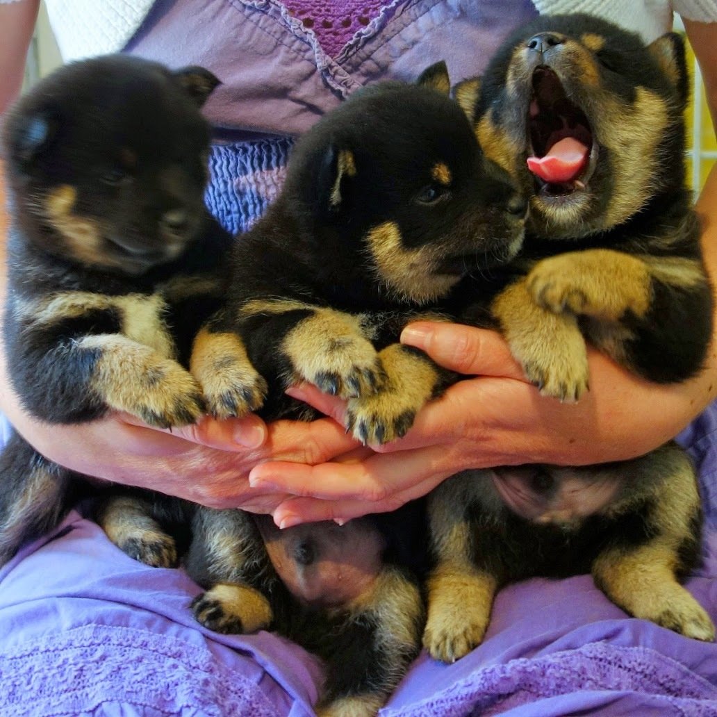
(Not recommended with real puppers)
Gzip compresses similar bits...
... into one!
Browser Caching
- Detailed info from Google
-
Balances load speed (loading from cache) vs currency (won’t see new versions of cached items)
- Some compromise by choosing a short-ish (a few hours) max-age
- Some set long max-age and change filenames
- Some (like Netlify) set 0 max-age, and require etag validation (explanation here)
How's Your Cache?
- Check effectiveness with Pagespeed Insights
- Check methods with Chrome Dev Tools:

Workflow Improvements
- Automation
- Asset management
Automation
- Generating and optimizing multiple image sizes is time-consuming and error-prone
- Lots of tool options, but not very organized
(Spreadsheet compilation here) - When comparing tools, consider:
- Does it require server-side code? Can it be run at build time, or on the fly?
- Is it hosted by a service? Are images built dynamically? Is there a fee?
- Does image loading require JS? (Look for
`data-src` attribute.)
Asset Management
- Storing multiple image sizes in the repo make it slow to clone, and slow to upload
- Generating image variants at build time makes for slow builds
- Git doesn't work well with large binaries: huge diffs
- Can use standard asset stores (Amazon S3, etc.), but setup can be difficult, and workflow is pretty manual

so overwhelm
A JAMstack Example
-
jekyll-responsive-image
- upload largest image size to repo, use liquid tags for markup (single image in repo)
- generates needed sizes at build time (slow builds)
-
jekyll-cloudinary
- upload largest image size to repo, use liquid tags for markup (single image in repo)
- Cloudinary generates and serves needed sizes
Responsive image plugins for Jekyll
Looking to the Future
Thanks!
slides.com/verythorough/speedy-images
