V. Sri
I am a writer designer
Portfolio
Function
Design
Content
Experience
Perception
Comprehension
Task completion
Usability
Information architecture
Messaging strategy
Taxonomy
Voice
Microcopy
Localization
Interface
Interaction
Visual systems
Gestalt
Accessibility
Prototyping
Data Security
APIs
Infrastructure
Performance
Analytics
Contents
Machine Translation, Mindfully Explained
Yelp
Yelp creative

Yelp's in-house creative studio serving community managers, business marketing, and product
introducing machine translation
Machine translated reviews would let users read local reviews in their own language while traveling.
But there was an interesting caveat.
Interesting caveat
Machine translation is imperfect
reviews are hard to translate
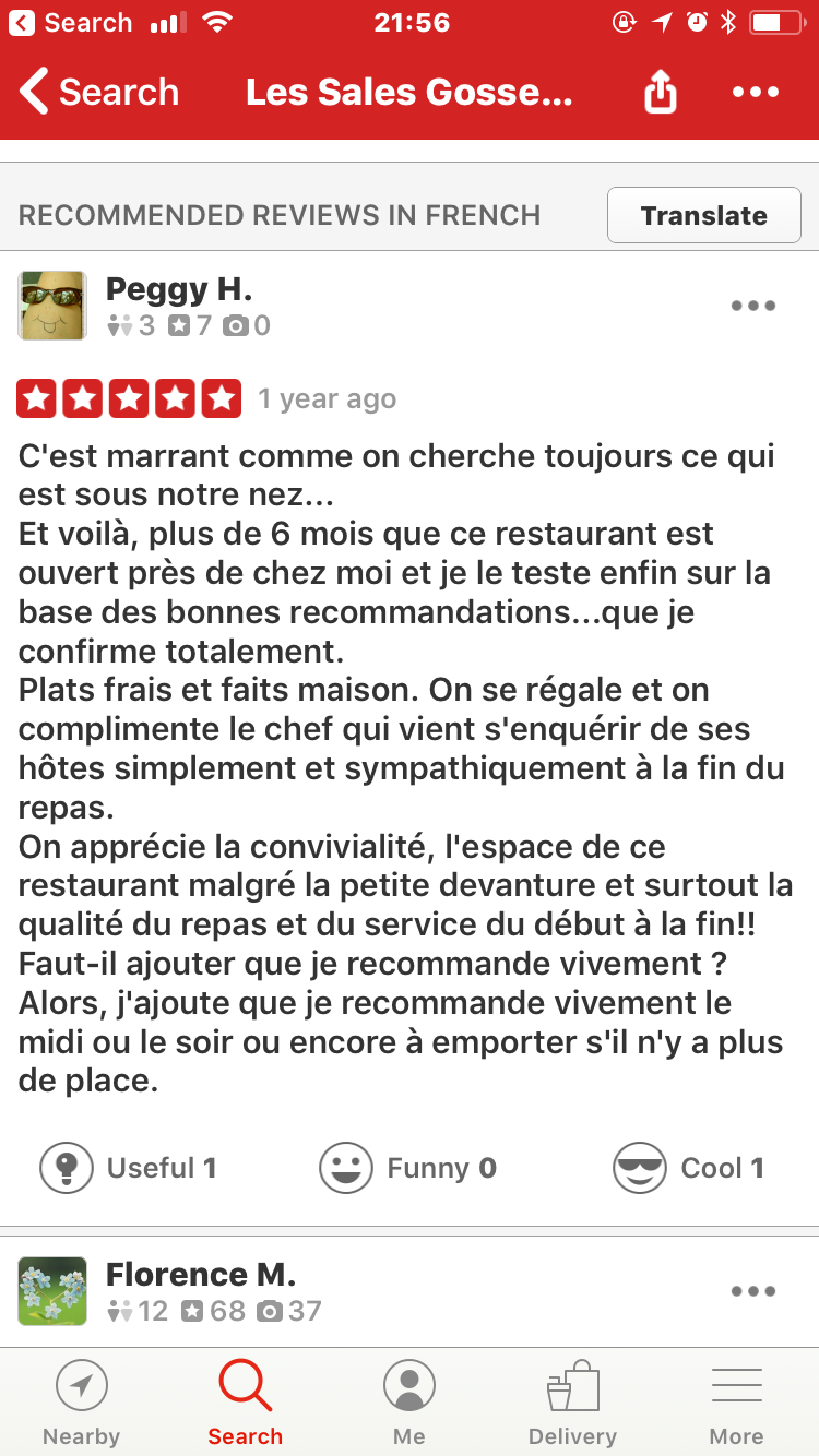
Yelp reviews are full of slang, colloquialisms, misspellings, grammar errors, made up words, and other stylistic choices that make them hard to translate—let alone automatically.
-
Be introductory and informative
-
Be realistic while optimistic
-
Be brief
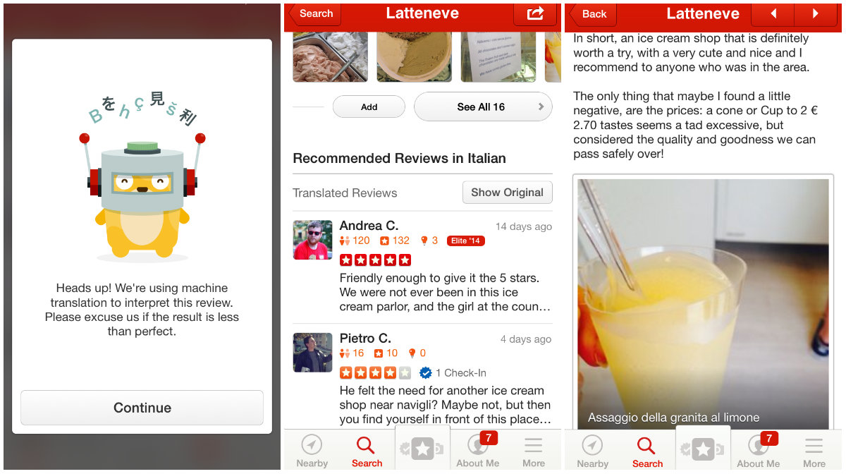
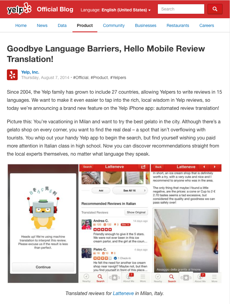
Heads up! We’re using machine translation to interpret this review. Please excuse us if the result is less than perfect.
“Heads up!”
Because it's not a warning.
“Interpret”
Legal advised against “translate.”
“Excuse us”
We shouldn’t apologize either.

Scroll down to see how I might approach this problem today
We’re using machine translation to interpret this review. Your result may be less than perfect.
{¡Hola!}
Could we find a friendly greeting for each language?
"Your result"
Lose "please" and "excuse us" and focus on the user.
How I might do this today
{Howdy!}
{¡Hola!}
{नमस्कार}
here's what shipped
The final content and design featuring Hammy the hamster.
Launch
In August 2014, the international team launched machine translation to the Yelp mobile app.
Contents
Story Ads: A New Chapter in Search Advertising
Ads quality UX
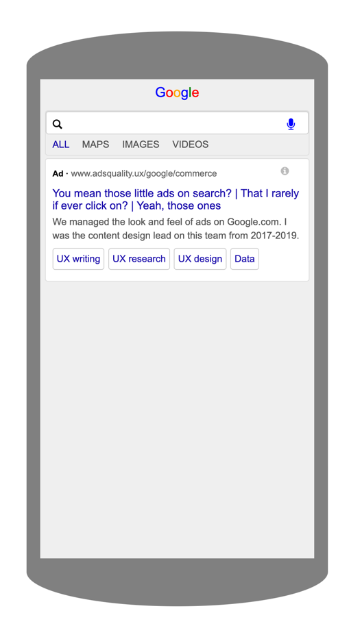
I was the UX writer for the Ads Quality UX team. We were responsible for the look and feel of ads on Google.com.
Ads quality UX
It was an incredibly fun job. And we took our mission seriously.
I worked with quantitative and qualitative UX researchers, interaction designers, UX strategists, UX engineers, data scientists, and product managers every day.
2017

2018
2019
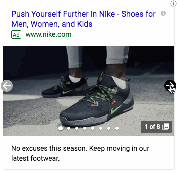
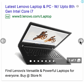
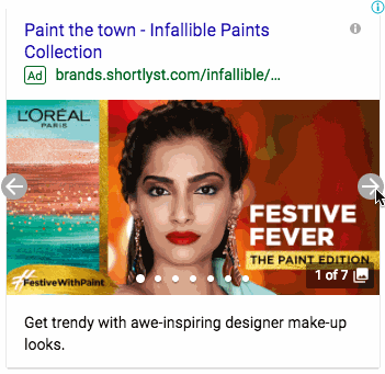
How might we introduce visual formats on search?
Story ads
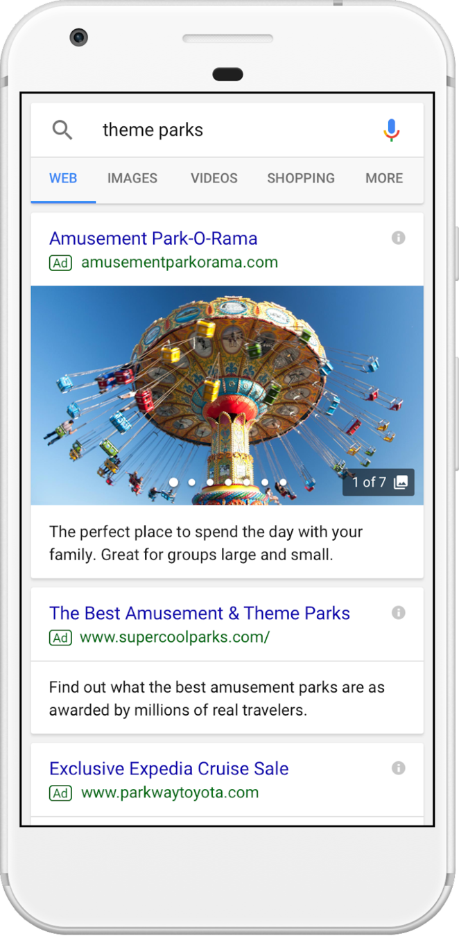
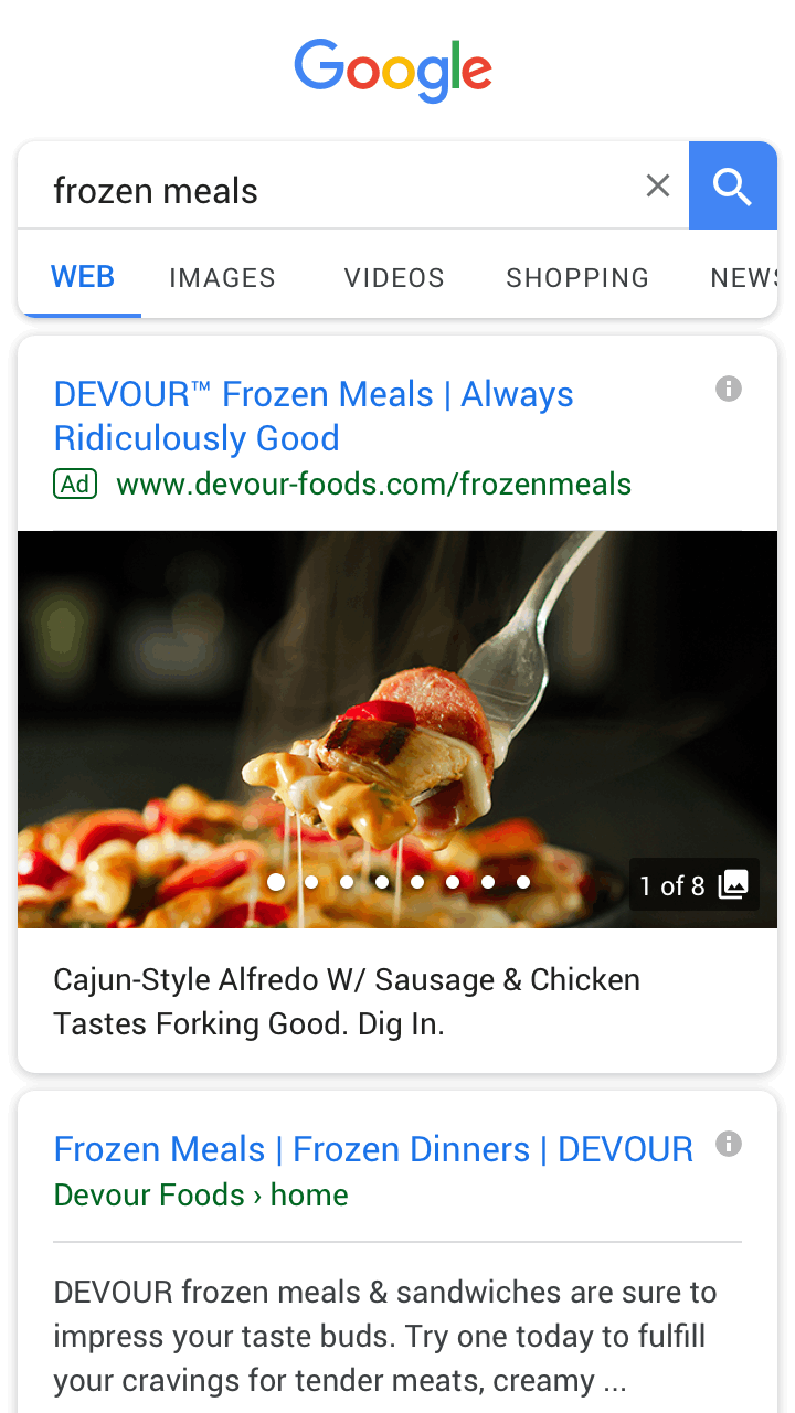
Why don't search ads typically have images?
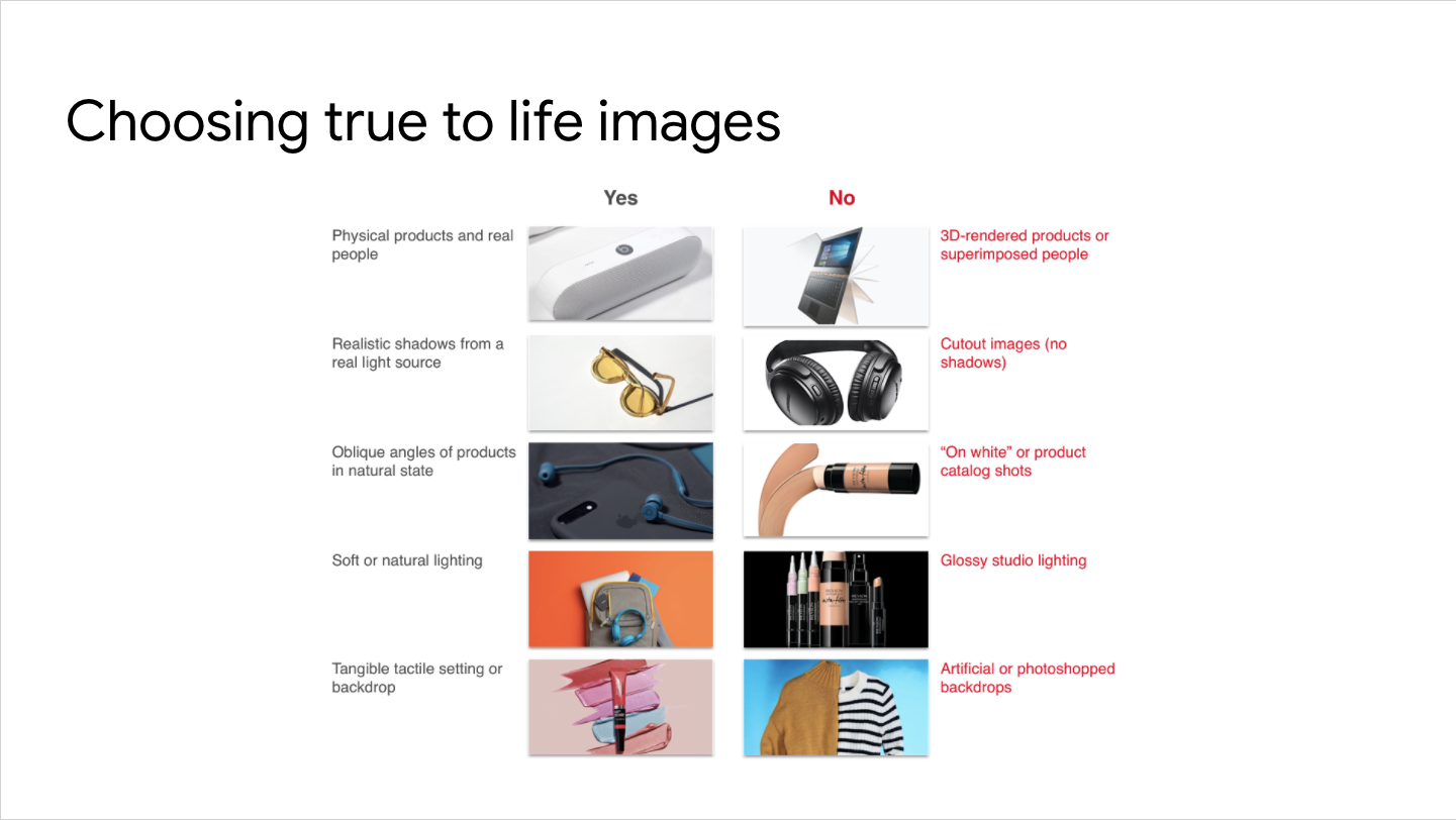
Advertisers struggled to meet our aesthetic standards.
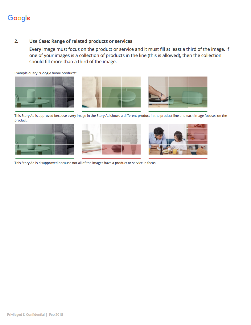
Which images would you approve?
1
2
3
4
5
6
1
2
3
4
5
6
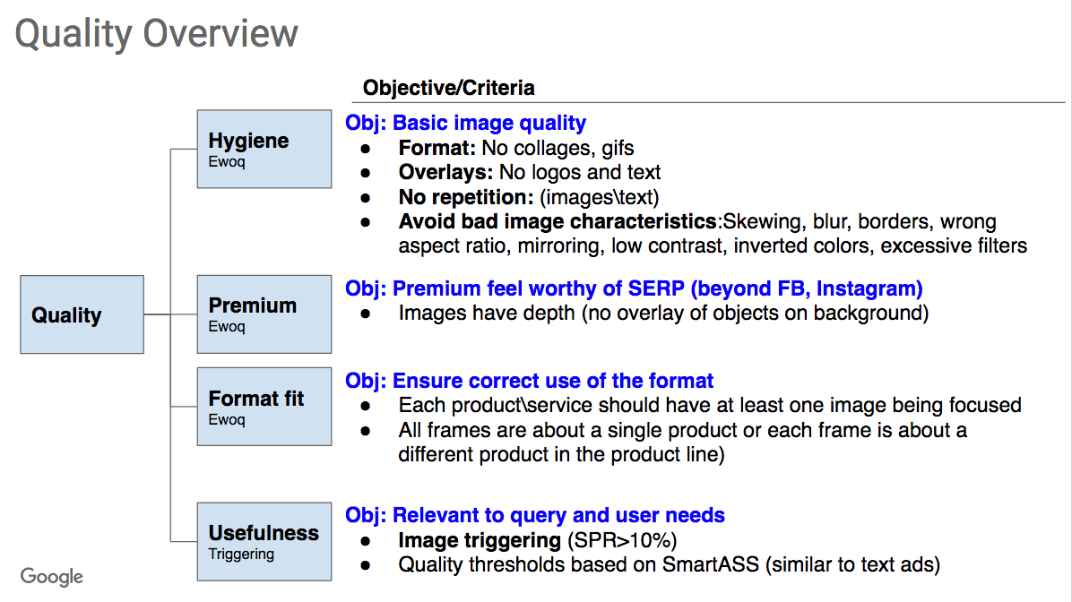
OUR STANDARD WASN'T CLEAR BECAUSE THERE WASN'T A CLEAR STANDARD
In search of a standard
I had the Ads Quality UX team rate sample ads by asking them two questions:
- How would rate the ad in terms of quality?
- How interested are you in the ad?
Title Text
Subtitle
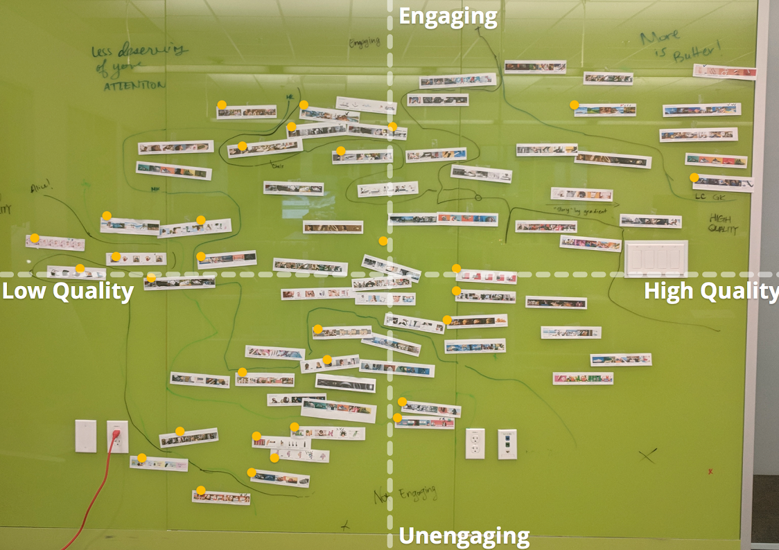
I plotted the results on a 2x2
The dregs
PREMIUM
spammy
Snoozy
How might we translate this to standards?
My initial approach
Let's think about the Audience
Digital marketers not creative directors
More technical and analytical
Less aesthetic and artistic
More like this
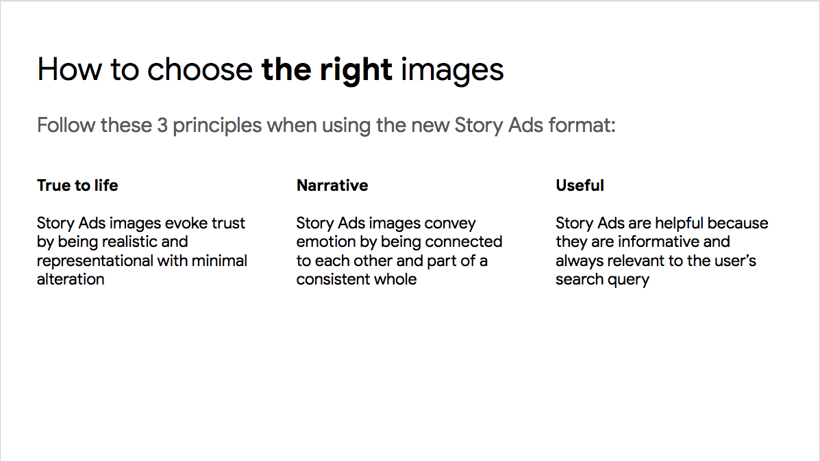
Granularity was the key
numbers and nuance
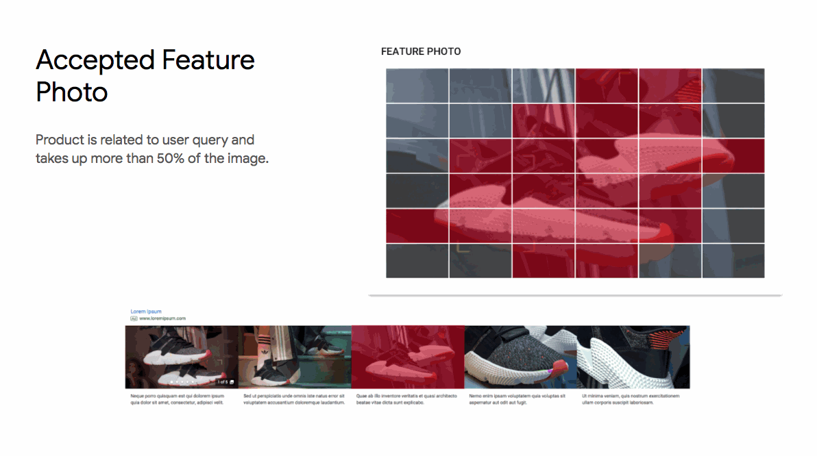
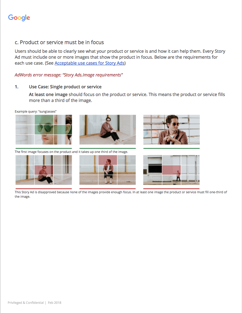
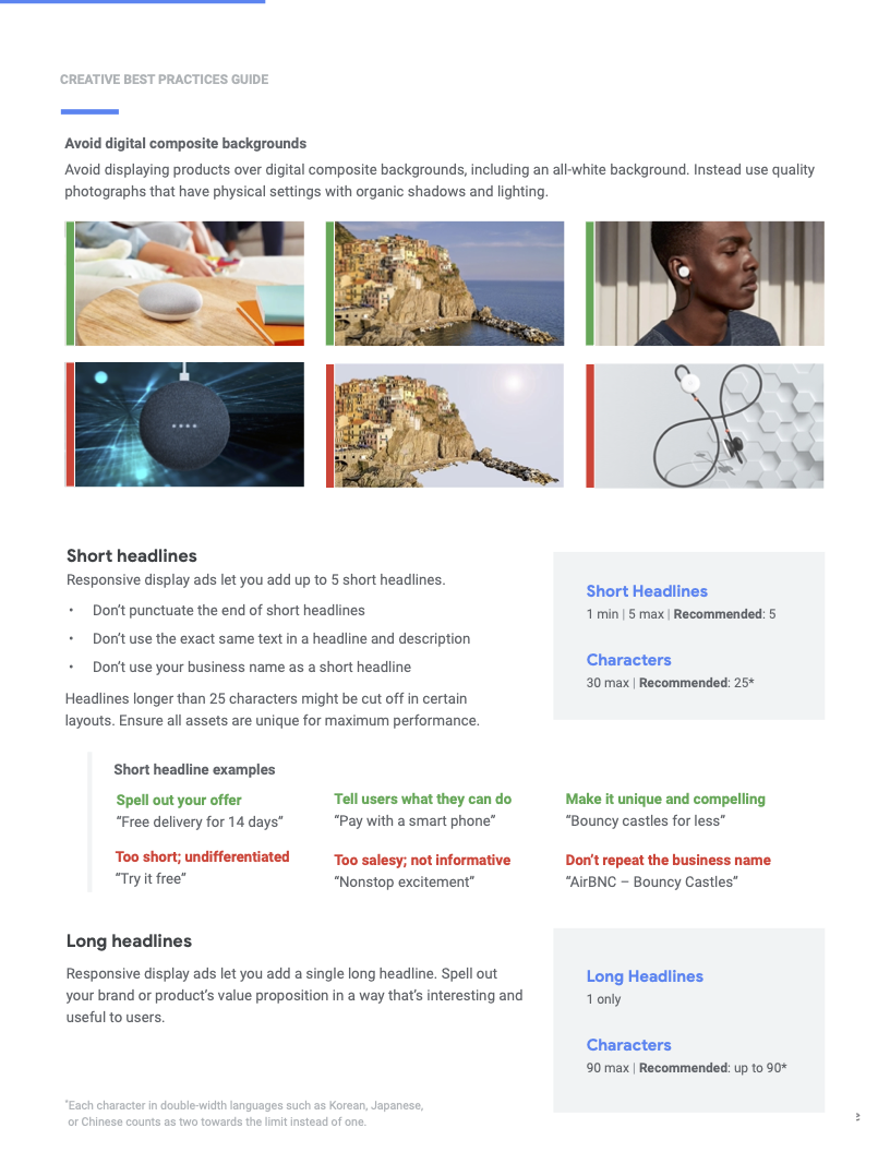
To keep the search results page (SRP) useful, the search query needed to be clearly represented in the image.
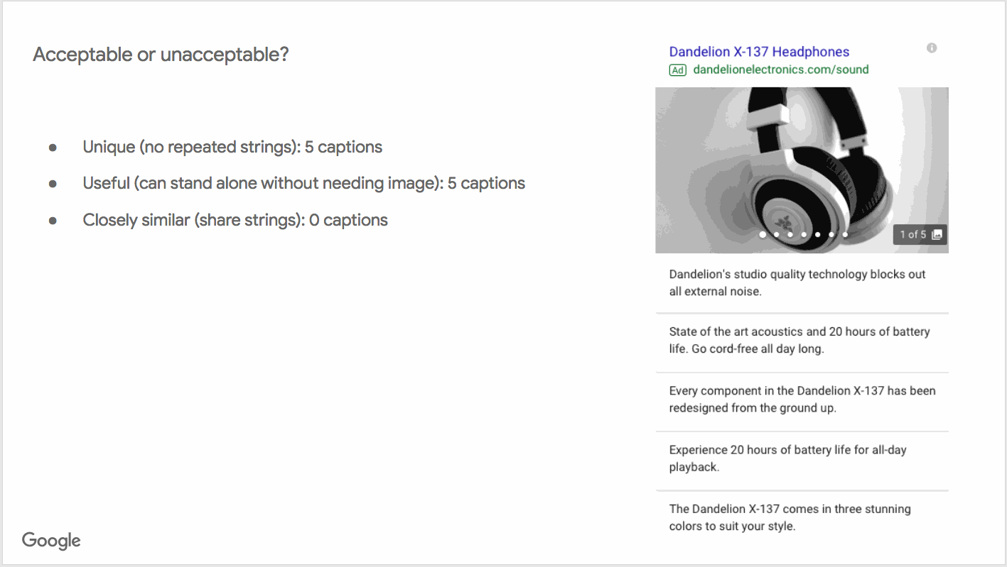
framework for advertisers
I also developed a framework for advertisers to craft copy that worked with our auction mechanics.
Where we started
Where we ended up
These specifications improved image quality by 86%
Launch
After more testing and a successful pilot, this product launched as “Gallery Ads” at Google Marketing Live in May 2019.
Un-launch
After about a year, Gallery Ads were retired in favor of Image Extensions.

Image standards live on
I was approached by another team at Google to repurpose these standards for Responsive Display Ads.
Contents
Coming into focus mode
Zendesk
Zendesk
At Zendesk I worked on a globally distributed team of content designers who are each embedded in specific product areas or areas of focus.
My area of focus was the agent experience.
Moonlighting
A "timeboxed effort" indeed
Because this was a side hustle, I could only meet with the Dublin-based team once per week.
The entire thing took 12 weeks from soup to nuts. This is that process.
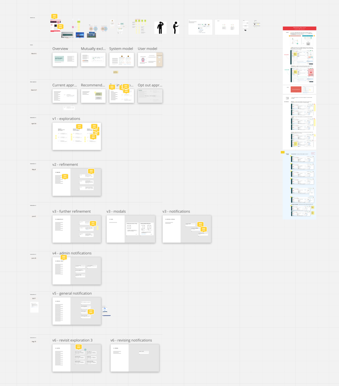
This took 12 weeks
Mutual exclusive channels → Focus mode
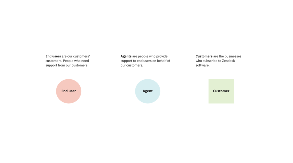
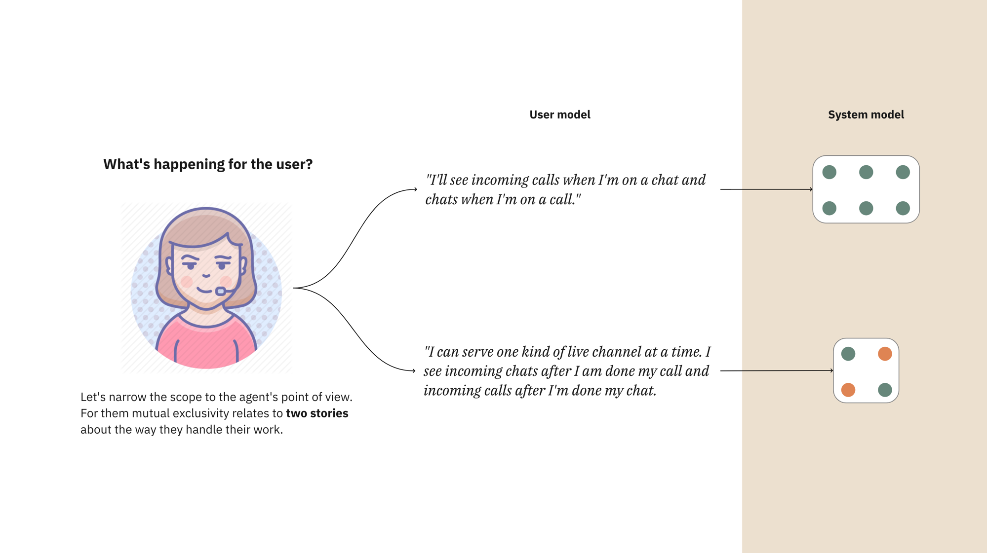
Who are we talking about?
What are live channels?
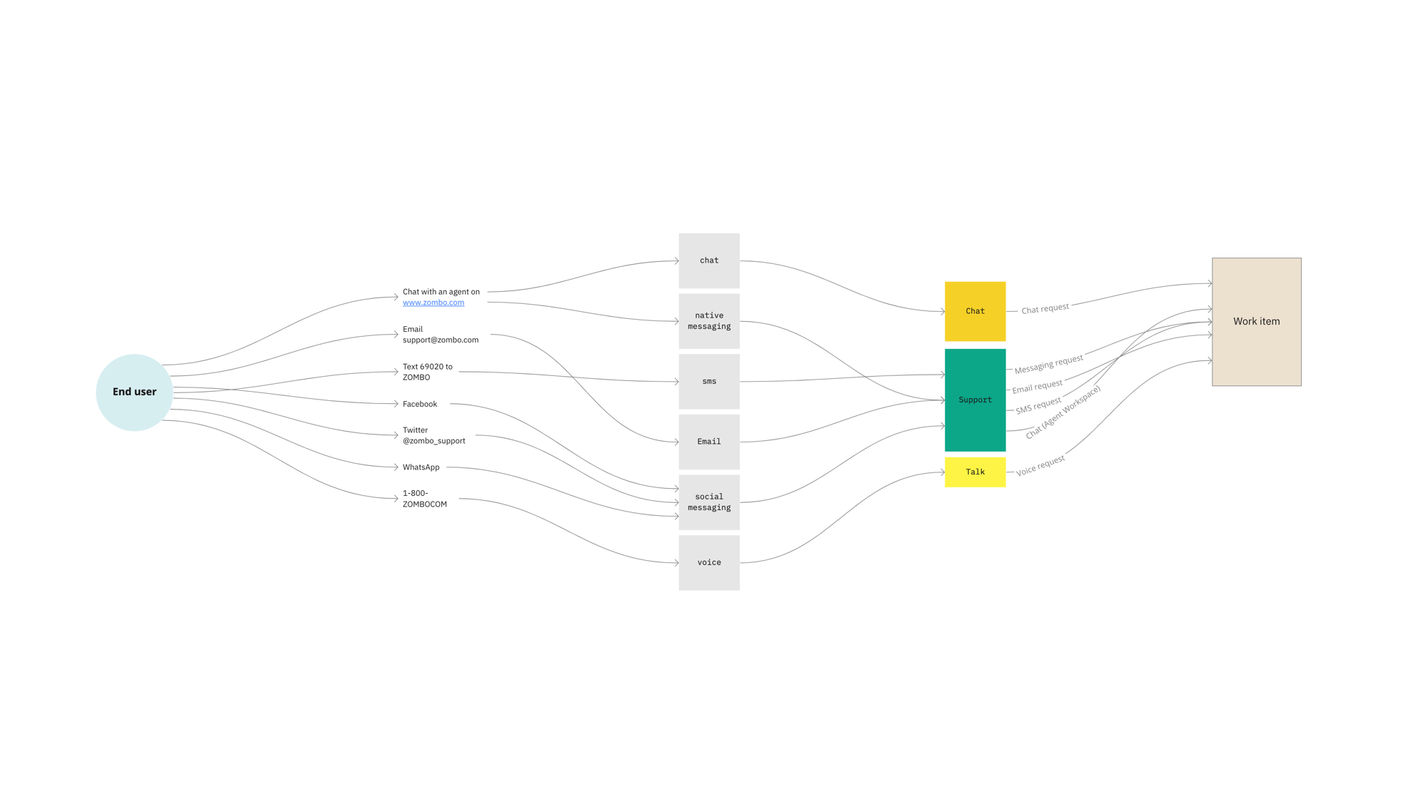
Agents struggle with live channels
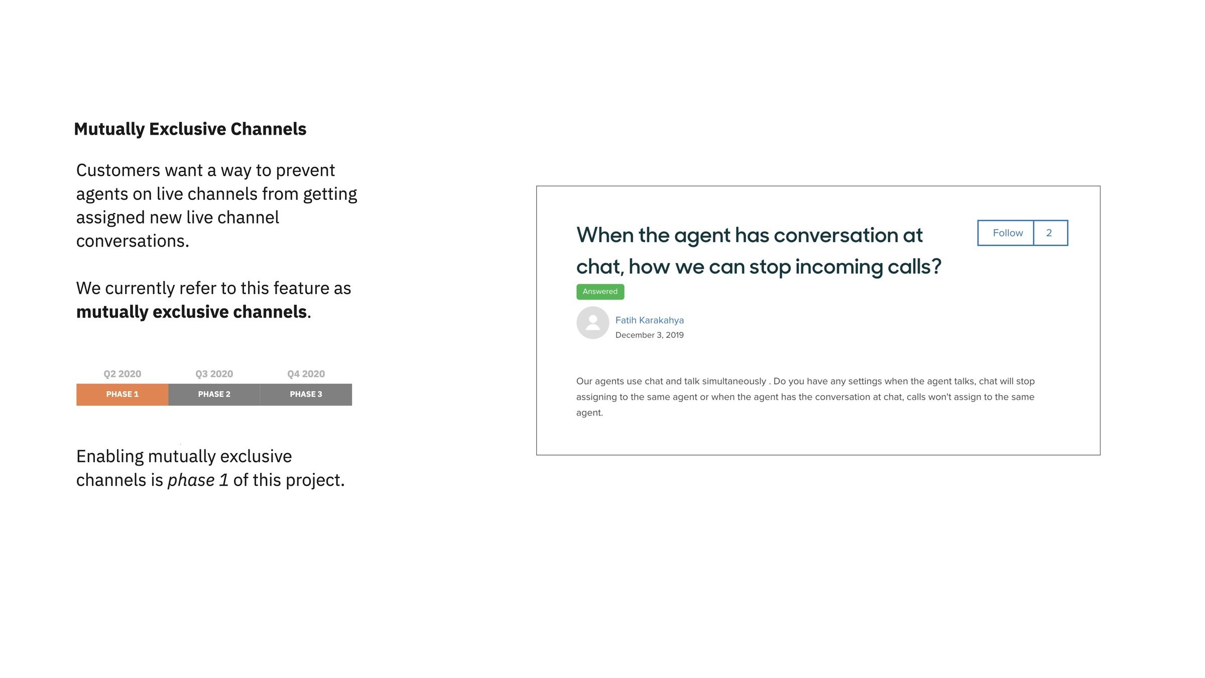
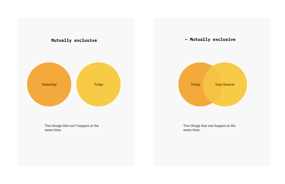
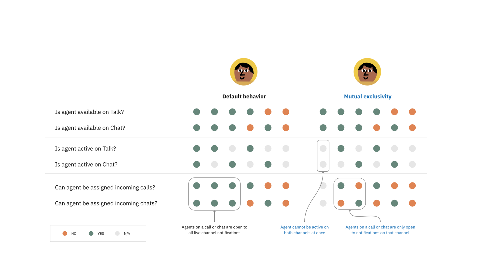
What is mutual exclusivity?
A look under the hood
The user's point of view
Decisions, decisions
I wanted to make sure my product partners agreed with my approach. I presented two ways forward:
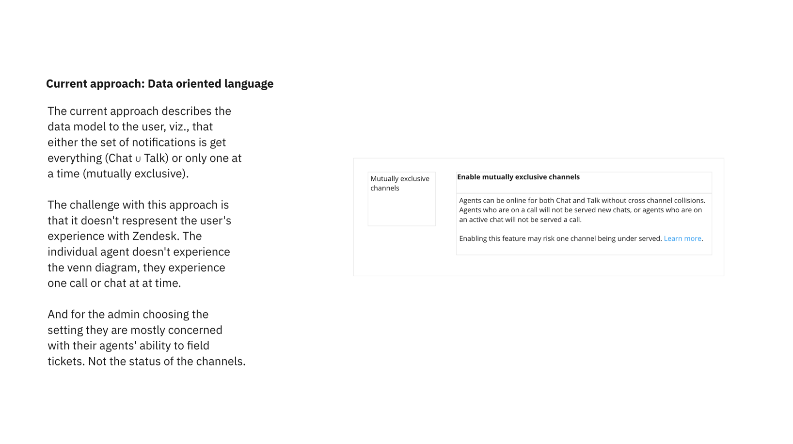
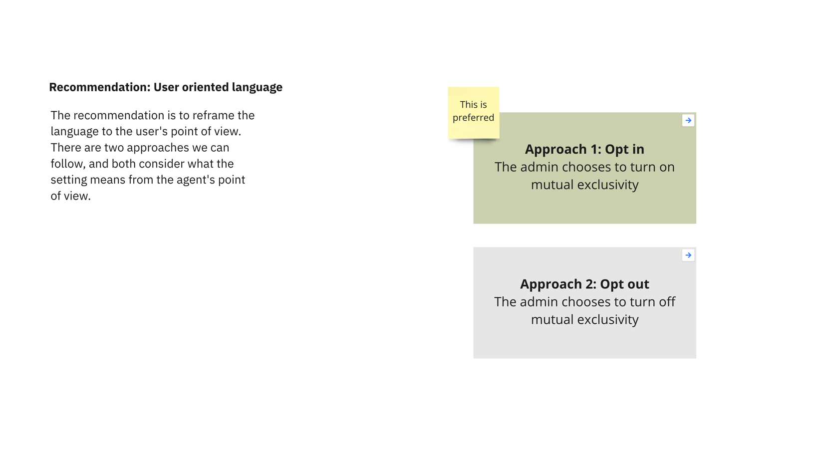
- data-oriented language
- user-oriented language
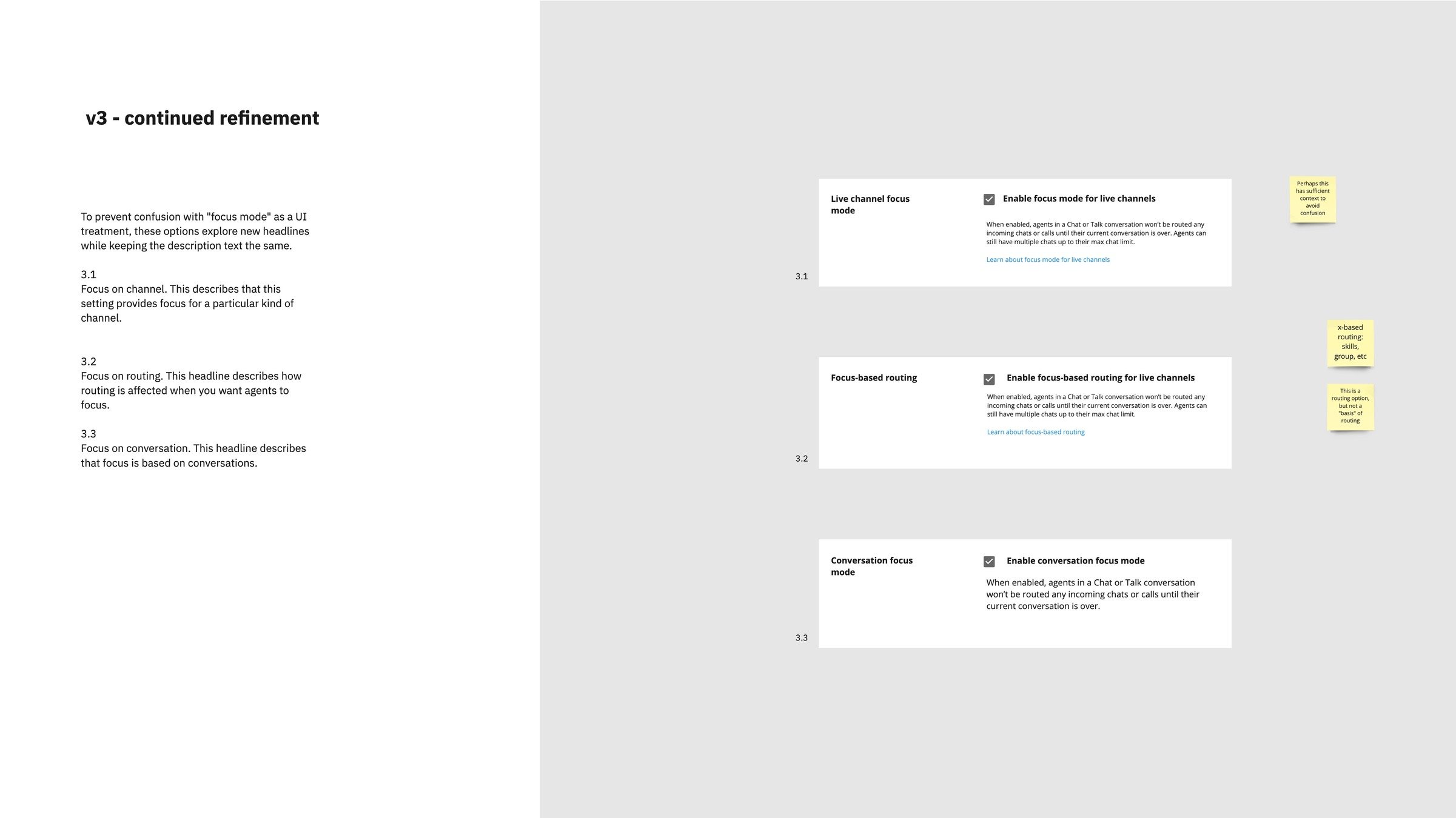
Key Learning

Check in with your product partners at every "fork in the road" before you move too far ahead.
what do we call this thing?
Three approaches

Setting name
Heading
Description
Naming the approaches helps partners
Deeper dive
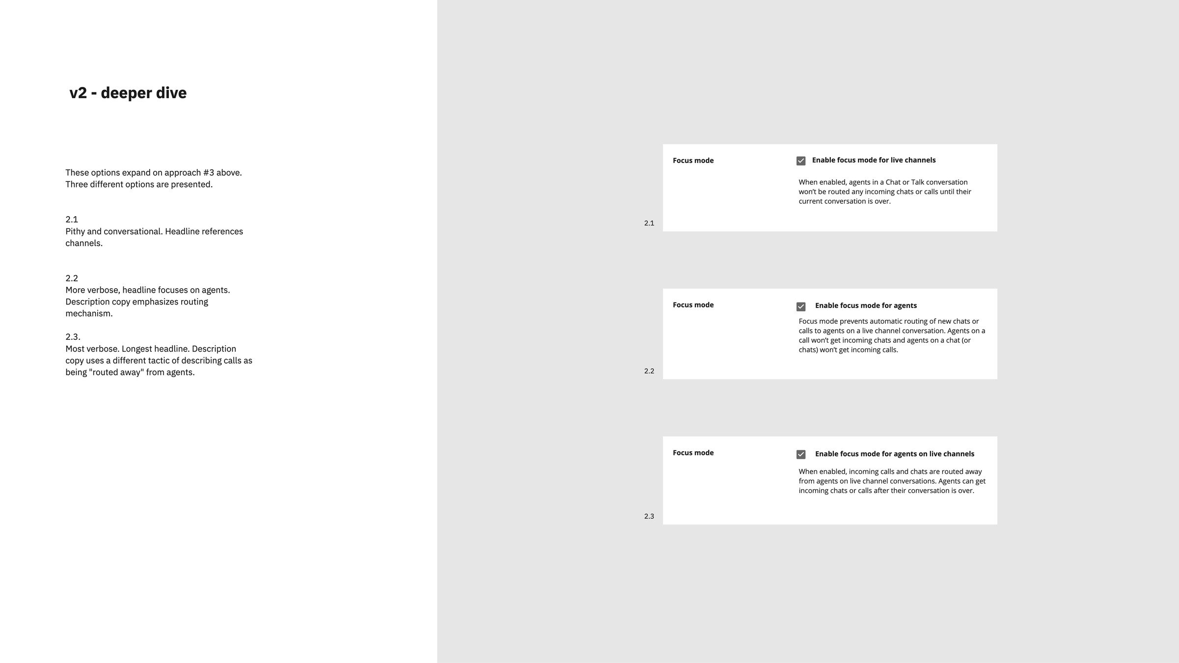
Named approaches
In situ
How else will this language be used?
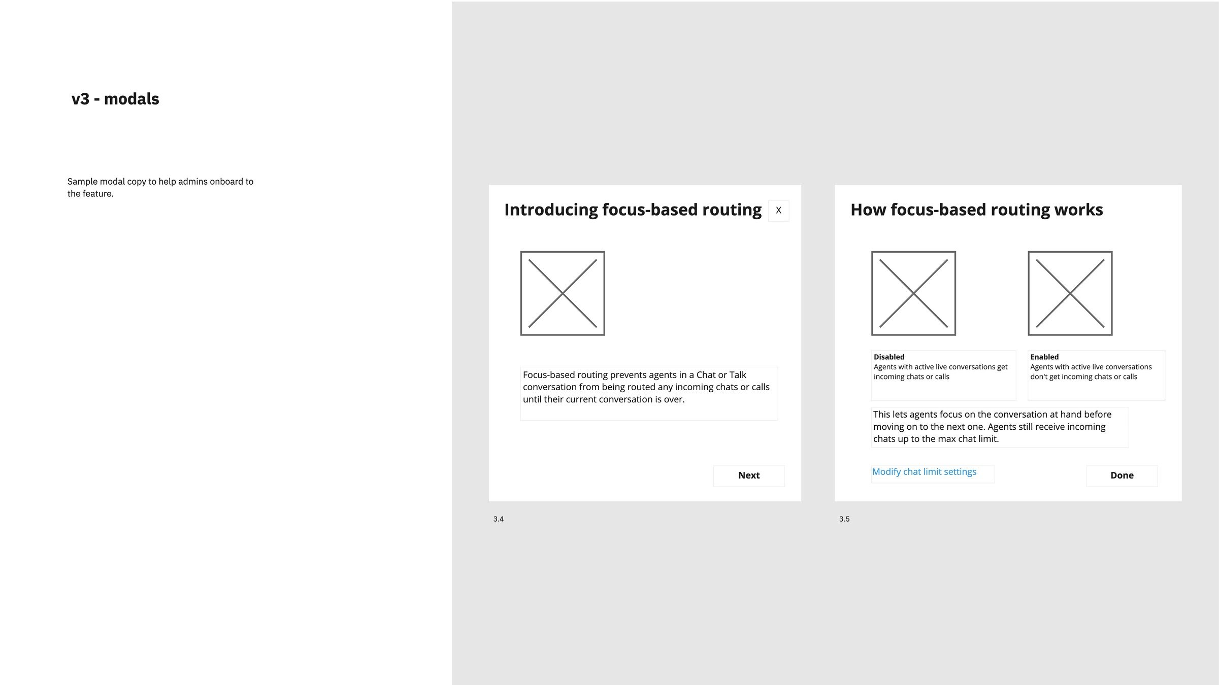
Including explorations of onboarding modals
Different contexts can help stress-test your language
the entire process was welL-documented

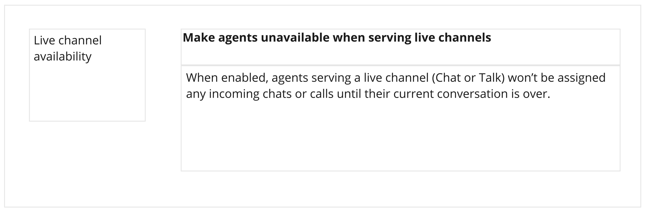
Final design
A sneak peek at the final setting for focus mode on the settings page.
Final design
A sneak peek at the final setting for focus mode on the settings page.
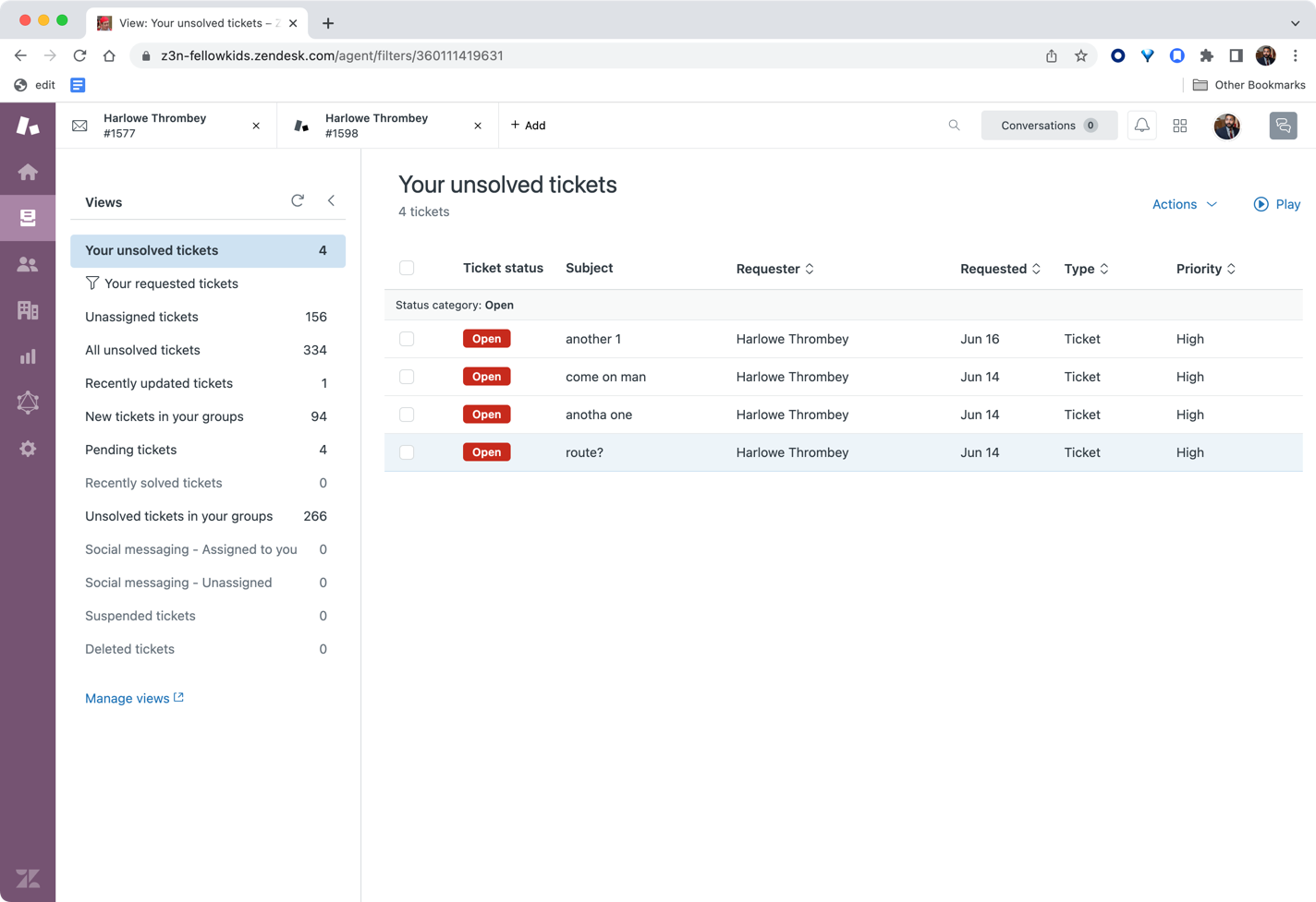
Anatomy of agent workspace
Zendesk
Agent workspace
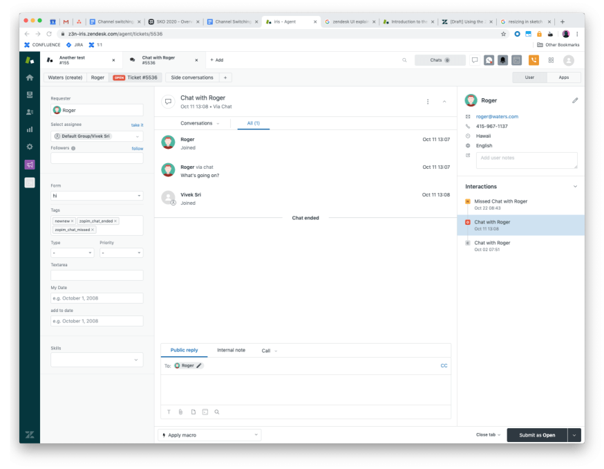
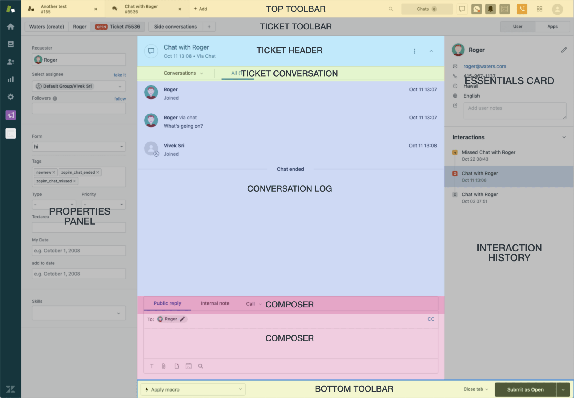
I was on a team tasked with integrating two of our flagship products, Support and Chat into a single unified experience.
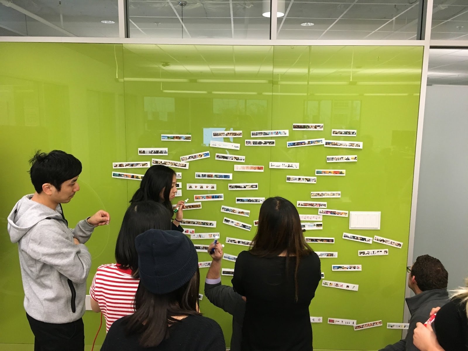
Sensemaking
Part of my approach is to take inventory of the UI. Because we were combining two separate products, we needed to understand the entire set of concepts.
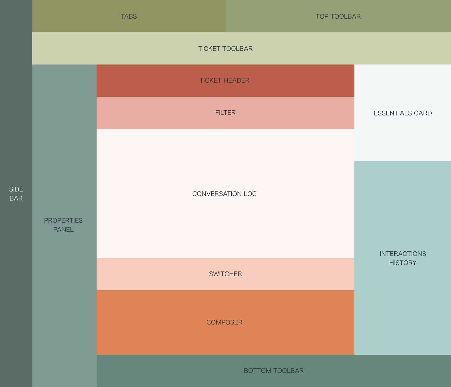
Sensemaking
We abstract away the UI to get a sense of all the major parts of the UI facing the user.
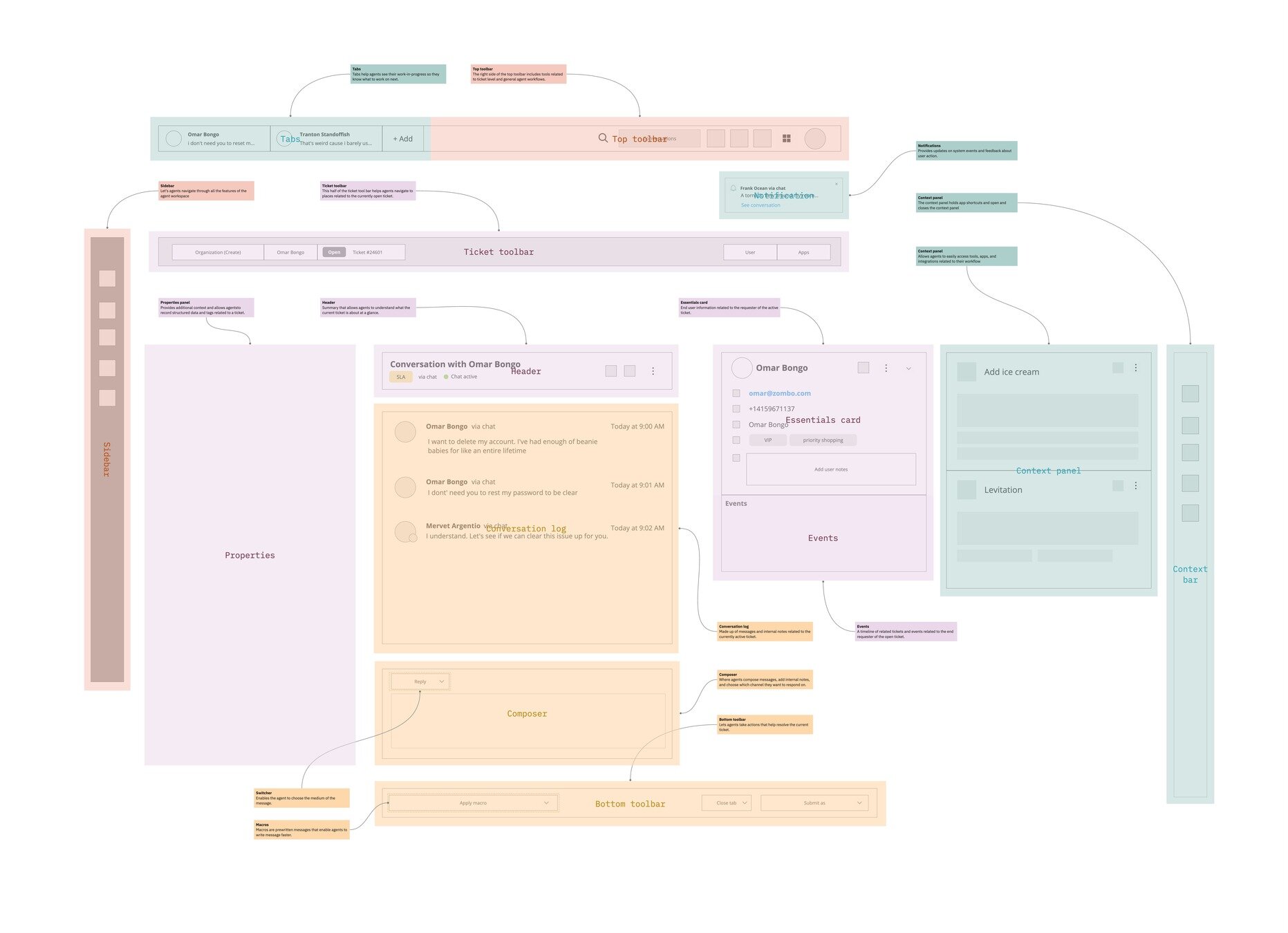
Adding detail
I broke apart the UI in this medium-fidelity mockup to show how different parts of the screen served different content needs. I wrote descriptions of each part and divided the UI into zones that reflect different levels of intent from the user's point of view.

hey@lookandpoint.com
