
D.I.Y
borders:
.demo {
  width: 100px;
  height: 100px;\


  border-width: thin; /* thin, medium, thick, 10px */
  border-style: solid; /* dotted, dashed, solid, double, groove, ridge, inset, outset */
  border-color: yellow; /* any colour in any unit*/

  /* border shorthand */
  border: 1px solid red;
}
D.I.Y
border radius:
.border {
  width: 100px;
  height: 100px;

  /* border shorthand
  border: 2px solid red;
  */

  border-radius: 1em; /* 1em = 16px */
D.I.Y
Border Radius in Too Depth:
.border {
  width: 100px;
  height: 100px;

  /*
   * border-radius: 1em;
   *
   * border-radius: border-top-left-radius border-top-right-radius border-bottom-right-radius border-bottom-left-radius
   *
   *
   * border-top-left-radius: border-top-left-top-radius border-top-left-left-radius;
   * border-top-right-radius: border-top-right-top-radius border-top-right-right-radius;
   * border-bottom-right-radius: border-bottom-right-bottom-radius border-bottom-right-right-radius;
   * border-bottom-left-radius: border-bottom-left-bottom-radius border-bottom-left-left-radius;
   *
   * can be used for creating blobs
   * shorthand:
  */

  border-radius: 1em 2em 3em 4em;

  border-radius: 95px 155px 148px 103px / 48px 95px 130px 203px;
}
D.I.Y
Border Radius Image:
.border {
  width: 100px;
  height: 100px;

  border-image-source: url(https://assets.codepen.io/174183/border-image-frame.jpg);
  border-image-slice: 61 58 51 48; /* top right bottom left*/
  border-image-width: 20px 20px 20px 20px; /* top right bottom left*/
  border-image-outset: 0px 0px 0px 0px; /* top right bottom left: distance between your border image and the box that it wraps around*/
  border-image-repeat: stretch stretch;
}
D.I.Y
-
Create an image card with rounded borders

D.I.Y
-
Create an image card with rounded borders 3 elliptical and 1 rounded border like in the website.


Flexbox - Flexible Box Layout Model
→ Flexbox is a layout mechanism
- it allows you to arrange the "Content" in the box, along one axis.
→ Flex items move as a group on either one axis.
⟶ but on the other axis items can move individually or as a group.
Flex-box is one dimensional, you can control alignment in one axis, a row or a column, not both.
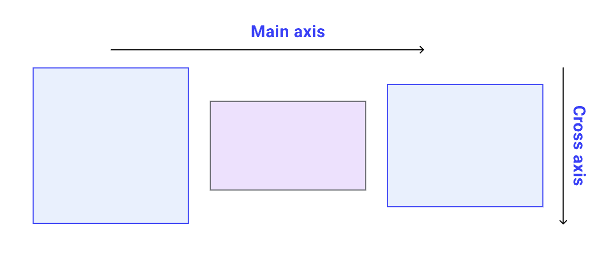
Think of your webpage as a 2-dimensional plain, with 2 axis:
X-axis or Main axis ⟶ (inline flow)
Y-axis or Cross axis ⟶ (block flow)
Flex divides the boxes in the layout in 2 parts:
- the container (parent element, known as “flex container”)
- the children (“flex items”).
Both have different set of properties.
D.I.Y
.flex-container {
  display: flex;

  border: 1px solid black;
  padding: 10px;
  margin: 10px;
}
Starting with Flex
Set the display of the box as "flex".
This box is the flex-container.
This is the box where your "content" is present.
D.I.Y
.flex-container {
  display: flex;
  flex-direction: column; /* row | row-reverse | column | column-reverse */

  border: 1px solid black;
  padding: 10px;
  margin: 10px;
}row: horizontal, left-to-right, default,
column: vertical, top-to-bottom
row-reverse: horizontal, right-to-left
column-reverse: vertical, bottom-to-top
D.I.Y
flex-direction:
Establishes which direction will be regarded as the Main-axis.
.flex-container {
  display: flex;
  flex-direction: column; /* row | row-reverse | column | column-reverse */
  flex-wrap: wrap; /* nowrap | wrap | wrap-reverse */

  border: 1px solid black;
  padding: 10px;
  margin: 10px;
}no-wrap: items will not wrap, default,
wrap: items will wrap, top to bottom,
wrap-reverse: items will wrap, bottom to top,
D.I.Y
flex-wrap:
.flex-container {
  display: flex;
  /*
   * flex-direction: column;  // row | row-reverse | column | column-reverse
   * flex-wrap: wrap; // nowrap | wrap | wrap-reverse
   */
  /*OR*/
  flex-flow: column wrap;

  border: 1px solid black;
  padding: 10px;
  margin: 10px;
}
shorthand for the flex-direction and flex-wrap properties
D.I.Y
flex-flow:
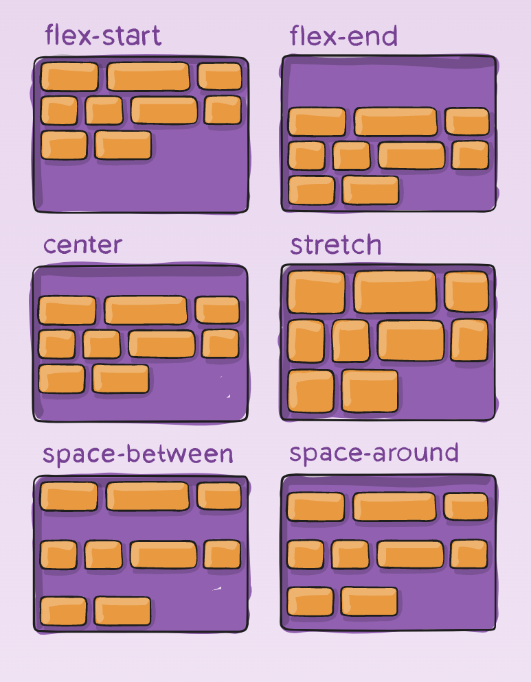
- flex-start:
- flex-end: different from row-reverse
- center:
- space-between:
- space-around: space between 2 items add up, space between edges are equal.
- space-evenly: space between items and edges are equal.
- start, end, left, right:
justify-content
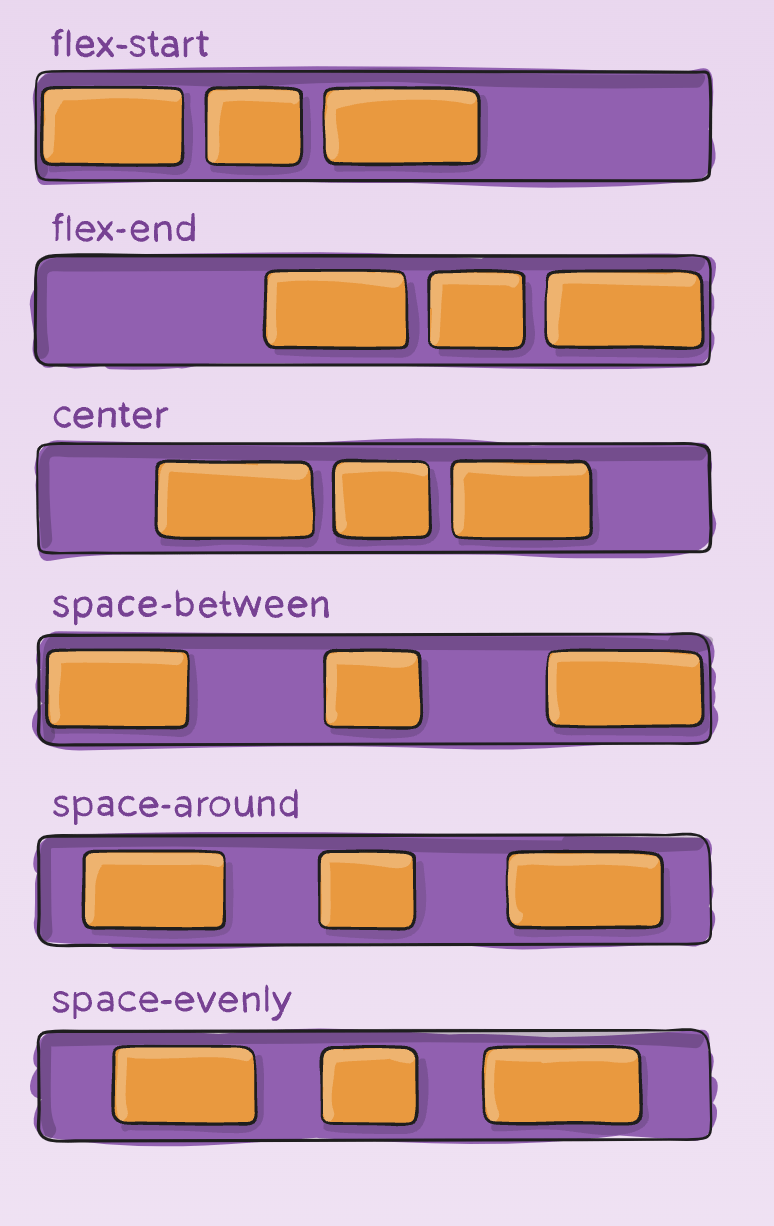
Arranges items along the Main axis
Note: Here we are assuming the main-axis as x-axis
(flex-direction: row;).
D.I.Y
justify-content
- stretch (default): stretch to fill the container
- flex-start / start / self-start: items are placed at the start of the cross axis.
- flex-end / end / self-end: items are placed at the end of the cross axis.
- center: items are centered in the cross-axis
- baseline: items are aligned such as their baselines align.
align-items
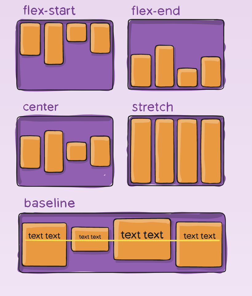
It handles arrangement of items on the cross-axis.
Affects only one line of items, if the items wrap to next line, on the next line also they are arranged as per this rule.
D.I.Y
align-items
- normal (default):
-
flex-start / start:
start honors the writing-mode, -
flex-end / end:
end honors the writing-mode - center: items centered,
- space-between: equal space around items,
- space-around: equal space around each line,
- space-evenly: equal space around items and line,
- stretch: lines stretch to take up the remaining space
align-content
- Works along the cross-axis.
- This property only takes effect on multi-line flexible containers, where flex-wrap is set to either wrap or wrap-reverse).
align-content
D.I.Y
Difference of align-content and align-items
If flex-direction is set to row,
Main-axis is X-axis, inline-flow
justify-content works along X-axis,
align-items works along Y-axis.
Now align-content, will also arrange items on Y-axis, but only those which have been wrapped on the next line.