How effective is the combination of your main product and ancillary text?
My A2 media studies group and I were asked to put together a music video along with two other products, which will promote my music video and appeal to my target audience. Pop and soul is the genre of my music video, which includes all the codes and conventions. Also by implementing the unique selling points of my music video into three of my products, which will help to promote and sell my album.
How and why is having a 'house style' or 'brand identity' when creating multiple media products?
Having a house style or brand identity implemented in multiple media products creates a personal recognition to its consumers. House style is the use of a consistent layout throughout its line of production. In my music video I have also used a house style, for instance, the style of the text used in the introduction of the music video links with the text used in the digipak and advert. I have also used similar style of images in my digipak and advert taken from my music video. Furthermore, I have included a comparable palate of colour in my multiple media products. This shows the consistency in the layout throughout my products; music video, digipak and advert.
Continued...

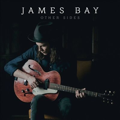
James Bay music video, advert and digipak

There are different examples of brand identity features applied to my digipak of which one is image branding. The image of the violent male’s shadow is used in my music video as well as my digipak. This shows the audience the iconic image of the brutal and aggressive male character in my multiple media products. This use of brand identity allows my audience and viewers to recognise this on my digipak and also creating this shadow image to initiate the remembrance of the artist and characters used in my music video in addition to remembering the story of the music video. Another example of brand identity which was used in my music video was the use of costumes. The clothes that were used in my music video are a mere representation of what my audience may wear. Hence, categorising or subdividing my audience and general viewers because of their choice of personal representation which correlates with the appearance of the characters in my music video.

How have you created a 'brand identity' important when creating multiple media products?
I have created a brand identity in many ways, in order to follow through with the theme, genre and atmosphere, which I want my music video, digipak and advert to give to my target audience. I made sure that in my digipak and advert I used the similar images, to reflect upon what my music video is about and giving my target audience an idea of what my album might consist of. I also made sure to follow up on the style that I have included in all three of my products. The style which I have implemented in all my products is dark and dull colours as well as making it very simple but adding very fine details to make the whole product stand out. I have included details such as the toy used in the music video, the father figure character that is represented in both the digipak and advert, which portrays the superiority of the character. I made sure throughout the process of making all three products I followed through on the theme of making sure each product gave the same effect. The font also performed a brand identity, for all three of the main products. I used the same font on all three products to still maintain the brand identity and make sure it is promoted well. I did my best to follow all codes and conventions for pop/soul genre, trying to implement a unique selling point to my products to appeal to my target audience. The characters for all three of my products are included throughout, to show realism and make sure it gives the right message to the audience.

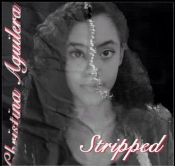
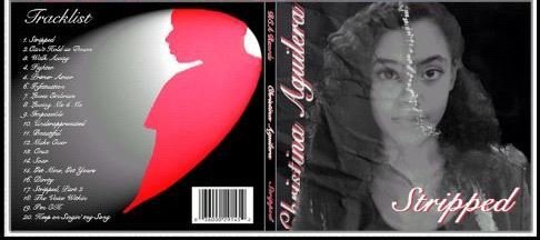
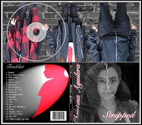
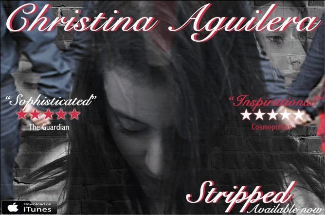
How do you think your digipak design will 'sell' the song/album to the audience?
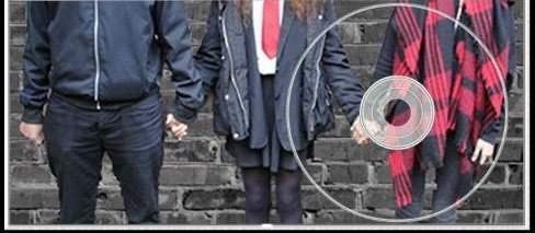
My digipak will have a great impact upon my song and album to sell, due to the fact that my digipak has a lot to give. It will consist of what the album is about by the colour, visual image, album name and extra information. My album is not just based on the pop genre but also a mix of soul, my song will also be an album which individuals can relate to which would be a great hit. My digipak although has all the conventions included, it does not give too much away and so can make my target audience intrigued and look into the whole album further by buying the album. Inside my digipak there are three large visual images, which show the characters holding hands that are within my music video. I made sure that my advert shows one image, my digipak shows another image and music video something else; in order for my audience to be kept in suspense and put two and two together to understand what the whole overall product is trying to say. By doing this it will persuade my target audience to buy the album as well as watch the music video.

How do you think your advert will 'sell' the digipak to the audience?
My advert is a poster that represents the album and music video. In order for my digipak to sell, I included all the main codes and conventions to make sure I was using the right selling points like other real adverts; by implementing my poster in popular places such as buses, trains, bustop shelters, underground stations and in tourist attractions. This can persuade individuals to buy this album and also let my target audience know that the album is out. By applying these in a variety of places it can increase the selling rate and promote my digipak to those who may not even listen to this genre of music. My advert will include where the album can be bought and the name of the album for my digipak advert, which will get my target audience on their feet and excited. Although the colour range is not of a variety, the reason for why I chose dark/dull colours is because it reflected upon what the whole album was about; looking back at my feedback from my target audience, they all said dark/dull colours would go well with the whole theme that I am trying to create.
What elements of your advert and digipak communicate the genre of the music video and the style of the brand?
My advert and digipak consist of many elements that communicate with the genre of the music video. My advert and digipak both have similar colour, wording and images to it, in order to represent the style of the brand and to show the genre of the music video. There are dark colours included in my music video to emphasise the genre, which is pop soul. In many pop soul music videos dark colours are used to portray a dull and gloomy atmosphere, creating a suspicious feel to the whole music video. This is also done by the layout, which is executed on the advert and digipak, presenting a very simplistic picture but shows a form of superiority of the male figure.