TrelliscopeJS
Ryan Hafen
Hafen Consulting, LLC
Small Multiples
A series of similar plots, usually each based on a different slice of data, arranged in a grid
"For a wide range of problems in data presentation, small multiples are the best design solution."
Edward Tufte (Envisioning Information)
This idea was formalized and popularized in S/S-PLUS and subsequently R with the trellis and lattice packages

Advantages of Small Multiple Displays
- Avoid overplotting
- Work with big or high dimensional data
-
It is often critical to the discovery of a new insight to be able to see multiple things at once
- Our brains are good at perceiving simple visual features like color or shape or size and they do it amazingly fast without any conscious effort
- We can tell immediately when a part of an image is different from the rest, without really having to focus on it
Trelliscope:
Interactive Small Multiple Display
- Small multiple displays are useful when visualizing data in detail
- But the number of panels in a display can be potentially very large, too large to view all at once
Trelliscope is a general solution that allows small multiple displays to come alive by providing the ability to interactively sort and filter the panels based on summary statistics, cognostics, that capture attributes of interest in the data being plotted
Motivating Example
Gapminder
Suppose we want to understand mortality over time for each country
Observations: 1,704
Variables: 6
$ country   <fctr> Afghanistan, Afghanistan, Afghanistan, Afghanistan, Afgh...
$ continent <fctr> Asia, Asia, Asia, Asia, Asia, Asia, Asia, Asia, Asia, As...
$ year      <int> 1952, 1957, 1962, 1967, 1972, 1977, 1982, 1987, 1992, 199...
$ lifeExp   <dbl> 28.801, 30.332, 31.997, 34.020, 36.088, 38.438, 39.854, 4...
$ pop       <int> 8425333, 9240934, 10267083, 11537966, 13079460, 14880372,...
$ gdpPercap <dbl> 779.4453, 820.8530, 853.1007, 836.1971, 739.9811, 786.113...
glimpse(gapminder)

qplot(year, lifeExp, data = gapminder,
  color = country, geom = "line")

Yikes! There are a lot of countries...
qplot(year, lifeExp, data = gapminder, color = continent,
  group = country, geom = "line")

Still too much going on...
qplot(year, lifeExp, data = gapminder, color = continent,
  group = country, geom = "line") +
    facet_wrap(~ continent, nrow = 1)

That helped a little...
p <- qplot(year, lifeExp, data = gapminder, color = continent,
  group = country, geom = "line") +
    facet_wrap(~ continent, nrow = 1)
plotly::ggplotly(p)
This helps but there is still a lot of overplotting...
qplot(year, lifeExp, data = gapminder) + theme_bw() +
  facet_wrap(~ country + continent)

qplot(year, lifeExp, data = gapminder) + theme_bw() +
  facet_trelliscope(~ country + continent, nrow = 2, ncol = 7, width = 300)
Note: this and future plots in this presentation are interactive - feel free to explore!
qplot(year, lifeExp, data = gapminder) + theme_bw() +
  facet_trelliscope(~ country + continent,
    nrow = 2, ncol = 7, width = 300, as_plotly = TRUE)
TrelliscopeJS
JavaScript Library
R Package


trelliscopejs-lib
trelliscopejs

- Built using React
- Pure JavaScript
- Interface agnostic
- No special server requirements
- htmlwidget interface to trelliscopejs-lib
- Evolved from older CRAN "trelliscope" package
devtools::install_github("hafen/trelliscopejs")
Creating Displays: 3 Interfaces
1. ggplot2
2. tidyverse
3. images
ggplot2 Interface
Turning a ggplot2 faceted display into a Trelliscope display is as easy as changing:
to:
facet_wrap()
or:
facet_grid()
facet_trelliscope()
facet_trelliscope() main arguments
- ~: conditioning variables
- name: the name of the display
- desc: a free text description of the display
- path: path in which the display files should be stored (multiple displays can be stored in the same path)
- height, width: original dimensions (in pixels) of each panel (actual size will vary based on user interactions)
- nrow, ncol: default layout of the panels (can be changed by the user)
qplot(year, lifeExp, data = gapminder) +
  theme_bw() +
  facet_trelliscope(~ country + continent,
    name = "gapminder_lifeexp",
    desc = "life expectancy vs. year by country"
    nrow = 2, ncol = 7,
    width = 300)
ggplot2 cognostics
- All conditioning variables are naturally cognostics
- Any column that is fixed within each group will be added as a cognostic
- For numeric columns that vary within each group, cognostic summary statistics of those variables will be added
- Optionally setting auto_cog = TRUE will also compute cognostics based on the context of what is being plotted
Observations: 1,704
Variables: 6
$ country   <fctr> Afghanistan, Afghanistan, Afghanistan, Afghanistan, Afgh...
$ continent <fctr> Asia, Asia, Asia, Asia, Asia, Asia, Asia, Asia, Asia, As...
$ year      <int> 1952, 1957, 1962, 1967, 1972, 1977, 1982, 1987, 1992, 199...
$ lifeExp   <dbl> 28.801, 30.332, 31.997, 34.020, 36.088, 38.438, 39.854, 4...
$ pop       <int> 8425333, 9240934, 10267083, 11537966, 13079460, 14880372,...
$ gdpPercap <dbl> 779.4453, 820.8530, 853.1007, 836.1971, 739.9811, 786.113...
ggplot2 auto_cogs
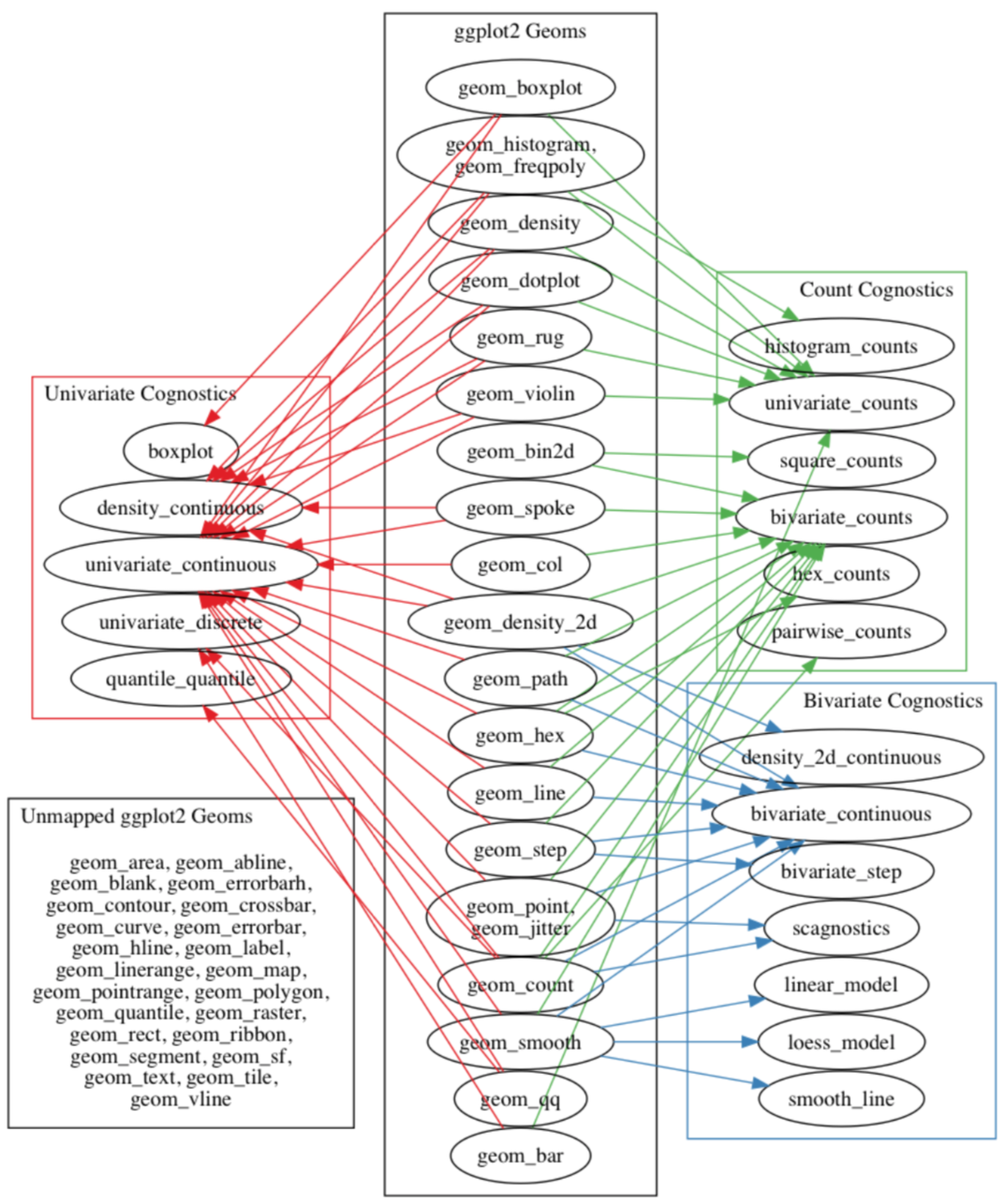
- Automatically compute cognostics based on the context of what is being plotted
- Work done by Barret Schloerke as part of his Ph.D. thesis (defense.schloerke.com)
- Implemented for ggplot2
Tidyverse Interface
- Create a data frame with one row per group, typically using Tidyverse group_by() and nest() operations
- Add a column of plots
- TrelliscopeJS provides purrr map functions map_plot(), map2_plot(), pmap_plot() that you can use to create these
- You can now use any graphics system to create the plot objects (ggplot2, htmlwidgets, etc.)
- Optionally add more columns to the data frame that will be used as cognostics - metrics with which you can interact with the panels
- All atomic columns will be automatically used as cognostics
- Map functions map_cog(), map2_cog(), pmap_cog() can be used for convenience to create columns of cognostics
- Simply pass the data frame in to trelliscope()
country_model <- function(df)
  lm(lifeExp ~ year, data = df)

by_country <- gapminder %>%
  group_by(country, continent) %>%
  nest() %>%
  mutate(
    model = map(data, country_model),
    resid_mad = map_dbl(model, function(x)
      mad(resid(x))))

by_country
Example adapted from "R for Data Science"
# A tibble: 142 × 5
       country continent              data    model resid_mad
        <fctr>    <fctr>            <list>   <list>     <dbl>
1  Afghanistan      Asia <tibble [12 × 4]> <S3: lm> 1.4058780
2      Albania    Europe <tibble [12 × 4]> <S3: lm> 2.2193278
3      Algeria    Africa <tibble [12 × 4]> <S3: lm> 0.7925897
4       Angola    Africa <tibble [12 × 4]> <S3: lm> 1.4903085
5    Argentina  Americas <tibble [12 × 4]> <S3: lm> 0.2376178
6    Australia   Oceania <tibble [12 × 4]> <S3: lm> 0.7934372
7      Austria    Europe <tibble [12 × 4]> <S3: lm> 0.3928605
8      Bahrain      Asia <tibble [12 × 4]> <S3: lm> 1.8201766
9   Bangladesh      Asia <tibble [12 × 4]> <S3: lm> 1.1947475
10     Belgium    Europe <tibble [12 × 4]> <S3: lm> 0.2353342
# ... with 132 more rows
Gapminder Example from "R for Data Science"
- One row per group
- Per-group data and models as "list-columns"
country_plot <- function(data, model) {
  figure(xlim = c(1948, 2011),
    ylim = c(10, 95), tools = NULL) %>%
    ly_points(year, lifeExp,
      data = data,
      hover = data) %>%
    ly_abline(model)
}

country_plot(by_country$data[[1]],
  by_country$model[[1]])
Plotting the Data and Model Fit for Each Group
We'll use the rbokeh package to make a plot function and apply it to the first row of our data
by_country <- by_country %>%
  mutate(plot = map2_plot(data, model, country_plot))

by_country
Example adapted from "R for Data Science"
# A tibble: 142 × 6
       country continent              data    model resid_mad         plot
        <fctr>    <fctr>            <list>   <list>     <dbl>       <list>
1  Afghanistan      Asia <tibble [12 × 4]> <S3: lm> 1.4058780 <S3: rbokeh>
2      Albania    Europe <tibble [12 × 4]> <S3: lm> 2.2193278 <S3: rbokeh>
3      Algeria    Africa <tibble [12 × 4]> <S3: lm> 0.7925897 <S3: rbokeh>
4       Angola    Africa <tibble [12 × 4]> <S3: lm> 1.4903085 <S3: rbokeh>
5    Argentina  Americas <tibble [12 × 4]> <S3: lm> 0.2376178 <S3: rbokeh>
6    Australia   Oceania <tibble [12 × 4]> <S3: lm> 0.7934372 <S3: rbokeh>
7      Austria    Europe <tibble [12 × 4]> <S3: lm> 0.3928605 <S3: rbokeh>
8      Bahrain      Asia <tibble [12 × 4]> <S3: lm> 1.8201766 <S3: rbokeh>
9   Bangladesh      Asia <tibble [12 × 4]> <S3: lm> 1.1947475 <S3: rbokeh>
10     Belgium    Europe <tibble [12 × 4]> <S3: lm> 0.2353342 <S3: rbokeh>
# ... with 132 more rows
Apply This Function to Every Row
A plot for each model
by_country %>%
  trelliscope(name = "by_country_lm", nrow = 2, ncol = 4)
Images Interface
- Trelliscope can act as an interface to query a database of images
- You simply need a data frame with one column pointing to a URL or local image file
- If image is a URL:
- Wrap the column with img_panel()
- This URL could also be a service that returns an image
- If image is local:
- Make sure the image files are located inside the display's directory and that the specified path is relative to that
- Wrap the column with img_panel_local()
read_csv("http://bit.ly/plot_pokemon") %>% glimpse()
# $ pokemon          <chr> "bulbasaur", "ivysaur", "venusaur", "venusaur…
# $ base_experience  <dbl> 64, 142, 236, 281, 62, 142, 240, 285, 285, 63…
# $ type_1           <chr> "grass", "grass", "grass", "grass", "fire", "…
# $ attack           <dbl> 49, 62, 82, 100, 52, 64, 84, 130, 104, 48, 63…
# ...
# $ url_image        <chr> "http://assets.pokemon.com/assets/cms2/img/po…
# ...
pokemon <- read_csv("http://bit.ly/plot_pokemon") %>%
  mutate_at(vars(matches("_id$")), as.character) %>%
  mutate(panel = img_panel(url_image))

pokemon
trelliscope(pokemon, name = "pokemon", nrow = 3, ncol = 6,
state = list(labels = c("pokemon", "pokedex")))
read_csv("http://bit.ly/trs-mri") %>%
  mutate(img = img_panel(img)) %>%
  trelliscope("brain_MRI", nrow = 2, ncol = 5)
Advanced Features
- Customizing cognostics using cog()
- Links as cognostics using cog_href()
- Linking across displays (new feature in dev branch)
Example: Home Prices
county <- read_csv("http://bit.ly/county201909")
county
## A tibble: 252,540 x 4
#   county             state_code date       price_sqft
#   <chr>              <chr>      <date>          <dbl>
# 1 Los Angeles County CA         2010-01-01      268.
# 2 Cook County        IL         2010-01-01      188.
# 3 Harris County      TX         2010-01-01       75.4
# 4 Maricopa County    AZ         2010-01-01       99.3
# 5 San Diego County   CA         2010-01-01      247.

state <- read_csv("http://bit.ly/state201909")
state
## A tibble: 5,865 x 4
#   state          state_code date       price_sqft
#   <chr>          <chr>      <date>          <dbl>
# 1 California     CA         2010-01-01      210.
# 2 Texas          TX         2010-01-01       85.6
# 3 New York       NY         2010-01-01      180.
# 4 Florida        FL         2010-01-01      120.
# 5 Illinois       IL         2010-01-01      137.
Monthly median price per square foot by state and county, 2001-2019
List Prices Over Time by County
county %>%
  filter(!is.na(price_sqft)) %>%
  group_by(county) %>%
  mutate(price_diff = max(price_sqft) - min(price_sqft)) %>%
  ungroup() %>%
  mutate(
    price_diff = cog(price_diff,
      desc = "difference between highest and lowest price"),
    wiki_link = cog_href(
      paste0("https://en.wikipedia.org/wiki/", county))
  ) %>%
  ggplot(aes(date, log10(price_sqft))) +
    geom_point() +
    theme_bw() +
    facet_trelliscope(~ county + state_code, nrow = 2, ncol = 5,
      name = "county_median_list_log10",
      desc = "monthly county median list price per square foot",
      group = "county",
      path = "~/Desktop/housing",
      width = 300, height = 500)
State-Level Display Linking to County-Level
state %>%
  filter(!is.na(price_sqft)) %>%
  mutate(
    counties_link = cog_disp_filter(
      "county_median_list",
      var = "state_code",
      val = state_code, default_label = TRUE)
  ) %>%
  ggplot(aes(date, price_sqft)) +
    geom_point() +
    theme_bw() +
    facet_trelliscope(~ state, nrow = 2, ncol = 5,
      name = "state_median_list",
      desc = "monthly state median list price per square foot",
      group = "state",
      path = "~/Desktop/housing",
      width = 300, height = 500)
For More Information
- Twitter: @hafenstats
- Blog: http://ryanhafen.com/blog
- Documentation: http://hafen.github.io/trelliscopejs
- Github: https://github.com/hafen/trelliscopejs
install.packages(c("tidyverse", "gapminder",
  "rbokeh", "plotly"))
devtools::install_github("hafen/trelliscopejs")
# or
devtools::install_github("hafen/trelliscopejs@dev")
library(tidyverse)
library(gapminder)
library(rbokeh)
library(trelliscopejs)
Most examples in this talk are reproducible after installing and loading the following packages:
TrelliscopeJS
By Ryan Hafen


