


Joan León PRO
⚡️ Web Performance Artisan at @perfreviews_ | @GoogleDevExpert in #WebTech | @cloudinary Ambassador
Joan León
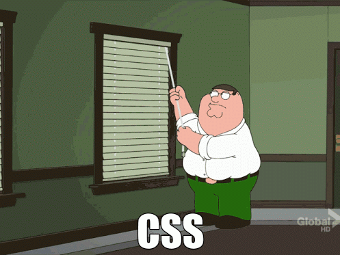
    /* Bad CSS */
    .selector, .selector-secondary, .selector[type=text] {
      padding:15px;
      margin:0px 0px 15px;
      background-color:rgba(0, 0, 0, 0.5);
      box-shadow:0px 1px 2px #CCC,inset 0 1px 0 #FFFFFF
    }

    /* Good CSS */
    .selector,
    .selector-secondary,
    .selector[type="text"] {
      padding: 15px;
      margin-bottom: 15px;
      background-color: rgba(0,0,0,.5);
      box-shadow: 0 1px 2px #ccc, inset 0 1px 0 #fff;
} .selector {
/* Positioning */
position: absolute;
z-index: 10;
top: 0;
right: 0;
bottom: 0;
left: 0;
/* Display & Box Model */
display: inline-block;
overflow: hidden;
box-sizing: border-box;
width: 100px;
height: 100px;
padding: 10px;
border: 10px solid #333;
margin: 10px;
/* Other */
background: #000;
color: #fff;
font-family: sans-serif;
font-size: 16px;
text-align: right;
} /*------------------------------------*\
#A-SECTION
\*------------------------------------*/
.selector { }
/*------------------------------------*\
#ANOTHER-SECTION
\*------------------------------------*/
/**
* Comment
*/
.another-selector { }
    $value: 42;

    // Yep
    $length: $value * 1px;

    // Nope
    $length: $value + px;
    /* Block component */
    .btn {}

    /* Element that depends upon the block */
    .btn__price {}

    /* Modifier that changes the style of the block */
    .btn--orange {}
    .btn--big {}


    <a class="btn btn--big btn--orange" href="...">
      <span class="btn__price">100,00 €</span>
      <span class="btn__text">Subscribe</span>
    </a>
    <div class="o-media  c-user  c-user--premium">
      <img src="" alt="" class="o-media__img  c-user__photo  c-avatar" />
      <p class="o-media__body  c-user__bio">...</p>
    </div>


    $s-config__path--img:   "../img" !default;
    $s-config__path--fonts: "../fonts" !default;

    $s-config__breakpoint--separator: \@ !default;

    @function s-core-breakpoint-suffix($_bp-name) {
      @return unquote("#{$s-config__breakpoint--separator}#{$_bp-name}");
    }

    $f-color__brand-primary:   #f25f5c !default;
    $f-color__brand-secondary: #69b7a4 !default;
    $f-color__brand-accent:    #ffe066 !default;

    @mixin t-mq(
      $from:          false,
      $until:         false,
      $and:           false,
      $media-type:    $t-sass-mq__media-type,
      $breakpoints:   $t-sass-mq__breakpoints
    ) {
        ...
    }
    <div class="o-media@md  c-user  c-user--premium">
      <img src="" alt="" class="o-media__img@md  c-user__photo  c-avatar" />
      <p class="o-media__body@md  c-user__bio">...</p>
    </div>
    .MyComponent {}
    .MyComponent.is-animating {}
    .MyComponent--modifier {}

    .MyComponent-part {}
    .MyComponent-anotherPart {}
    base/
    atom/
    molecule/
    organism/
    template/
    page/
    style.scss
    base/
    components/
    layout/
    pages/
    themes/
    abstracts/
    vendors/
main.scss <!DOCTYPE html>
<html>
<head>
<title>CSS Grid Layout Test: free space unit</title>
<link rel="author" title="Leo Deng" href="mailto:myst.dg@gmail.com">
<link rel="help" href="http://www.w3.org/TR/css-grid-1/#free-space">
<link rel="match" href="../reference/grid-layout-basic-ref.html">
<meta name="assert" content="the layout should behave the same as reference.">
<style>
body {
margin: 0;
padding: 0;
}
#caseTitle {
margin: 10px;
height: 40px;
}
#grid {
width: 150px;
background: #eee;
display: grid;
grid-template-columns: 1fr 50px;
}
.a {
background: blue;
grid-column: 1;
grid-row: 1;
}
.b {
background: yellow;
grid-column: 2;
grid-row: 1;
}
</style>
</head>
<body>
<p id="caseTitle">The test passes if it has the same visual effect as reference.</p>
<div id="grid">
<div class="a"> </div>
<div class="b"> </div>
</div>
</body>
</html>Browsers & Mobile Devices for Live Testing
Real Mobile & Tablet Devices for App Live Testing
Browsers & Mobile Devices for Selenium Testing
Browsers & Mobile Devices for JavaScript Testing
Browsers & Mobile Devices for Screenshot Testing
#Alias
alias pullAllDir='find . -type d -depth 1 -exec git --git-dir={}/.git --work-tree=$PWD/{} pull origin master \;'
    /// Find the last simple selector in a selector
    @function _last-simple-selector($selector) {
        $parsed: selector-parse($selector);

        @if length($parsed) > 1 {
            @if $bem-throw-errors {
                @error '`#{$selector}` contains #{length($parsed)} selectors and the `_last-simple-selector()`function accepts only 1.';
            }
            @return false;
        }

        $last-simple-selector: nth(nth($parsed, 1), -1);

        @return $last-simple-selector;
}cube broadcast (pure CSS) - Ana Tubor
Particles (1 element, no JS) - Ana Tubor
    import postcss from "postcss"
    import replaceRuleSelector
      from "postcss-selector-matches/dist/replaceRuleSelector"

    const CUSTOM_SELECTOR_RE = /:--[\w-]+/g

    export default postcss.plugin("postcss-custom-selectors", function(options) {
      const {
        extensions,
        lineBreak,
        transformMatches,
      } = {
        extensions: {},
        lineBreak: true,
        transformMatches: true,
        ...options || {},
      }

      const transformMatchesOnRule = transformMatches
        ? (rule) => replaceRuleSelector(rule, {
          lineBreak,
        })
        : (rule) => rule.selector

      return function(css, result) {
        const toRemove = []
        const customSelectors = {}

        // first, read custom selectors
        css.walkAtRules(function(rule) {
          if (rule.name !== "custom-selector") {
            return
          }

          // @custom-selector = @custom-selector <extension-name> <selector>
          const params = rule.params.split(/\s/)
          const customName = params.shift()
          const customList = rule.params.replace(customName, "").trim()
          customSelectors[customName] = customList

          toRemove.push(rule)
        })

        // Add JS defined selectors
        Object.keys(extensions).forEach(function(extension) {
          customSelectors[extension] = extensions[extension]
        })

        // Convert those selectors to :matches()
        css.walkRules(function(rule) {
          if (rule.selector.indexOf(":--") > -1) {
            rule.selector = rule.selector.replace(
              CUSTOM_SELECTOR_RE,
              function(extensionName, matches, selector) {

                if (!customSelectors[extensionName]) {
                  result.warn(
                    "The selector '" + rule.selector + "' is undefined",
                    {node: rule}
                  )

                  return selector
                }

                return ":matches(" + customSelectors[extensionName] + ")"
              }
            )

            rule.selector = transformMatchesOnRule(rule)
          }
        })

        toRemove.forEach(function(rule) {
          rule.remove()
        })

      }
})What’s happening in CSS? (Rachel Andrew)
/*------------------------------------*\
$NOTIFICATIONS
\*------------------------------------*/
/*
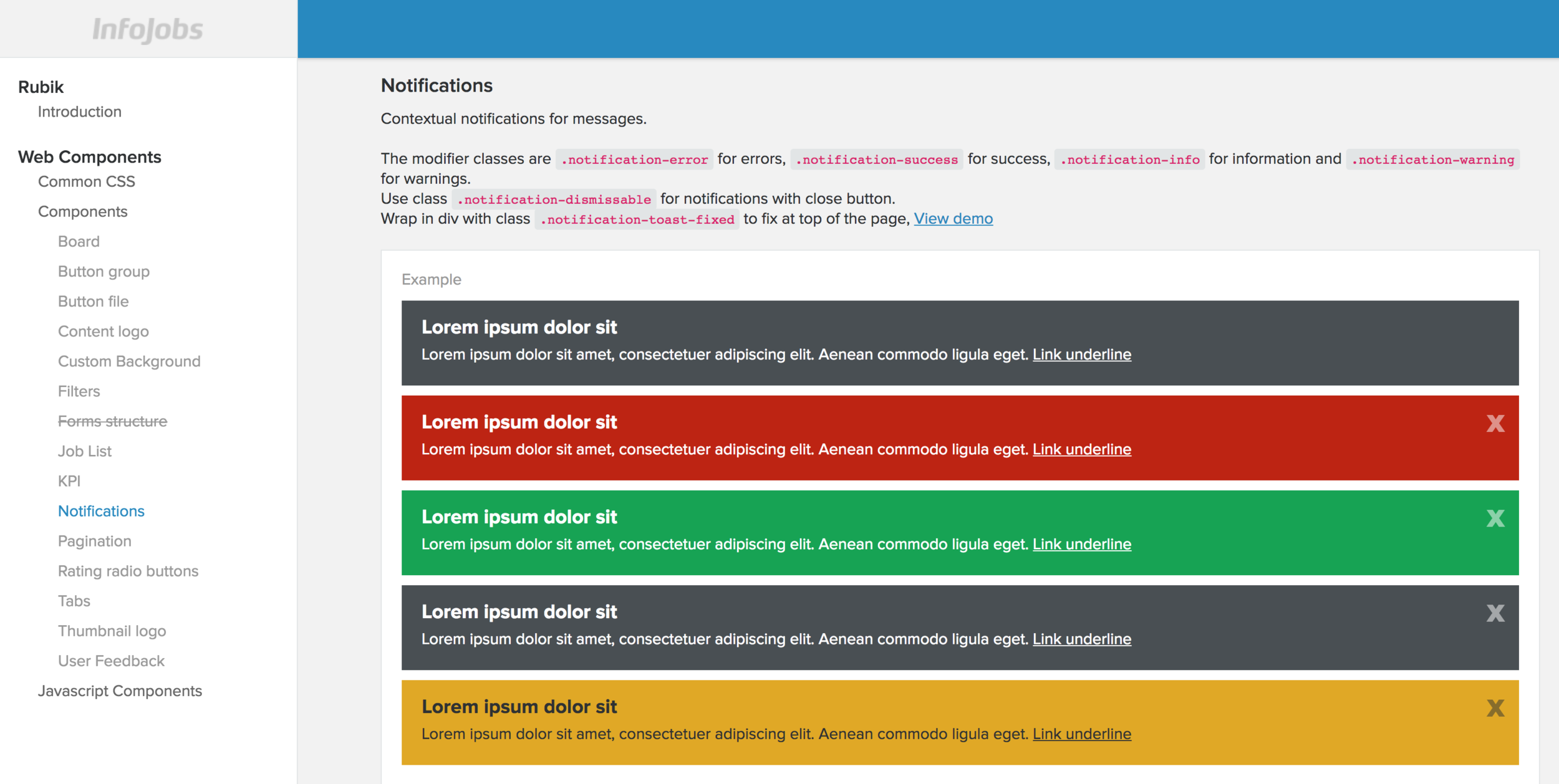
Notifications
Contextual notifications for messages.
The modifier classes are `.notification-error` for errors, `.notification-success` for success, `.notification-system for information and `.notification-warning` for warnings.<br>
Use class `.notification-dismissable` for notifications with close button.<br>
Wrap in div with class `.notification-toast-fixed` to fix at top of the page, <a href="#{$sgp-notificationToast}" target="blank">#{$sgp-openPage}</a>
Markup:
<!-- Notification succes-->
<div class="notification-success" role="alert">
<div class="notification-body">
<span class="notification-icon iconfont-Big-check"></span>
<p>Lorem ipsum dolor sit amet,Lorem ipsum dolor sit amet,Lorem ipsum dolor sit amet, Lorem ipsum dolor sit amet, consectetuer adipiscing elit. Aenean commodo ligula eget. <a href="#" class="link-underline">Link underline</a></p>
<button class="notification-close js-notification-close" type="button" aria-label="Close"><span aria-hidden="true" hidden>Close</span></button>
</div>
</div>
<!-- /Notification success-->
<div class="container-expanded">
<!-- Notification error -->
<div class="notification-error" role="alert">
<div class="notification-body">
<span class="notification-icon iconfont-Alert"></span>
<p>Lorem ipsum dolor sit amet,Lorem ipsum dolor sit amet,Lorem ipsum dolor sit amet, Lorem ipsum dolor sit amet, consectetuer adipiscing elit. Aenean commodo ligula eget.</p>
<button class="notification-close js-notification-close" type="button" aria-label="Close"><span aria-hidden="true" hidden>Close</span></button>
</div>
</div>
<!-- /Notification error -->
</div>
<div class="container-expanded">
<!-- Notification system -->
<div class="notification-system" role="alert">
<div class="notification-body">
<p>Lorem ipsum dolor sit amet,Lorem ipsum dolor sit amet,Lorem ipsum dolor sit amet, Lorem ipsum dolor sit amet, consectetuer adipiscing elit. Aenean commodo ligula eget. <a href="#" class="link-underline">Link underline</a></p>
<button class="notification-close js-notification-close" type="button" aria-label="Close"><span aria-hidden="true" hidden>Close</span></button>
</div>
</div>
<!-- /Notification info -->
</div>
<div class="container-expanded">
<!-- Notification warning -->
<div class="notification-warning" role="alert">
<div class="notification-body">
<span class="notification-icon iconfont-Info"></span>
<p>Lorem ipsum dolor sit amet,Lorem ipsum dolor sit amet,Lorem ipsum dolor sit amet, Lorem ipsum dolor sit amet, consectetuer adipiscing elit. Aenean commodo ligula eget. <a href="#" class="link-underline">Link underline</a></p>
<button class="notification-close js-notification-close" type="button" aria-label="Close"><span aria-hidden="true" hidden>Close</span></button>
</div>
<div class="notification-footer">
<button class="btn-small btn-default-alternative" type="button">Secondary alternative</button>
</div>
</div>
<!-- /Notification warning -->
</div>
Styleguide #{$sgi-notifications}
*/
$notifications: success $bamboo , system $outer-king, error $trueblood, warning $kiiro;
@mixin notification-fixed {
position: fixed;
width: 100%;
max-width: $container-width;
margin: 0 auto;
.inner & {
margin-left: -10px;
@include mediaquery ($bp-tablet) {
margin-left: -20px;
}
}
}
@mixin notification {
@include font-rendering;
font-size: $base-font-size;
line-height: $base-line-height;
width: 100%;
z-index: $zindex-sticky-content;
overflow: hidden;
}
.notification {
&-body {
@include display-flex;
@include align-items(flex-start);
padding: $padding $padding 0 $padding;
&:only-child {
padding-bottom: $padding;
}
p {
@include flex(1 1 100%);
margin: 0;
}
a {
white-space: nowrap;
}
}
&-close {
@include btn-close;
@include flex(1 0 auto);
color: inherit;
margin-left: $padding/2;
}
&-icon {
display: none;
@include mediaquery($bp-tablet) {
@include flex(1 0 auto);
display: block;
margin-right: 5px;
color: inherit;
&::before {
color: inherit;
}
}
}
&-footer {
padding: $padding/2 $padding $padding $padding;
text-align: right;
}
@each $notification-type in $notifications {
$key: nth($notification-type, 1);
$value: nth($notification-type, 2);
&-#{$key} {
@include notification;
background: $value;
color: set-color-contrast($value);
a,
a:hover,
a:focus {
color: set-color-contrast($value);
}
}
}
&-toast,
&-advise {
position: relative;
z-index: $zindex-notification;
margin-top: -$padding/2;
@include mediaquery ($bp-tablet) {
margin-top: $padding/2;
}
}
@at-root .notification-toast > [class*="notification-"] {
@include close-animate;
position: absolute;
transition: height .5s;
&.is-fixed {
@include notification-fixed;
top: 0;
}
}
@at-root .notification-advice > [class*="notification-"] {
border-top: 1px solid rgba(0, 0, 0, 0.4);
&.is-fixed {
@include notification-fixed;
bottom: 0;
transition: bottom .5s;
}
&.is-closed {
@include close-fixed-bottom;
}
}
@media print {
display: none;
}
}Not only working css,
but also well-crafted css
Not only responding to change,
but also steadily adding value
Not only individuals and interactions,
but also a community of professionals
Not only customer collaboration,
but also productive partnerships
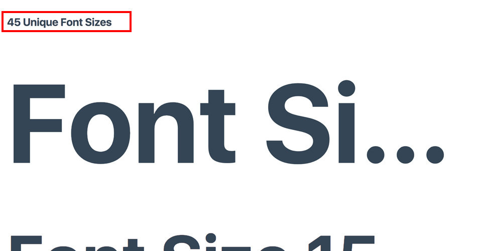
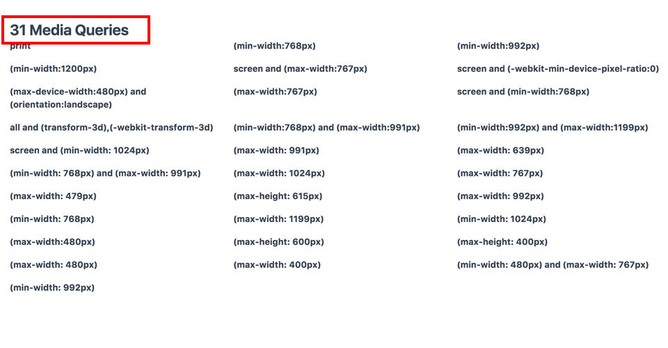
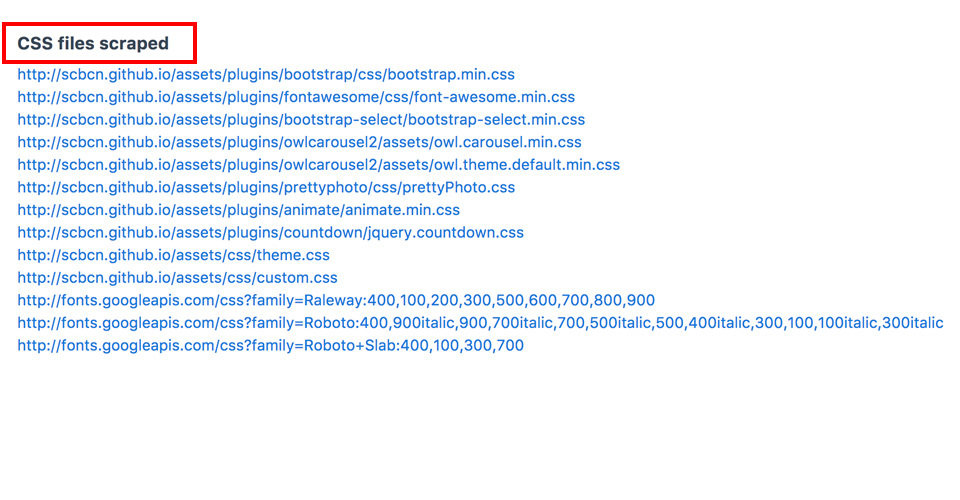
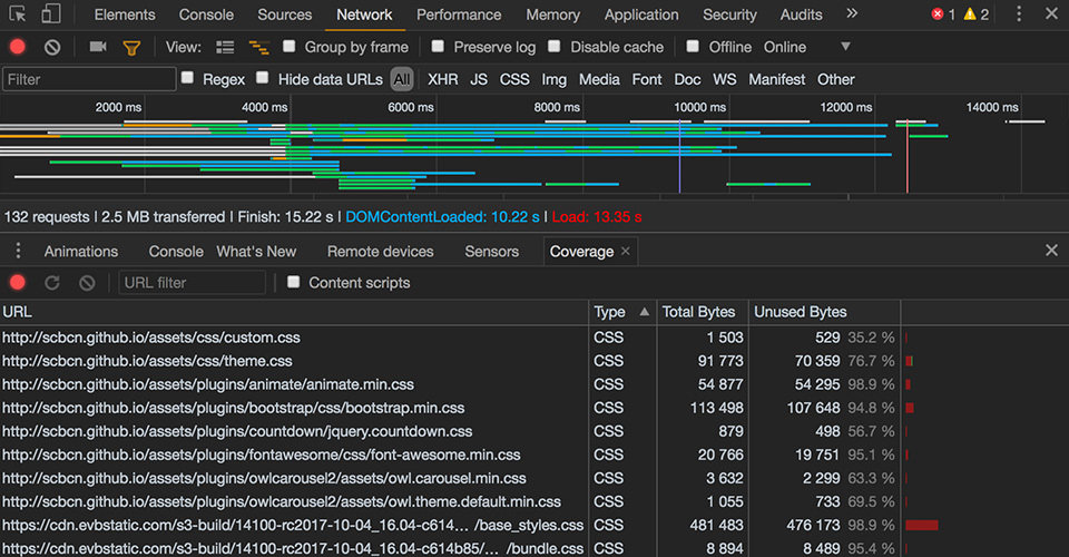
By Joan León
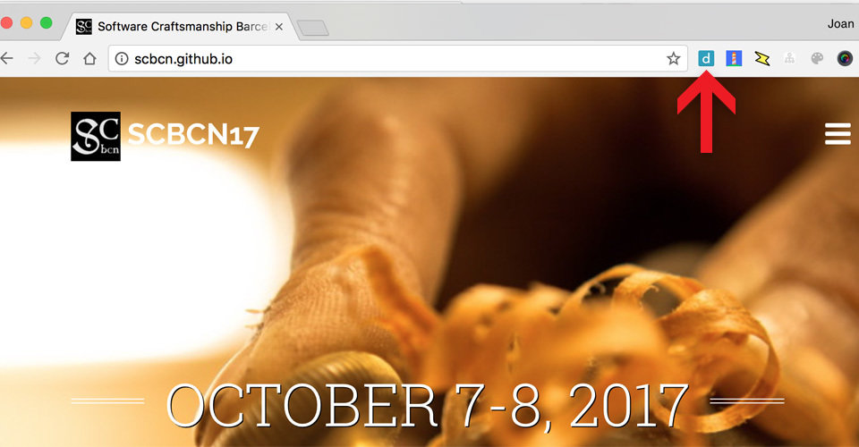
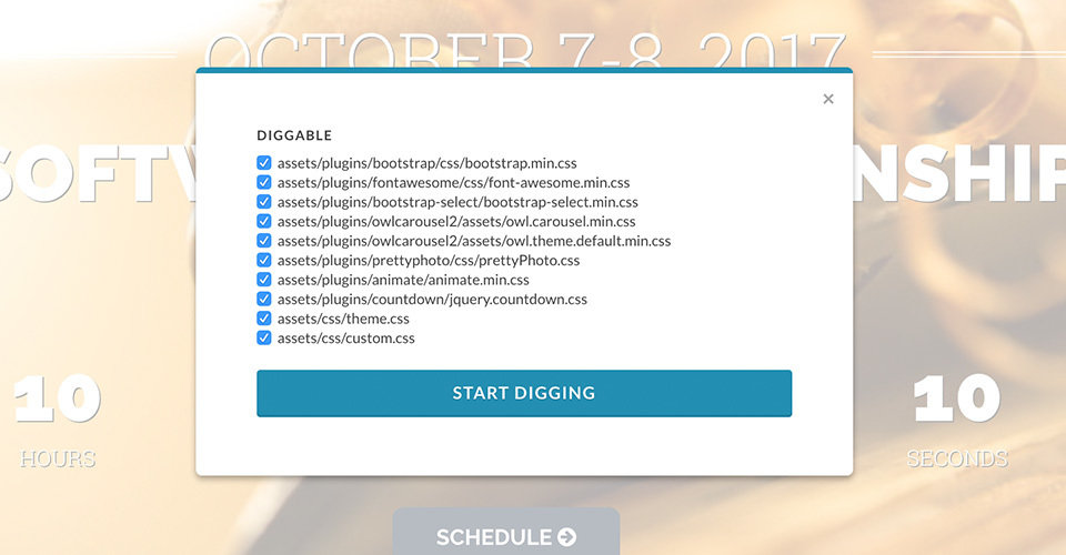
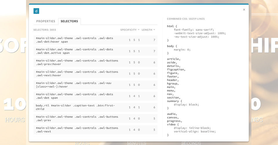
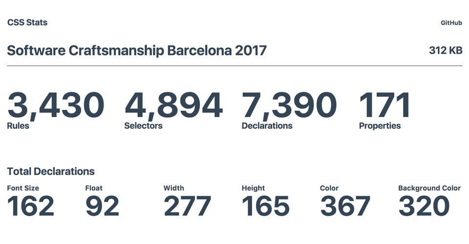
Slides de la charla CSS Craftsmanship en la conferencia Software Craftsmanship Barcelona 2017 http://scbcn.github.io/


