Modern Screen Design Process
Using style guides
Outline
- Styleguide
- Why
- How to start
- Atomic Design
- My Design Workflow
- Example of a Styleguide
Designer should be able to
!
code
Developer should be able to
design
"Design systems, not pages."

- Andy Clark
Styleguide
Pattern Lab
Component Guide
Modular Design Guide
Front-End Design Guide
+ consistency
+ easier to test
+ better workflows
+ reference / documentation over time
Why a Styleguide?
- time consuming
- too abstract
- no best practices established
Where to start?
+ look at the methodology of Atomic Design
by Brad Frost
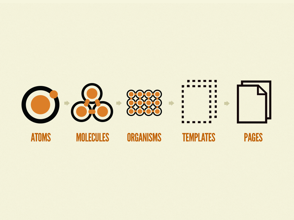
Atomic Design by Brad Frost
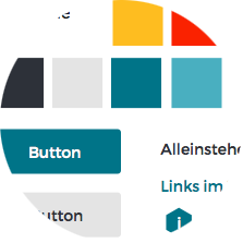
Styleguide
The smallest possible element

Label
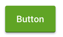
Button
Input Field
Atoms


A combination of atoms
Molecules

A combination of atoms and molecules
Organisms
Whats your workflow?
?
My Workflow
Requirements/
Wireframes
Work out design
Designsheet
Styleguide
Templates


Inspiration
direction
Aa Bb Cc
Aa Bb Cc Dd
Wireframes - Why?
" I really like the color, but can you change it? "
"Please just use Comic Sans. We need it look 'fun'."
"Can you move the heading 10px down?"
Wireframes
- Fast & good basis for discussion
-
Low fidelity
- Sketches
- Wireframe Tool (Balsamiq, Omni Graffle, ...)
- Interactive
- Showing important workflows
- InVision, Framer.js, ...
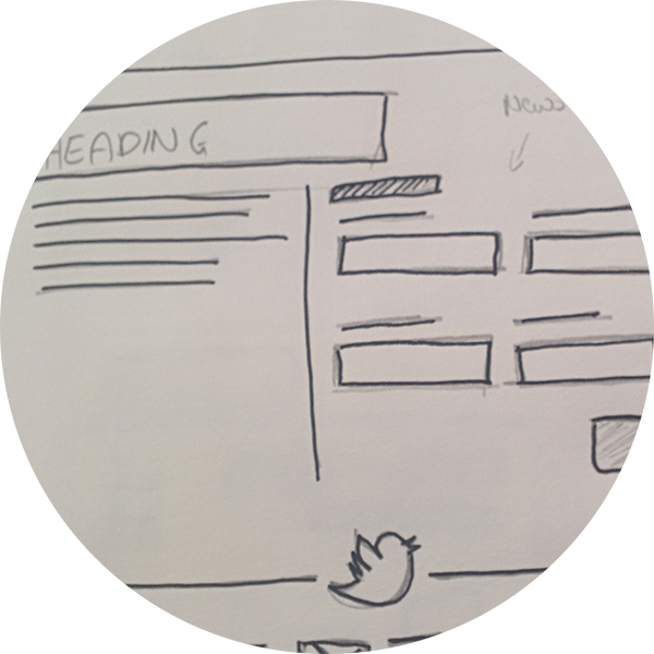
Designsheet
- Collect all basic elements
- Translate your worked out design to the UI elements
- Good for discussing with customers
Next steps
- All Screens with Sketch or Photoshop
- Most important Screens with Sketch or Photoshop
- Start with a Styleguide
Styleguide
Create Atoms an Molecules in HTML and CSS
by reference to the wireframes and the design sheet
Styleguide
What to use:
- CSS Documentation
- Auto generates Style Guide
- SCSS, LESS
- Example: Yelp
- Sass and Markdown
- Separated CSS and HTML
- Works with task runner (Gulp, Grunt, Broccoli,...)
- Example following
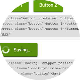
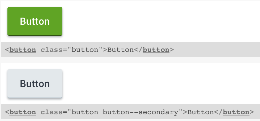
Living Style Guide
.button {
  padding: 13px 20px;
  width:100%;
  border:none;
  font-family: $main-font;
  border-radius: $border-radius;
  box-shadow: 0 2px 3px rgba($color-darkgrey, 0.4);

  @include base_button($white, $color-primary);
}

.button--secondary {
  @include base_button($color-darkgrey, $color-lightgrey);
}
Stylesheet: _button.scss
Living Style Guide
Buttons //Markdown file for buttons
=======

```
<button class="button">Button</button>
```

```
<button class="button button--secondary">Button</button>
```
Markdown: _button.md
Living Style Guide
Workflow Summary
- Choose a task runner: Gulp, Grunt, Broccoli
- Make some basic configuration
- Create a Sass and Markdown file with the same name
- Start styling
Example: Cropster Hub

Styleguide File structure Cropster Hub
Be always 100% in sync with your codebase.
!
Use Sketch!
New to code?

Thanks for listening.
Happy styling.
Modern Screen Design Process
By Lisa Gringl
Modern Screen Design Process
Modern Screen Design Process - Using style guides


