Data Visualisation
14 May 2020
@maartenzam
Boehringer Ingelheim
4.Dashboard design
Today
1. Data visualisation fundamentals
2. Online and interactive data visualisation
3. Going beyond bars and lines: non-standard visualisations
4. Dashboard design
Dashboard design
Dashboards?
Know your audience
Visual information seeking mantra
Basic design principles for dashboards
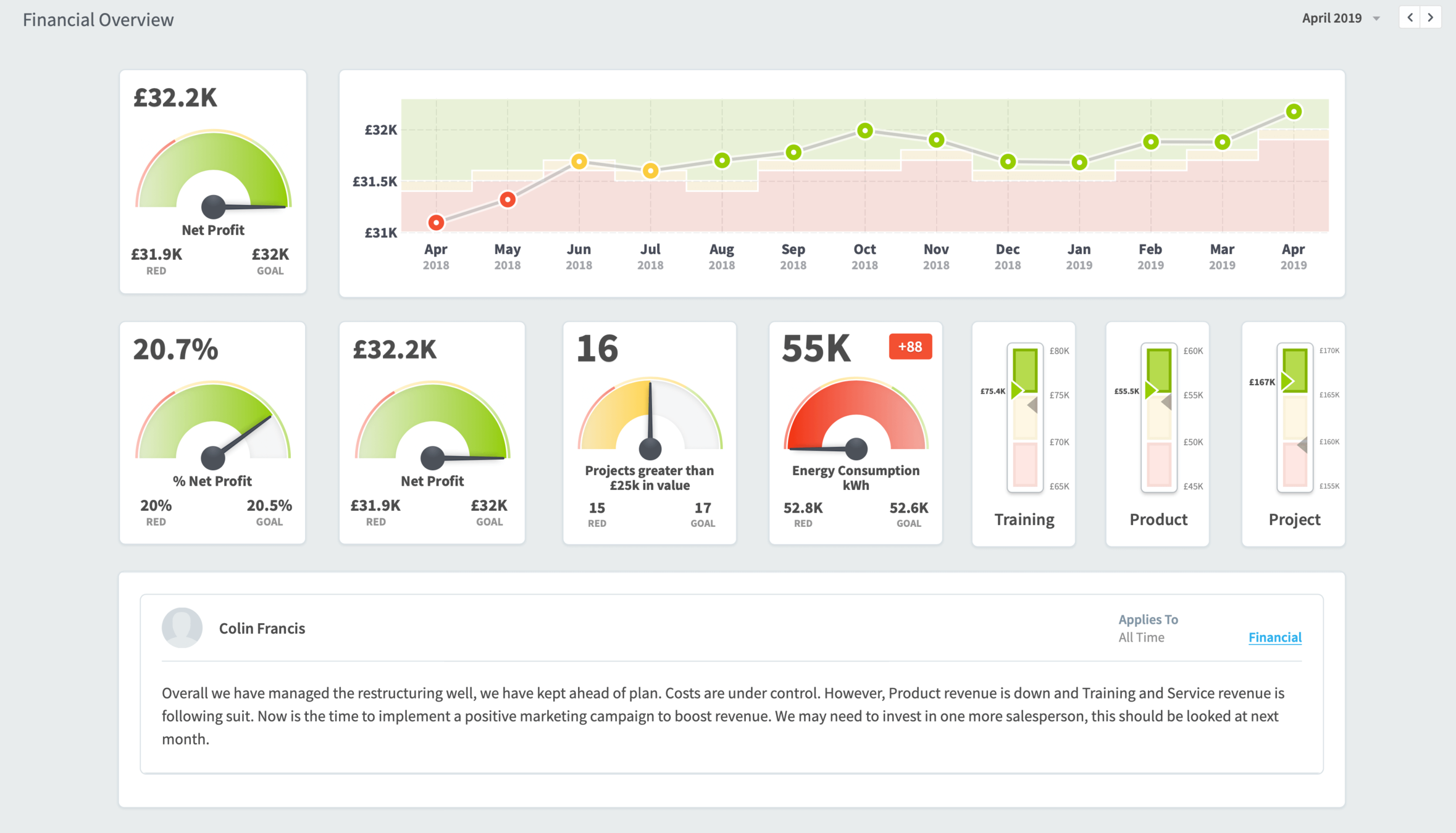
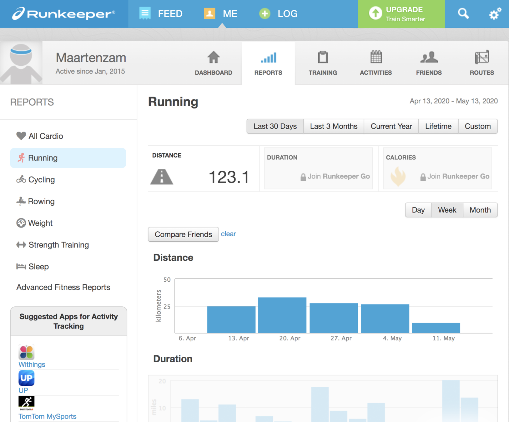
Examples
Exercise: dashboard design evaluation
Dashboards?
Any display with a bunch of charts on it"

"Dashboard design best practices" are like "Document writing best practices"
All dashboards have different
data
audiences
goals
Types of dashboards
Monitoring
Anwser specific questions
- Everything ok?
- Processes ended?
- Cause of problem?
- Where to invest resources?
Exploration
Gain insights
- Who are our customers?
- How are people using our webshop?
- What are the patterns in our sales?
Monitoring
Anwser specific questions
- Only show relevant data
- Data and context
- Time frame is short
- User is most important
- Should lead to action
- Tool = operational dashboard
- Limited interactivity
Exploration
Gain insights
- Show all the data
- Data
- Time frame is long
- Data is most important
- Should lead to insight
- Tool = analytical dashboard
- Filters, tabs, sliders, ...

Monitoring dashboard

Analytics dashboard
Monitoring dashboards:
Know your audience
Who is going to use your dashboard?
Topical knowledge?
Technical skills?
Goals?
What tasks does the user need to perform?
Objectives?
Key information to reach those?
How to get to key information?
Actions after interacting with dashboard?
What is the context the dashboard will be used in?
How much time does the user have?
What devices are used?
How to get to key information?
Actions after interacting with dashboard?
Example
Delivery load dashboard

Visual information seeking mantra
Overview first,
zoom and filter,
then details-on-demand
The Information Seeking Mantra, Ben Shneiderman

Illustration: Stephen Few
Overview first
The whole dataset, summarised
Only higher level components
No individual records
Can be a single number, or a single chart
Zoom and filter
Zoom in on items of interest
Filter out items not of interest
Might require UI, which should be obvious
Details on demand
Get details of single items, or of a group of items
Dashboard design principles
User centric,
not data centric,
not dashboard centric

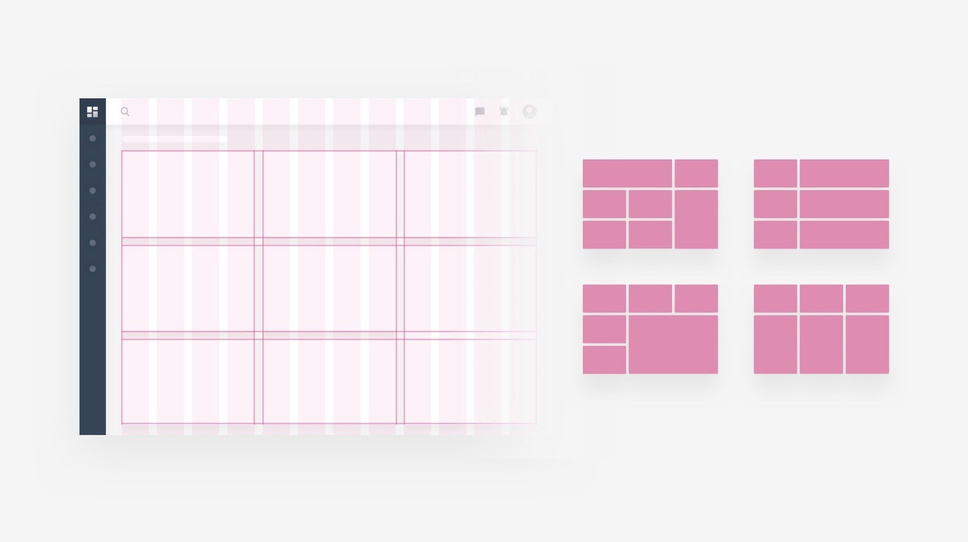
Layout
Use a grid
Layout
Use the Z pattern
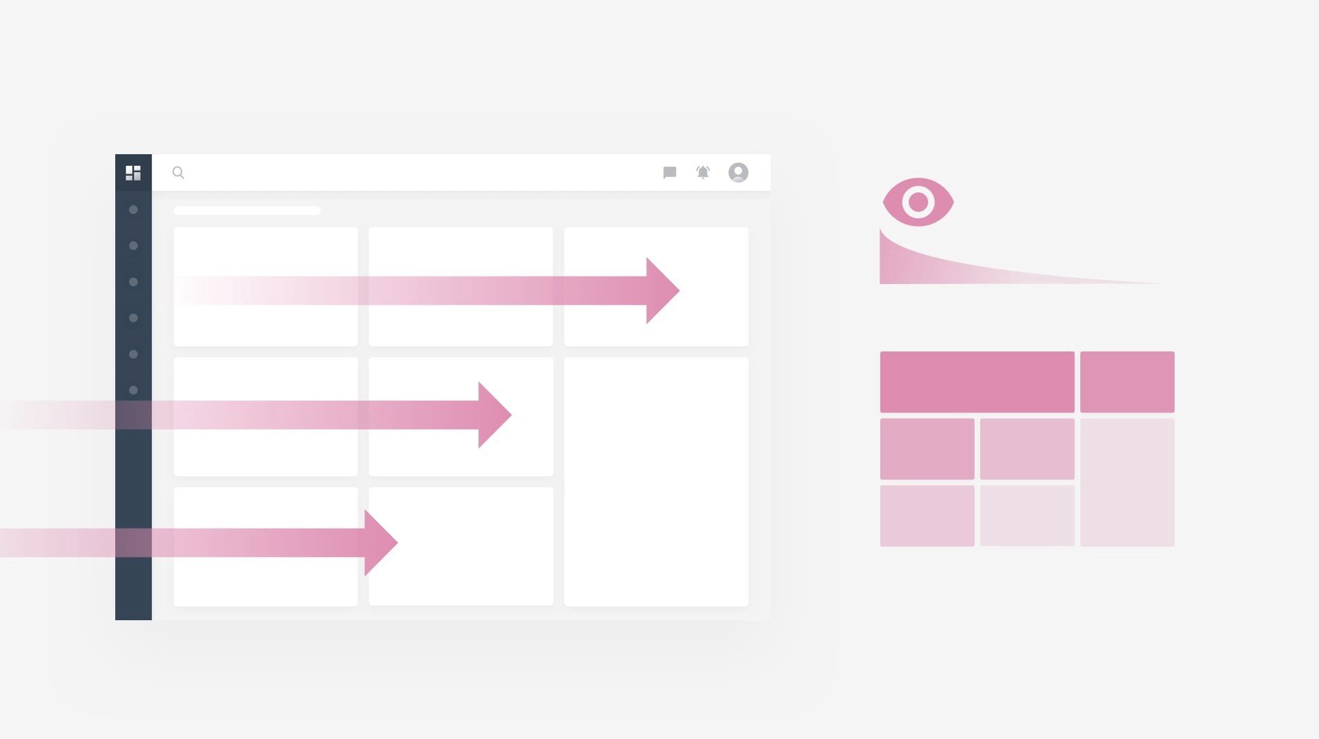
Layout
Use whitespace
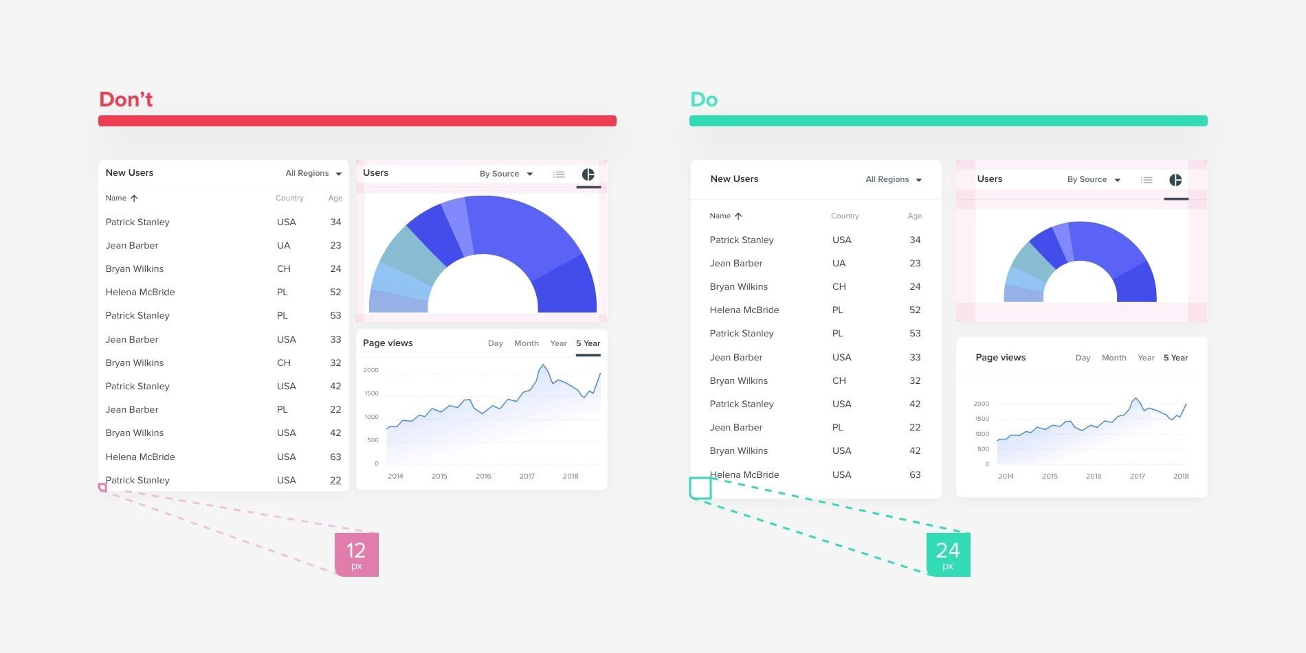
Less is more

Create hierarchy
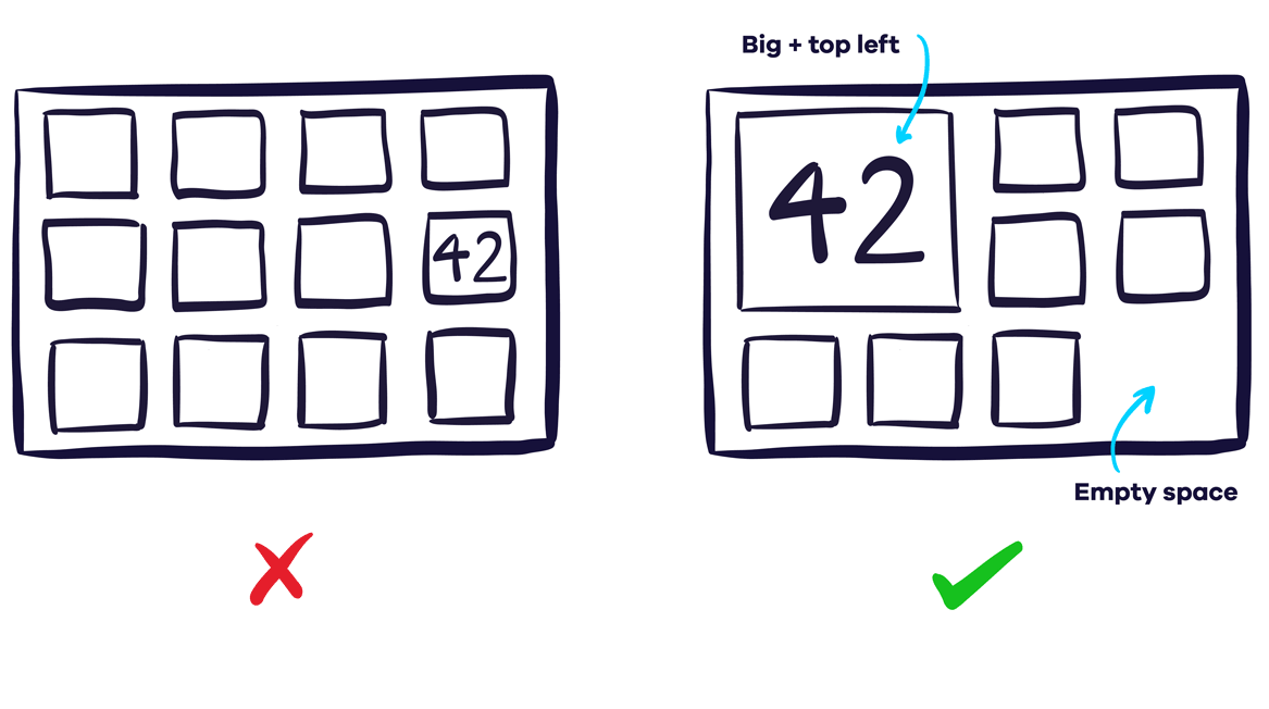
Group

Be consistent

Color
Be consistent
Sparse: draw attention, call to action
Accessible
Numbers
Round: 1.2M instead of 1.245.543,23€
Include context (targets, averages, ...)

Text
Create visual hierarchy
Include all necessary explanations,
but limit/hide them
Visualisation
Use appropriate chart types
Respect basic rules of data visualisation
Guide attention
Colors
Grouping
Fonts
Grid
Guide action
Actions to perform
People to contact
Interactivity
Obvious
Undo/Redo, Go back
Tooltips for details on demand
Examples


Exercise: dashboard design evaluation
Exercise
What kind of dashboard (monitoring, exploration, what-if, ...)?
Who would be the end user?
What is the goal of the dashboard?
What is good about the dashboard?
What could be improved?


Thank you!
Dashboard design
By maartenzam


