Introduction to web UI styling for fresh frontend Programers
© Nadav Sinai 2016
Rendering in the browser
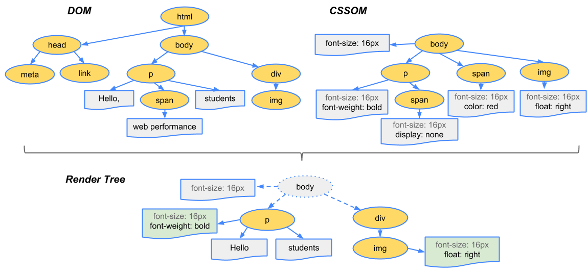
<html>
  <head>
    <meta name="viewport" content="width=device-width,initial-scale=1">
    <link href="style.css" rel="stylesheet">
    <title>Critical Path</title>
  </head>
  <body>
    <p>Hello <span>web performance</span> students!</p>
    <div><img src="awesome-photo.jpg"></div>
  </body>
</html>
body { font-size: 16px }
p { font-weight: bold }
span { color: red }
p span { display: none }
img { float: right }HTML
CSS
HTML is transformed to DOM
CSS is transformed to CSSOM
Both are combined to Render Tree
CSS Basics
Syntax
selector {property : value}


selector1 selector2, selector1 selector3 {
 property:value;

}

@direction argument

@direction argument (conditional_argument:value) AND (conditional_argument:value) {

    block_selector {
        property : value;
    }
}
Selectors
Cascading
CSS styles can be specified in many ways, but they will all cascade into one style sheet in the end.
- Browser default
- External style sheet
- Internal style sheet
- Inline style
Application method matters
Selectors have different weight
- element
- .class
- #id
Cascading order
Combining selectors makes selector more specific,
div.container {
    z-index:1;
}

body div.container  {
    z-index:10;
}

html body div.conatiner {
    z-index:100;
}
!important
.container {
    z-index:1000!important;
}
Cascading order
Action state or media state add to selectivity
div.container {
    z-index:1;
}

div.container:hover  {
    z-index:10;
}
@media screen {
    div.container{
        z-index:100;
    }
}
Cascading order
Inheritence
During the cascade, property values are resolved tocomputed values. Some of these values are inherited from its parent’s element in the document tree.
<p style="color: red; border: 1px solid #000;"><q><span>red text</span></q></p>red text
Box Model
For each element in the document a "box model" is calculated accounting its size in pixels
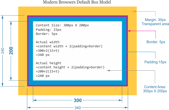
Layout Process
For each element in the document a "box model" is calculated accounting its size in pixels
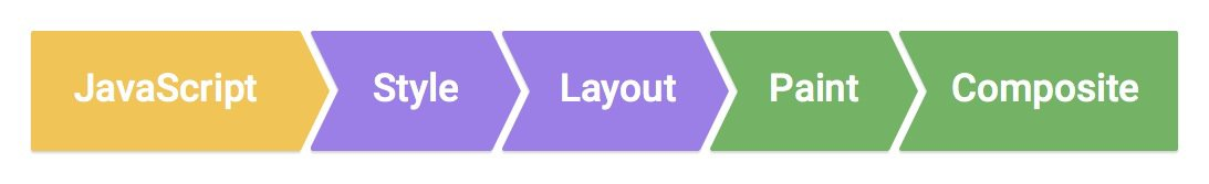
Initial render is always so
But repaints which try to happens 60 times a second, may skip some of the steps if the browser realizes nothing changed
CSS values can be changed via JS, media queries, user actions and animations. some CSS properties require Layout and repaint, some do not
Box Model
CSS 3 box-sizing property
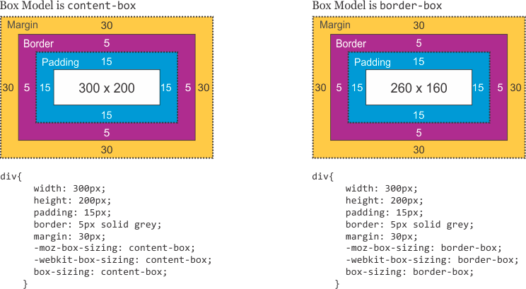
Box Model
CSS 3 box-sizing property
Layout Properties
Display
display is CSS's most important property for controlling layout. Every element has a default display value depending on what type of element it is. The default for most elements is usually block or inline.
display: block;
- p, h1-6, div and many others are block by default
- start and occupy a whole line ( no sibling elements)
- produce a line break after them
- can have width,height, margin and padding
display:block
display:block
display:block
display: inline-block;
-
button, select few other others are inline-block
- they allow sibling elements and child block elements
- they sit in the line context and are effected by vertical-alignement, text-align, line-height etc.
- their initial dimensions are based on their content
- width, height and all margins and padding properties affect them.
- they can not break over lines, but do not produce line breaks on their own.
display:inline-block
display:inline-block
display:inline-block
display: inline-block;
-
span, img, button, input and many others are inline
- they do (should) not contain block elements
- width or height propeties don not effect them
- they take only thier content spance
display:inline
display:inline
display
:inline
display: table
- table and its natuaral child tags (tr,td,th) will inherit the relevant table display property - table-row, table-cell but it can be used on any element
- display:table container is in itself similar to :block, but used to contain other :table-row or :table-cell elements
- table-row takes the whole row and produces line break
- table-cell takes as much space as possible of the row dividing the available space in the number of its sibling cells
display:table
display:table-row
display:table-row
display:table-cell
display:table-cell
display: flex
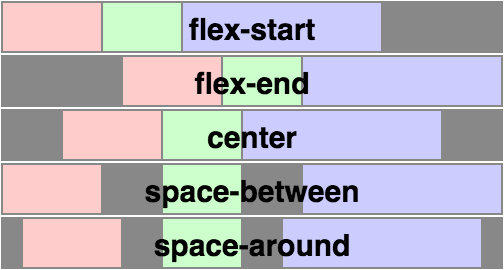
producing complex layouts with css was difficult and a new model was needed, flexbox is the new way to do layouts, now made even more as browser support is ~96%
- display:flex is added to the container
- its child nodes expand and shrink to share the container space dynamically by their width/height and some flex related properties
Float elements
Floats were initially made to allow text to wrap around an image
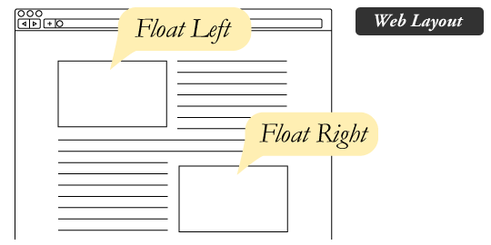
but were soon adopted as a layout tool (sidebars, navigation bars etc)
float makes block elements behave more like inline-block, but there are some differences:
- float nodes do not count for the height the parent container
- float can be disabled via the clear property (1-2 directions)
Margin and center
margin can be used to center elements HORIZENTALY in container
- width needs to be set (max-width is also OK)
- display needs to be block
text-align is used to center internal text
vertical-alignment is used in inline elements only
Values
the simplest unit is obviously the pixel (px) but it is not really absolute screen pixels- some devices have DPR (Device pixel ratio)
we gain better control when using relative units -
| em | Relative to the font-size of the element (2em means 2 times the size of the current font) |
| rem | Relative to font-size of the root element |
| vw | Relative to 1% of the width of the viewport |
| vh | Relative to 1% of the height of the viewport |
| vmin | Relative to 1% of viewport's* smaller dimension |
| vmax | Relative to 1% of viewport's* larger dimension |
| % | Percent of default size (font size in p tag 100% =16px) |
Position Property
Position changes the layout drastically possible values:
| static | Default value. Elements render in order, as they appear in the document flow |
|---|---|
| relative | The element is positioned relative to its normal position, so "left:20px" adds 20 pixels to the element's LEFT position< |
| absolute | The element is positioned relative to its first positioned (not static) ancestor element |
| fixed | The element is positioned relative to the browser window |
Overflows
Overflow property
- only block elements with height are relevant for overflow property
- the default is visible so content can overflow from set height containers!
text-overflow property
- allows for text overflow with ellipsis (....), requires the text not to break in white space - use with white-space:nowrap
Position and Transform
left,right,top & bottom properties allow to change the element's position in relative and absolute positioning
this affects other elements in the layout
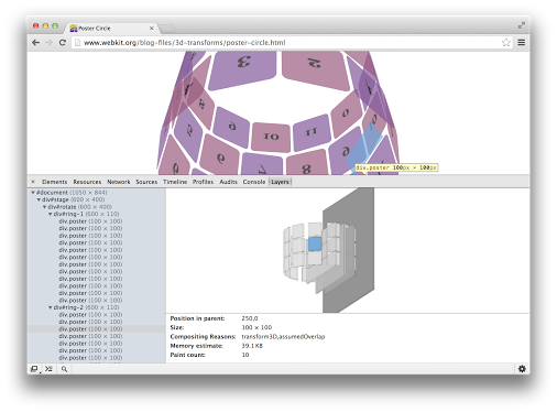
the transform property allows to change element's geometry in the composition stage
so while
and
look like they do the same thing they are different
this is particularly important for animations
.demo {left:10px;}.demo {transform:translate-x(10px);}Browser's Layout internals
will-change more info
The browser is smart to separate some elements to groups and to re-layout and re-paint only relevant groups.
we can help the browser know things will be repainted often (and make the browser promote element to a layer) via the will-change: property
layers more info
Sass
- With the complexity of web pages CSS became cumbersome to maintain, sass and other preprocessors came to help with making css more DRY and maintainable
core features
- variables
- @mixin
- @function
- @extend
Variables
variables are used/assigned with $ prefix, types are interfered.
variables can have default values using !default
//colors.scss
$btnColor:#22ddee;

//button.scss
$btnColor:#ddffee!default;

.btn{
    color:$btnColor

}

///main.css
@import "colors.scss";
@import "button.scss";


//compiled
.btn{
    color:#22ddee;

}
Mixins
simple functions can be declared using @mixin
//declration
@mixin large-text {
  font: {
    family: Arial;
    size: 20px;
    weight: bold;
  }
  color: #ff0000;
}

//use
.page-title {
  @include large-text;
  padding: 4px;
  margin-top: 10px;
}

//compiled

.page-title {
    font: {
    family: Arial;
    size: 20px;
    weight: bold;
  }
  color: #ff0000;
  padding: 4px;
  margin-top: 10px;
}
Mixins and functions
mixins can have arguments and default values
@mixin sexy-border($color, $width:10px) {
  border: {
    color: $color;
    width: $width;
    style: dashed;
  }
}

p { @include sexy-border(blue, 1in); }
there are also functions
$grid-width: 40px;
$gutter-width: 10px;

@function grid-width($n) {
  @return $n * $grid-width + ($n - 1) * $gutter-width;
}

#sidebar { width: grid-width(5); }
Reuse classes @extend
one can keep DRY with @extend
.error {
  border: 1px #f00;
  background-color: #fdd;
}
.seriousError {
  @extend .error;
  border-width: 3px;
}


//compiled

.error, .seriousError {
  border: 1px #f00;
  background-color: #fdd;
}

.seriousError {
  border-width: 3px;
}
CSS structure
Angular2 styles
- Componentization and encapsulation
- native (nothing in)
- emulated (all in, nothing out)
- none (all in/out)
- special selectors
- :host - target styles in the element host (selector tag)
- /deep/ - force a style down through the child component tree into all the child component views.
- scss in angular2 webpack build
//general style
require('../common/template/general.scss'); //will be moved to head as css

@Component({
    styles:[require('./my.component.scss')] // will be processed and exported as string -> .compoennt.scss
})
export class MyComponent{
}
Do and don'ts
- Namespace your css
- Use class prefixes not nesting
- think well about naming - function not presentaion
- Use sans-underscores BEM -
lowerCamelCaseModule-subElement--activeState - If using nesting - Avoid more than 1 non-grammatical nesting
- use @extend, functions, mixins sparingly and document well
- use OO approach with single responsibility principle when creating classes
- Open to extension - closed to modification
- Composition over inheritance
Links
CSS and rendering
By Nadav SInai
CSS and rendering
Slides for the CSS and rendering talk in Algotec


