Responsive Modern Web
Workshop by Nadav Sinai
Nadav Sinai
- Fullstack JS Web developer @ MisterBit
- Working as a consultant for firms such as Algotec, StartApp, Kaltura
- Angular.js & Angular 2 expertise
- Instructor of Angular 2 Courses

mail: ns@nadavsinai.com
web: nadavsinai.com
twitter: @nadavsinai
github: github.com/nadavsinai
Subjects Outline
- Responsive web
- Basics
- Mobile
- Layouts
- Media
- Dev tools
- Animations
- Basics
- CSS use
- JS use
- Easing
- Frameworks
- Twitter Bootstrap
- Basics
- Preprocessing
- Use cases
- SPA
- Basics
- w/wo Frameworks
- Vue.js
- Modern Javascript
- Build tools
- ES2015
Responsive web design
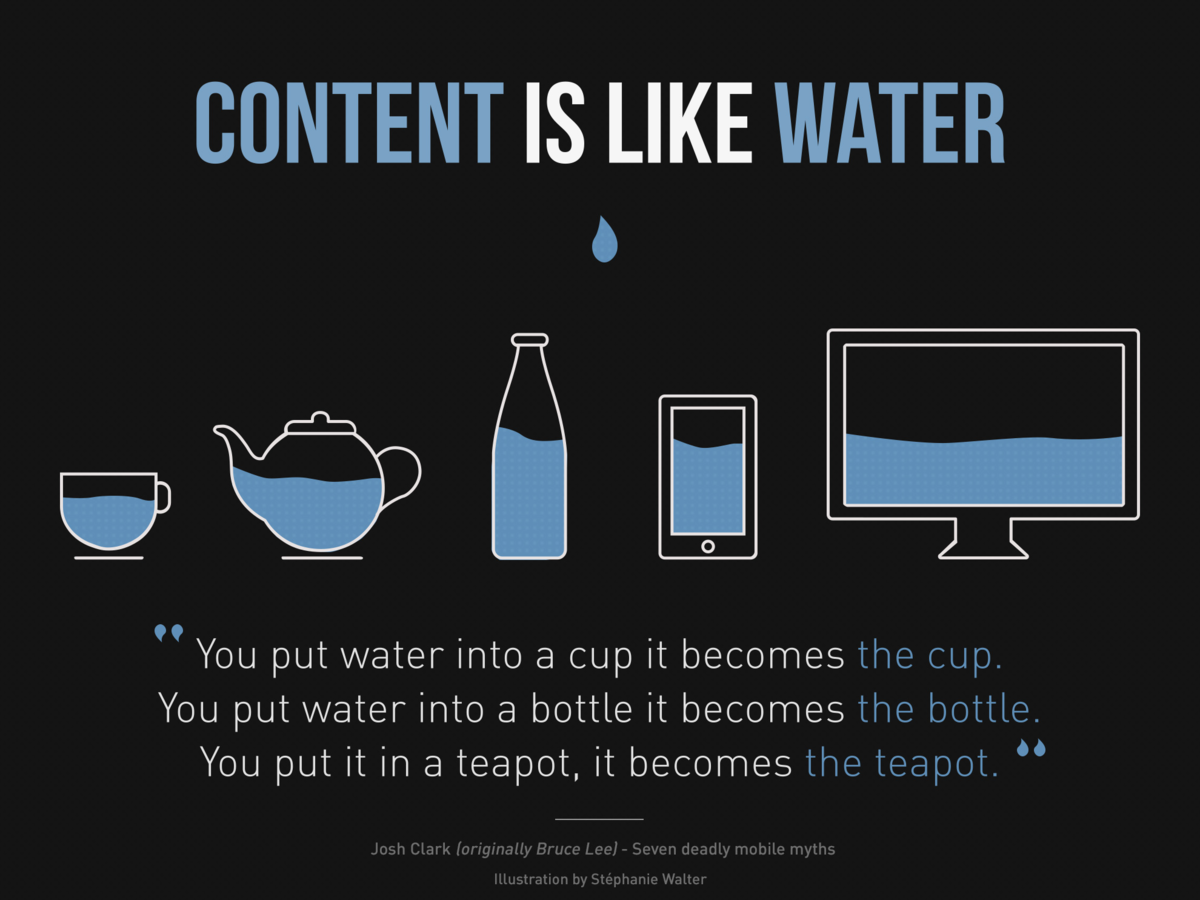
Ethan Marcotte @List Apart 2010 - design that responds to the needs of the users and the devices they’re using.
Changes in :
- Layout
- Text size
- Controls
- Data sources
...based on the size and capabilities of the device.

ReSponsive design - basics
in the past mobile browsers tried to guess...
(font boosting)
Viewport meta tag instructs the browser how to scale the page.
We can also control the zoom factor/range - not recomended
now we need to instruct:

<meta name="viewport" content="width=device-width, initial-scale=1">
Reponsive design - basics
NOTE:
Hardware <!=> CSS (DIP) pixels
Mobile devices uses hardware specific DPR (device pixel ratio)
Reponsive design - basics
| em | Relative to the font-size of the element (2em means 2 times the size of the current font) |
| ex | Relative to the x-height of the current font |
| ch | Relative to width of the "0" (zero) |
| rem | Relative to font-size of the root element |
| vw | Relative to 1% of the width of the viewport |
| vh | Relative to 1% of the height of the viewport |
| vmin | Relative to 1% of viewport's* smaller dimension |
| vmax | Relative to 1% of viewport's* larger dimension |
| % | Percent of default size (p = 16px) |
ReSponsive design - MEdia Queries
@media __TYPE__ (__TEST__) {
}
@media screen (min-width:960px) {
}
@media screen (min-width:480px) and (max-width:720px) {
}
Reponsive design - MEdia Queries
|
min-width |
Rules applied for any browser width over the value defined in the query. |
|
max-width |
Rules applied for any browser width below the value defined in the query. |
|
min-height |
Rules applied for any browser height over the value defined in the query. |
|
max-height |
Rules applied for any browser height below the value defined in the query. |
|
orientation=portrait |
Rules applied for any browser where the height is greater than or equal to the width. |
|
orientation=landscape |
Rules for any browser where the width is greater than the height. |
discouraged : *-device-width
ReSponsive design - Mobile First
- Design for content flow and least break points
- Optimisations for data size eg image src-set,
Media queries at the style sheet level
<link rel="stylesheet" media="(min-width:601px)" href="large.css"> -
Mobile interaction first
-
Progressive enhancement
ReSponsive design - Mobile First
Choosing breakpoints:
- Start from mobile
- Resize until too much whitespace
- Create breakpoint
- Optimize based on content
- Minor breakpoints if needed

ReSponsive design - Mobile First
Text Optimizations
Classical theory suggests 70-80 letters per line,
one can constrain containers or resize fonts to follow this
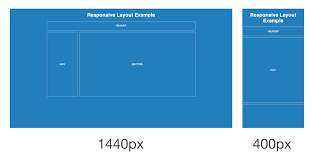
ReSponsive design - Flexible layout
A Layout may have multiple CSS implementations
think about :
- Ease of catering for different content
- Ease of adjusting for responsiveness
- Ease of maintenance
- Browser compatability
ReSponsive design - Flexible layout
Layout Categories (Luke Wroblewski)
- mostly fluid
- column drop
- layout shifter
- tiny tweaks
- off canvas
ReSponsive design - Flexible layout
CSS Display property revision
none
block
inline
inline-block
table (cell/row...)
flex
ReSponsive design - Flexible layout
CSS position property revision
static (inherit)
absolute
fixed
relative
Floats.... clear floats...
ReSponsive design - Flexible layout
use Flexbox! (if IE 11+ is OK)
- Display flex is set on parent of items to layout
- items will shrink/grow in relations to each other
- items can be rearranged by CSS
ReSponsive design - Flexible MEDIA
Flexible media (Images,Videos)
- Responsive to size
- Responsive to connection speed
Used to rely on JS, now available on platform

ReSponsive design - Flexible MEDIA
IMAGES -srcset
<img src="small.jpg" srcset="medium.jpg 2x, HD.jpg 3x">
x stands for DPR the src is 1x implied.
ReSponsive design - Flexible MEDIA
IMAGES -srcset w & sizes
<img src="fallback.jpg" srcset="small.jpg 320w, medium.jpg 1024w, HD.jpg 2000w" sizes="80vw">
w = image width, vw = viewport width
the w unit must come together with the sizes attribute when supported, then src is ignored.
the browser can then make an educated choice for the right image
ReSponsive design - Flexible MEDIA
IMAGES -sizes is responsive
<img src="fallback.jpg" srcset="small.jpg 320w, medium.jpg 1024w, HD.jpg 2000w" sizes="(min-width:2500px) 2000px,(min-width:800px) 80vw,100vw">
the sizes attribute can accept multiple media queries
ReSponsive design - Flexible MEDIA
IMAGES
<picture> is used when total control is needed, for example when a completely different picture is to be used for artistic reasons.
<picture>
        <source media="(min-width: 650px)" srcset="images/kitten-large.png">
        <source media="(min-width: 465px)" srcset="images/kitten-medium.png">
        <!-- img tag for browsers that do not support picture element -->
        <img src="images/kitten-small.png" alt="a cute kitten">
</picture>ReSponsive design - Flexible MEDIA
VIDEO
<video id="intro-video" poster="img/poster.png" controls>
		<source src="videos/intro.mp4" type="video/mp4" media="all and (min-device-width:1600px)">
		<source src="videos/intro.webm" type="video/webm" media="all and (min-device-width:1600px)">
		<source src="videos/intro-1600.mp4" type="video/mp4" media="all and (min-device-width:1100px)">
		<source src="videos/intro-1600.webm" type="video/webm" media="all and (min-device-width:1100px)">
		<source src="videos/intro-1100.mp4" type="video/mp4" media="all and (min-device-width:481px)">
		<source src="videos/intro-1100.webm" type="video/webm" media="all and (min-device-width:481px)">
		<source src="videos/intro-480.mp4" type="video/mp4">
		<source src="videos/intro-480.webm" type="video/webm">
</video>
NOT SUPPORTED
ReSponsive design - Flexible MEDIA
VIDEO
<video controls="controls" preload="none">
    <source class="mp4 sp" src="mov_bbb.mp4" type="video/mp4" />
    <source class="mp4 hd" src="mov.mp4" type="video/mp4" />
    <source class="webm sp" src="mov_bbb.webm" type="video/webm" />
    <source class="webm hd" src="mov.webm" type="video/webm" />
    <source class="ogg sp" src="mov_bbb.ogg" type="video/ogg" />
    <source class="ogg hd" src="mov.ogg" type="video/ogg" />
</video>$(document).ready(function($){
var currentVid = $('video')[0].currentSrc,
supportedType;
//findout which format the browser picked
if (currentVid.indexOf('mp4') > 0) {
supportedType = 'mp4';
} else if (currentVid.indexOf('webm') > 0) {
supportedType = 'webm';
} else if (currentVid.indexOf('ogg') > 0) {
supportedType = 'ogg';
}
//use window width to set which video to pick
if ($(window).innerWidth() < 768) {
$('video')[0].src = $('video .' + supportedType + '.sp ').attr('src');
} else {
$('video')[0].src = $('video .' + supportedType + '.hd ').attr('src');
}
});ReSponsive design - Flexible MEDIA
VIDEO
.videoWrapper {
	position: relative;
	padding-bottom: 56.25%;
	padding-top: 25px;
	height: 0;
}

.videoWrapper iframe,
.videoWrapper embed {
	position: absolute;
	top: 0;
	left: 0;
	width: 100%;
	height: 100%;
}<div class="videoWrapper">
<iframe src="http://player.vimeo.com/video/6284199" width="800" height="450" frameborder="0"></iframe>
</div>ReSponsive design - FONTS & ICONS
Use Vector Icons (svg,font Icons) whenever possible
Supply font files for all platforms
@font-face {
	font-family: 'MyFontFamily';
	src: url('myfont-webfont.eot?#iefix') format('embedded-opentype'),
	     url('myfont-webfont.woff') format('woff'),
	     url('myfont-webfont.ttf')  format('truetype'),
	     url('myfont-webfont.svg#svgFontName') format('svg');
	}
ReSponsive design -TOUCH
make sure your app is responsive to touch events
- use pseudo classes (:active) to style interactive elements
- Add custom gestures that relate to your UI

Responsive design - Dev tools
-
Real devices -
- Chrome remote debug
- Safari Remote debug
- IOS Debugging proxy (repo)
- Android/IOS simulator
- Online simulators - like these
- DevTools Emulator
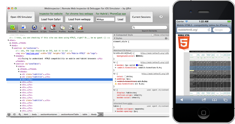
Responsive design - Dev tools
Dev tools demo
ReSponsive design - SUMMARY
Q & A
MODERN WEB - Animations
Animations can be very beneficial for interaction
Animations should:
- Enrich the interaction
- Not cause any performance overload
MODERN WEB - Animations
Animations can be done via:
- CSS
- transition
- animation
- JS (WebAnimations)
- animate API
- requestAnimationFrame
MODERN WEB - Animations
Transitions
box {
  transform: translate(0, 0);
  transition: transform 500ms;
}

.box.move {
  transform: translate(100px, 100px);
}MODERN WEB - Animations
CSS Animatons
.box {
  animation-name: movingBox;
  animation-duration: 1300ms;
  animation-iteration-count: infinite;
  animation-direction: alternate;
}

@keyframes movingBox {
  0% {
    transform: translate(0, 0);
    opacity: 0.3;
  }

  25% {
    opacity: 0.9;
  }

  50% {
    transform: translate(100px, 100px);
    opacity: 0.2;
  }
  100% {
    transform: translate(30px, 30px);
    opacity: 0.8;
  }
}MODERN WEB - Animations
CSS Animatons
var box = document.querySelector('.box');
box.addEventListener('transitionend', onTransitionEnd, false);

function onTransitionEnd() {
  // Handle the transition finishing.
}
Knowing when the animation has finished
MODERN WEB - Animations
JS Animate method (support) (POLYFILL)
var target = document.querySelector('.box');
var player = target.animate([
  {transform: 'translate(0)'},
  {transform: 'translate(100px, 100px)'}
], 500);
player.addEventListener('finish', function() {
  target.style.transform = 'translate(100px, 100px)';
});MODERN WEB - Animations
JS RequestAnimationFrame
if (!window.requestAnimationFrame)
        window.requestAnimationFrame = function(callback, element) {
            var currTime = new Date().getTime();
            var timeToCall = Math.max(0, 16 - (currTime - lastTime));
            var id = window.setTimeout(function() { callback(currTime + timeToCall); },
              timeToCall);
            lastTime = currTime + timeToCall;
            return id;
        };
MODERN WEB - Animations
JS RequestAnimationFrame
var start = null;
var element = document.getElementById("SomeElementYouWantToAnimate");
element.style.position = 'absolute';

function step(timestamp) {
  if (!start) start = timestamp;
  var progress = timestamp - start;
  element.style.left = Math.min(progress/10, 200) + "px";
  if (progress < 2000) {
    window.requestAnimationFrame(step);
  }
}

requestAnimationFrame(step);
With requestAnimationFrame you can do anything, modify DOM, Attributes, Styles, or render to <canvas>
MODERN WEB - Animations
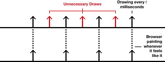
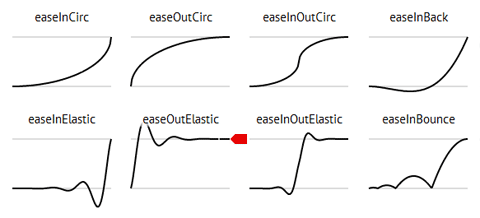
Easing
CSS animations and JS .animate support Easing properties, which fine tune the progression of movement between the keyframes
MODERN WEB - Animations
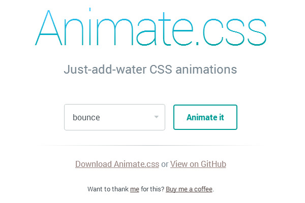
FrameWORKS

MODERN WEB - Animations
Navigation Animation
MODERN WEB - Animations
Q & A
TWITTER BOOTSTRAP

Bootstrap is the most popular HTML, CSS, and JS framework for developing responsive, mobile first projects on the web.
TWITTER BOOTSTRAP
CSS Framework
HTML Patterns
JS (Jquery) Plugins

TWITTER BOOTSTRAP
CSS
Written in LESS, can be consumed by:
- Precompiled, overriding to change
- Compiled with own variables via UI generator
- Compiled via own build step, allowing to use and change all internal variables, mixins etc..

TWITTER BOOTSTRAP
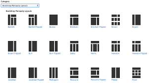
CSS - Layout
TWITTER BOOTSTRAP
CSS - Navigation

TWITTER BOOTSTRAP
CSS - Position + Responsive
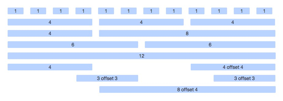
The bootstrap grid
- .container , .container-fluid
- .row
- .col-xx-n, offsets
TWITTER BOOTSTRAP
CSS - Position + Responsive
Other
- tables
- images
- responsive utils
TWITTER BOOTSTRAP
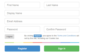
CSS + JS - Forms
TWITTER BOOTSTRAP
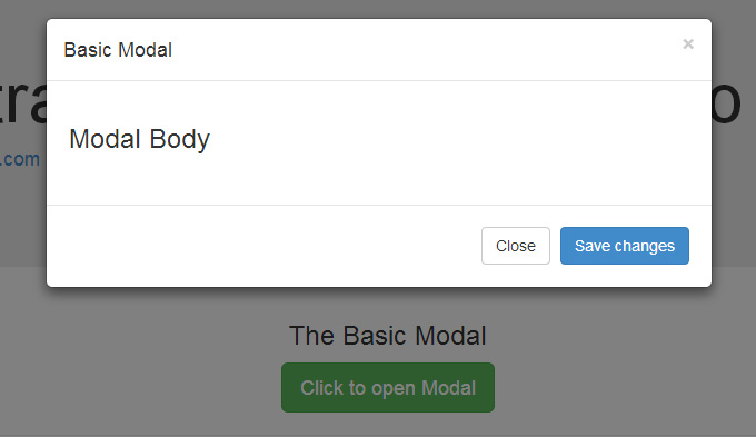
JS - Modals
Modern alert(),confirm() etc..
TWITTER BOOTSTRAP
Links
TWITTER BOOTSTRAP
Q & A
Modern web - SPA
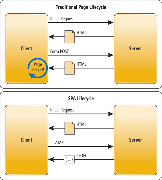
Modern web - SPA
- Speed
- Interactivity
- Data costs
- Offline support
- Server costs
- Ease of development
Modern web - SPA
- Client Side Logic
- Client Side Templates & Data Binding
- After initial load C/S Interaction is for data loading only
- Internal routing may need to be done via the hash (#) if no server side support
Modern web - SPA
Frameworks
Prototype
Backbone
-----
Knockout
Ember
Angular.js
----
React
-------
Vue.js
Riot.js
Modern web - SPA
No Framework?
One can go framework-less for simple tasks
- Jquery can help with AJAX/DOM/utils
- Handlebars/other light templating library can help with templating
- Structure is up to us
Modern web - SPA
HAndling the URL
- raw URL strings are available using the window.location
- they need to be decoded via decodeURIComponent
- location change event is $(window).on('hashchange',...
- programmatic changes should also update the location
- to keep large state in the URL a little library help can be beneficial
Modern web - SPA
Mini frameworks

Modern web - SPA
Logic that makes SENSE
Messy and random (no modules)
|
Packages and modules (modular)
|
Modern web - SPA
Webpack
-
allows writing modular code
-
bundles files together
-
allows other resources as modules
-
allows transformations
-
many build & development tools

Modern web - SPA
Q & A
MODERN WEB - ES2015
- What Is ES2015
- Where can it be used (kanjax)
- Code transpiling tools

MODERN WEB - ES2015
BABEL
- General code transpiler
- Transforms,plugins, presets
- preset-es2015
- Modules
- use via Gulp/Webpack/Runtime

MODERN WEB - ES2015
LEt,COnST
- var had a problem of not being contained to block
- always use let or const to avoid problems
function varTest() {
  var x = 1;
  if (true) {
    var x = 2;  // same variable!
    console.log(x);  // 2
  }
  console.log(x);  // 2
}

function letTest() {
  let x = 1;
  if (true) {
    let x = 2;  // different variable
    console.log(x);  // 2
  }
  console.log(x);  // 1
}
MODERN WEB - ES2015
Arrow Functions
- A function that does not set a new scope but uses the lexical this
- very useful for callbacks, promises, class constructors...
- short and concise syntax
function LongWay(){
 console.log(this);
}

//to use it with relevance to something
var bound = LongWay.bind(something)
bound()
//or
LongWay.apply([],something);
LongWay.call(undefined,something);

doingSomething(){
let something = this;
()=>{
    console.log(this); /// same as something
}();

}
MODERN WEB - ES2015
String Templating
- C like template syntax, multiline
- can be acted as a function
let str = `
whitespace
will be
preserved
value is ${1===1}
`

function tag(strings, ...values) {
  console.log(strings[0]); // "Hello "
  console.log(strings[1]); // " world "
  console.log(values[0]);  // 15
  console.log(values[1]);  // 50

  return "Bazinga!";
}

tag`Hello ${ 10 + 5 } world ${ 10 * 5 }`;
MODERN WEB - ES2015
- Syntatic sugar for Function constructors + prototypes
- Can not be instantiated without the "new" keyword
- Class declaration is not hoisted
- Class can be an expression
- Methods can be static or belong to the instance
- Constructor has special rules
Classes
class Point {
    constructor(x, y) {
        this.x = x;
        this.y = y;
    }
    toString() {
        return `(${this.x}, ${this.y})`;
    }
}

class ColorPoint extends Point {
    constructor(x, y, color) {
        super(x, y);
        this.color = color;
    }
    toString() {
        return super.toString() + ' in ' + this.color;
    }
}

// Use
const cp = new ColorPoint(25, 8, 'green');
cp.toString(); //'(25, 8) in green'
cp instanceof ColorPoint //true
cp instanceof Point //true
MODERN WEB - ES2015
MODERN WEB - ES2015
Object improvmens
Objects can now have :
- Symbol keys
- Computed properties
- shorthand notation
- getter/setters
Object prototype has a few important new methods like
- Object.assign
- Object.is
MODERN WEB - ES2015
- Native future type for async operations
- Chaining
- Better Error handling
- Performance benefits
- 1st class citizen in new APIs (fetch, ServiceWorker etc...)
Q & A
MODERN WEB - ES2015
Responsive Web
By Nadav SInai
Responsive Web
slides for a workshop day on responsive modern web tech


