The end of the mobile web

October, 2021 - Sylvain Pollet-Villard
2010: The childhood OF MOBILE WEB


- iPad and iPhone 4G just released
- Android market has 80,000 apps
- Smartphones are <10% web trafic
- Mobile OS wannabes: "Windows Mobile 7", Bada, WebOS
Apps are cooler
SLOW AND BORING


double the costs. Every time.
and pretend Windows Phone does not exist

BET ON Mobile web ?


UserS
DEVS


Web
"Mobile
Web"
"Desktop
Web ?"
The most common strategy at the time
to split desktop and mobile users was
User Agent sniffing
https://adrianroselli.com/2011/10/detecting-mobile-devices.html

but how do you decide if some device is "mobile" or not ?
GAME: Mobile or not ?
Play in the chat:
Enter "mobile" or "desktop"
APPLE IPAD 3rd gen
13 inch touch screen
CONNECTED IN WI-FI
USED IN public transports

Mobile or desktop ?
low-cost netbook
CHROME FOR ANDROID android 6.0
10,1 inch non-touch screen
CONNECTED IN 4G
USED AT HOME, ON A TABLE
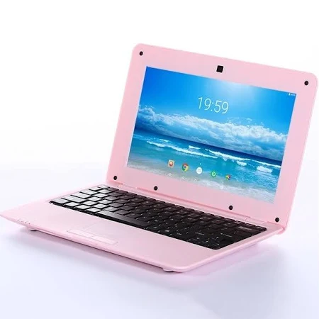
Mobile or desktop ?
MICROSOFT DUO
EDGE - windows 10x
2 X 5.6 INCH touch screen
connected in 4g
USED AT WORK, AT HIS DESK
Mobile or desktop ?


nINTENDO WII U
webkit netfront
6.2 inch touch screen
CONNECTED IN WIFI
used in dual screen mode
at HOME, in the couch
Mobile or desktop ?

samsung galaxy note 10+
CHROME - ANDROID 9.0
6.3 INCH touch screen
2280 x 1080 pixels !
connected in 4g
Mobile or desktop ?


USING SAMSUNG DEX MODE
what made you decide ?
Screen size ? Screen definition ?
Inputs ? Touch screen or keyboard/mouse ?
Connectivity ? Bandwidth ? Latency ?
Device power ? Capabilities ?
Usage context, user intent ?
mobile is not black & white

Not even a grayscale

screen size ? bandwidth ? user focus ?
It's a multidimensional problem
What does mobile even mean ?
phone
handheld
touch UI
moving,
changing ?
YET, decisions based on this ABSTRACT
frontier Are done every day
- Functional specs:
show a different content here for mobile users
- Web design:
display a different navigation menu on mobile
- Front-end dev:
load an alternative version of a component on mobile
- Client / Product owner:
focus on tickets from mobile users


Web devs love to criticize browsers...
WRONG ASSUMPTIONS HAVE BAD CONSEQUENCES


but it's not the first time browsers fix web devs mistakes:


It didn't age well in 2021
Why do we make
these bad decisions ?
1. mobile as an excuse
- for commercials, to sell more
- for project managers, to create new tasks and extend deadlines
- for devs, to do half of the job (I plead guilty !)
Bad arguments:
-
"you can't handle all devices"
→ yes, you can, with the right level of abstraction -
"we have to make generalizations at some point"
→ unnecessary "sacrificial" decisions -
"my client doesn't use mobile"
→ my client is stuck with big screens because of me

2. works on my machine
the gap between dev and user
environments and usage contexts
Emulating small resolutions, touch controls, bad performance with CPU and network throttling, does not replace testing with a real device
- Address all usecases. Test without mouse. Then test without keyboard. Then test with only one hand, lying on a sofa.
- Testing panels: have your app tested by your boss, your roommate, your children, your mother
- Don't blame the user ! Your job is to make the website usable

3. User stories are just stories
Reasoning cognitive bias lead to a poor perception of reality:
- Hypothesis confirmation bias :
prefer elements which confirm rather than invalidate a hypothesis - Representativeness bias:
consider one or more elements as representative of a population - Selective perception:
selectively interpret information based on own experience.
User scenarios → are you sure about the order of the actions ? the timing ?
Mockups on Illustrator → what happens to your pixel-perfect layout if we slightly change the width, or zoom in text because user is myopic ?
This "mobile web" thing is a user story

How to fix this ?
Dealing with divertisity and complexity

"mobile web" assumptions
smartphone
at home (WiFi)
Grandpa's
computer ?
iPad in
public transport

Think in variables, not categories
(of course there are more than 3 variables:
browser support, device capabilities, usage context...)
8 categories
3 variables
Dealing with divertisity and complexity
H
CSS Media Queries have been thought this way:
Think in variables, not categories

They also tried to make device categories, but it did not work in the end:

Cut into smaller parts
Move from full-page mockups to components and graphic charter
The smaller the component is, the easier it is to adapt
to all the variables: screen size, input methods...
Things to ban: "mobile" mockups, fixed layouts, ideally prefilled data

cut into smaller parts
Modularize everything: components, inputs, actions, services...
For each part, define hypotheses, constraints and options
Example: a photo gallery component
gallery-lib.desktop.js / gallery-lib.touch.js
- what image size to load ?
→ check screen resolution and network conditions
- how will the user interact with the component ?
→ load gallery-mouse-controls module if mouseover event,
load gallery-touch-controls module if touchstart event
- what should be the loading strategy ? preload next pictures ?
→ based on first image loading time or user actions
do not assume mobile should not preload
Think in actions, not scenarios
(Unpopular opinion: this applies to devs, QA and
product owners, from writing specs to end-to-end testing)
Don't presume the user :
- will do a set of actions in a certain order
- will not be interrupted when doing so
- will not switch to a different device in between

Users switch often between devices and expect consistency from your website UX, data and service

(Study by Google, August 2012)
Know when to optimize VS when to adapt
I can try to optimize:
- network data consumption
- CPU usage
- space used on screen
Optimizing will keep your application simple and consistent,
but can only be done up to a point before having to adapt.
Media queries are a good example of this kind of breaking point.

I need to adapt to:
- network and device constraints
- screens too small / too big
- user inputs and usage context


EMBRACING ONe WEB APPROACH
What future for the mobile web ?
Step 1 : mobile web sucks
Step 2 : mobile web used to suck
Step 3: there is no mobile web, only the Web
I'd like to think we are already at step 2
Now I want to move to step 3
The end of the mobile web
Thanks ! Questions ? Opinions ?
The end of the mobile web
By sylvainpv


