CSS
GRID
Aaron Vanston
Aaron Vanston
@aaronvanston
CSS Who?
Two-dimensional layouts
Flexbox helped out... but is only really intended for one-dimensional layouts
css-tricks.com/snippets/css/complete-guide-grid
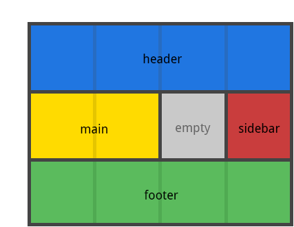
.item-a{
  grid-area: header;
}

.item-b{
  grid-area: main;
}

.item-c{
  grid-area: sidebar;
}

.item-d{
  grid-area: footer;
}
Once we have our grid container set-up...
Separating layout from display and markup
However...
Browser support is not the best, but getting there...

Internet Explorer 10 and 11 were some of the first to support it, but it's an old implementation with an outdated syntax


chrome://flags
and enable
"experimental web platform features"
Prior to chrome 57
Basic terminology
Similar to flexbox in that you have a container and an item but with about 100x the amount of terminology to confuse you with

Grid Line

Grid Track

Grid Cell

Grid Area
Sub Grid

GRID
FACTS!
Grid areas are not at risk of overflowing its content into others
However... it is possible to layer grid areas
Flexbox can re-order components in a single row or column...... cute


Grid can change positions of any content around the whole page!
fr units?
fraction of available space
Think flex-grow and flex-shrink
Demo Time!


There is more...
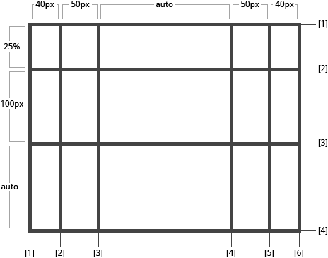
.container{
  grid-template-columns: 40px 50px auto 50px 40px;
  grid-template-rows: 25% 100px auto;
}
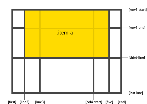
.item-a{
  grid-column-start: 2;
  grid-column-end: five;
  grid-row-start: row1-start
  grid-row-end: 3
}
Aaron Vanston
@aaronvanston