SCARY
FLEXBOX

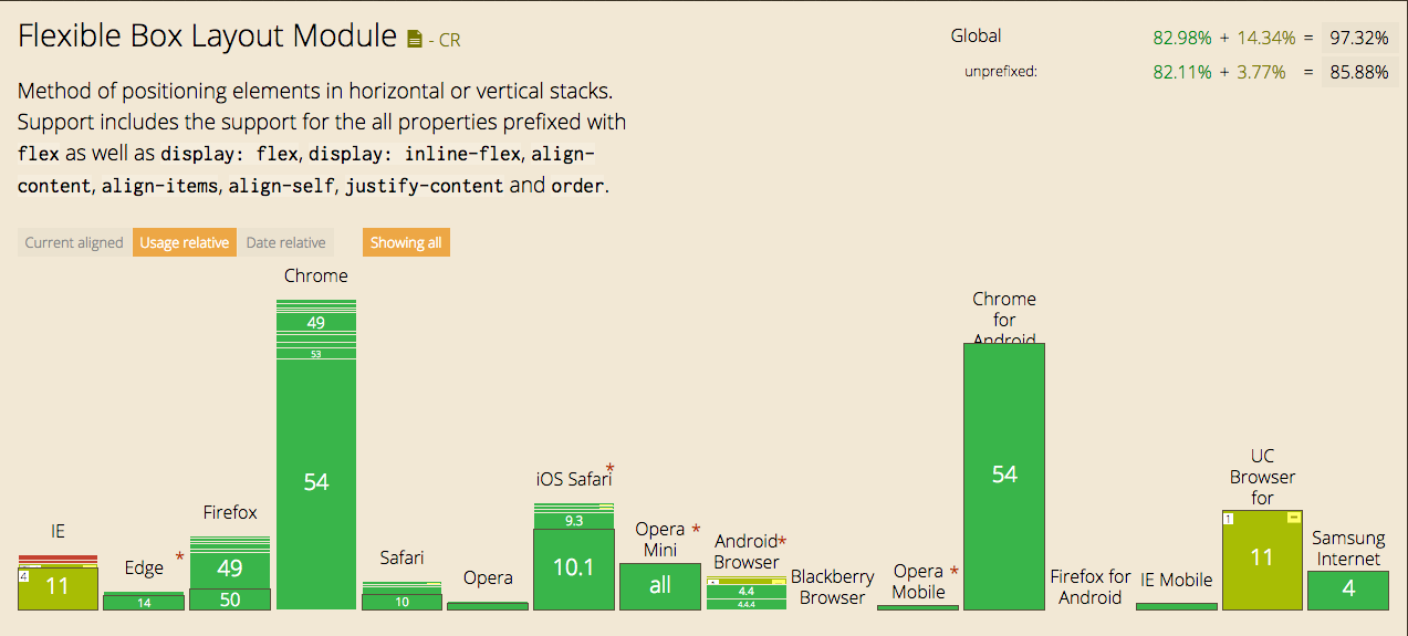
Chrome ~21 Supported it in 2012
.flex-ussage {
  display: box;      /* First draft */
  display: flexbox;  /* Transition draft */
  display: flex;     /* Final draft */
}
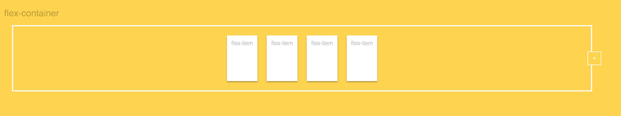
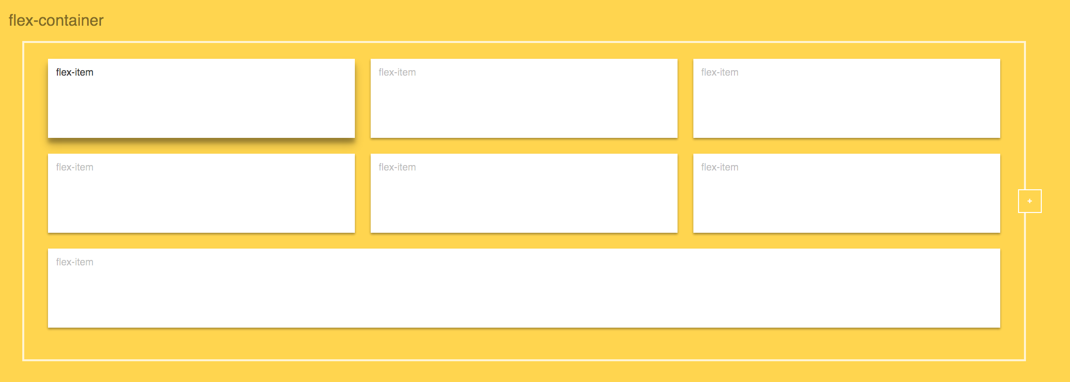
FLEX CONTAINER
FLEX ITEM
.flex-container {
  display: flex;
}
.flex-item {
flex: 1;
}PUT THESE TOGETHER
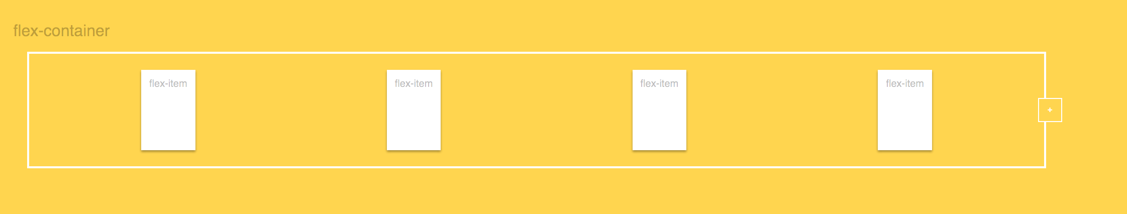
FLEX CONTAINER
FLEX ITEM
.flex-container {
  flex-direction: row;
  flex-wrap: nowrap;
  justify-content: flex-start;
  align-items: flex-start;
  align-content: flex-start;
}
.flex-item {
order: 1;
flex-grow: 1;
flex-shrink: 1;
flex-basis: 1;
align-self: 1;
}CONTAINER: justify-content
space-around
center
CONTAINER: align-items
center
flex-start
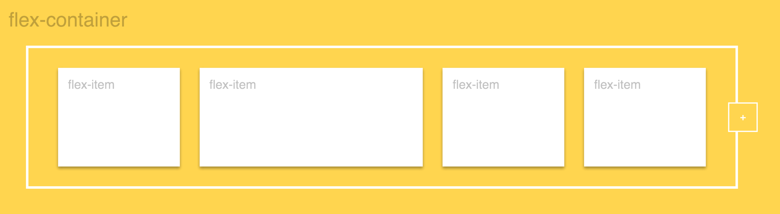
CONTAINER: flex-wrap
wrap
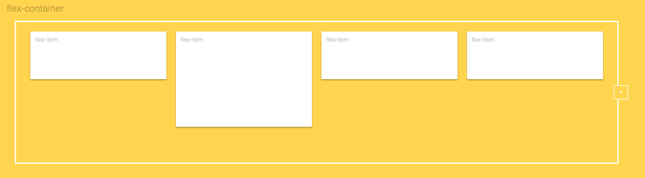
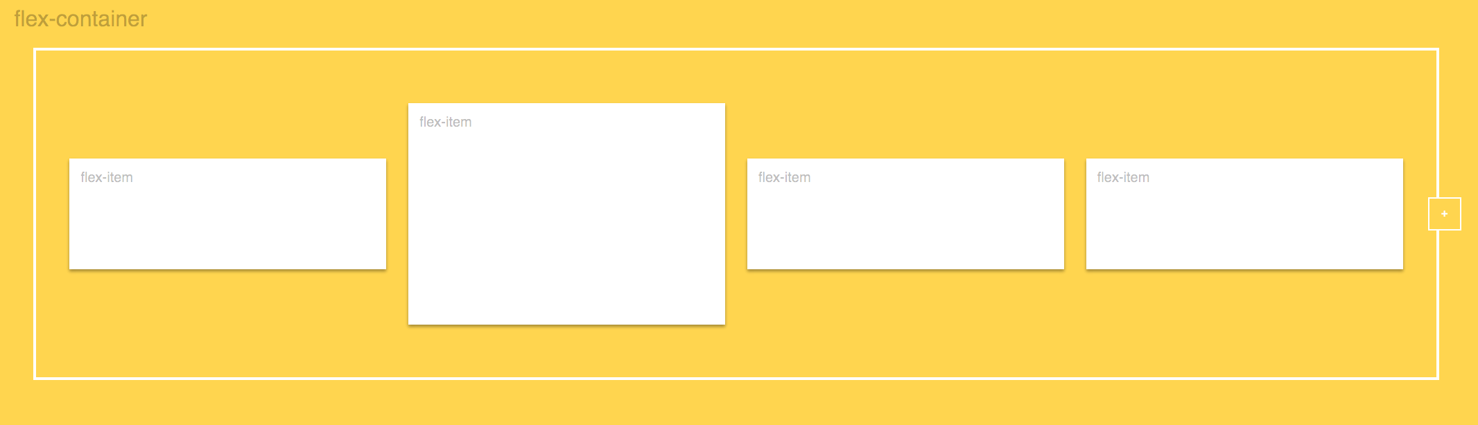
ITEM: flex-grow
Grow and Shrink
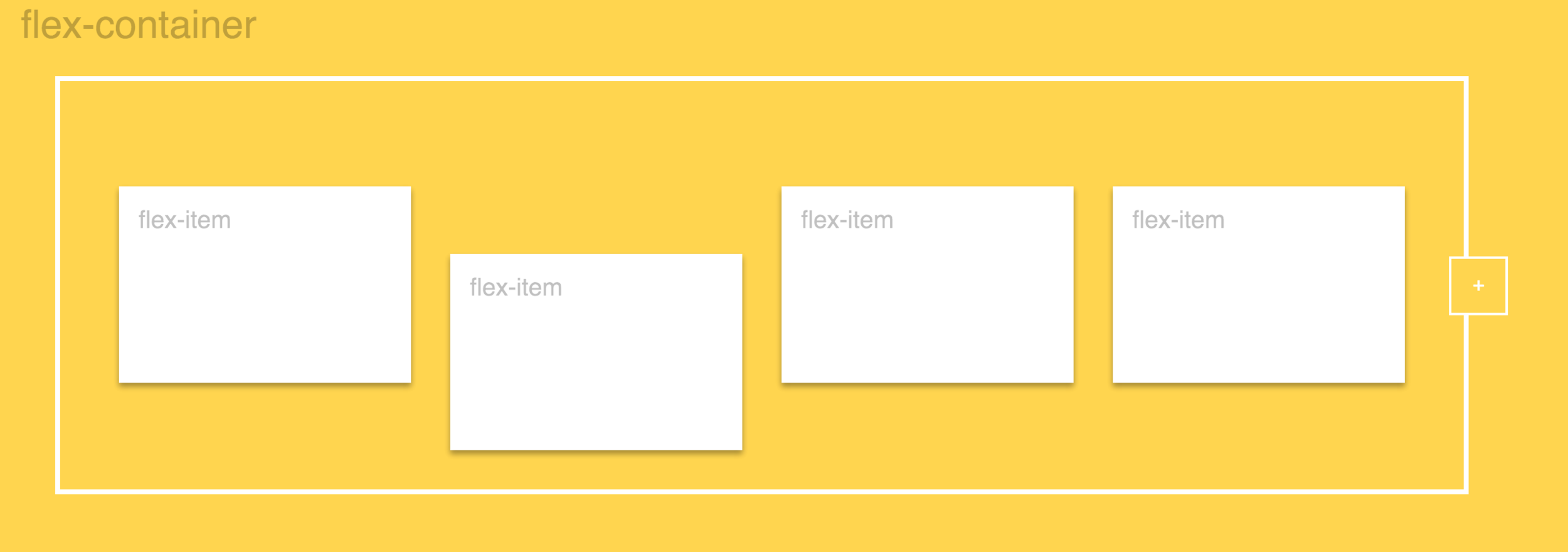
ITEM: align-self
Flex Item #2: flex-end
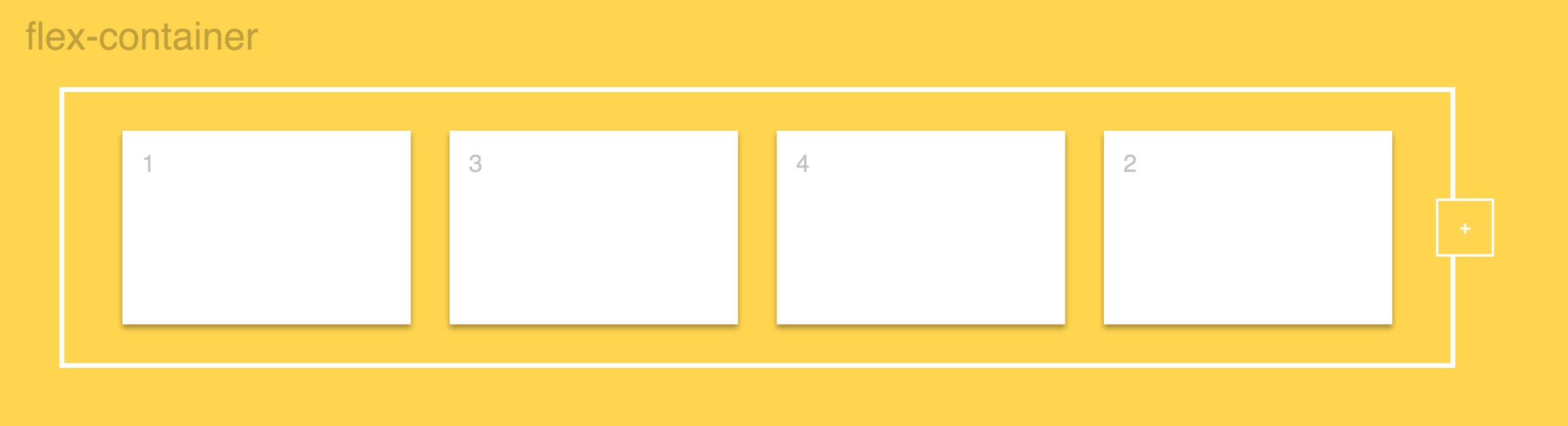
ITEM: order
Flex Item #2: order: 2
css-tricks.com/a-guide-to-flexbox/
-
Chris Coyier
flexbox.io
-
WesBos
HOW TO FLEX
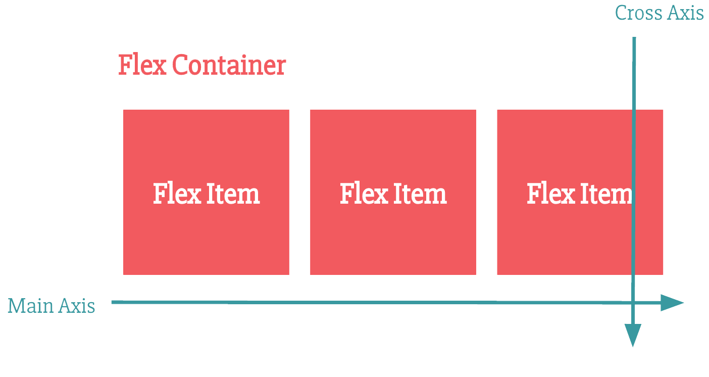
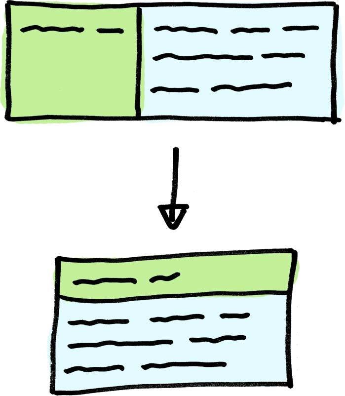
GRASPING THE AXIS CONCEPT
GRASPING THE AXIS CONCEPT
.flex-container {
  flex-direction: column;
}
FLEX ITEMS
.flex-item {
  flex: 1 1 auto;
}
.flex-item {
flex-grow: 1;
flex-shrink: 1;
flex-basis: 1;
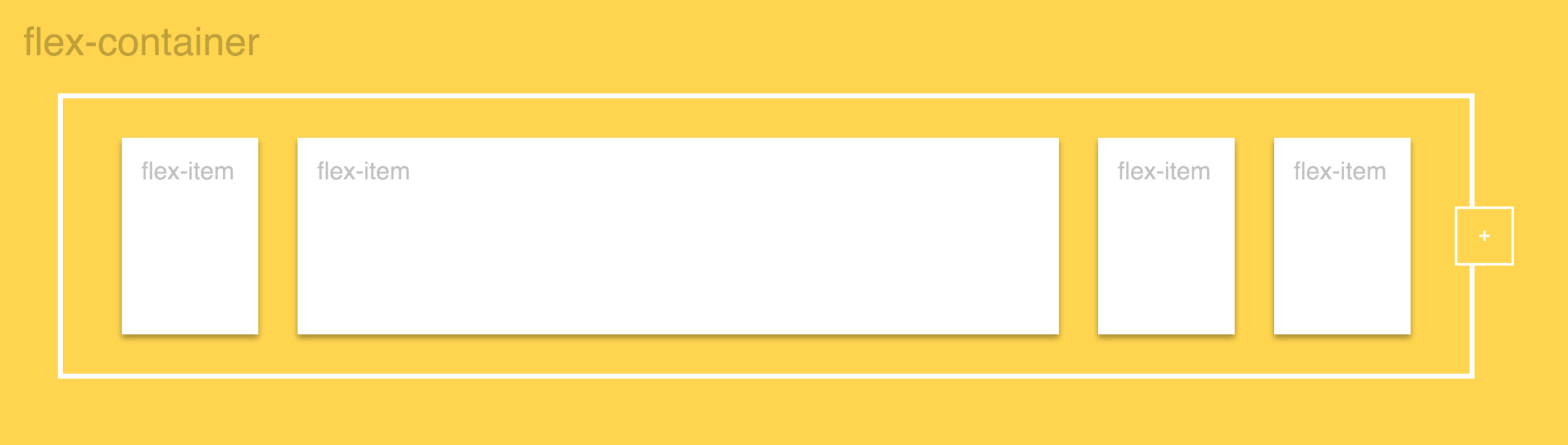
}FLEX ITEMS
FLEX ITEM #2: flex: 2
FLEX ITEMS
FLEX ITEM #2: flex-basis: 50%
FLEX ITEMS
/* 0 0 auto */
flex: none;

/* One value, unitless number: flex-grow */
flex: 2;

/* One value, width/height: flex-basis */
flex: 10em;
flex: 30px;
flex: auto;
flex: content;
FLEX ITEMS
/* Two values: flex-grow | flex-basis */
flex: 1 30px;

/* Two values: flex-grow | flex-shrink */
flex: 2 2;

/* Three values: flex-grow | flex-shrink | flex-basis */
flex: 2 2 10%;
FLEX ITEMS
It is recommended that you use this shorthand property rather than set the individual properties. The short hand sets the other values intelligently.
- Chris Coyier
https://github.com/philipwalton/flexbugs#4-flex-shorthand-declarations-with-unitless-flex-basis-values-are-ignored
IE SUPPORT
Internet Explorer 10-11 ignores unitless flex-basis
.flex-item {
  flex-basis: auto;  /* Sad IE */
  flex-basis: 100%;  /* Happy IE */
  flex-basis: 40px;  /* Happy IE */
}
ONE NEAT TRICK FOR A COOL FLEXBOX HACK
http://joren.co/flex-grow-9999-hack/
ONE NEAT TRICK FOR A COOL FLEXBOX HACK
http://joren.co/flex-grow-9999-hack/
ONE NEAT TRICK FOR A COOL FLEXBOX HACK
http://joren.co/flex-grow-9999-hack/
We could use a breakpoint but....
1. The width of item A is unknown. For instance, it contains words that are longer in another language.
2. We don’t know the width of the components parent element. For instance, if it is used in a sidebar and in some other places.
ONE NEAT TRICK FOR A COOL FLEXBOX HACK
http://joren.co/flex-grow-9999-hack/
.container {
    display: flex;
    flex-direction: row;
    flex-wrap: wrap;
}

.item-a {
    flex-grow: 1;
}

.item-b {
    flex-grow: 9999;
    flex-basis: 20em;
}
SCARY
FLEXBOX
NOT SO