SXSW 2014
What I learned
Andrew Baker
Visually Turning Complexity
into
Clarity
Data is MOST CERTAINLY.....
BIG
But doesnt have to be....
SCARY
As long as we know how to....
visually illustrate
data relationships
Some things to consider
YOUR AUDIENCE
CONTENT AND EDITING ARE HUGELY IMPORTANT
CLARITY IS KEY
LOGIC MATTERS
DESIGN MATTERS
data mining
"The science of extracting useful information from large data sets or databases."
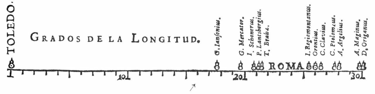
Then (1600's)
Now
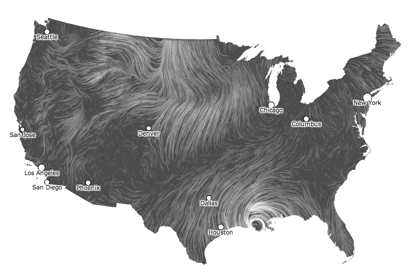
Why is "wind patterns" great?
- its realtime...its alive!
- built on government data
- its dynamic
- its made from code. Javascript!!
- its complex but clear & concise
- It was iterative and exploratory
- dont use it to help you fly a plane
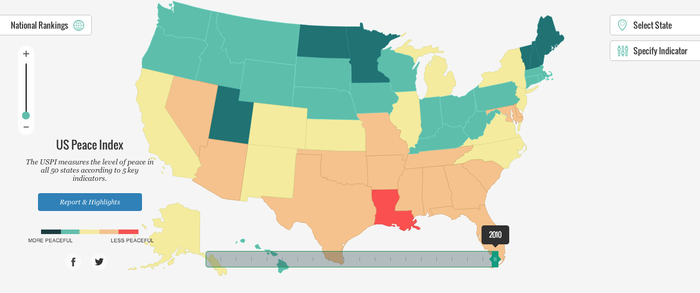
How do you measure PEACEFULNESS?
The United States Peace Index (USPI) is a statistical measurement of all 50 states' peace and the cost of violence
- homicide
- violent crime
- policing
- incarceration rates
- availability of small arms
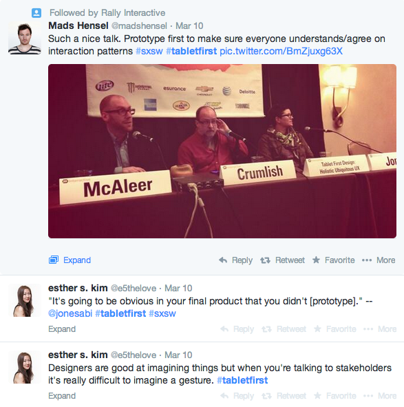
Tablet First Design
Holistic UX
designing ubiquitous multi-device experiences
So, how do we design Multi-device Experiences?
- research first
- understand customers first
- design a holistic experience without regard to device or screen size
- sketch and storyboard elaborate user journeys (including mobile journeys)
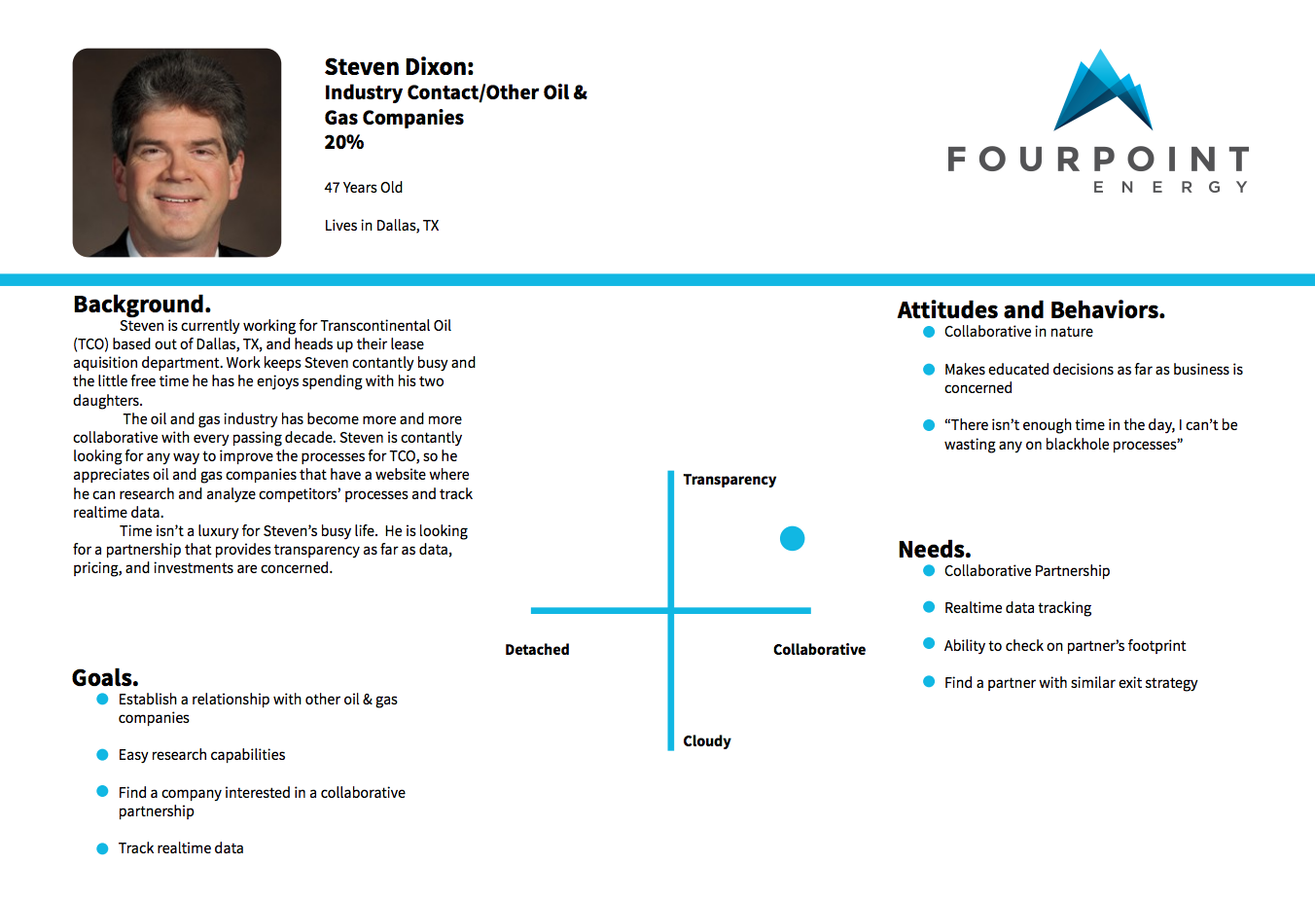
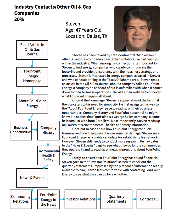
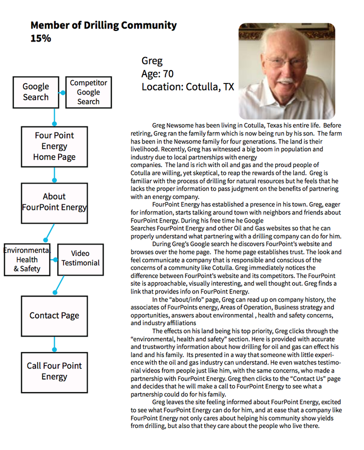
FourPoint Energy Example
rule: understand your user
Fourpoint example (continued)
rule: storyboard elaborate user journeys
"Design is a balance between
Utility
Usability
& Beauty"
- John Wiley, Lead Designer on Google search UX
Prototype!
The modern web has transformed
then: flat, static page loads
now: rich, animated page transition and interaction patterns
Why?
So that everyone understands/agree on interaction patterns
Designers vs. clients/stakeholders (envisioning gesture and animation)
how?
- Build simple interactive prototypes using HTML, CSS, and Javascript
-
Illustrate user interaction patterns via animated .gif's created in after effects or similar motion graphic software
Pinnbank website example
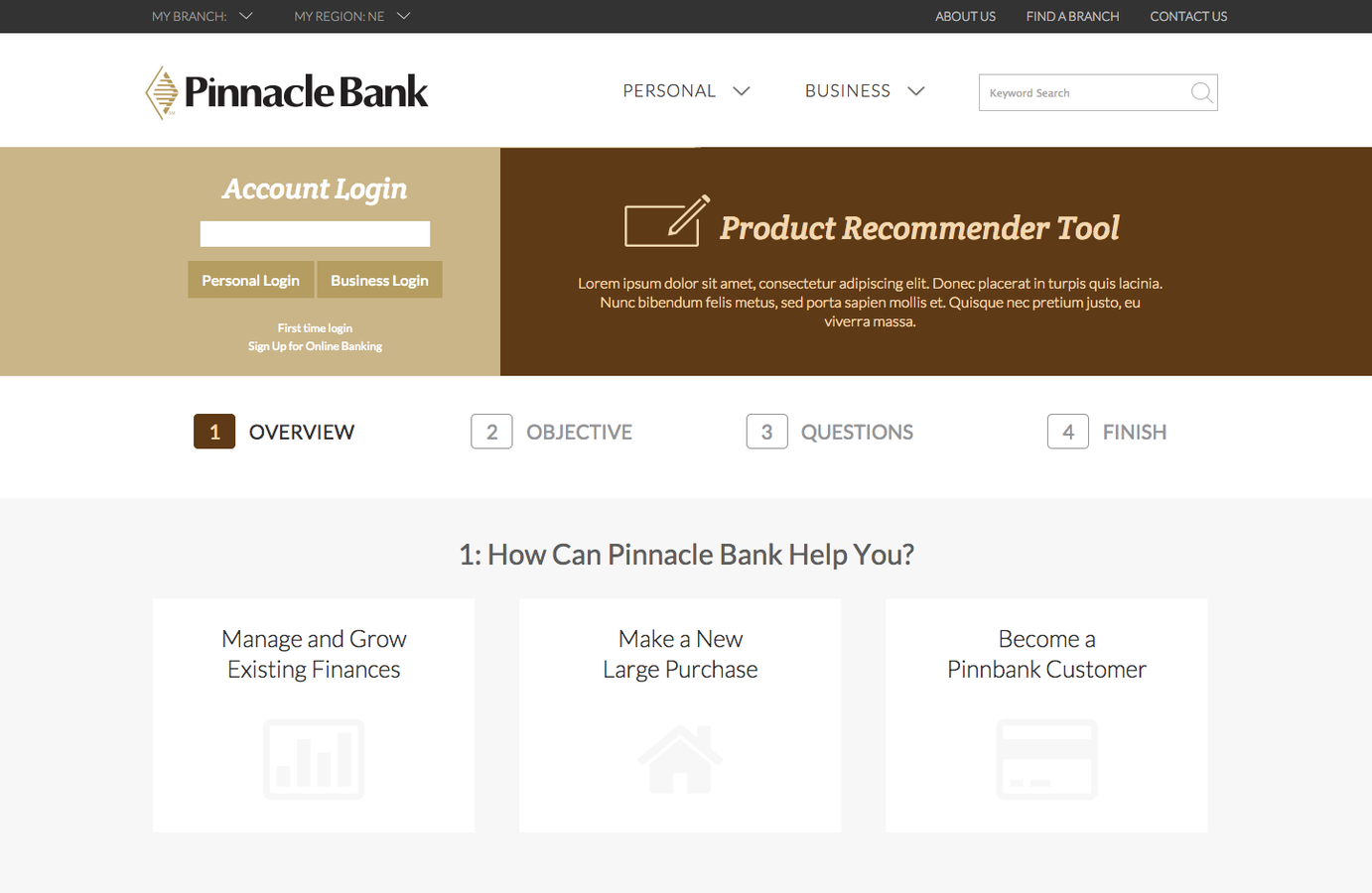
Flat Design Comps
Animated UI design prototype
Phone, Tablet, PhaBlet, Tablerone
"The user is a mobile person - not a mobile device - who moves across screens and devices"
- Christian Crumlish
Director of product at CloudOn
Fragmentation
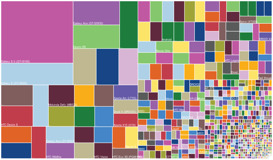
2013 Landscape: 11,868 different ANDROID devices
Up from 3,997 in 2012
Something to think about
Research and analytics can tell you what a user is currently using your service for on whatever device they are on. But it's up to you to go out and determine what your user may want in the future
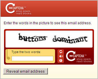
Example discovery
Captcha UI bug - user clicks, input zooms, keyboards slides up, covers captcha box
#tabletfirst vs #tablet1st
Rich CAPABILITIES of the web
What are those?
Here are some analogies from an english major
-
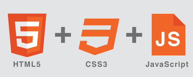
HTML does the nouns:
<p></p>means "paragraph"; -
CSS does the adjectives:
    p
    {color:#00ffff;}
means that paragraph text is rad turquoise; -
Javascript does verbs:
window.open()means "open a window"
What Am i talking about?
“mixed media leveraging interactivity and the web for an immersive experience”
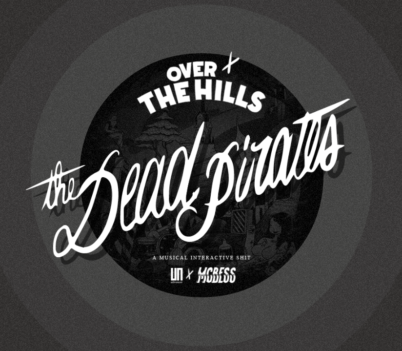
How is this made?
1) WebGL (web graphics library) - 3d programming language used to display the interactive 'scene' of this web experience. It is a javascript API that allows for interactivity with 3d and 2d graphics in supported browsers
2) Web audio API - high-level JavaScript API for processing and synthesizing audio in web applications. For Over the Hills, it especially allows the placement of the sound based on the camera's position in the 3D scene.
CodePen
Mission
Raindrops
Mask Overkill