Analysis of three advertisements
The artists which i have chosen to analysis their advertisements are the ones of
which i have analysed their digipaks.
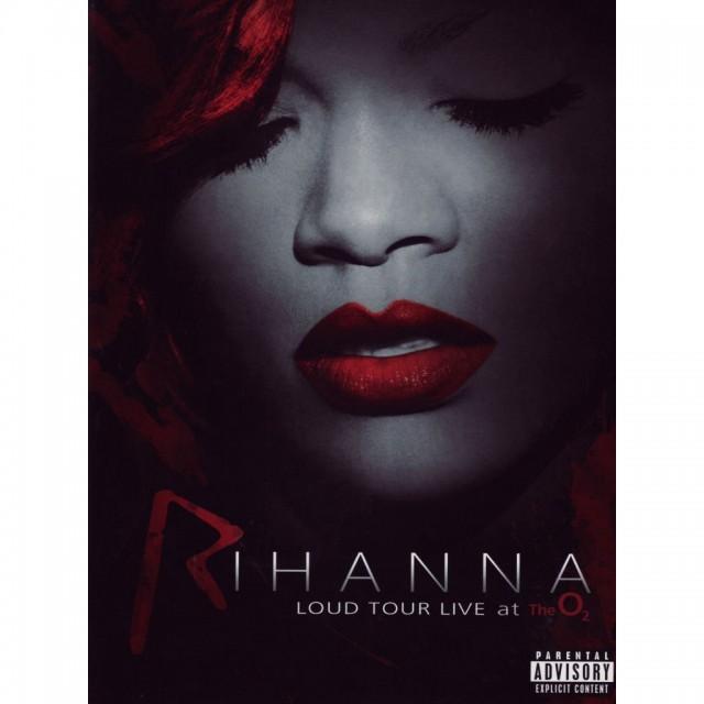
Rihanna
Rihanna's Loud album features a three panel digipak and it sure starts off with a bang, the use of the red throughout the digpiak just stands out for the audience also with the very simple font used. These relate to the audience as the audience is a pop based fan base and the same with the genre. The fact that the album title is bigger then her name is due to her face being recognised world wide and so the even if the album cover didn't have her name it would still sell off a huge amount. I'll be using the idea of a small colour palette and probably the colour white for the font.