Making images fly on
WordPress with Image CDNs
Alistair Shepherd - Front-End Developer
SeriesEight

Images on the web

<img
  src="/our-image.jpg"
  alt="our image"
>
Images change size depending on screen width
HTML Responsive Images
<img
     src="/wp-content/uploads/our-image.jpg"
     srcset="
             /wp-content/uploads/our-image-300x200.jpg 300w,
             /wp-content/uploads/our-image-768x512.jpg 768w,
             /wp-content/uploads/our-image-1024x683.jpg 1024w,
             /wp-content/uploads/our-image-1536x1024.jpg 1536w
     "
     sizes="(min-width: 800px) 768px, 100vw"
     ...
 >
Optimisation and Image Format
| Size | |
|---|---|
| Source JPEG | 300kB |
| Optimised JPEG | 60kB |
| WebP 🙂 | 36kB |
| AVIF * 😀 | 28kB |
| JPEG XL * 😍 | 24kB |

| Size | Chrome | Firefox | Safari | |
|---|---|---|---|---|
| Source JPEG | 300kB | yes | yes | yes |
| Optimised JPEG | 60kB | yes | yes | yes |
| WebP 🙂 | 36kB | yes | yes | recent |
| AVIF * 😀 | 28kB | yes | recent | no |
| JPEG XL * 😍 | 24kB | no | no | no |
| Size | |
|---|---|
| Source JPEG | 300kB |
| Optimised JPEG | 60kB |
| WebP 🙂 | 36kB |
| AVIF * 😀 | 28kB |
| JPEG XL * 😍 | 24kB |
Optimisation and Image Format
Hi DPI displays
<picture>
    <source
      media="(-webkit-min-device-pixel-ratio: 1.5)"
      srcset="https://example.com/images/our-image_width1200_quality40.jpg 1200w"
      sizes="...">
    <img
      srcset="https://example.com/images/our-image_width600_quality80.jpg 600w"
      sizes="..."
      alt="">
</picture>
iPhone 12 Pro (right) screen:
- Screen width: 1170 pixels
- 'Viewport' width: 390 pixels
- Device Pixel Ratio of 3
The browser could decide to load an image with resolution 3x larger than it's displayed - 9x increase in file size!!!
We can mitigate increase in file size by increasing the image compression without visible effect.
Lazy Loading and Decoding
- "loading" attribute set to "lazy" or "eager" depending on position on page
- decoding="async" when images shouldn't delay text rendering
<img
    loading="lazy"
    decoding="async"
 >
<picture>
<source
type="image/avif"
media="(-webkit-min-device-pixel-ratio: 1.5)"
srcset="/assets/image/otter-300-q40.avif 300w, /assets/image/otter-450-q40.avif 450w, /assets/image/otter-600-q40.avif 600w,
/assets/image/otter-800-q40.avif 800w, /assets/image/otter-1000-q40.avif 1000w, /assets/image/otter-1200-q40.avif 1200"
sizes="(min-width: 87rem) 40rem, (min-width: 768px) calc(50vw - 4rem), calc(100vw - 2rem)">
<source
type="image/avif"
srcset="/assets/image/otter-300-q80.avif 300w, /assets/image/otter-450-q80.avif 450w, /assets/image/otter-600-q80.avif 600w,
/assets/image/otter-800-q80.avif 800w, /assets/image/otter-1000-q80.avif 1000w, /assets/image/otter-1200-q80.avif 1200"
sizes="(min-width: 87rem) 40rem, (min-width: 768px) calc(50vw - 4rem), calc(100vw - 2rem)">
<source
type="image/webp"
media="(-webkit-min-device-pixel-ratio: 1.5)"
srcset="/assets/image/otter-300-q40.webp 300w, /assets/image/otter-450-q40.webp 450w, /assets/image/otter-600-q40.webp 600w,
/assets/image/otter-800-q40.webp 800w, /assets/image/otter-1000-q40.webp 1000w, /assets/image/otter-1200-q40.webp 1200"
sizes="(min-width: 87rem) 40rem, (min-width: 768px) calc(50vw - 4rem), calc(100vw - 2rem)">
<source
type="image/webp"
srcset="/assets/image/otter-300-q80.webp 300w, /assets/image/otter-450-q80.webp 450w, /assets/image/otter-600-q80.webp 600w,
/assets/image/otter-800-q80.webp 800w, /assets/image/otter-1000-q80.webp 1000w, /assets/image/otter-1200-q80.webp 1200"
sizes="(min-width: 87rem) 40rem, (min-width: 768px) calc(50vw - 4rem), calc(100vw - 2rem)">
<source
media="(-webkit-min-device-pixel-ratio: 1.5)"
srcset="/assets/image/otter-300-q40.jpg 300w, /assets/image/otter-450-q40.jpg 450w, /assets/image/otter-600-q40.jpg 600w,
/assets/image/otter-800-q40.jpg 800w, /assets/image/otter-1000-q40.jpg 1000w, /assets/image/otter-1200-q40.jpg 1200"
sizes="(min-width: 87rem) 40rem, (min-width: 768px) calc(50vw - 4rem), calc(100vw - 2rem)">
<img
alt="otter standing on a log looking out majestically"
src="/assets/image/otter-1200-q80.jpg"
srcset="/assets/image/otter-300-q80.jpg 300w, /assets/image/otter-450-q80.jpg 450w,
/assets/image/otter-600-q80.jpg 600w, /assets/image/otter-800-q80.jpg 800w,
/assets/image/otter-1000-q80.jpg 1000w, /assets/image/otter-1200-q80.jpg 1200"
sizes="(min-width: 87rem) 40rem, (min-width: 768px) calc(50vw - 4rem), calc(100vw - 2rem)"
width="1200"
height="784"
loading="lazy"
decoding="async"
>
</picture>
That's a lot going on!
Image processing wishlist
- Convert to several different formats, update to support new ones like AVIF and JPEG XL for browsers that support them
- Resize images to many different sizes for responsive devices
- Handle differing quality levels depending on density
- Bonus: Perform quality analysis comparing image sizes between different formats
- Optimise images and compress where possible
To display a few images on a webpage!

Images on WordPress

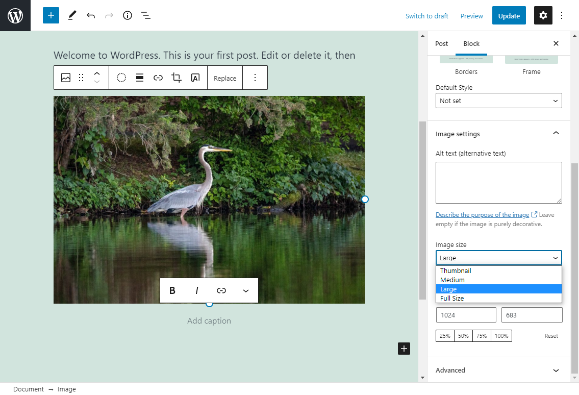
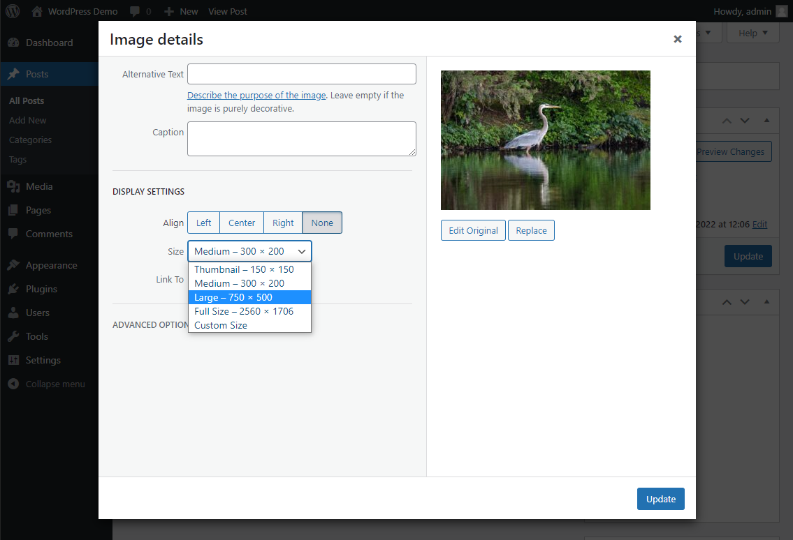
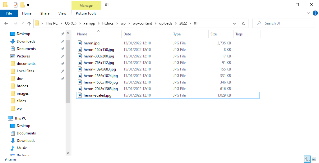
WordPress image sizes
- Thumbnail: Crop to 150 x 150 px
- Medium: Fit within 300 x 300 px
- Large: Fit within 1024 x 1024 px
- Full: original uploaded size
WordPress wishlist
- Convert to several different formats, update to support new ones like AVIF and JPEG XL
- Resize images to many different sizes
- Handle differing quality levels depending on density
- Bonus: Perform quality analysis comparing image sizes between different formats
- Optimise images and compress where possible
Bespoke theme development
<?php
add_image_size('image-size-name', 1000, 600, true);
Applies to all images, not just those that need it!
Plugins to help
- Conversion: WebP Express, Imagify, AVIF?
- Resizing: many different plugins
- Quality levels: can't find any
- Quality analysis: definitely not
- Optimisation: Resmush.it, EWWW, Shortpixel, WP Smush
HTTP Archive data

Source and image credit:
HTTP Archive Web Almanac, 2021 - CMS Chapter
WordPress image issues in the wild

- Fresh redesign and rebuild as a bespoke WordPress Theme
- Very visual featuring lots of images
- Was in a reasonably rural area so we wanted to ensure performance was very good


- Around 15 different services
- Up to 20-30 pictures of products for each service
- Hundreds of high-quality images
Implemented with WordPress
- Used WebP Express for WebP conversion, it worked but
wasn't ideal
- Added many custom image sizes with add_image_size()
- Handle differing quality levels depending on density
- Bonus: Perform quality analysis comparing image sizes between different formats
- Used Resmush.it for image optimisation
Results
- Created a lot of additional costs of servers, services and storage
- Degraded WordPress editor experience
- Created technical debt
- In the end we removed a lot of it to make maintenance easier and the editing experience better
- At first it was okay, improved performance slightly
Image
CDNs to
the rescue

What is an Image CDN?
- Content Delivery Network (CDN) specialising in image processing
- Sits between the web server of your site and the user, 'transforming' images on the fly by changing image URLs


- Third-party services selling solutions to make dev experience of working with images easier and improving performance

and many more
Web Server
HTML
CSS
JS
Images
Images
User's browser


Optimised
Source


Web Server

User's browser

HTML
CSS
JS
Images
Images

Web Server


Optimised
Source


Web Server

User's browser

HTML
CSS
JS
Images
Images

Media Storage


How do we use them?
https://example.imagecdn.com
Start with our image
CDN domain
https://example.imagecdn.com
/https://oursite.com/wp-content/uploads
/example.jpg
Add the URL to our
source image
https://example.imagecdn.com
/example.jpg
Many CDN providers allow
you to make presets/aliases
https://example.imagecdn.com
/example.jpg
?w=600&h=400
Add parameters to
'transform' the image
https://example.imagecdn.com/fetch
/example.jpg
/w_600,h_400
Different CDNs have different formats,
but work on the same concepts
- Handled separately from your main site
- Managed by image experts
- Automatic format detection

.../w_300,h_600,c_thumb,g_auto/...
Tall banner with automatic gravity
.../w_1000,h_400,c_fill,g_north,
    e_colorize:30,co_rgb:dd14d1/...
Wide banner anchored to top, coloured pink
Implementing
Image CDNs

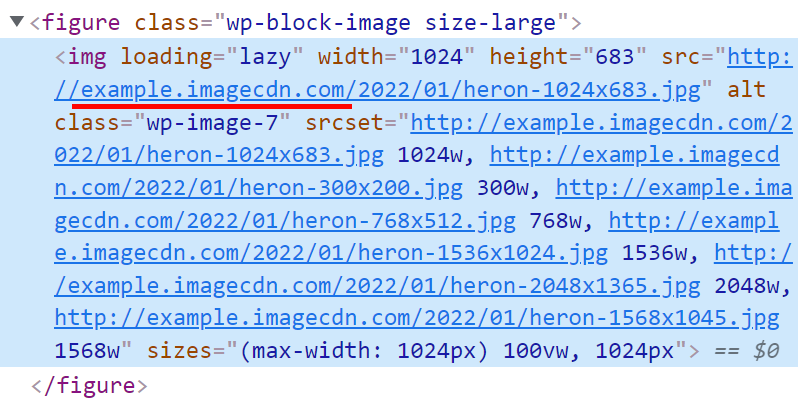
Changing Image URLs
(simplest)
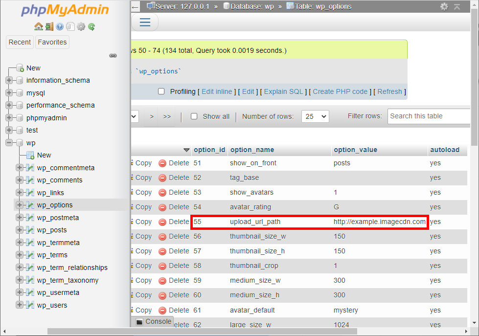
Changing the setting upload_url_path within database table wp_options will change the image domain, allowing you to set it to your image cdn
Offload to cloud storage


You could also move your uploads to cloud storage which has benefits:
- reliability of storage;
- making local development easier;
- reducing server load;
- makes moving website easier.
Check out the plugins:
- WP Offload Media
- Humanmade S3 Uploads
Image CDN Plugin
(easiest)
Depending on Image CDN provider there are likely both official and unofficial plugins that make integration very easy and might give lots of bonus features

Image courtesy of Cloudinary WordPress plugin
Custom Theme Markup
(best performance)
<?php
echo image( [
  'image'   => get_field('image'),
  'srcset'  => [300, 450, 600, 800, 1000, 1200],
  'sizes'   => '100vw',
  'loading' => 'lazy'
  'class'   => 'image-class'
] );
accud.io/imagecdn-acf
Image CDNs make all images easy - not just for WordPress!


Moving to using an Image CDN

What we did
- Used the CloudImage Image CDN
- Set up a custom code solution with ACF like the previous example
- Removed custom WordPress image sizes and WebP conversion
Lighthouse performance score improved by ~25
Increased speed of development
Significantly reduced server load and costs
No free lunch!

Cost
- As an external service, there is a cost implication
- Many have a generous free tier, small site might not cost anything
- Larger sites will cost, pricing model depends on the provider
- Unless you have hundreds of thousands of images, likely cheaper than developers maintaining image processing or faffing with plugins
- Can be offset by reduced server load and storage requirements
- Disable CDN for local development
- Offload images to cloud storage
- Push images to your site when needed
Local dev


For very high performing sites different origin has an impact
Solution for nginx
location /cdn/ {
  proxy_pass https://example.imagecdn.com/;
}


The scores are in...

Improve the performance of images on your websites
Make working with images easier during development
Reduce server requirements
Try an Image CDN in your next project!
Thank You!
These slides, my sources and helpful links on image CDNs available at accud.io/wordpress-imagecdns
On twitter and most social media @accudio
My website and blog posts alistairshepherd.uk