Do more with CUSTOM
@Directive()


Adithya Sreyaj
Front-end @ Hypersonix


@Directive()
Directives are classes that add additional behavior to elements in your Angular applications.
- Components - directives with a template.
- Attribute directives - change the appearance or behavior of an element, component, or another directive.
- Structural directives - change the DOM layout by adding and removing DOM elements.
Built-in Directives
- NgClass
- NgStyle
- NgModel
Attribute Directives
- NgIf
- NgFor
- NgSwitch
Structural Directives
Possibilities
- Access to the native element
- Access to template reference
- Listen and Handle events
- Input Validations
Benefits
- Reusable
- Maintainable
- Testable
- Lean Components
Directives in Action

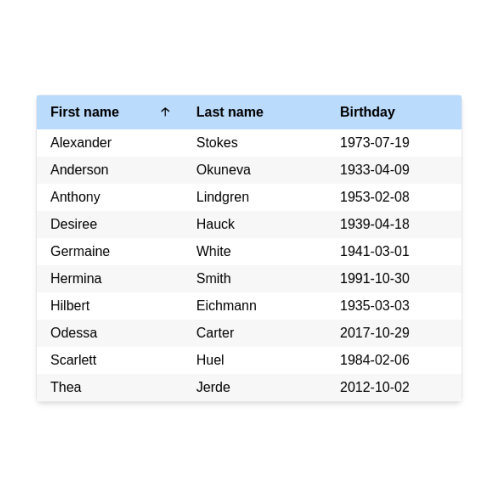
TABLE SORT DIRECTIVE
-
Directive + Component
-
Place the parent directive on the table.
-
Place the sort header directive on the cell header.
-
Complete sorting logic moved outside.
-
Access parent from child directive.
import {
  Component, Directive, EventEmitter,
  HostListener, Input, Output
} from '@angular/core';

export interface SortChangeEvent {
  column: string;
  direction: SortDirection;
}

type SortDirection = 'asc' | 'desc' | null;

@Directive({
  selector: '[sorter]',
})
export class Sorter {
  active: string | null = null;
  direction: SortDirection = null;
  @Output() sortChange = new EventEmitter<SortChangeEvent>();

  sort(column: string) {
    let direction = this.direction;
    if (this.active !== column) {
      this.direction = null;
      this.active = column;
    }
    if (this.direction === null) {
      direction = 'asc';
    } else if (this.direction === 'asc') {
      direction = 'desc';
    } else if (this.direction === 'desc') {
      direction = null;
    }
    this.sortChange.emit({
      column,
      direction,
    });
    this.direction = direction;
  }
}

@Component({
  selector: '[sortHeader]',
  template: `
    <div class="sort-col">
      <ng-content></ng-content>
      <div
        [ngClass]="{
          arrow: true,
          hide: sorter?.active !== ref || sorter?.direction === null,
          asc: sorter?.active === ref && sorter?.direction === 'asc',
          desc: sorter?.active === ref && sorter?.direction === 'desc'
        }"
      >
        🡡
      </div>
    </div>
  `,
  styles: [
    `
      .sort-col {
        display: flex;
        justify-content: space-between;
        align-items: center;
      }
      .arrow {
        font-size: 14px;
      }
      .arrow.hide {
        opacity: 0;
      }
      .arrow.desc {
        transform: rotate(180deg);
      }
    `,
  ],
})
export class SortHeader {
  @Input() ref: string | null = null;

  @HostListener('click')
  sort() {
    if (!this.ref) {
      throw new Error('ref should be provided');
    }
    this.sorter.sort(this.ref);
  }
  constructor(public sorter: Sorter) {}
}
<table sorter>
    <thead>
      <tr>
        <th ref="firstname" sortHeader>First name</th>
        <th ref="lastname" sortHeader>Last name</th>
        <th ref="birthday" sortHeader>Birthday</th>
      </tr>
    </thead>
    <tbody>
      <tr *ngFor="let user of users$ | async">
        <td><div>{{user?.firstname}}</div></td>
        <td><div>{{user?.lastname}}</div></td>
        <td><div>{{user?.birthday}}</div></td>
      </tr>
    </tbody>
 </table>
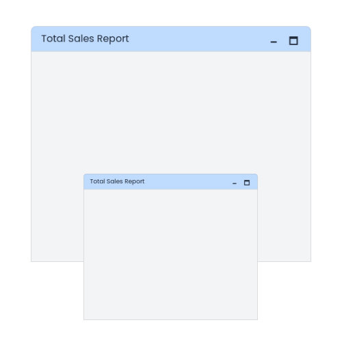
Fullscreen Directive
-
Attribute directive
-
Exports the directive to be used in a template
-
Manage state inside the directive
@Directive({
  selector: '[appUiFullscreen]',
  exportAs: 'fullscreen',
})
export class UiFullscreenDirective {
  private isMaximizedSubject = new BehaviorSubject(false);
  isMaximized$ = this.isMaximizedSubject.asObservable();

  constructor(private el: ElementRef) {}

  toggle() {
    if (this.isMaximizedSubject?.getValue()) this.minimize();
    else this.maximize();
  }
  maximize() {
    if (this.el) {
      this.isMaximizedSubject.next(true);
      this.nativeElement.classList.add('fullscreen');
       if (Fullscreen.isEnabled) {
        Fullscreen.request();
      }
    }
  }
  minimize() {
    if (this.el) {
      this.isMaximizedSubject.next(false);
      this.nativeElement.classList.remove('fullscreen');
      if (Fullscreen.isEnabled) {
        Fullscreen.exit();
      }
    }
  }

  private get nativeElement() {
    return this.el.nativeElement as HTMLElement;
  }
}
<div appUiFullscreen #fullscreen="fullscreen">
<header>
<p>Total Sales Report</p>
<div>
<button (click)="fullscreen.minimize()">🗕</button>
<button (click)="fullscreen.maximize()">🗖</button>
</div>
</header>
<div class="body"></div>
</div>.fullscreen {
width: 100vw;
height: 100vh;
position: fixed;
top: 0;
left: 0;
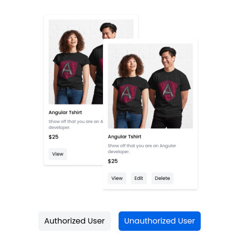
}Permission Directive
-
Structural directive
-
Displays content only if authorized
-
Pass feature and permission as input
-
Validates the permission and embed the item in view
@Directive({
  selector: '[appUiPermissions]',
})
export class UiPermissionsDirective implements OnInit, OnDestroy {
  private loggedInUser!: User;
  private permission!: Permissions;
  private feature!: string;

  private subscription!: Subscription;

  @Input()
  set appUiPermissions(permission: Permissions) {
    this.permission = permission;
    this.updateView();
  }

  @Input()
  set appUiPermissionsFeature(feature: string) {
    this.feature = feature;
    this.updateView();
  }

  constructor(private tpl: TemplateRef<any>,
              private vcr: ViewContainerRef,
              private authService: AuthService) {}

  ngOnInit() {
    this.subscription = this.authService.loggedUser$.subscribe((user) => {
      this.loggedInUser = user;
      this.updateView();
    });
  }

  ngOnDestroy() {
    this.subscription.unsubscribe();
  }

  private updateView() {
    this.vcr.clear();
    if (this.hasPermission()) {
      this.vcr.createEmbeddedView(this.tpl);
    } else {
      this.vcr.clear();
    }
  }

  private hasPermission() {
    if (!this.loggedInUser) return false;
    const featurePermissions = this.loggedInUser.permissions[this.feature];
    if (featurePermissions) {
      return featurePermissions.includes(this.permission);
    }
    return false;
  }
}
export enum Permissions {
  create = 'CREATE',
  read = 'READ',
  update = 'UPDATE',
  delete = 'DELETE',
}

const permissions = {
    product: [
      'CREATE',
      'READ',
      'UPDATE'
      'DELETE'
    ]
 }
<footer>
<button *appUiPermissions="'READ'; feature: 'product'">
View
</button>
<button *appUiPermissions="'UPDATE'; feature: 'product'">
Edit
</button>
<button *appUiPermissions="'DELETE'; feature: 'product'">
Delete
</button>
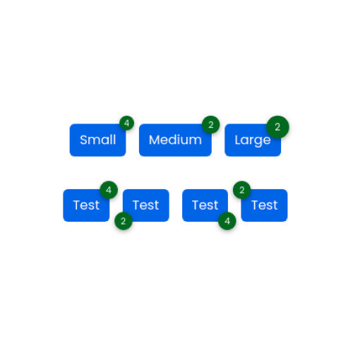
</footer>BADGES Directive
-
Simple attribute directive
-
Appends a span to the host element
-
Pass options for size and positions
@Directive({
  selector: '[badge]',
})
export class UiBadgeDirective implements OnChanges, OnDestroy {
  @Input() badge: string | null = null;
  @Input() size: BadgeSizes = 'medium';
  @Input() position: BadgePositions = 'top-right';
  @Input() customBadgeClasses: string | null = null;
  @Input() variant: BadgeVariants = 'secondary';

  badgeElement: HTMLElement | null = null;

  constructor(@Inject(DOCUMENT) private document: Document, private elRef: ElementRef<HTMLElement>) {}
  ngOnChanges(changes: SimpleChanges): void {
    if ('badge' in changes) {
      const value = `${changes.badge.currentValue}`.trim();
      if (value?.length > 0) {
        this.updateBadgeText(value);
      }
    }
  }

  ngOnDestroy() {
    if (this.badgeElement) {
      this.badgeElement.remove();
    }
  }

  private updateBadgeText(value: string) {
    if (!this.badgeElement) {
      this.createBadge(value);
    } else {
      this.badgeElement.textContent = value;
    }
  }

  private createBadge(value: string): HTMLElement {
    const badgeElement = this.document.createElement('span');
    this.addClasses(badgeElement);
    badgeElement.textContent = value;
    this.elRef.nativeElement.classList.add('badge-container');
    this.elRef.nativeElement.appendChild(badgeElement);
    return badgeElement;
  }

  private addClasses(badgeElement: HTMLElement) {
    const [vPos, hPos] = this.position.split('-');
    badgeElement.classList.add('badge', vPos, hPos);
    if (this.customBadgeClasses) {
      const customClasses = this.customBadgeClasses.split(' ');
      badgeElement.classList.add(...customClasses);
    }
    badgeElement.classList.add(this.variant);
    badgeElement.classList.add(this.size);
  }
}
<button badge="2" position="bottom-left">Test</button>
<button badge="4" position="bottom-right">Test</button>
<button badge="4" size="small">Small</button>
<button badge="4" size="small" class="btn primary badge-container">
Small
<span class="badge top right secondary small">4</span>
</button>Demo & Code

Resources
- Table Sort Directive: https://bit.ly/3xQvwoK
- Fullscreen Directive: https://bit.ly/3zodydZ
- Badge Directive: https://bit.ly/3oEYZhF
thank you