Dark Patterns
Adrián Bolonio

User Interfaces Designed to Trick People
What is a UI Dark Pattern?

"A Dark Pattern is a user interface that has been carefully crafted to trick users into doing things, such as buying insurance with their purchase or signing up for recurring bills."
Harry Brignull
Bait and Switch

The user sets out to do one thing, but a different, undesirable thing happens instead. This is one of the oldest tricks in the book, and it is very broad in nature – many dark patterns involve some kind of bait & switch.
Bait and Switch


Clicking the cross in the top-right hand corner of the pop-up box now agrees to a scheduled upgrade rather than rejecting it.
Roach Motel

A Roach Motel makes it very easy for a user to get into a certain situation, but then makes it hard for them to get out of it when they realize it is undesirable.
Easy IN - Difficult OUT
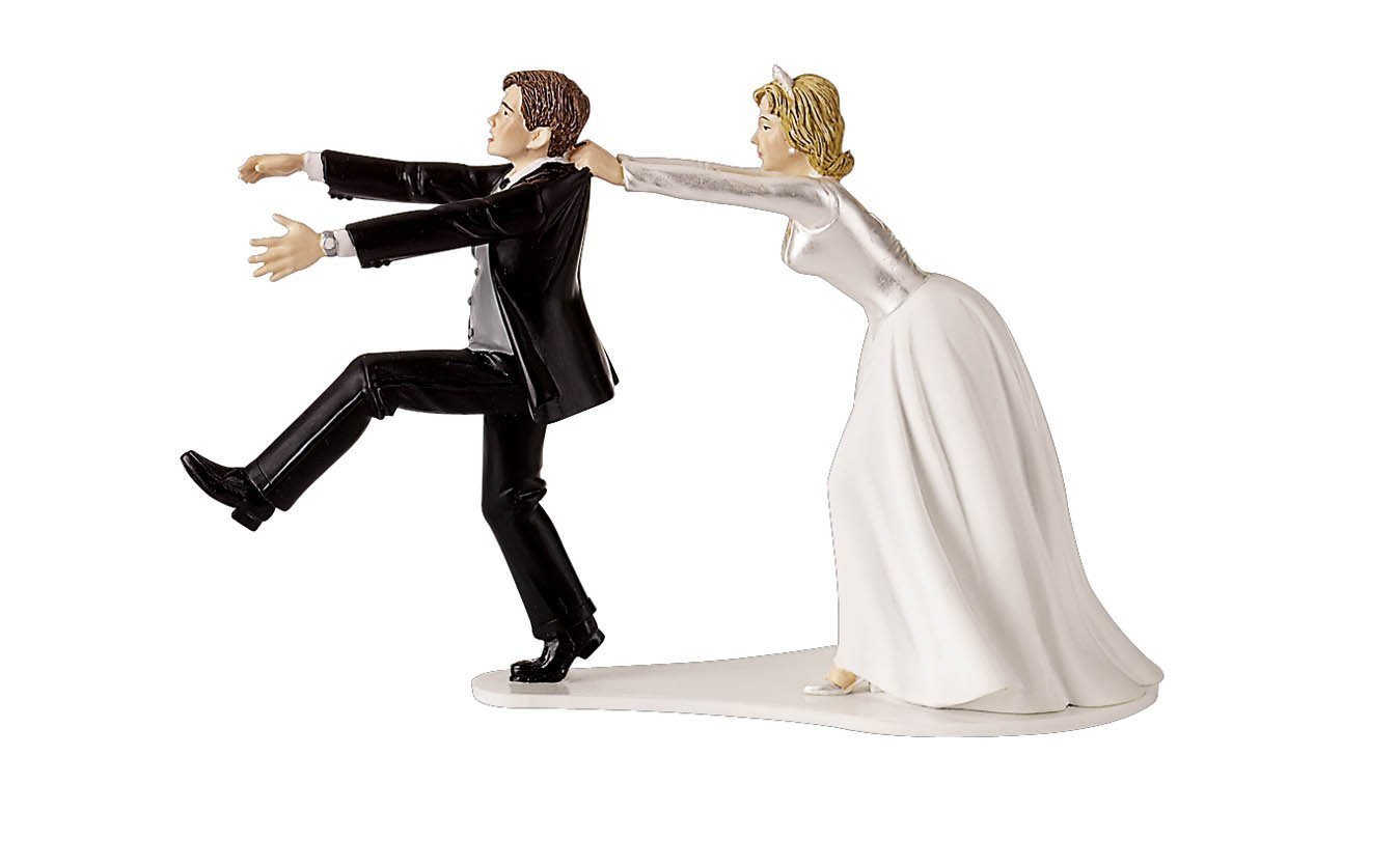
Roach Motel


Roach Motel

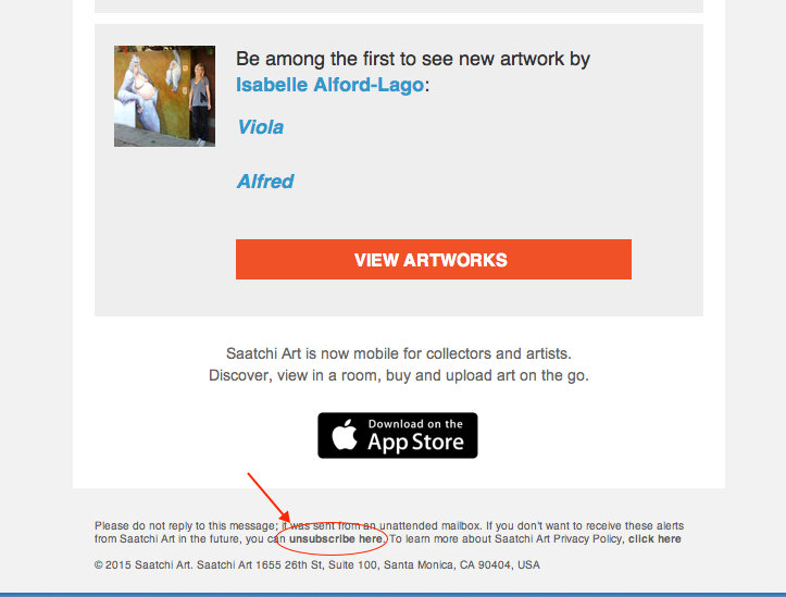
Roach Motel

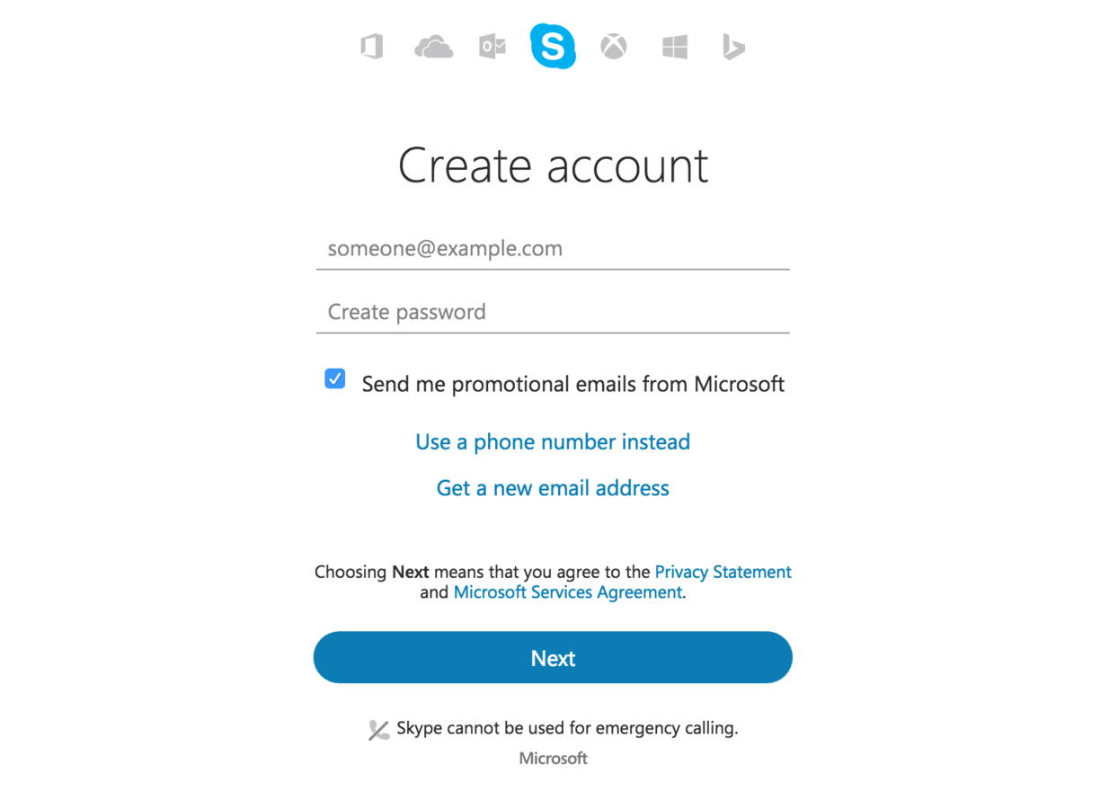
Opt-out
Roach Motel

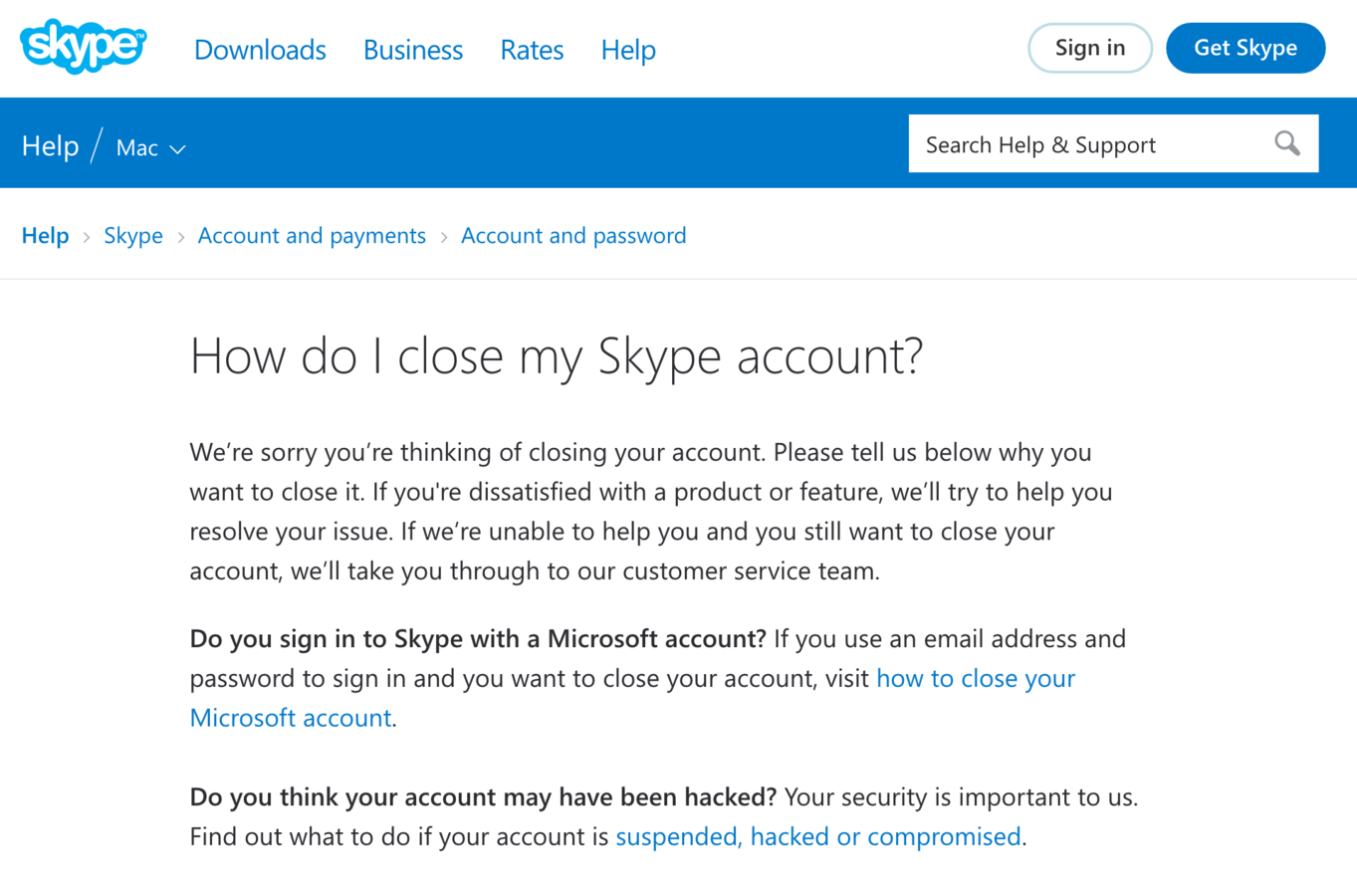
Sneak into Basket

The user attempts to purchase a specific item. However, somewhere in the purchasing journey the site sneaks an additional item into their basket, often through the use of an opt-out radio button or checkbox on a prior page.
Sneak into Basket

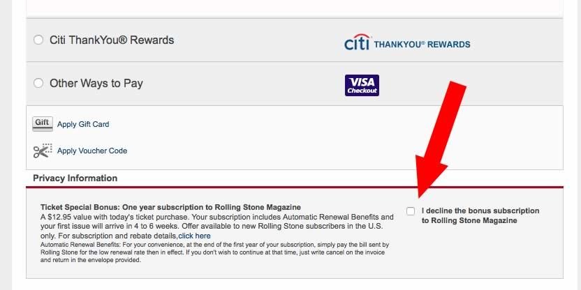
Trick Questions

The user is required to respond to a question (typically in the checkout process), which, when glanced upon quickly appears to ask one thing, but if read carefully, asks another thing entirely.
”We don’t read pages. We scan them.“
Steve Krug
Trick Questions: Opt-out

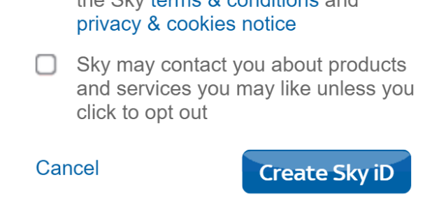

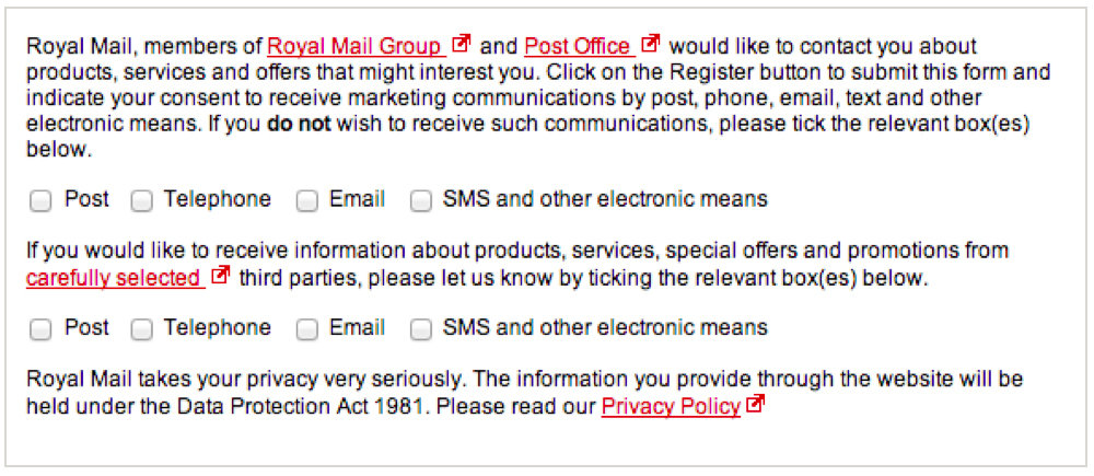
Trick Questions: Opt-out dance

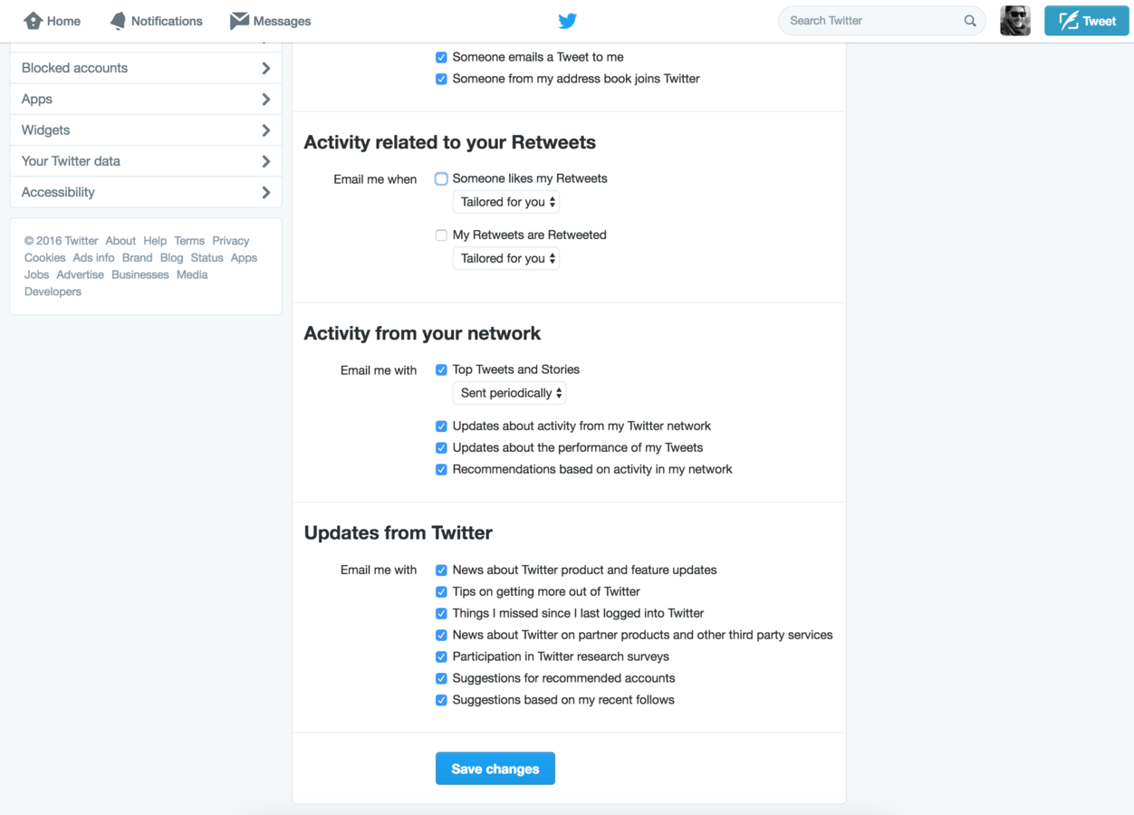
Trick Questions: Opt-out

More Categories of UI Dark Patterns
-
Hidden Costs
-
Faraway Bill
-
Forced Continuity
-
Friend Spam (games)
-
Road Block (pop-up ads)
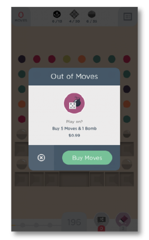
Mobile Games

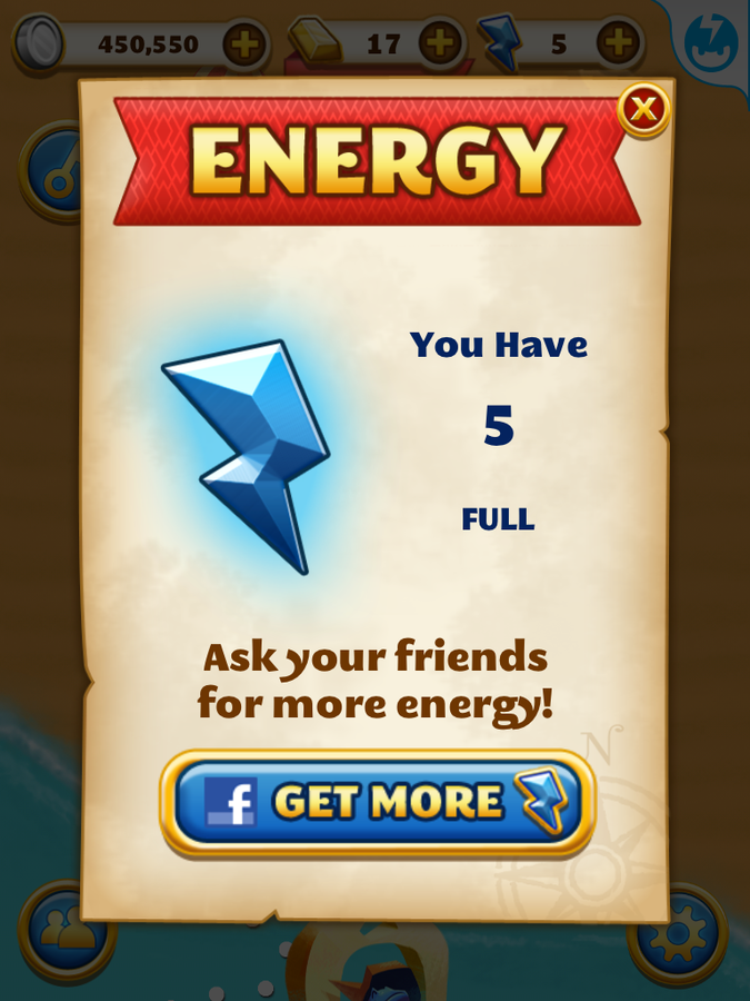
Mobile Games



http://darkpatterns.org/
Harry Brignull
