Artist Website Forms and Conventions
Artist websites are usually very graphic

Here is Lady Gaga's website which has images coming down on both sides of the site.

Here is Beyonce's website which just has one large focal image as the landing page
Here is AlunaGeorge's website which also has one large focal image as the landing page
We made our website as graphic as possible so that it looked interesting as well as aesthetically pleasing. We included photo-shoot pictures as well as images from our Instagram and Facebook. Doing this meant that our audience would be more likely to be active on our social medias.


Usability - easy to navigate

Above is our menu bar - through this, anyone who uses our website will be able to easily navigate through the site, this is ensured by the fact that the menu bar stays consistent across all pages.
This feature is extremely essential and is common across all different types of websites - no matter the artist
Below are menu bars from three other artists


Interactive Sections
This is useful for our audience who are able to find out information without needing to go on the actual twitter page - they are able to see info that the artists put out
This is a fun and creative way of doing a question and answer section as at first you see an image, but when the mouse glides over it the picture, it disappears and an answers pops up
This is another way to integrate social media into the website, you are able to check the next picture when clicking the arrow


Purchasing Oppurtunities

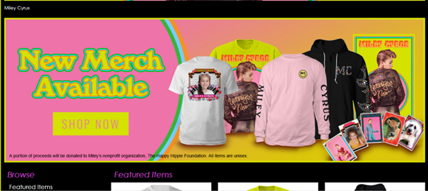


Miley Cyrus' purchasing opportunities on her website
Ariana Grande's purchasing opportunities on her website
The Weeknd's purchasing opportunities on his website
Here is our "Cruze Shop" which includes, t-shirts, cps, key chains, beanies and backpacks. As our artist is new, the merchandise is not as expensive as Ariana Grande's products say which has prices like £65 and £100