5) How did I attract/ address my audience?
Images
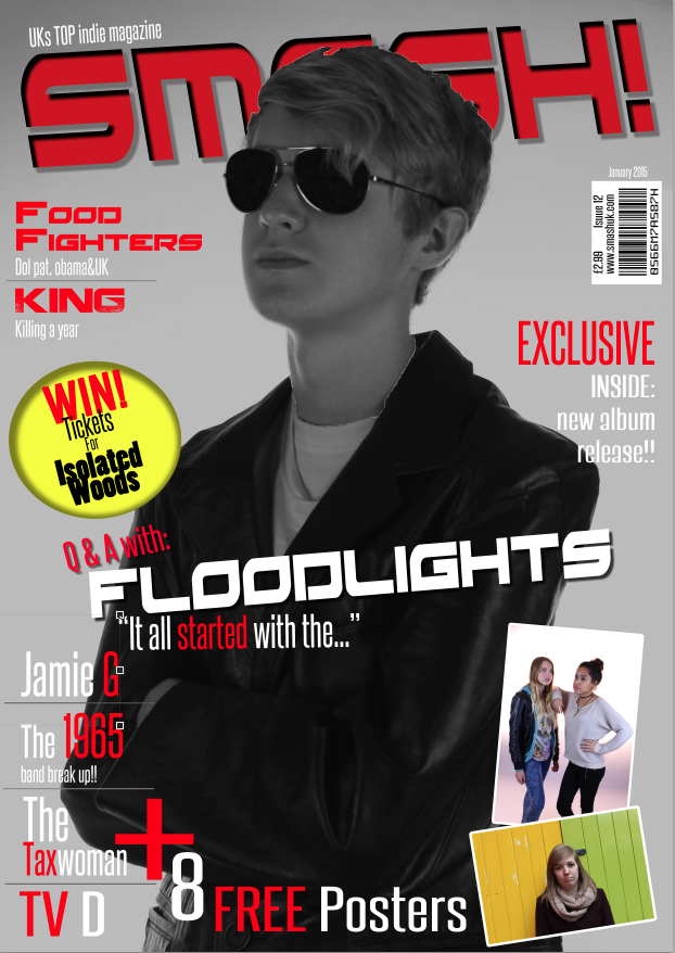
For my FC I have used a close up shot and it is a little trend that younger people like to do and I can see this through some of the social networking sites like Facebook with profile pictures etc. Using Photoshop I have made the image black and white and this gives my magazine a very vintage look and this is also a very popular trend at the minuet in some places such as London and some people like to tie in a vintage item to go with their new outfits. On the FC I have also used a border for the poster photos and this makes them look like a Polaroid camera and the colours that come out with the photos can look very unique. The Polaroid effect is in trend and you can now use some photo editing software’s such as Instagram to get the same effects that you might get on the cameras and a lot of younger generations like to use and show there photos on this Instagram.
Font
I have used a more laid bay text stile and but using a house fond that created the text to look neat but in an indie rock way. I have also used some fonts just for the bands for example for the 'Floodlights' I have used a font that is called Red rocket and this font is bold but it also looks modern. I have used these fonts to try and attract the audience that would like indie rock. I have also put some of the text on a slant so that it might look like a broken sign, you might see text like this in some kerrang magazines and it is effective at attracting their audience that is also indie rock.


Contents
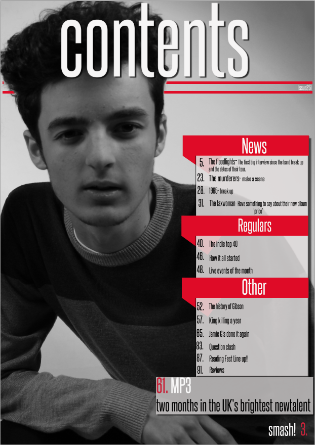
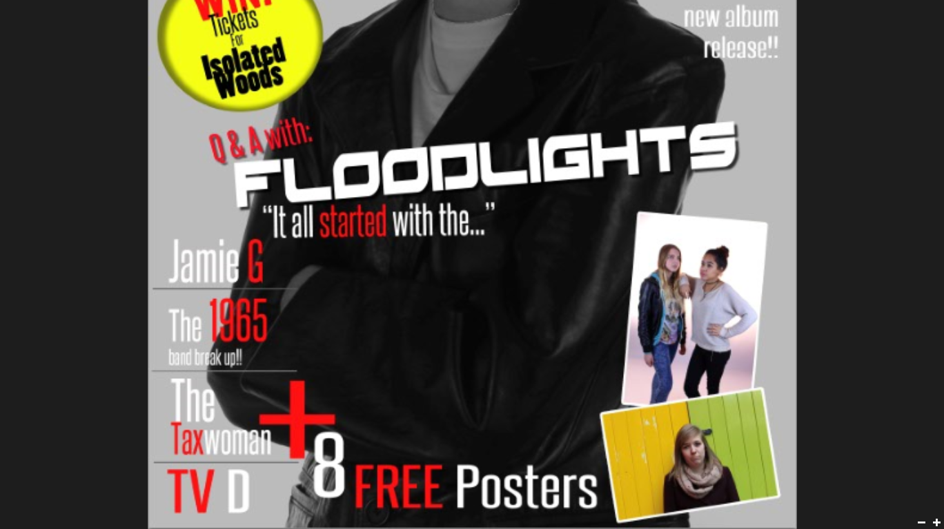
On my FC you are able to see some of the contents for my magazine from winning tickets to go and see.... or to read an article about the Floodlights. I have tried to have as much eye catching contents on my FC as I was able to from having 'FREE' at the side showing that in the magazine I would be giving away 8 New posters in the magazine or just having all of the different bands around the main image.
All of the contents will be to try and attract everyone to magazine and it would help when I use Free as this is a very eye catching word.
Language
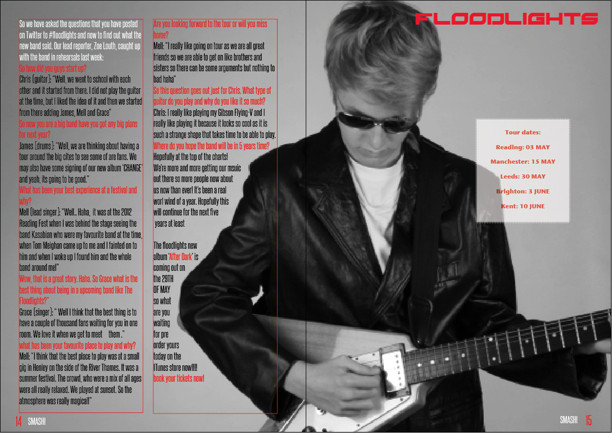
The text language that I have used is a more formal style throughout my magazine and this is really shown in my interview on the DPS. I have also used some text language such as ‘haha’ and this will give the effect of the reader being in the conversation as my audience is young and a stereo type of them would be someone who texts a lot so they would be used to seeing this type of language.