CSS is awesome
Aleksandra Hristov
3 July 2018, Skopje @ BEST course: Bohemian WEBsody
Building responsive layout solutions using the latest CSS features

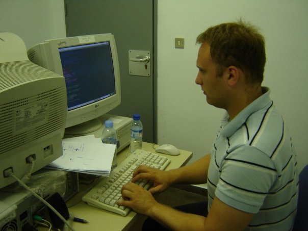
Hi! 🙋🏻
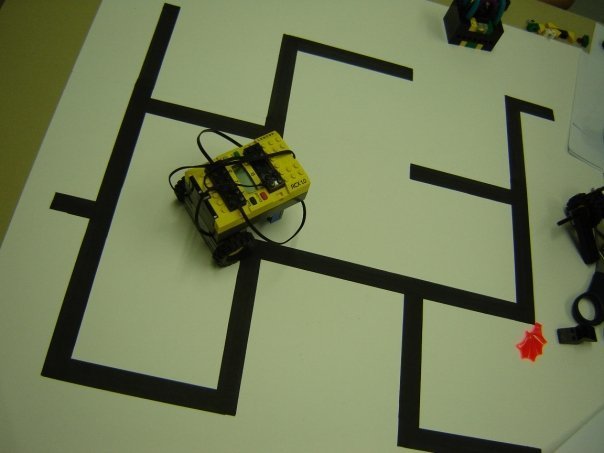
BEST Engineering Competition, Barcelona 2006
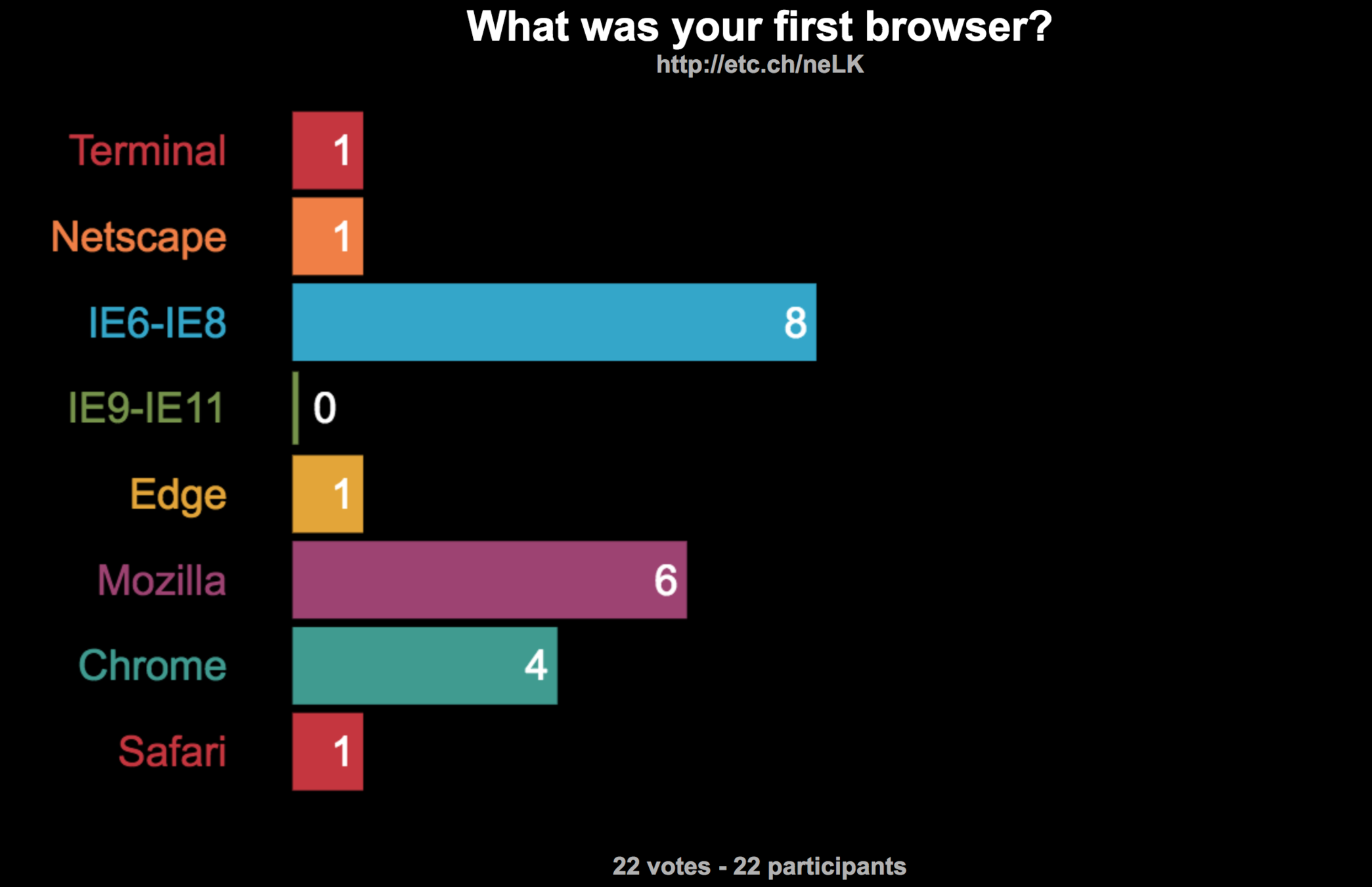
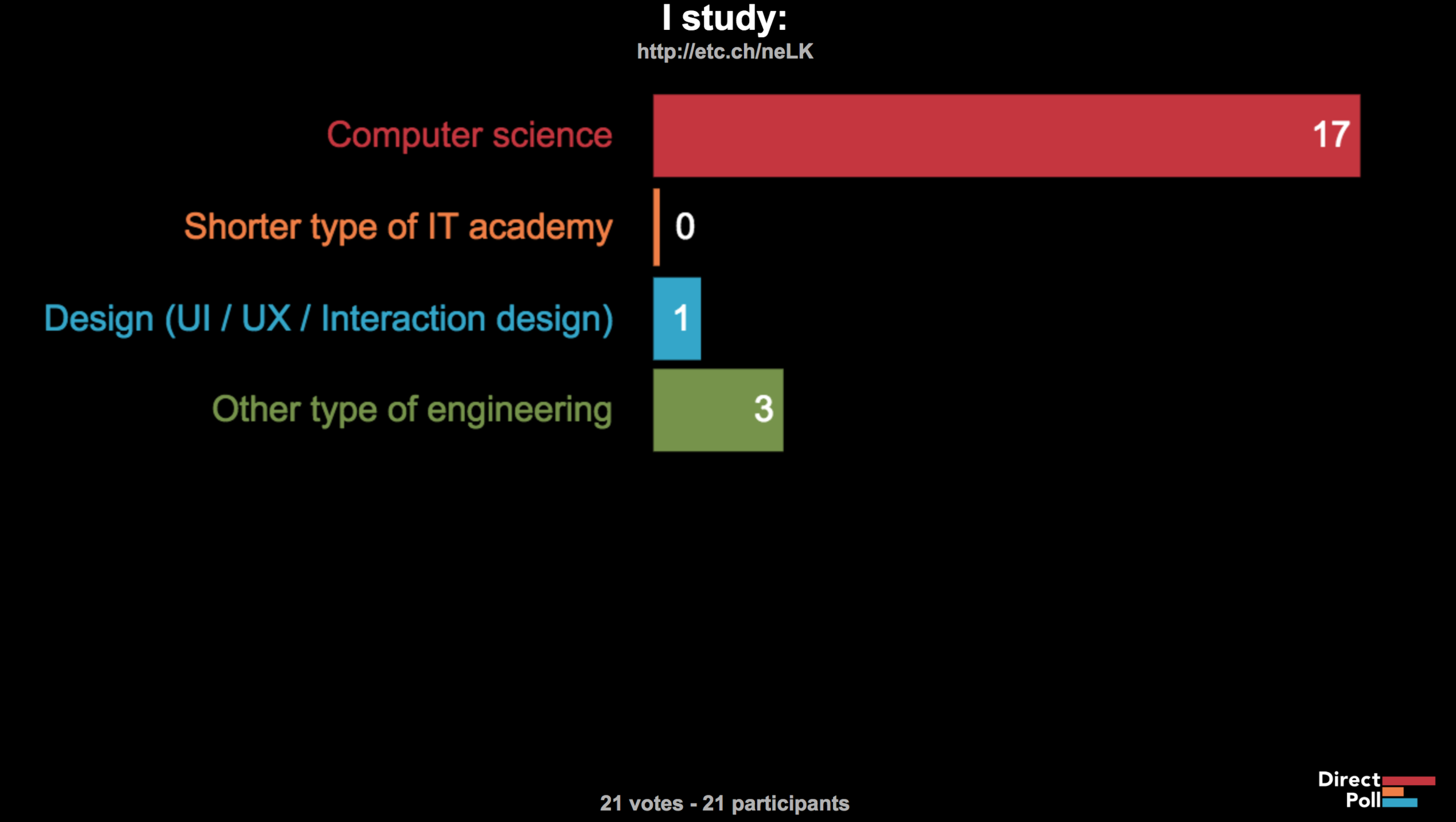
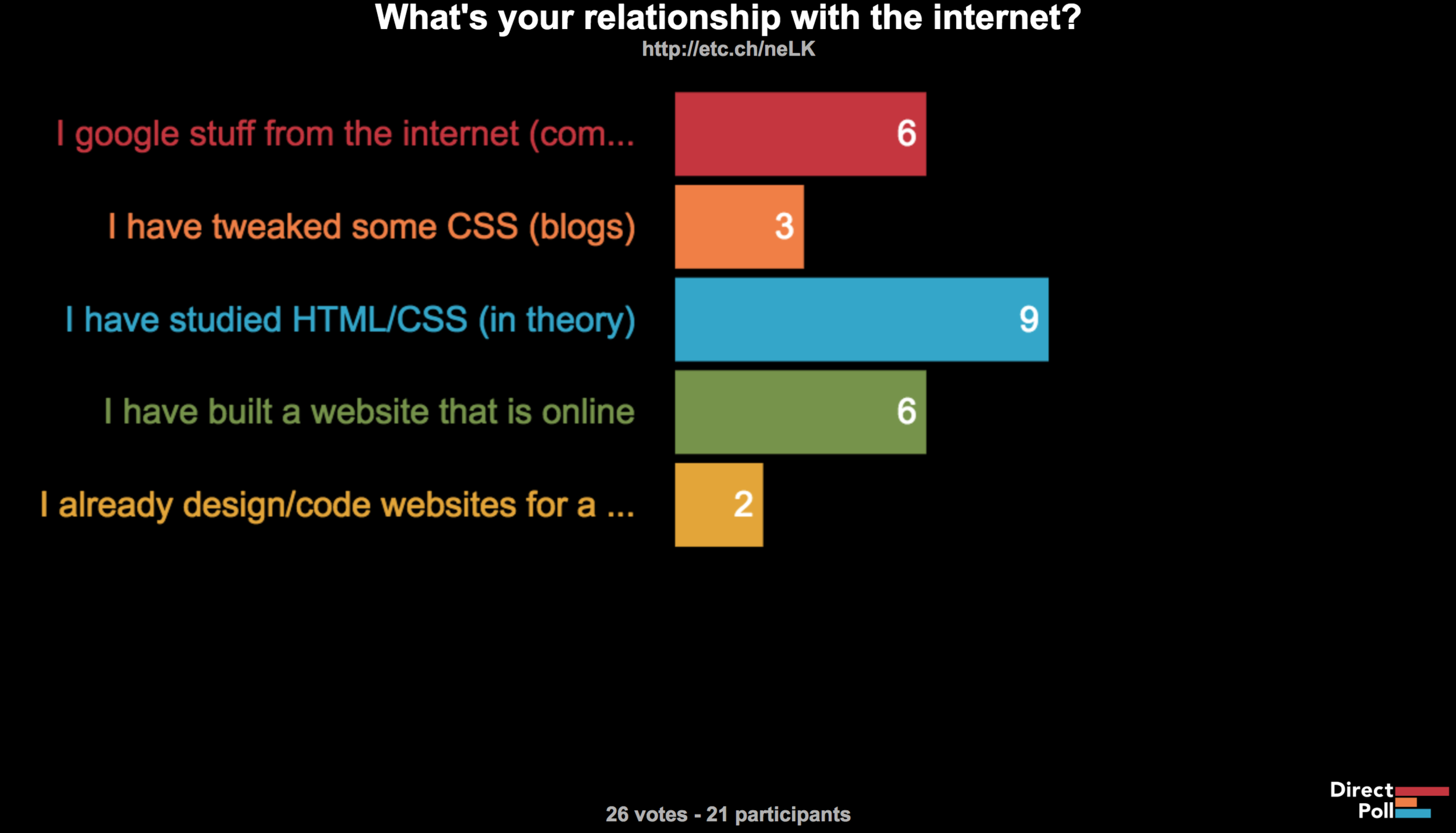
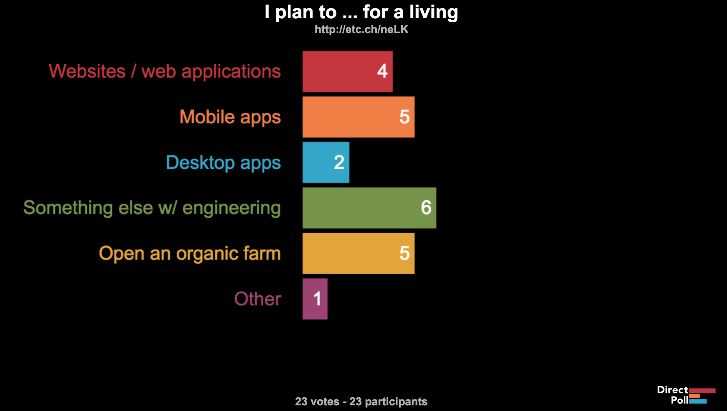
http://etc.ch/neLK
CSS Transforms
Transforms
.box {

  width: 10rem;
  height: 15rem;
  transform: translate(20px, 50%);

 /* 50% is calculated from the element height */
}
Transforms
.box {

  width: 10rem;
  height: 15rem;
  transform: translate(20px, 50%) rotate(45deg);

}
Transforms
.box {

  width: 10rem;
  height: 15rem;
  transform: translate(20px, 50%) rotate(45deg);

  transform-origin: 0 0;
}
When you apply transform
-
you create a new coordinate system for the element
- does not affect the surrounding elements
- creates a stacking context
CSS Shapes
Shape-outside
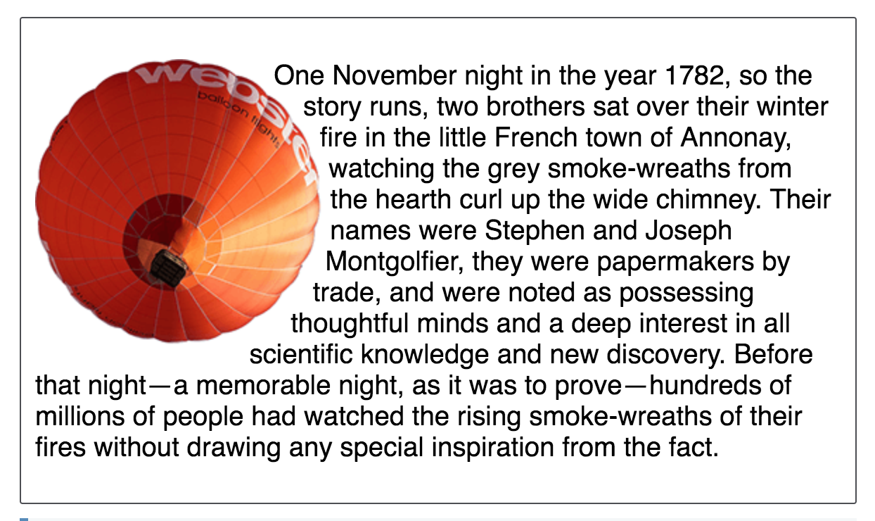
img {
float: left;
shape-outside: circle(50%);
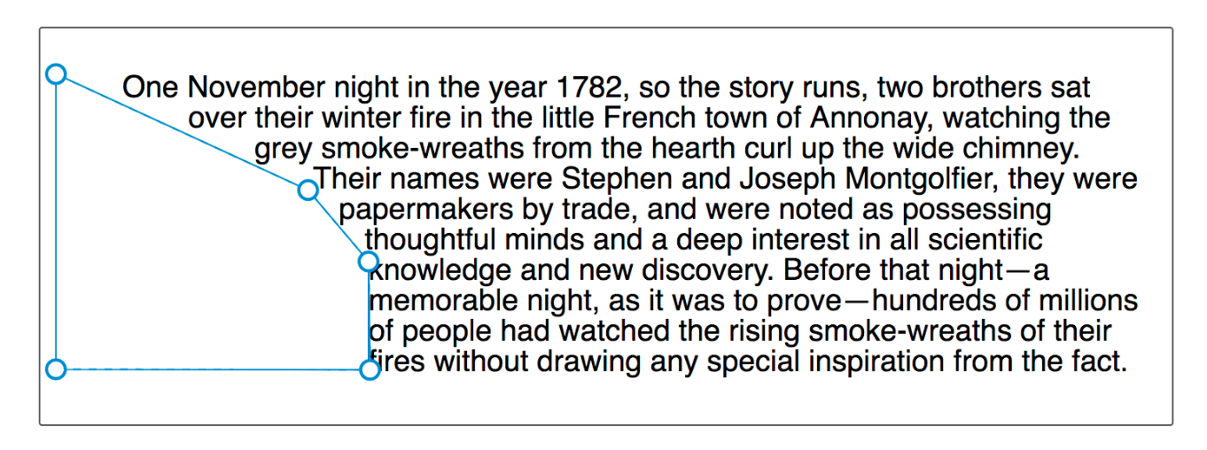
}<div class="box">
<img src="../images/round-balloon.png"
alt="balloon" />
<p>One November night in the year ...</p>
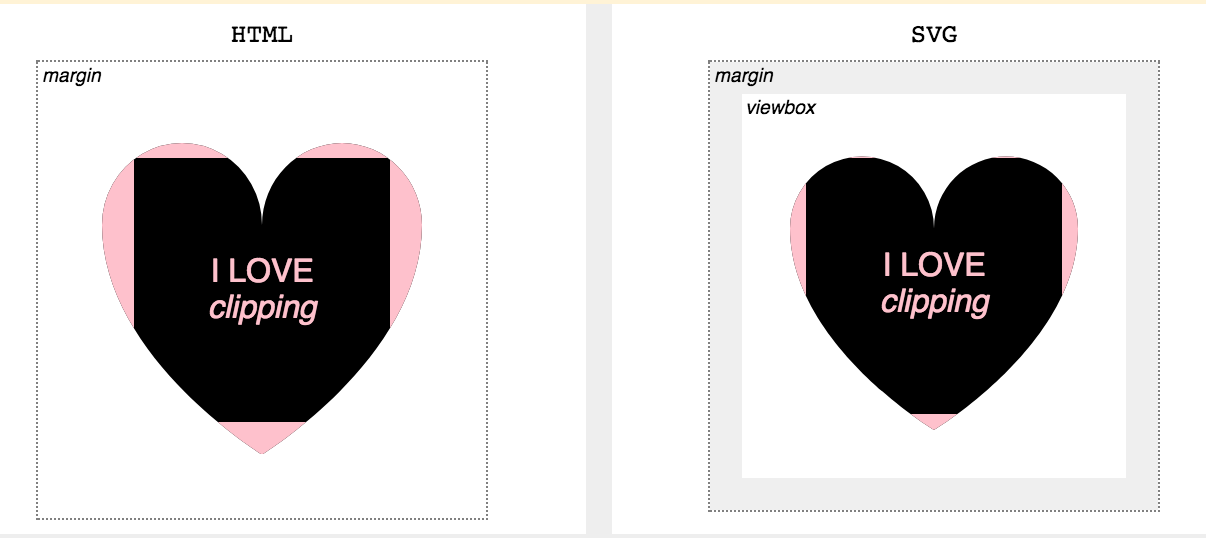
</div>The reference box
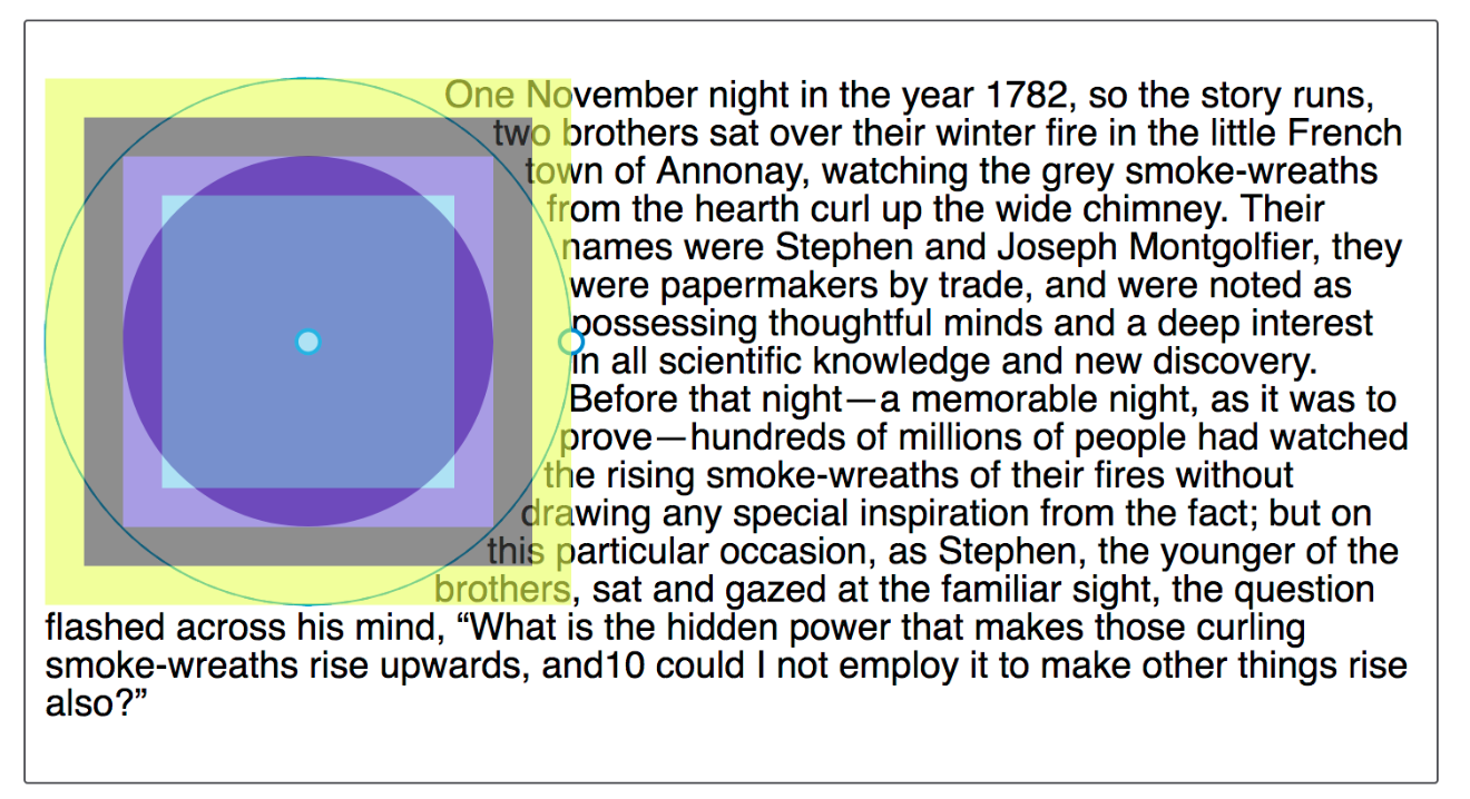
.shape {
  shape-outside: circle(50%) border-box;
}
.shape {
shape-outside: circle(50%) margin-box;
}.shape {
float: left;
shape-outside: polygon(0px 0px, 0px 189px, 100.48% 94.71%, 200px 120px, 80.67% 37.17%);
width: 200px;
height: 200px;
}

🤦♀️
Dreamweaver... 10 years ago.
Everything is the same with clip-path
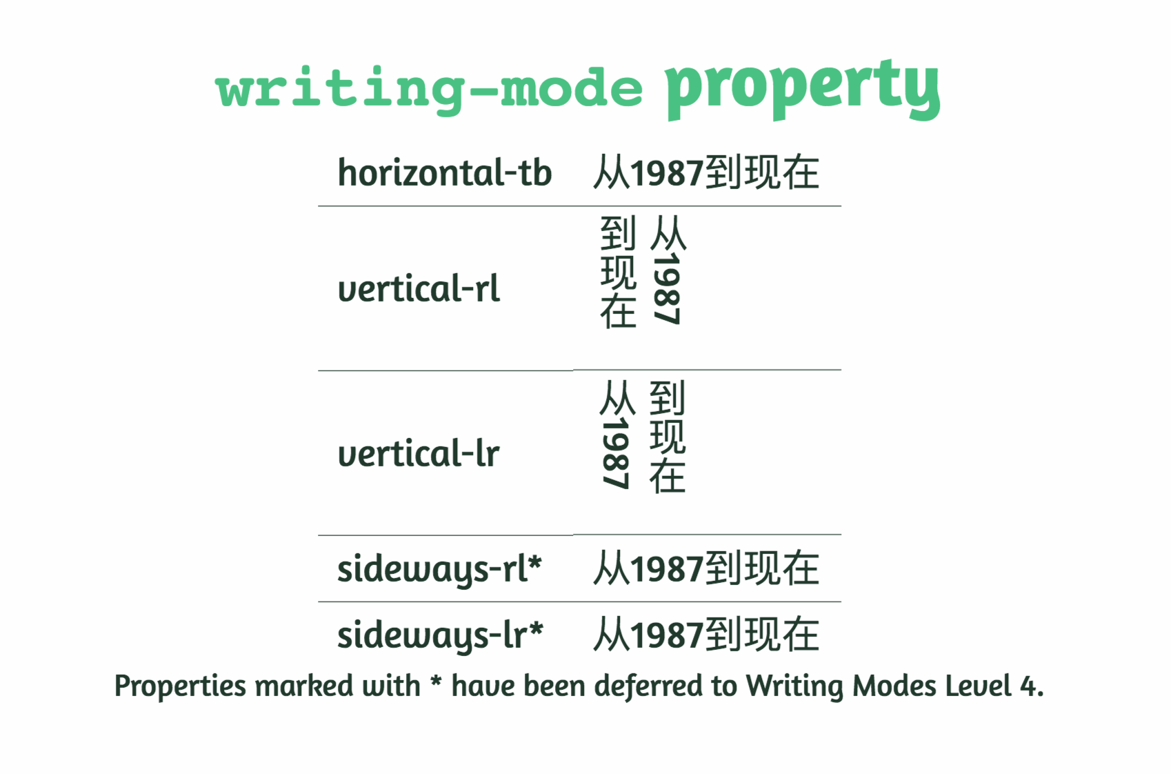
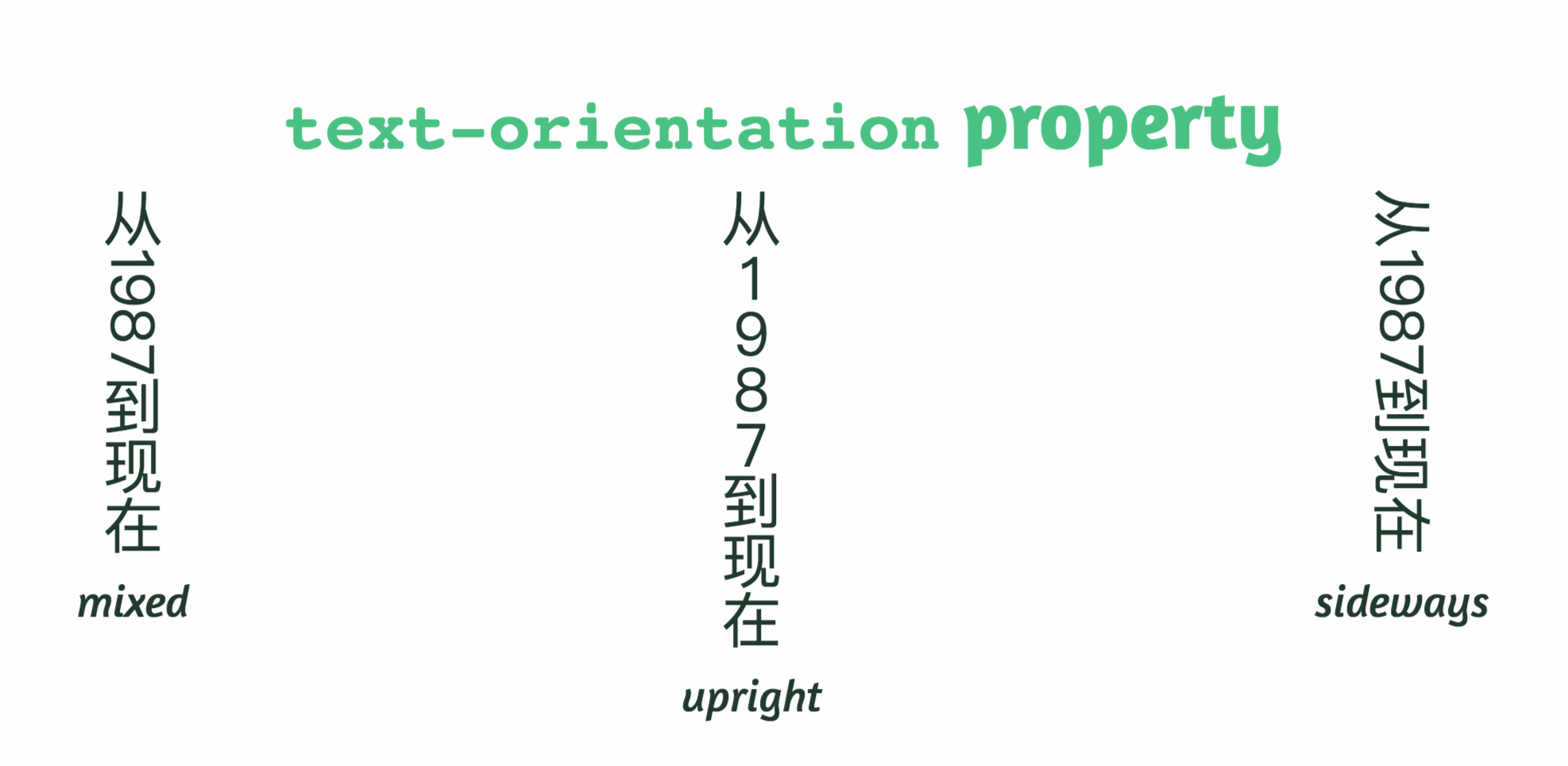
CSS Writing Mode
Flow direction:
horizontal / vertical
international writing modes:
-
left-to-right (e.g. Latin or Indic)
-
right-to-left (e.g. Hebrew or Arabic)
-
bidirectional (e.g. mixed Latin and Arabic)
-
vertical (e.g. Asian scripts).
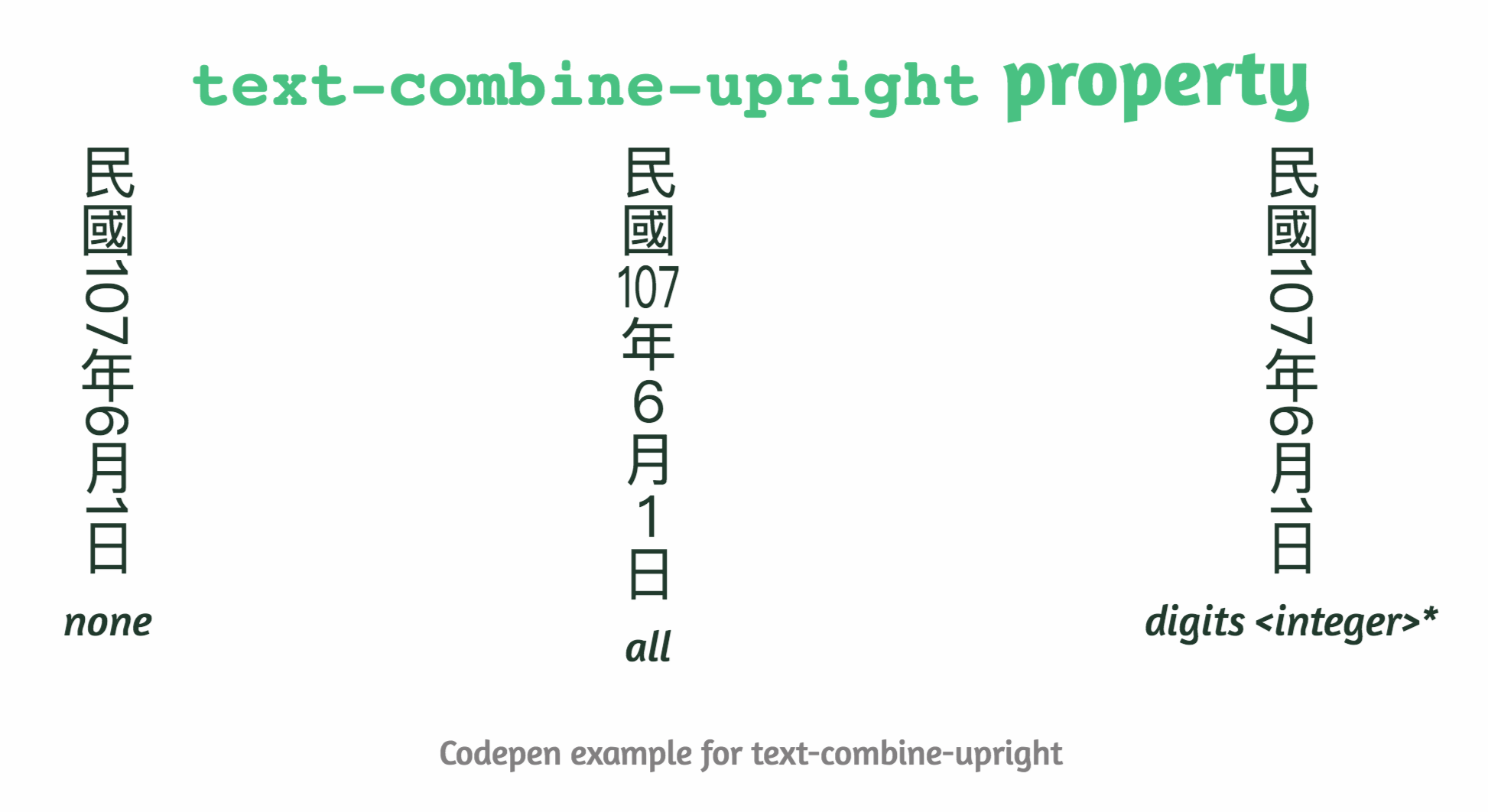
Codepen example: https://codepen.io/huijing/pen/bWzMEJ
Layouting
None
Tables
CSS 2.1
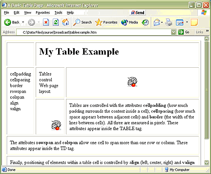
float: left;
width: 50%;
display: inline-block;
width: 50%;
CSS 2.1
(only on inline elements by default or IE8+)
CSS 2.1
(all browsers)
div
div
div
div
div
div
Traditional CSS layout drawbacks
- Rules of proportion (complicated math)
- Vertical centering
- Same-height columns
- Shrink-to-fit containers
- Float drop and clearing
- Source order dependence
CSS(+JS) Frameworks
- Bootstrap
- Foundation
- ...
CSS+JS Frameworks
- Bootstrap
- Foundation
- Kendo UI
- Material
- Semantic UI
- PrimeNG
- Clarity
- ...
CSS Flexbox
Best used for
unknown and dynamic one-dimensional layouts
(one direction -> x OR y axis)
Suitable for
small-scale layouts
(components)
Structure
parent: flex container
children: flex items
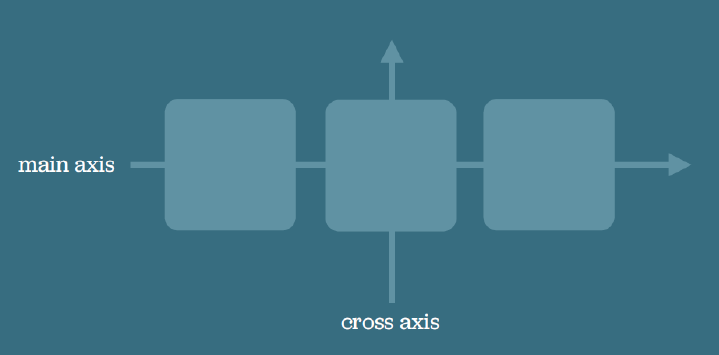
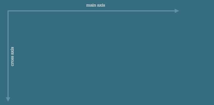
Two axis
main / cross
can be switched
Traditional CSS layout drawbacks
- Rules of proportion (complicated math)
- Vertical centering
- Same-height columns
- Shrink-to-fit containers
- Float drop and clearing
- Source order dependence
✓
✓
✓
✓
✓
✓
.container {
  display: flex;
}
Flexible box layout
.container {
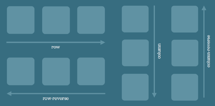
display: flex;
flex-direction: row; /* default */
}
- row
- row-reverse
- column
- column-reverse
flex-direction
.container {
  display: flex;
  flex-direction: row; /* default */
  flex-wrap: nowrap; /* default */
}
-
nowrap
-
wrap
-
wrap-reverse
flex-wrap
flex-direction + flex-wrap => flex-flow: row nowrap;
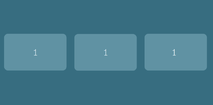
.box1 {
  flex: 1;
}

.box2 {
  flex: 1;
}

.box3 {
  flex: 1;
}
flex-grow
The ability for a flex item to grow if necessary and dictates the amount of available space an item should take.
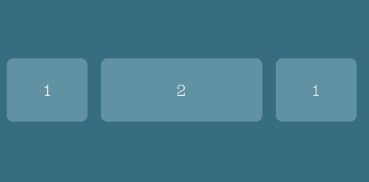
.box1 {
  flex: 1;
}

.box2 {
  flex: 2;
}

.box3 {
  flex: 1;
}
flex-grow
Box2: Takes twice the available space as other siblings
.container { width: 800px; }

.box1 {
  flex-grow: 1;
  flex-basis: 200px; /* added 66px */
}

.box2 {
  flex-grow: 1;
  flex-basis: 200px; /* added 66px */
}

.box3 {
  flex-grow: 1;
  flex-basis: 200px; /* added 66px */
}
flex-basis
The container is wider so the items divide the remaining space equally
.container { width: 800px; }

.box1 {
  flex-grow: 1;
  flex-basis: 200px; /* added 50px */
}

.box2 {
  flex-grow: 2;
  flex-basis: 200px; /* added 100px */
}

.box3 {
  flex-grow: 1;
  flex-basis: 200px; /* added 50px */
}
flex-basis
The items divide the available space:
box2 gets 2 parts
.container { width: 800px; }

.box1 {
  flex: 1 200px; /* added 50px */
}

.box2 {
  flex: 2 200px; /* added 100px */
}

.box3 {
  flex: 1 200px; /* added 50px */
}
flex-basis
The items divide the available space:
box2 gets 2 parts
flex-grow + flex-basis => flex: 1 200px;
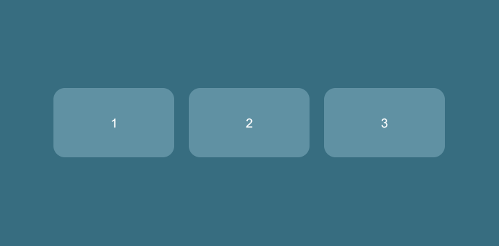
.box1 {
  order: 1;
}

.box2 {
  order: 2;
}

.box3 {
  order: 3;
}
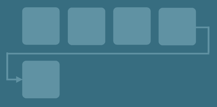
order
Controls the order in which items appear visually in a flex container
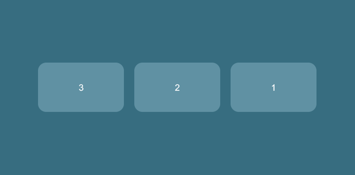
.box1 {
  order: 3;
}

.box2 {
  order: 2;
}

.box3 {
  order: 1;
}
order
Without changing the HTML you can change the order of visual appearance
.container{
  flex-direction: row-reverse;
}
OR
.container {
  justify-content: flex-start; /* default */
}
-
flex-start
-
flex-end
-
center
-
space-between
-
space-around
justify-content
related to alignment on the main axis, single row
flex-start
flex-end
center
space-between
space-around
.container {
  align-items: stretch; /* default */
}
-
stretch
-
flex-start
-
flex-end
-
center
-
baseline
align-items
related to alignment on the cross axis, single row
stretch
flex-start
center
baseline
baseline
baseline
.container {
  align-content: stretch; /* default */
}
-
stretch
-
flex-start
-
flex-end
-
center
-
space-between
-
space-around
align-content
related to alignment on the cross axis, multiple rows wrapped
stretch
flex-start
flex-end
center
space-between
space-around
.box2 {
  align-self: flex-end;
}-
auto (default)
-
flex-start
-
flex-end
-
center
-
stretch
-
baseline
align-self
related to alignment of a single element on the cross axis
flex-end
.container {
  display: table;
}

.row {
  display: table-row;
}

.cell {
  display: table-cell;
}
Fallback?
Real-life examples
Horizontal & Vertical alignment of forms
Components that repeat layout,
but change content
One layout - multiple solutions
😥
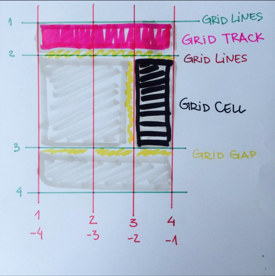
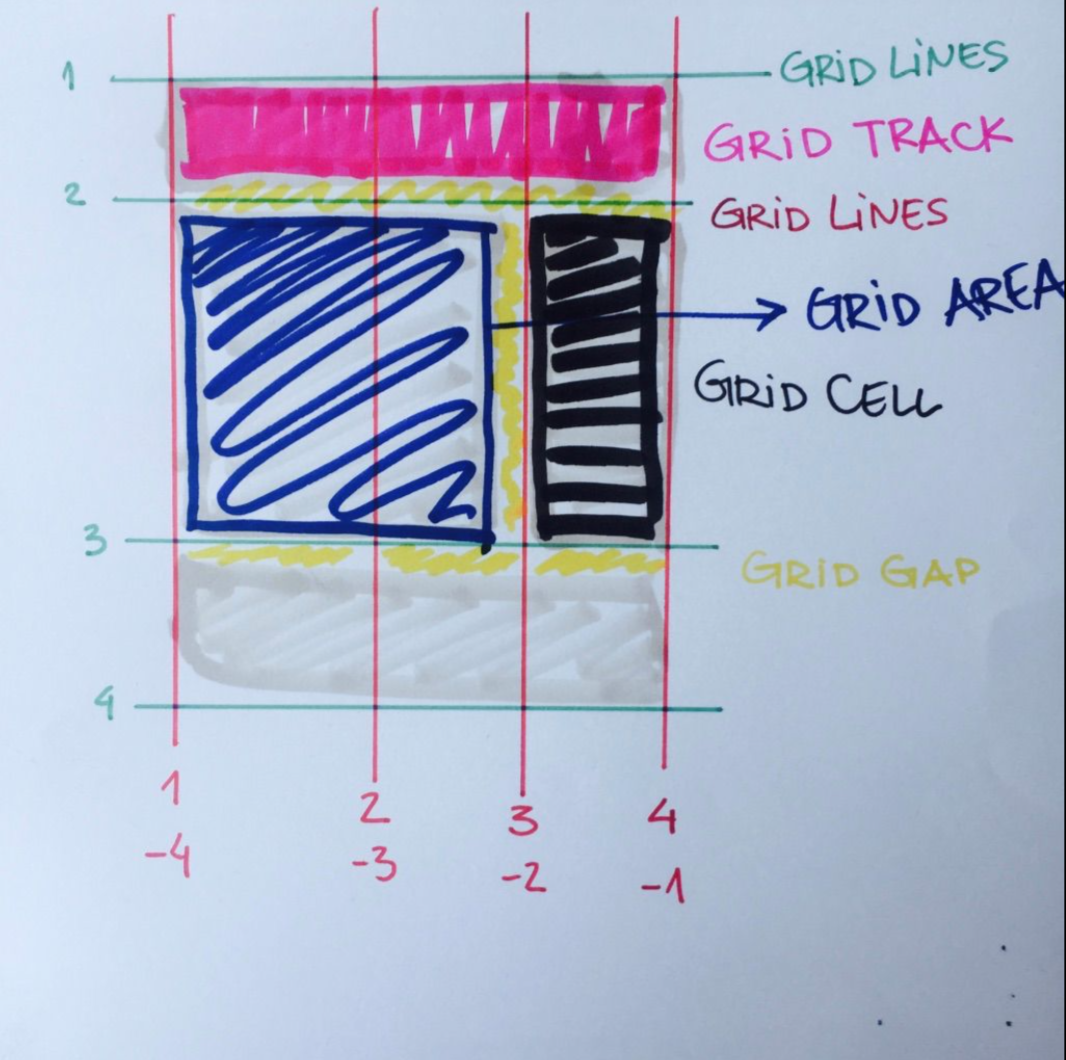
CSS Grid
Best used for
unknown and dynamic two-dimensional layouts
(two directions -> x AND y axis)
Suitable for
large-scale layouts
(main layout / specific components)
Structure
parent: grid container
children: grid items
Two-dimensional matrix
columns / rows
Credit: UI Tiles - joashpereira.com
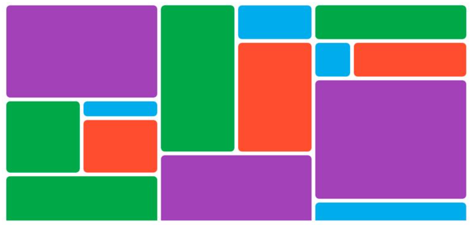
what i want
what i get :(
Flexbox
Rows
OR
Columns
Grid
Rows
AND
Columns
vs.
CSS Grid allows us to
-
control the placement and sizing of grid items
-
rearrange the layout independent of the item's source order
-
change the layout without touching the HTML
-
fill up available space without complicated calculations (powerful auto-placement algorithm)
-
spend more time on designing layouts instead of wrangling code
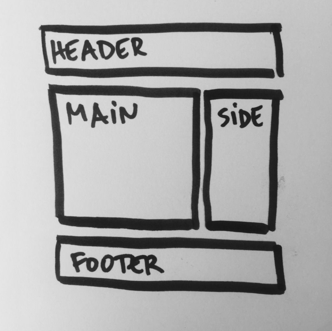
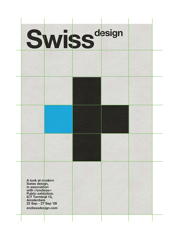
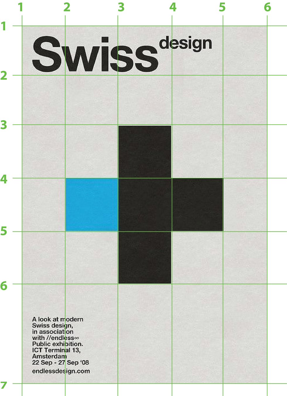
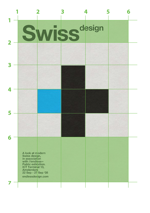
Start with a sketch
Credit: Colleague Ana Risteska (@_anaris)
Grid starts from the container,
other layout options start with the item.
.container {
  display: grid;
}
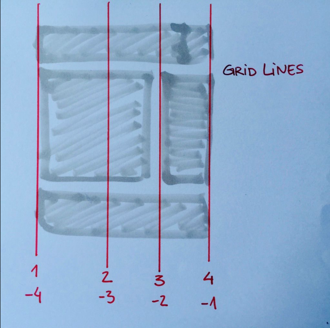
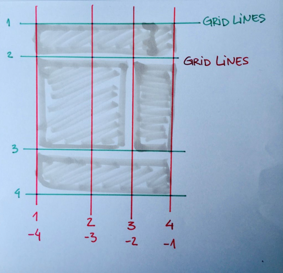
Defining the grid
.container {
  display: grid;
  grid-template-columns: 100px 100px 100px; /* 3 columns */
  grid-template-rows: 100px 100px; /* 2 rows */
}
.item {
  grid-column-start: 2;
  grid-column-end: 3;     /* grid-column: 2 / 3; */

  grid-row-start: 1;
  grid-row-end: 2;        /* grid-row:  1 / 2; */
}
1
2
3
1
2
3
4
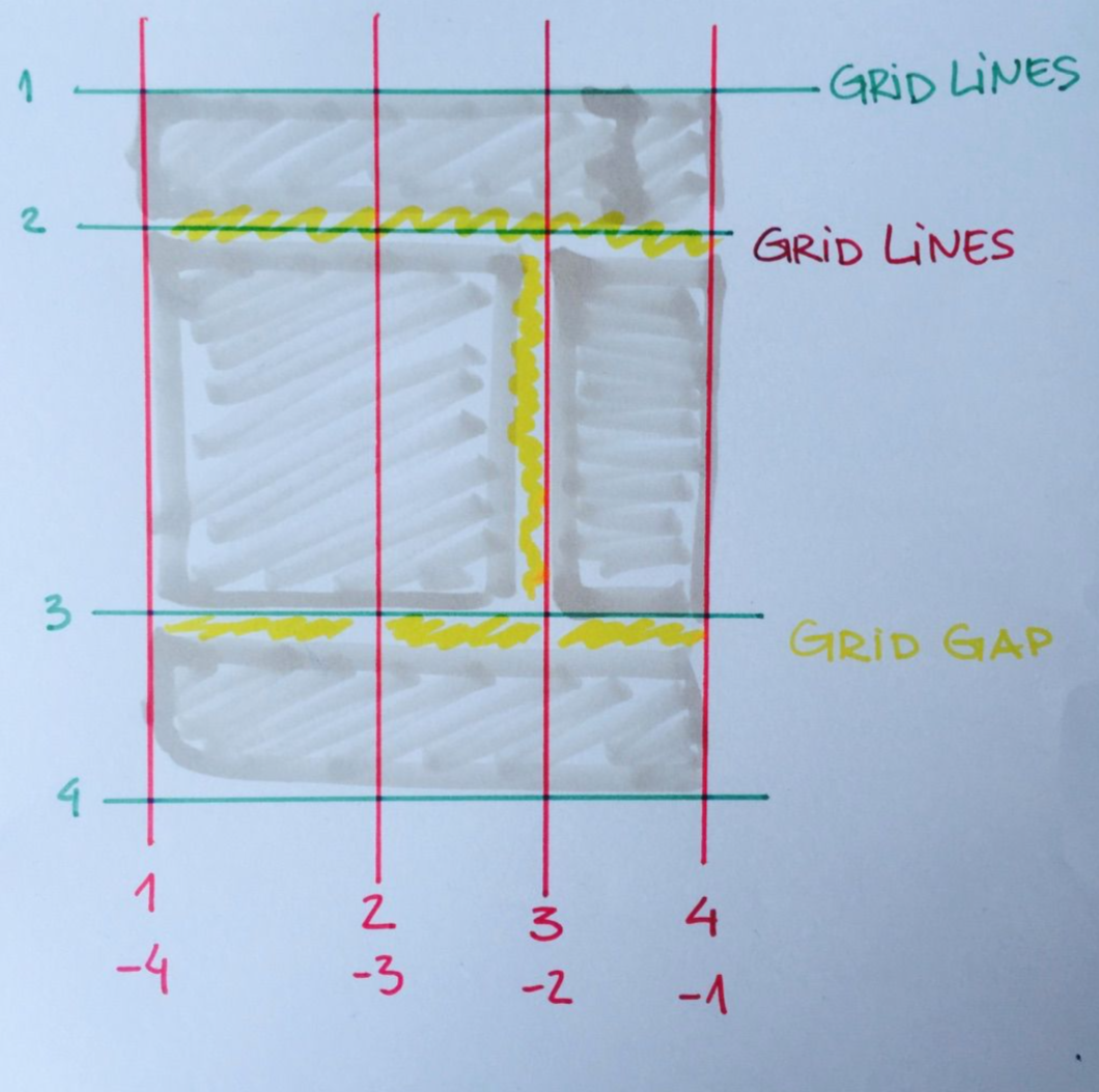
.container {
  display: grid;
  grid-template-columns: 100px 50px 100px;
  grid-template-rows: 80px auto 80px;

  grid-column-gap: 10px;
  grid-row-gap: 15px; /* grid-gap: 15px; for equal */
}
grid-gap
10px
10px
15px
15px
.container {

  display: grid;

  grid-template-rows: 1fr 1fr 1fr;

}
the fraction unit
(flexible tracks)
.container {

  display: grid;

  grid-template-rows: 1fr 1fr 1fr;

  grid-template-columns: repeat(3, minmax(150px, 1fr));

  grid-auto-flow: column;

}
minmax()
(ditch the media queries)
.container {

  display: grid;

  grid-template-rows: 1fr 1fr 1fr;

  grid-template-columns: repeat(auto-fill, minmax(150px, 1fr));

  grid-auto-flow: column;

}
auto-fit & auto-fill
auto-fit stretches items to fill up the space
auto-fill doesn't :)
.item {
  grid-column: <start-line> / <end-line>; /* OR <start-line> / span <value>; */
  grid-row: <start-line> / <end-line>; /* OR <start-line> / span <value>; */
}
items - line positioning
.item-1 {
  grid-column: 3 / span 2;
  grid-row: 3 / 4;
}
body {
display: grid;
grid: "header header"
"nav nav"
"content sidebar"
"footer footer";
grid-template-columns: 1fr 25%;
}
header { grid-area: header; }
nav { grid-area: nav; }
footer { grid-area: footer; }naming areas
(replace numbers with your own keywords)
.container {
  grid-template-columns: 50px 50px 50px 50px;
  grid-template-rows: auto;
  grid-template-areas:
    "header header header header"
    "main main . sidebar"
    "footer footer footer footer";
}
.container{
grid-template-columns: 40px 50px auto 50px 40px;
grid-template-rows: 25% 100px auto;
}naming lines
(replace numbers with your own keywords)
.container {
  grid-template-columns: [first] 40px [line2] 50px [line3] auto [col4] 50px [five] 40px [end];
  grid-template-rows: [row1-start] 25% [row1-end] 100px [third-line] auto [last-line];
}
Real-life examples
One layout - multiple solutions
One layout -
multiple solutions
CSS Custom Properties
Variables
//SCSS

$text-color: #565656;
/* LESS */
@text-color: #565656;/* CSS */
:root {
--text-color: #565656;
}
.component {
color: var(--text-color);
}Declaration
Difference with pre-processor variables is that they are static
//Compiled

.component {
  color: red;
}

.component {
  color: blue;
}
//SCSS
$text-color: red;
.component {
color: $text-color;
}
$text-color: blue;
.component {
color: $text-color;
}Custom properties are dynamic
with specific overrides
//Compiled for screens <= 900px

.component {
  color: var(--text-color); //blue
}


//Compiled for screens > 900px

.component {
  color: var(--text-color); //red
}
/* CSS */
:root {
--text-color: red;
}
.component {
color: var(--text-color);
}
@media (max-width: 900px) {
:root {
--text-color: blue;
}
}Browser support
Browsers
| IE/Edge (17) | Chrome (67) | Firefox (60) | Safari (11.1) | |
|---|---|---|---|---|
| Flexbox | IE 10/11 (2012) w/ -ms- Edge 12 (2015) |
21 (2012) | 28 (2014) | 6.1 (2013) w/ -webkit- |
| Grid | IE 10/11 (2012) Old spec w/ -ms- Edge 16 (10.2017) |
57 (03.2017) | 52 (03.2017) | 10.1 (03.2017) |
| Custom Properties | Edge 15 (04.2017) | 49 (2016) | 31 (2014) | 9.1 (2016) |
| Shapes | 😢 | 37 (2014) | 👩🔬 | 7.1 (2014) w/ -webkit- |
| Writing Mode | IE6+ (partial) Edge 12 (2015) |
8 (2010) w/ -webkit- |
41 (2015) | 5.1 (2011) w/ -webkit- |
.selector {
  /* Styles that are supported in old browsers */
}

@supports (property:value) {
  .selector {
    /* Styles for browsers that support the specified property */
  }
}
Feature queries
You can use AWESOME CSS
today!
Grid Demo

-1
-2
-3
-4
-5
-6
-1
-2
-3
-4
-5
-6
-7


Homework

Homework
Use CSS to create graphic-design style layouts
and have fun while doing it!
THANK YOU!
any questions?

aleksandra.hristov@netcetera.com
@alexhris
medium.com/@alexhris
- A Complete Guide to Flexbox
https://css-tricks.com/snippets/css/a-guide-to-flexbox/ - Flexbox Froggy
http://flexboxfroggy.com/
Explore
-
Grid by example
http://gridbyexample.com/
-
A Complete Guide to Grid
https://css-tricks.com/snippets/css/complete-guide-grid/
-
CSS Grid Garden - Interactive game for learning CSS grid
http://cssgridgarden.com/
-
CSS Reference: grid
https://tympanus.net/codrops/css_reference/grid/
-
CSS Grid playground example by @_anaris
https://jsfiddle.net/s0c46c2m/5/