THE HUMAN SIDE OF ACCESSIBILITY

I'm Alex, nice to meet you!
@alexnmoldovan
Co-Founder @ JSHeroes

medium.com/@alexnm

Hello 🇷🇴 JSHeroes!
Open Source Engineer @ teleportHQ
http://bit.ly/human-a11y
Stage 1 Awareness
Accessibility is the design of products, devices, services, or environments for people with disabilities.
Accessibility is the design of products, devices, services, or environments for people with disabilities.
ACCESSIBILITY = DESIGN FOR PEOPLE
accessibility
a11y
a 11 y
https://www.w3.org/WAI/standards-guidelines/wcag/

Stage 2
Misconceptions
Our country does not have accessibility regulation
Misconception
We don't have users with disabilities
Misconception
Accessibility does not have any return of investment
Misconception
More than 1 billion persons in the world have some form of disability. This corresponds to about 15% of the world's population. Between 110-190 million people have very significant difficulties in functioning.
More than 1 billion persons in the world have some form of disability. This corresponds to about 15% of the world's population. Between 110-190 million people have very significant difficulties in functioning.
More than 1 billion persons in the world have some form of disability. This corresponds to about 15% of the world's population. Between 110-190 million people have very significant difficulties in functioning.
Stage 3
Spectrum


Alice

Bob

Charlie

Alex
Stage 4
The Human Side
Before software can be reusable it first has to be usable.
Ralph E Johnson, GoF
User Experience
Availability and Accessibility
Safety and Privacy
Convenience and Cost
Delightful Experience
Availability and Accessibility
Safety and Privacy
Convenience and Cost
Delightful Experience
Availability and Accessibility
Safety and Privacy
Convenience and Cost
Delightful Experience
"It works" vs "It's nice"
Working on accessibility is about doing someone a favor
Misconception
1. Visual

Color Contrast

✅ Aim for >4.5:1 - AA
✅ Prioritize Text
Patterns and colors


Typography
✅ Minimum 16px text
✅ Font-family consistency
✅ Standard paragraphs and letter spacing
✅ 80 characters per line
Animations
Animations
✅ No unexpected transitions
✅ Use prefers-reduced-motion

✅ No parallax / scroll to
1. Visual
2. Semantic
A11y Object Model

Page Semantic

✅ Stop the divfest
✅ Define major sections
✅ Use headings in the right order
Forms
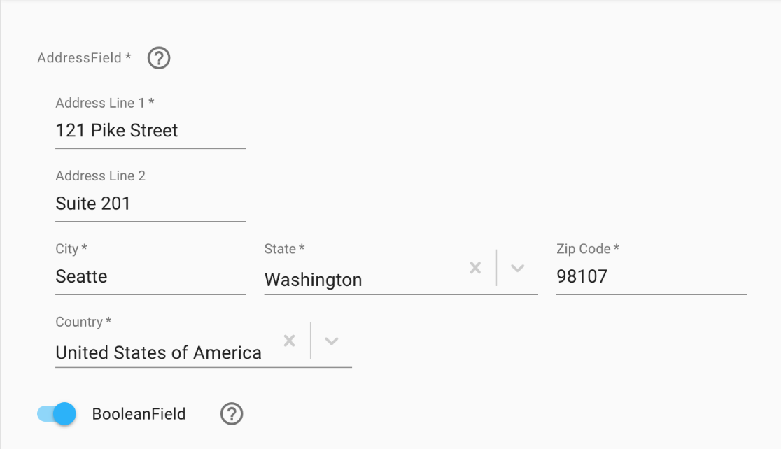
✅ Use <label> or aria-label
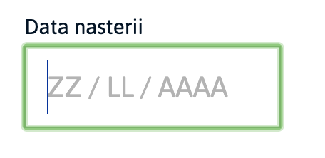
✅ Placeholder is not a replacement for labels
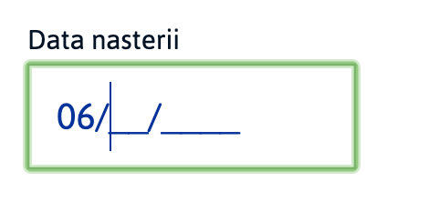
✅ Careful with styling & functionality


Menus
✅ Should be keyboard accessibile
✅ Use nav and list elements

Images & Links
✅ Use meaningful alt text
✅ Consider background-image
✅ Use <figure> & <figcaption> (in the future)
✅ Use clear title for links

✅ Avoid "click here" and "read more"
ARIA
✅ Don't use ARIA
✅ Use role / aria for non-standard elements
unless you have to
✅ aria-hidden / role=presentation for non-relevant content
✅ aria-label / aria-labelledby for assisting the SR
1. Visual
2. Semantic
3. Interaction
Keyboard Nav
✅ Support for tab navigation - tabindex "0" or "-1"
✅ Menu / lists - support left/right & up/down arrows
✅ Escape / Enter support
Outline


✅ Never do outline: 0
✅ Style your own outline
✅ At a minimum support keyboard outline
Focus
✅ :focus should accompany :hover / onclick
✅ Follow the natural order (tabindex > 1 is an antipattern)
✅ Focus trap / loop in modal windows
✅ Handle focus after navigation / content change
Touch Area
✅ interactive elements should be at least 44px big
✅ Small icons should use paddings to increase touch area
✅ Add labels for toggle buttons

VoiceOver


Orca


Lighthouse


Be inspired by what you don't know
Take Ownership
Team Culture

I'm open to questions!
@alexnmoldovan
Co-Founder @ JSHeroes

medium.com/@alexnm

Thank You!
Open Source Engineer @ teleportHQ
http://bit.ly/human-a11y
Engineer 2.0


User
Engineer 2.0
Peer