Codes and Conventions of Print Production

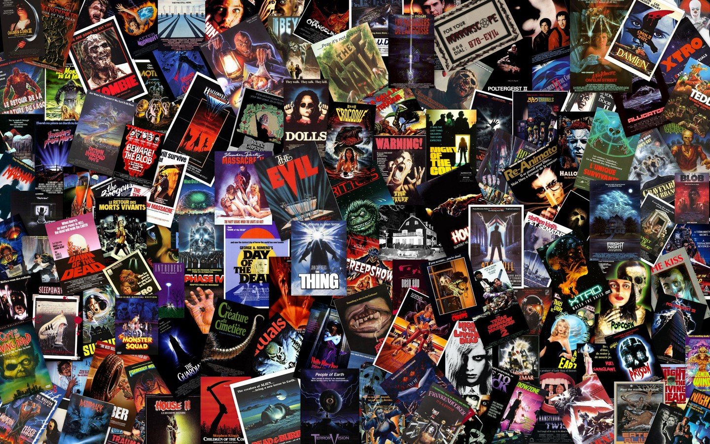
First of all, I will be exploring the codes and conventions of horror film posters and demonstrate how I have employed them in my own work.

Horror Film Posters

The title of the film is conventionally placed in the lower third and centred with the billing block below it. This is usually shown in the largest font, standing out against the other text.  

The Title

The billing block is almost always featured at the very bottom of the poster in the conventional tall but small font that is hardly readable from afar. This features the cast and crew members that are worth crediting in the poster.

The Billing Block

If featured, the tagline is usually at the top of the poster or above the title. It would be in a smaller font than the title. This allows the reader to gain an understanding of the film in a few words.

The Tagline

Sometimes the release date is revealed through the poster and displayed at the bottom, below the title, this creates anticipation for the consumer.
The Release Date

Made with Slides.com