Evaluation Question 2
This is a live streamed presentation. You will automatically follow the presenter and see the slide they're currently on.
This is a live streamed presentation. You will automatically follow the presenter and see the slide they're currently on.
How effective is the combination of your Main Task and Ancillary texts?
By Alisha Somaiya
I spent a long time thinking about how i would combine all three of my media texts so that they all linked to one another. I consider a range of factors including, style and theme. The main focus was to attract my desired target audience in by my magazine review and Movie poster to want to watch the Short film.
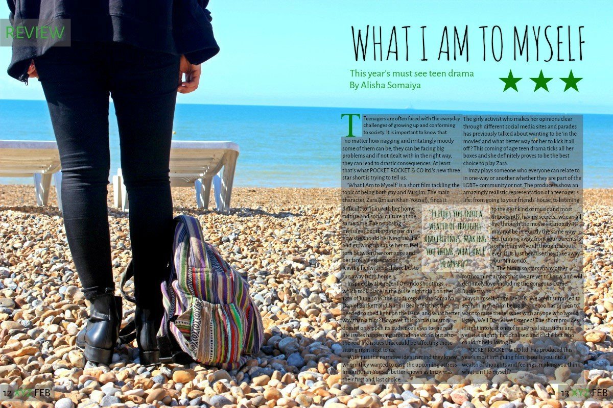
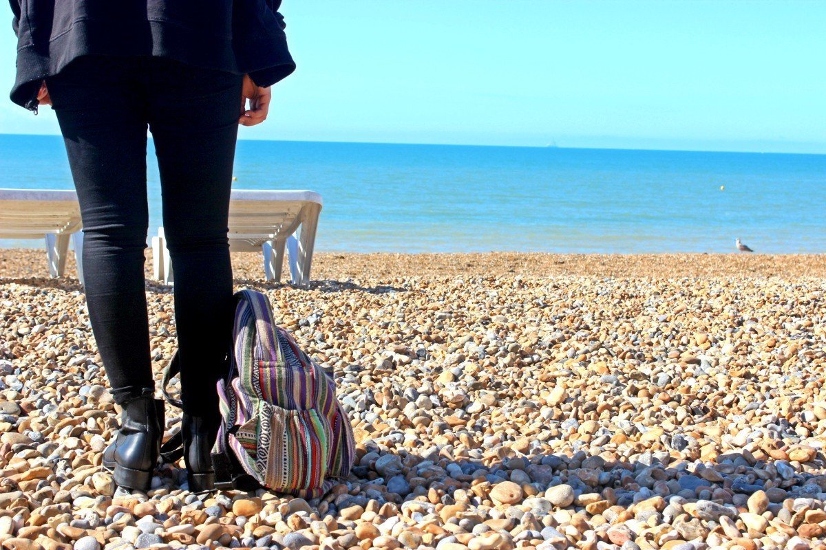
The magazine review is a picture of the main character's legs standing at a beach while at Pride. The picture doesn't show her face so makes the audience have to think about the situation she is in and have to solve certain 'enigmas'.
Colour
The magazine review uses colour as a big reference to the location of the picture and allows a match to the actual magazine colour scheme. The Colourful rucksack next to her feet highlight the happiness she is feeling at the place she is - Pride, with her friends. Its a contrast to her dark attire.
Font
The font is a direct reference to 'What i am to Myself' but this is only known if the movie is seen the short film. The font is suppose to resemble the handwriting of the main character as a main part of the film is her spoken word which she writes down in a journal. The spoke word is a huge part of Zara's (the main character) thoughts and feeling. It explains why she runs away
Magazine Review
Picture
The picture was edited a little. Especially because the colour was a huge aspect to the image in linking it to the short film and the stimulus. The colours in the rucksack were enhanced as they are similar colours to the Pride flag and the film is about a gay teenager.
Overall, i feel like the magazine review reflects the main task well and pulls the audience in to want to watch the movie as it doesn't give too much away. Making the audience wanting to know more
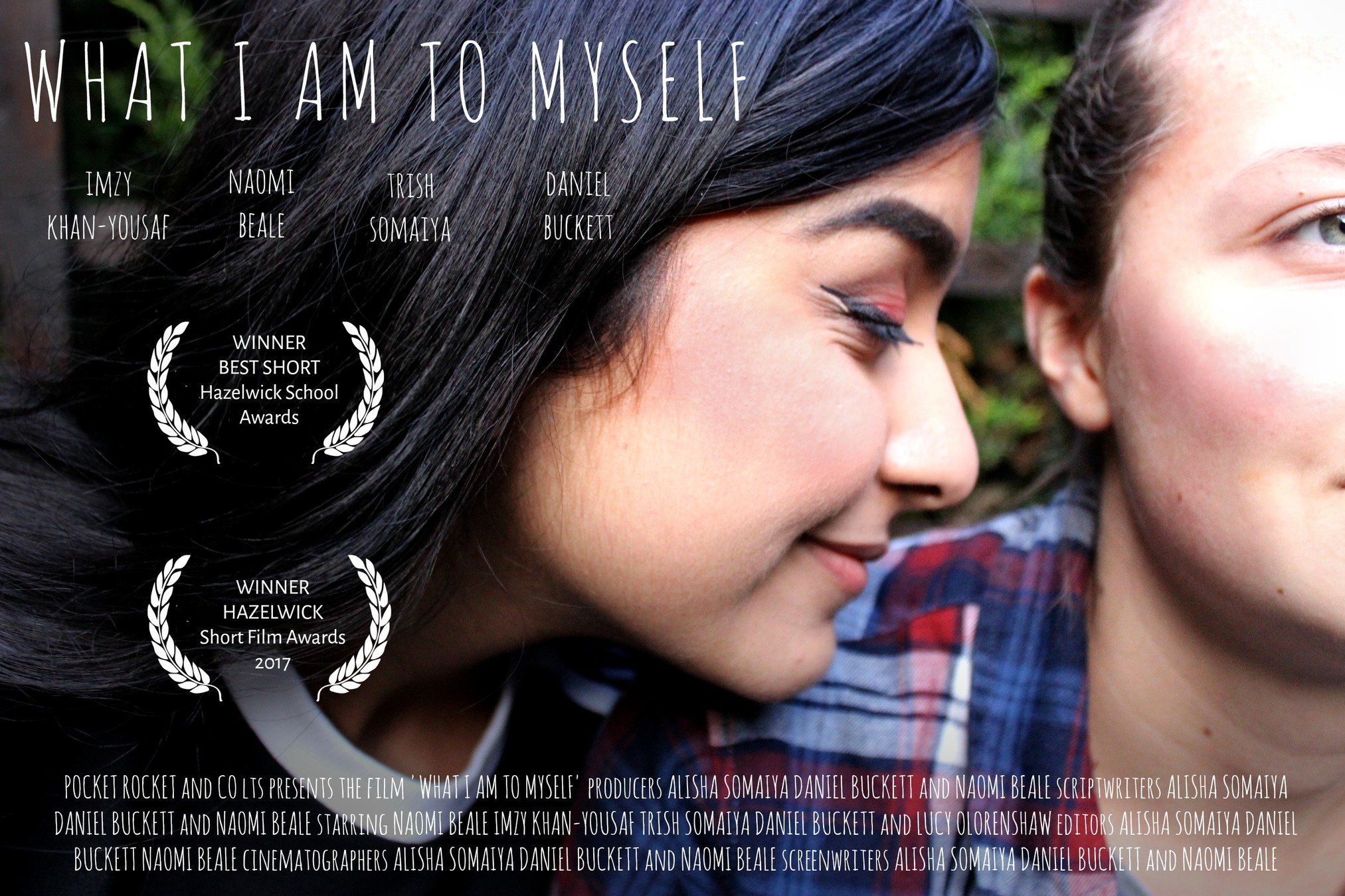
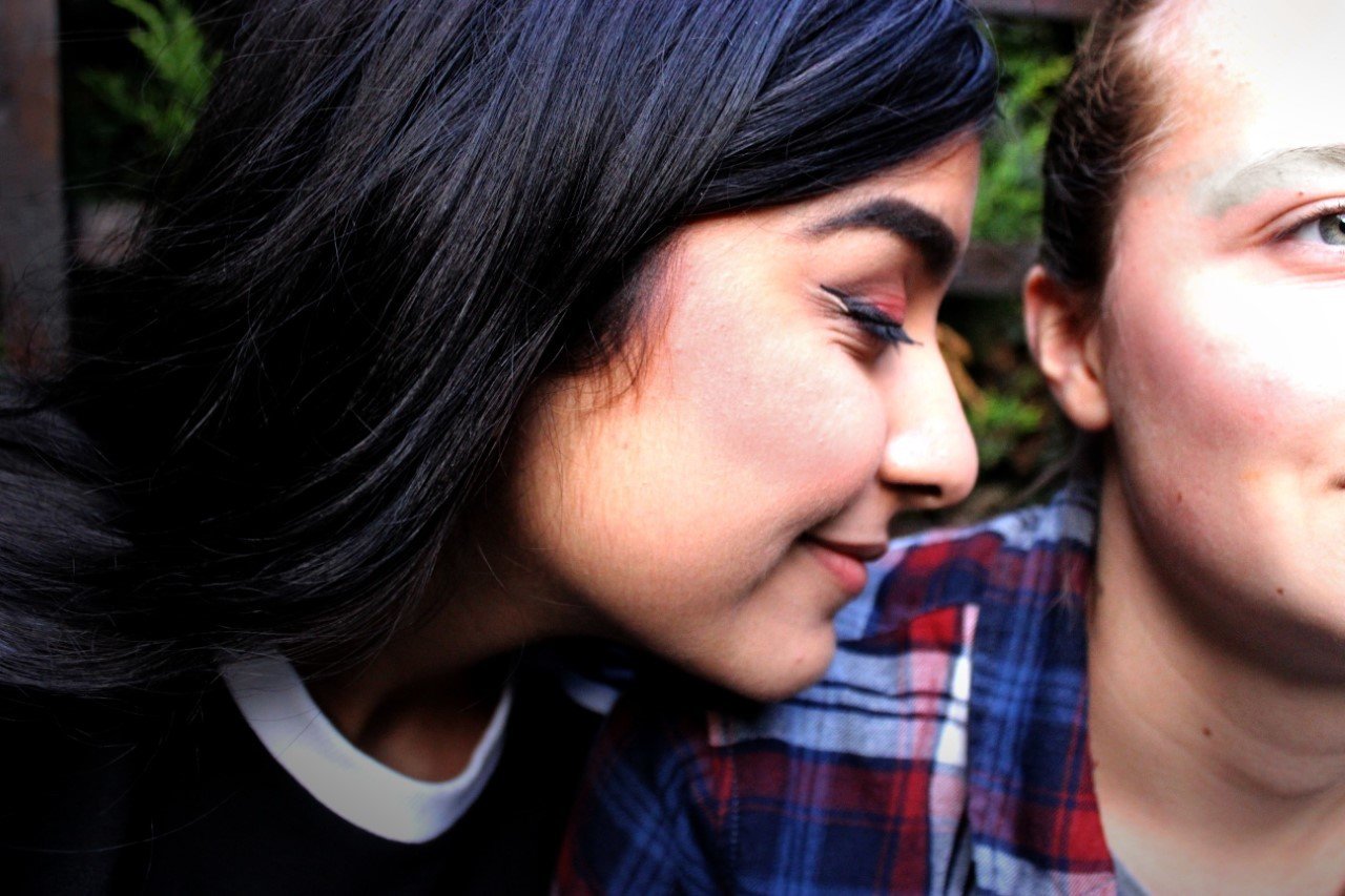
The movie poster is a picture of the main character Zara with her girlfriend. The picture is mainly focused on Zara herself but the half of her girlfriends face allows the audience to make assumptions about what the short film is about.
Colour
The colour was a big aspect of the movie poster. A lot of editing went into the picture as i highlighted the blush on Zara's face and deepened her hair colour to make the picture look very personal with the two characters - again giving an idea to the audience about what the film is about.
Font
The font is a direct reference to 'What i am to Myself'. The font is suppose to resemble the handwriting of the main character as a main part of the film is her spoken word which she writes down in a journal.
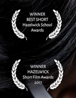
Awards
The awards make the movie look more appealing to the audience and draw the audience even more to want to watch the short film. Knowing that the film has won awards makes it look more appealing and can even make the audience want to watch a short film without looking at any other promotional media texts
Picture
The picture was edited a lot from the original. As said before the blush on both the characters cheeks was increased, the intensity of the hair was depended and i also added a selective focus blur on the face area of the characters so that the audiences' eyes are drawn to them
Overall i think that the movie poster worked well in portraying the short film and advertising it to draw an audience in to want to watch it
Conclusion
In Conclusion, i think that the audiences were able to link the three media texts - Poster, Magazine review and Main task together through different codes and conventions put together through colour, font and the pictures used. The codes allowed different preferred reading to be made and enabled the audience to try to figure out what they think the movie is about without watching it. In the end drawing the audience in to want to watch the short film in the end.