Styling forms
accessibly


Styling forms
accessibly
Web accessibility
The inclusive practice
of removing barriers
that prevent interaction with, or access to websites,
by people with disabilities.
Wikipedia says:
Most studies find that
about one fifth (20%) of the population has some
kind of disability.
WebAIM says:
Visual
Motor
Auditory
Cognitive


Visual

blindness, low vision,
color-blindness
Motor

inability to use a mouse, slow response time,
limited fine motor control
Auditory
deafness,
hard-of-hearing

Cognitive
learning disabilities,
inability to remember or focus on large amounts
of information

How does this apply
to user experience?
Building for accessibility creates better
user experiences.
How it feels
Implementation
Beyond the basics
Who it benefits
Small percentage
of users?
Small percentage
of users?
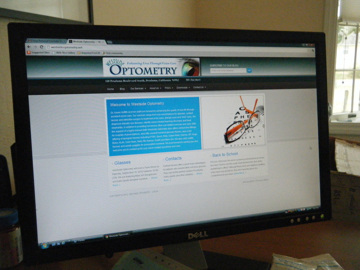
Non-retina display
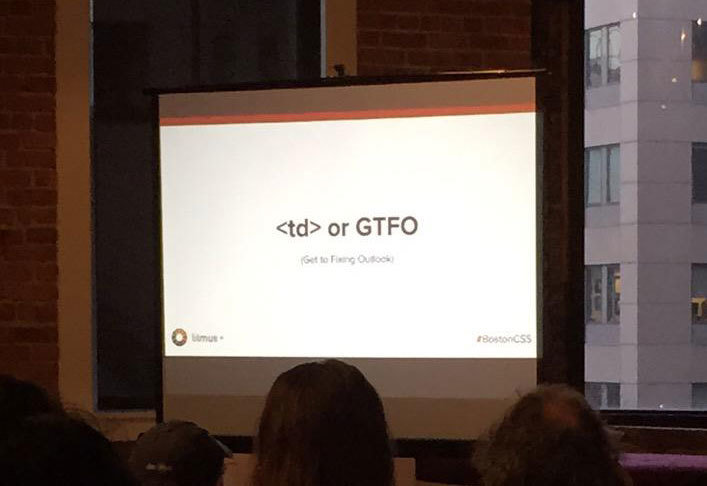
Projection
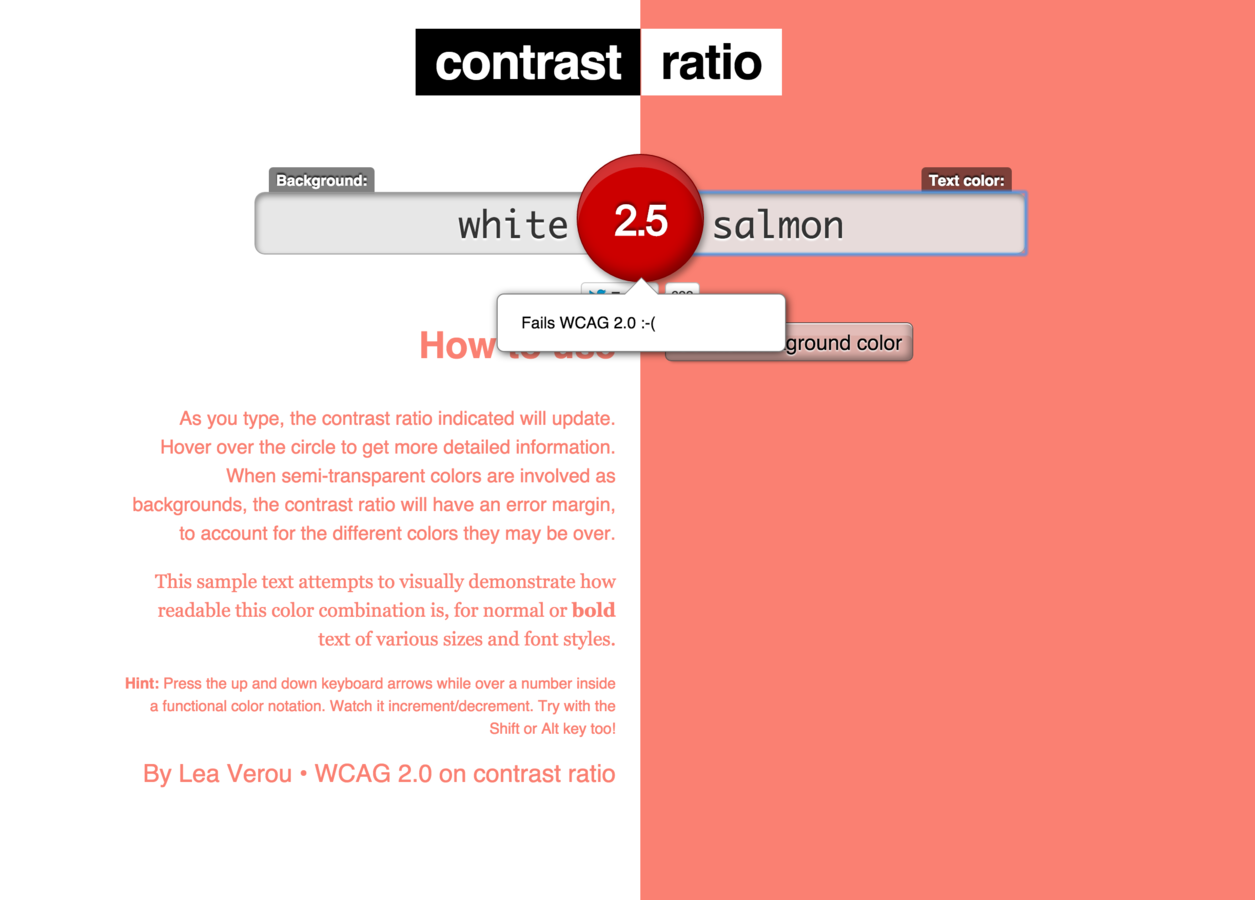
Sun glare

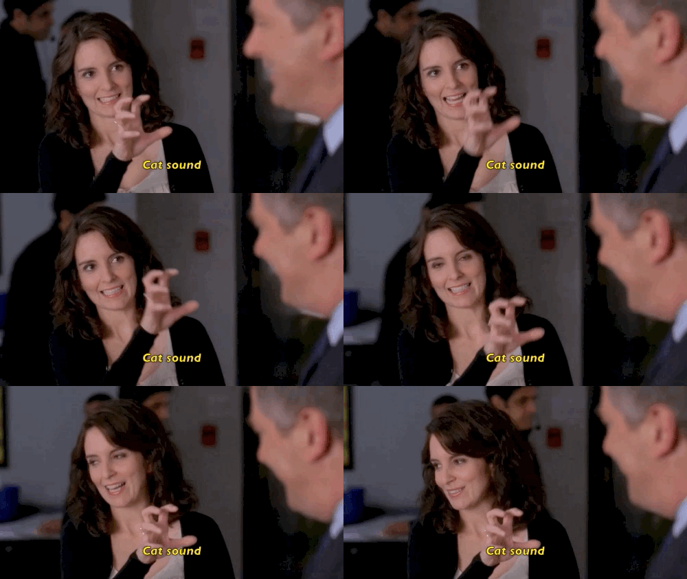
Closed captioning
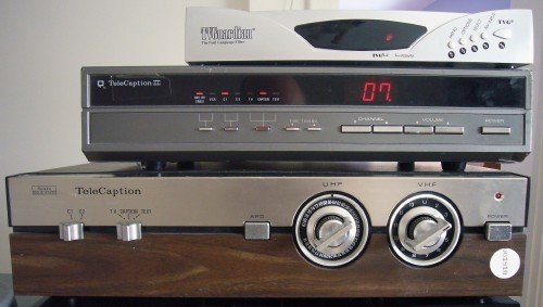
External decoders
Over half of the TeleCaption decoders are actually sold to the hearing population
Closed captioning

Makes it accessible to the hearing impaired
- SEO benefits
- Search and find
- Don’t need to listen
to the audio
Accessibility
benefits everyone!
Who it benefits
Implementation
Beyond the basics
How it feels
What are accessibility features that we should
be aware of?
Definitions
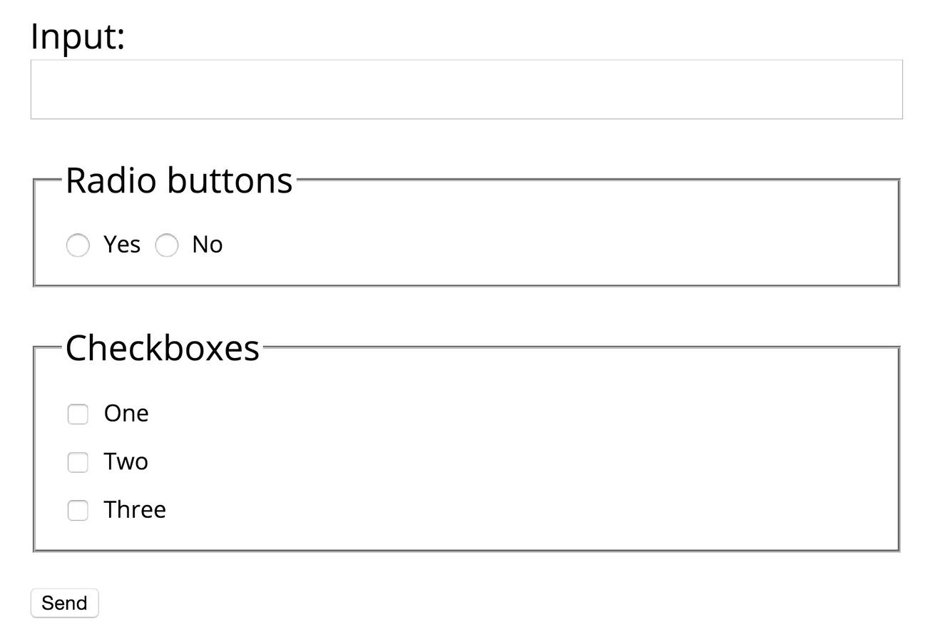
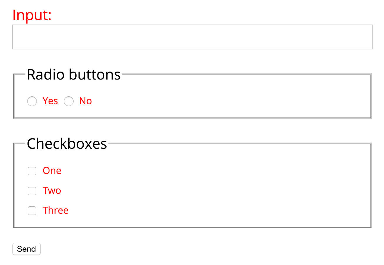
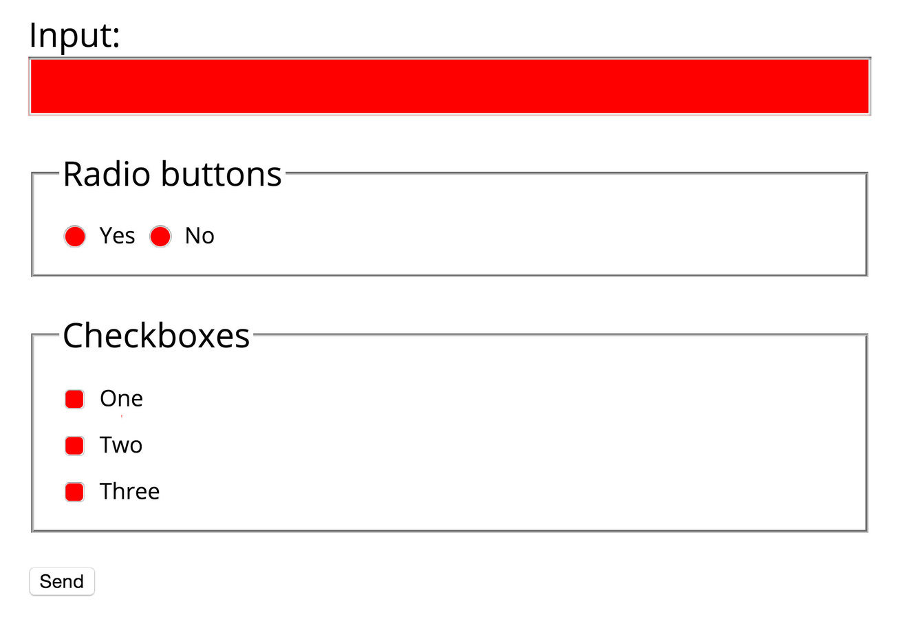
Associate labels
and inputs
Focus cursor

Larger target areas

Makes it easier for
people with motor disabilities.
As well as people who don't.
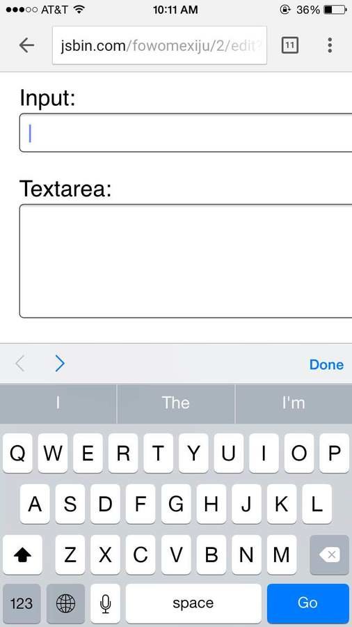
Keyboard shortcuts
through inputs
tab
On mobile, can use < >.
-
↑↓←→ to choose option for radio button
space
enter
- to select checkbox
-
↑↓←→ and type to choose in a dropdown popup, and select with
Makes it usable for
blind users and users with low-mobility.
Makes it more efficient
for those who aren’t.
Assistive technology
Who it benefits
How it feels
Beyond the basics
Implementation
Design + development
Stick to semantic HTML
Semantic HTML is a way
of writing HTML that emphasizes the meaning
of the encoded information
Wikipedia says:
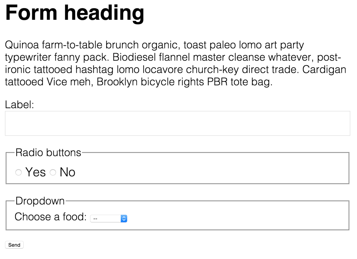
<h1><p><label><input><select>Accessibility is baked in when we begin with semantic HTML.
Semantic HTML
<form>
  <label for="name">Name:</label>
  <input name="name" id="name">

  <label for="food">Choose a food:</label>
  <select name="food" id="food">
    <option selected disabled>--</option>
    <option>Apples</option>
    <option>Coconuts</option>
    <option>Chocolate</option>
  </select>

  <input type="submit" value="Send">
</form>
Pro: native implementations
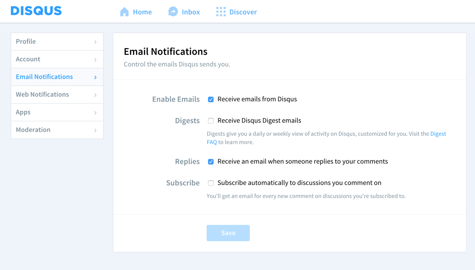
Pro: native implementations
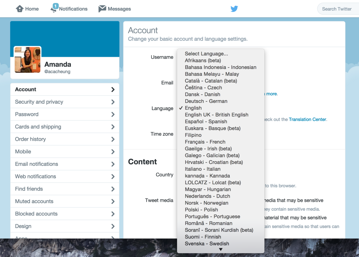
Con: customization limits
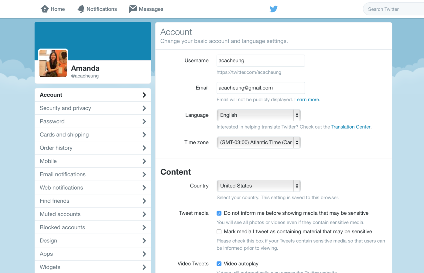
What can we do if the browser doesn’t let us override default styles?
Workarounds
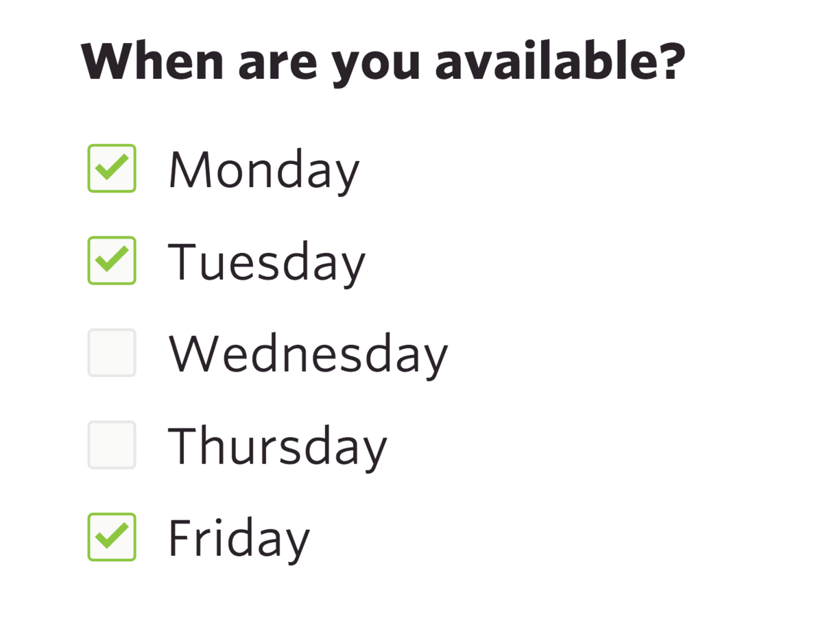
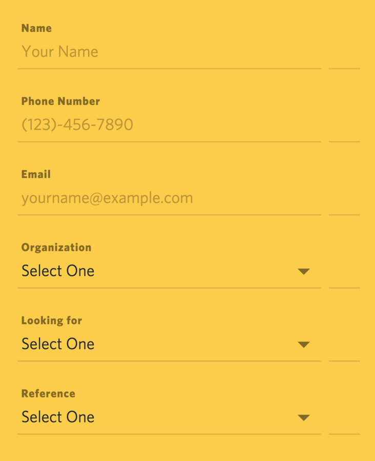
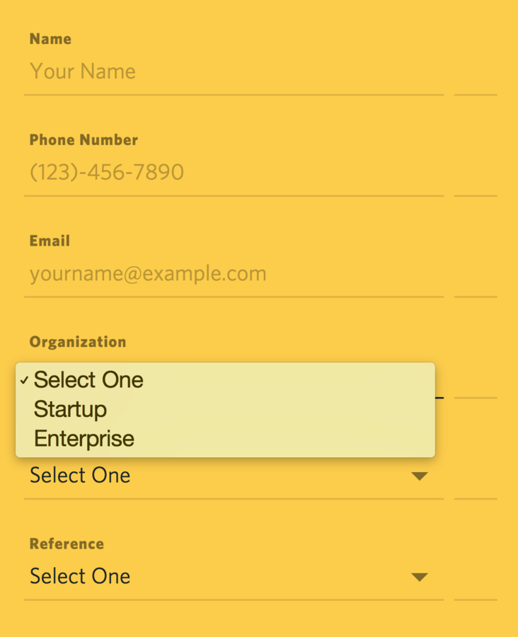
Don’t fight the browser!
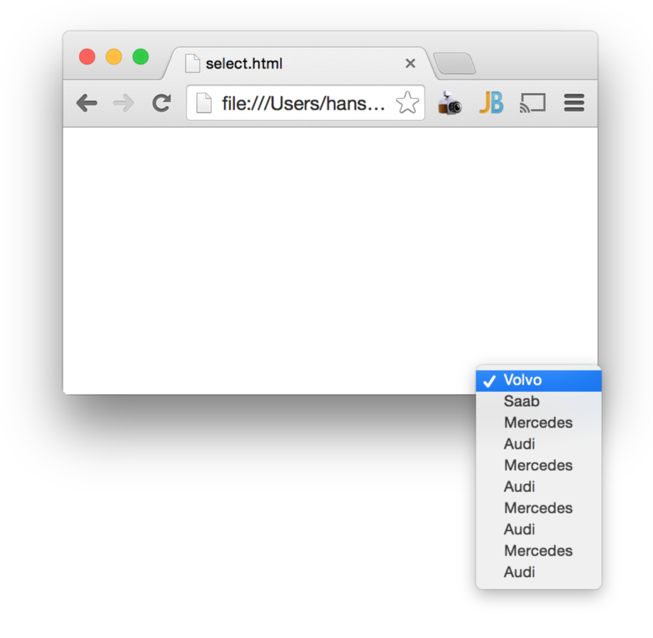
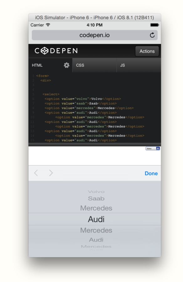
Be careful
when hiding labels
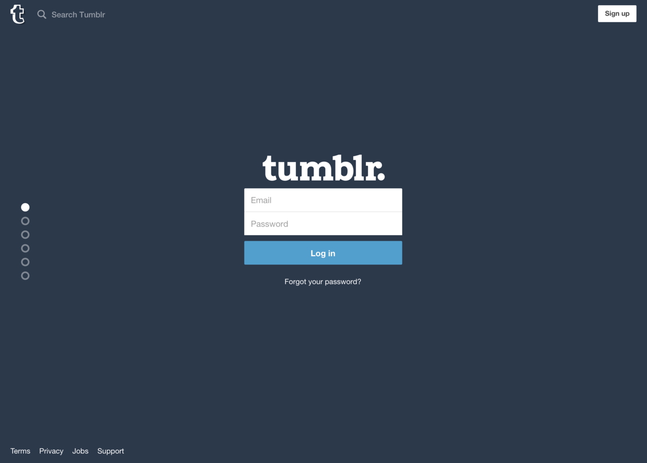
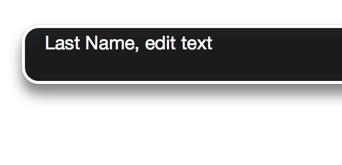
Relying on placeholders


.hide {
  display: none;
}
.hide {
position: absolute;
clip: rect(1px 1px 1px 1px); /* IE6, IE7 */
clip: rect(1px, 1px, 1px, 1px);
}
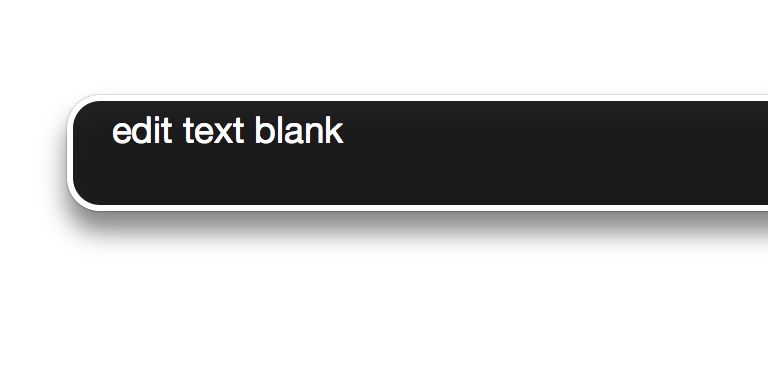
.is-hidden {
  position: absolute !important;
  clip: rect(1px 1px 1px 1px); /* IE6, IE7 */
  clip: rect(1px, 1px, 1px, 1px);
}
Replace default focus state rather than removing it
Focus styles
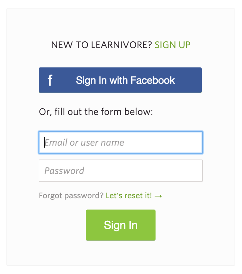
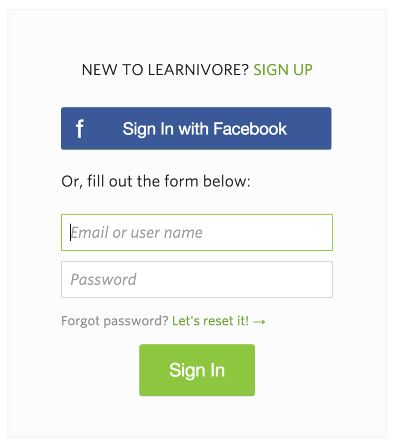
Who it benefits
How it feels
Implementation
Beyond the basics
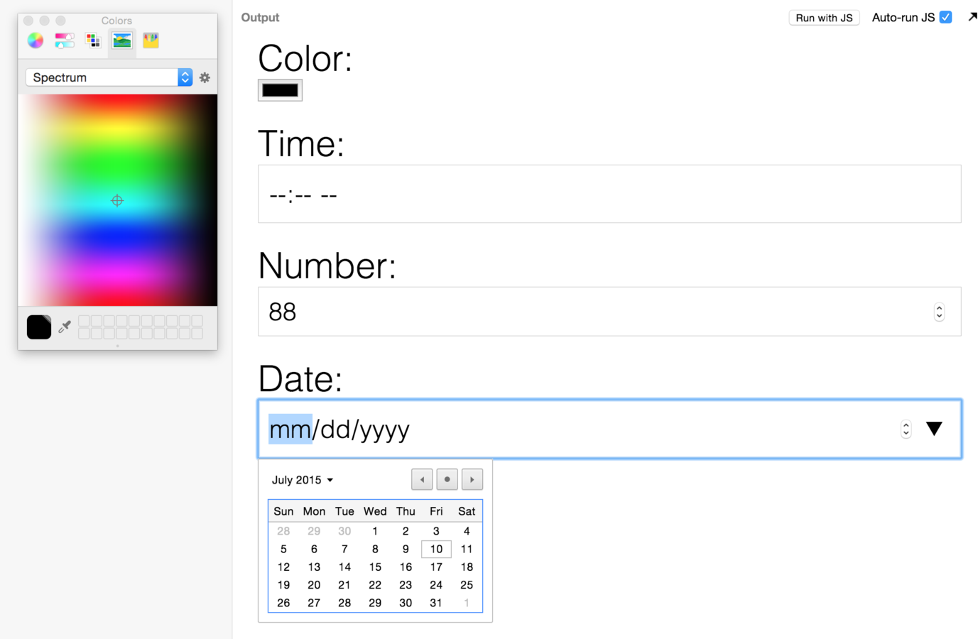
Cross browser support
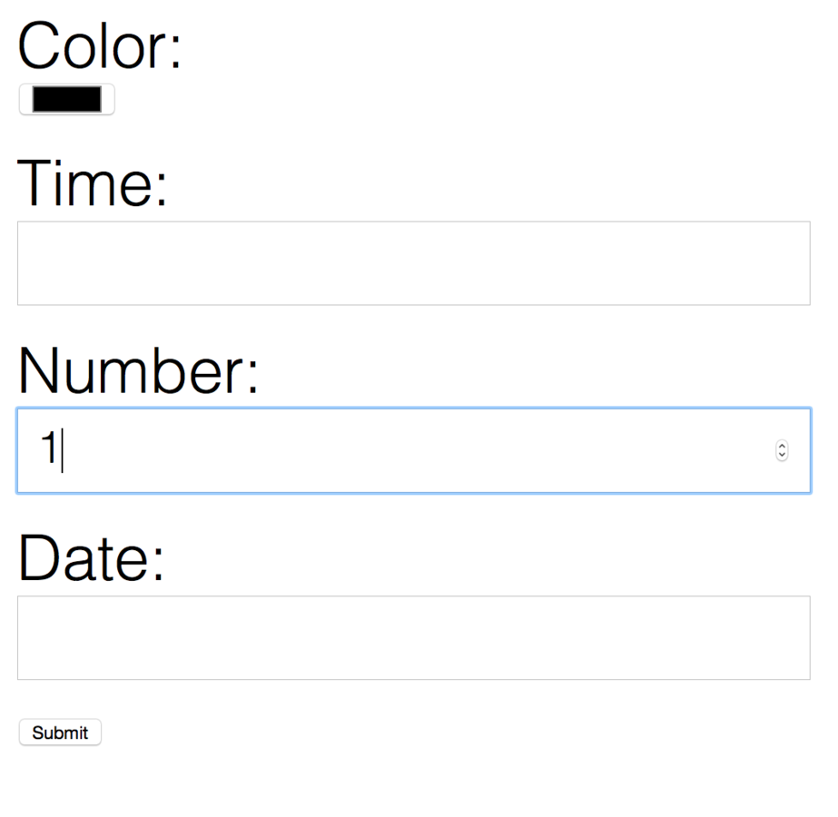
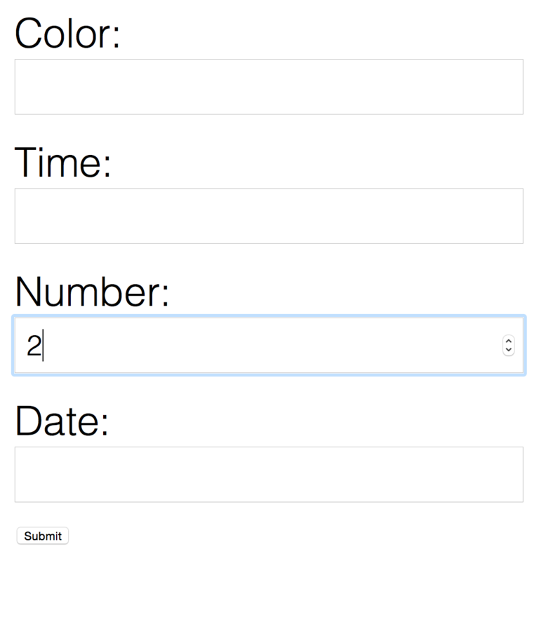


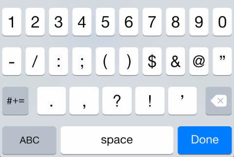
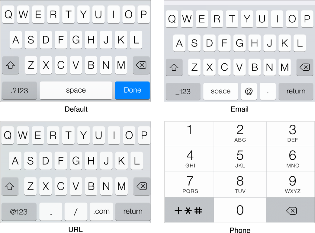
iOS number keypad
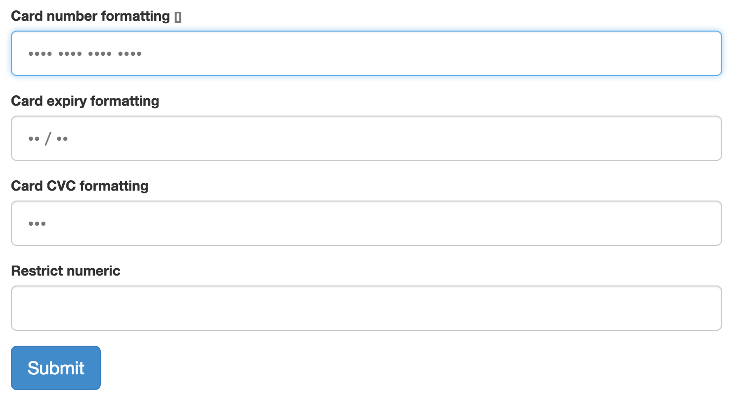
We can still do more!
What other ways can we help out our users?
Workflow
- Design
- Semantic HTML
- Test for a11y
- Add CSS styles
- Test again!
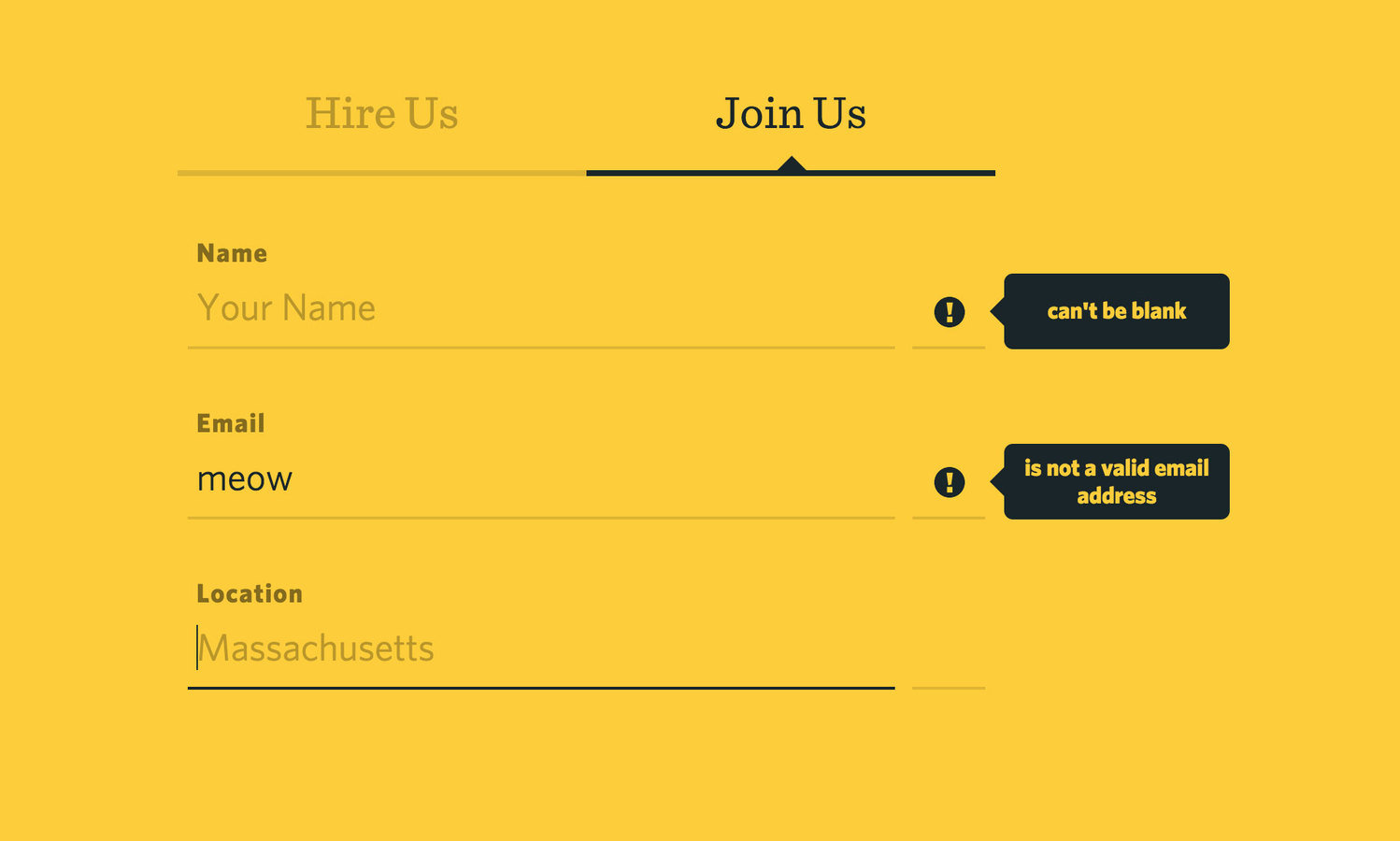
Example

Label text is 18px and bold
Is that okay?
Hire us link also fails

The End!
Resources
Thank you :)