Styling forms
semantically & accessibly
Hi, I'm Amanda.
Lead UX Developer at DockYard
@acacheung

Web accessibility
• Visual: blindness, poor eyesight, color blindness
• Motor: difficulty or inability to use hands
• Auditory: hearing impairment
• Cognitive: developmental and learning disabilities
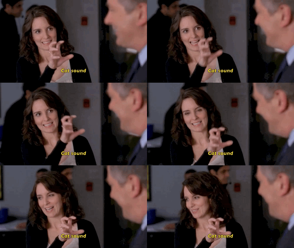
Example: Closed Captioning
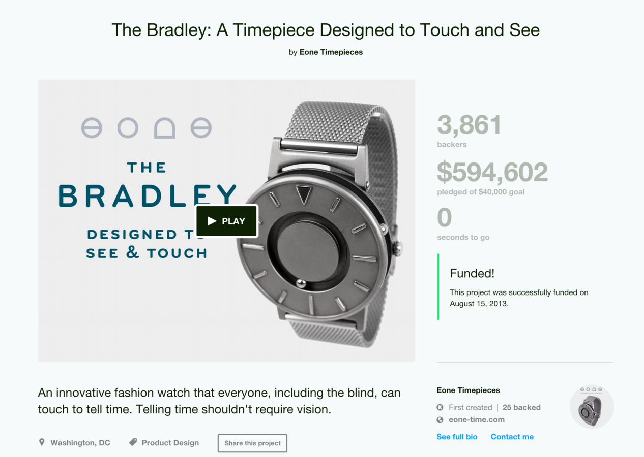
Example: The Bradley Watch
User experience
Effectiveness, efficiency and satisfaction
Basics: does it behave as expected?
• Click on label for its related field?
•
tab through inputs?
•
to choose radio button?
•
space to select checkbox?
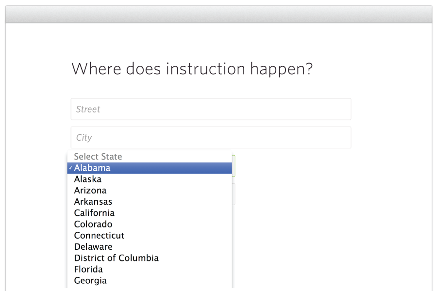
• Dropdown functionality?

Bonus: is it visually engaging?
http://jsbin.com/wonez/1/edit
Things to keep in mind
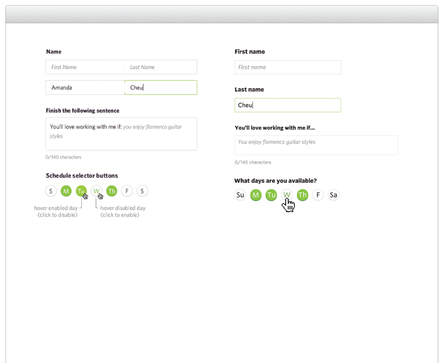
• Relying on placeholders? Is there prepopulated data?
Problem areas
• Cross-browser styling for checkboxes and radio
New things!
• New input types
• Datalists
Currently in the W3C recommentation:
text, password, checkbox, radio, submit,
reset, file, image, button, hidden
reset, file, image, button, hidden
What has been added to the working draft:
telephone, url, email, date, time, number, range, color
Mobile / table keyboards

Overview
- Write semantic HTML
- Test
- Add styles
- Test again!
Thanks!

@acacheung