
Class 1
- Welcome
- Administrivia
Who am I?

I am...
- Former lead user experience developer at DockYard
- BFA in painting and graphic design
- Took this very class five years ago!
- Teaches with Girl Develop It - Boston chapter
- Conference speaker
- Organizes the Boston CSS Meetup group
Your TA: Siya
- Studying interaction design at Dynamic Media Institute
- Currently in thesis year
- Undergrad in computer engineering
- Loves designing, crafting and implementing interesting user experiences
I ♥ the web
I want you to be as excited about
the current state of the web as I am!
Course goals
- Get you comfortable with the basics
- Help you understand how to design for the web
- Get you building stuff!
How we’re going to accomplish this
- Lots of hands-on exercises
- Lots of critical evaluation of websites
- Just enough lecture and theory to get by
- Not a one-size-fits-all approach
Administrivia
- Syllabus
- Projects (Dobot shop, final project)
- Accounts (GitHub, CodeSandbox)
- Download Chrome and Visual Studio Code
- In Safari, go to Preferences > Advanced >
Check "Show Develop menu in menu bar"
Homework setup
- Fork https://github.com/acacheung/fall2016
- Click "Settings" and change the repository name to [yourusername].github.io
- (Click back to Admin) Next click on "Collaborators," type in "acacheung" and click add
- Log in to GitHub Desktop
- Find your "username.github.io" repository
- Clone and open in finder
- Open the "meee" folder and edit index.html
- Commit
- Sync!!
- Visit [yourusername].github.io/meee/index.html to double-check
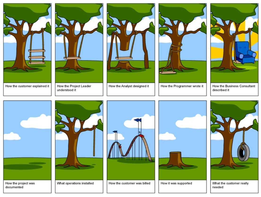
What is the web?
Wikipedia says:
"The world wide web is a system of interlinked hypertext documents accessed via the Internet. With a web browser, one can view web pages that may contain text, images, videos, and other multimedia and navigate between them via hyperlinks."
What can you do
on the web?
Just about anything...
The web is...
- "Brochure" websites: MassArt
- E-commerce: Amazon
- Social networking: Twitter
- Online/IRL communities: Meetup
- Interactive information applications: Google maps
- Interactive games: Candy Crush
- Whatever you want to build
The good:
If you can dream if, you can build it
The bad:
There’s a LOT to learn
- HTML/CSS/JavaScript
- Design layout fundamentals
- Typography
- User experience
- Marketing
- Content strategy
- Search engines
Who runs the internet?
NOBODY
- Carriers have peering arrangements to deliver bandwidth (Comcast, Verizon)
- Standards groups promote best practices (W3C, WHATWG)
- Browser makers implement whatever they want (Mozilla, Webkit)
- Servers serve pages (Apache, IIS, Nginx)
- Scripting languages talk to servers (PHP, C#, Python)
Open source vs closed
- Free as in “Beer” (closed source freeware) vs Free as in “Speech” (open source)
- Open-source does not mean without cost
- Closed source does not mean expensive
- But usually that’s the case
Know your license!
- CC BY, CC BY-SA, CC BY-ND, CC BY-NC, CC BY-NC-SA, CC BY-NC-ND Attribution, Share-Alike, No-Derivitives, Non Commercial (http://creativecommons.org/licenses/)
- Unlicenses, public domain
- GPL, LGPL, AGPL
- BSD, MIT
HTML / CSS / JavaScript
What’s the point of each?
- HTML
- CSS
- JavaScript
What is HTML?
- Stands for Hypertext Markup Language
- Invented by Tim Berners-Lee in 1991 to share scientific papers
<!DOCTYPE html>
<html>
  <head>
    <title>My Awesome Website</title>
    <link rel="stylesheet" href="style.css">
    <script src="application.js"></script>
  </head>
  <body>
    <header>
      <a class="logo" href="index.html">My Awesome Website</a>
      <nav>
        <a href="about.html">About</a>
        <a href="contact.html">Contact</a>
      </nav>
    </header>
    <main>
      <h1>Header</h1>
      <p>Lorem Ipsum</p>
    </main>
    <footer>
      © Copyright 2016
    </footer>
  </body>
</html>UX Audit: Oyyo
- Think about WHAT your end users might want,
- WHY they want it,
- HOW to provide it to them
- What should they START doing?
- STOP doing?
- CONTINUE doing?
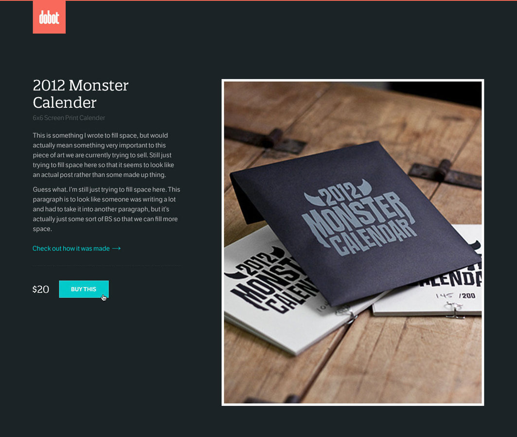
Go through the process of purchasing
the largest size of the Labyrinth rug
Homework
-
Finish meee (MUST be synced)
-
Add the link to your [yourusername].github.io/homework/
-
Read Building Your First Web Page by Shay Howe
-
Read A Dao of Web Design by John Allsopp
-
Read UI, UX: Who Does What? A Designer's Guide
to the Tech Industry
Class 2
-
UX Audit: Epicurrence
- Request an invite for this conference
- Discussion
- Introduction to HTML
Homework
- Review A Dao of Web Design
- Questions about design / UX roles?
Let’s talk HTML
Hypertext markup language
It gives content structure and meaning
History of HTML
- Invented by Tim Berners-Lee
- Created “hypertext” to share scientific papers
- First web page August 6, 1991
- Standardized by W3C
- HTML4 in 1997
- XHTML in 2000
- HTML5 in 2014
Don’t fear the internet
Hamburger Text Markup Language
Review
- What are elements, tags and attributes?
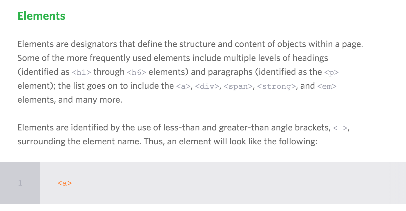
Review
- What are elements, tags and attributes?

Review
- What are elements, tags and attributes?
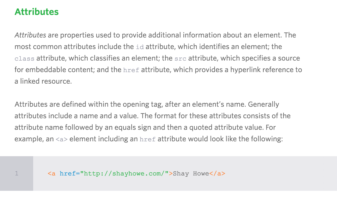
Review
- What are elements, tags and attributes?

In HTML you can write just the opening tag and it will
often work. Don’t do this. Unless it is a self-closing element,
always use open and close tags.
Common elements
-
<head> describes the web page, meta info
-
<body> visible page content
-
<header> group of introductory or navigational aids (headings, logo, nav, search)
-
<footer> (related links, copyright)
-
<div> defines a division or a section, a container/wrapper
-
<nav> links to other pages or parts within a page
-
<aside> tangential content related to its surrounding content, sidebar
-
<section> grouping of content with heading
-
<article> a self-contained piece of content (forum post, article, blog entry)
-
<p> paragraph text
-
<h1> most important heading
-
<h2> heading less important than h1
-
<span> generic inline container
-
<ul> unordered list
-
<ol> ordered list
-
<li> list item
-
<a> link, stands for anchor
<nav>
- A section of a page that links to other pages
or to parts within the page - Main navigation: home, about, contact
- User navigation: login, register, account
- Sidebar navigation: products, blogs, etc.
<section>
- A group of content, typically with a heading
- Ex: introduction, news items, contact information, chapters
<article>
- Self-contained piece of content
- Ex: forum post, magazine article, newspaper article, blog entry
<footer>
- Represents the footer for the section it applies to (does not have to mean the bottom of the page)
- Ex: information about its section, who wrote it, links to related documents, copyright data, appendices, indexes, colophons, license agreements

Remember!
- Validate your markup
- Use HTML tags in meaningful ways
- Your HTML is NOT your design
- Does the outline make sense?
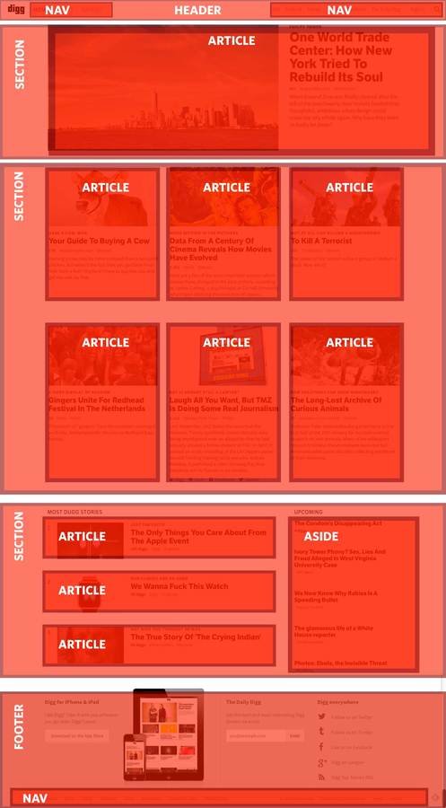
Your first HTML chop!
- Go to your Codepen (In-class Codepen assignment #1)
- Write the HTML for this blog post (stop after the category tags)
Did you validate
your HTML?
Code style guides
Homework
-
Read Shay Howe’s Getting to know HTML
-
Sign up for Codecademy and complete Unit 1 & 2
-
Work on HTML for Dobot shop (make sure it is VALIDATED) - Due in two weeks!
Class 3
- UX Audit: Robin Mastromarino
- You are hiring an intern - What would you want to know about them?
- Discussion
- Moar HTML
Homework corrections
- REMINDER: We will not be able to see your updates if you don’t sync! Always double check your work in production
- These are all handled in GitHub
- You will receive an issue notification
- Fix described issue
- Close out the issue
Don’t fear the internet
Don’t fear starting from scratch (Part 1)
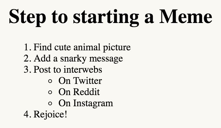
Lists
- Ordered Lists (ex: numbered)
- Unordered Lists (ex: bulleted)
- Definition Lists
- Can have lists inside of lists (aka nested)
Create this in a Codepen (In-class Codepen assignment #2)
Directory relationships
- If it’s in the same folder: contact.html
- If it’s inside another folder inside your folder: images/logo.png
- If it’s outside the folder you are in: ../index.html
One page scrolling site
-
Decide where on the page you want to link
-
Add the id="..." attribute inside the opening tag
-
Name the id something that makes sense
-
IDs are for identifying elements uniquely. Only occurs once.
-
In the nav, reference the anchor text using href="#id-name"
Create this in a Codepen (In-class Codepen assignment #3)
<header>
  <h1>MY PAGE</h1>
  <nav>
    <ul>
      <li><a>Home</a></li>
      <li><a>About</a></li>
      <li><a>Portfolio</a></li>
      <li><a>Contact</a></li>
   </ul>
  </nav>
</header>
<section>
  <h2>Bacon Ipsum</h1>
  <p> Brisket chuck leberkas short ribs tenderloin tongue. Filet mignon sirloin jerky chicken strip steak t-bone. Ribeye short ribs fatback pancetta ham boudin, pork biltong tenderloin leberkas ball tip pork chop bresaola. Spare ribs kielbasa pork loin hamburger pork chop rump beef. Chuck spare ribs pork chop shank ribeye, leberkas turkey pig. Tri-tip tongue turducken, pig jowl brisket tail tenderloin flank rump bresaola pork chop short loin shoulder.</p>

  <h2>About</h1>
  <p>T-bone strip steak beef ribs, tenderloin drumstick pancetta biltong sirloin jowl speck kielbasa ball tip. Filet mignon leberkas jerky, cow shankle spare ribs fatback venison tri-tip short ribs kielbasa brisket. Swine pork loin beef kielbasa, prosciutto boudin beef ribs hamburger pork chop short ribs meatloaf frankfurter bresaola. Chuck kielbasa tail boudin.</p>

  <h2>Portfolio</h1>
  <p>Ball tip swine salami, strip steak boudin chicken fatback. Kielbasa bresaola ribeye swine speck pork belly. T-bone chuck turducken, tail pig ball tip kielbasa. Ribeye kielbasa tenderloin spare ribs, turducken beef ribs prosciutto drumstick brisket pastrami strip steak. Jerky salami biltong chicken, ground round pig pork chop meatball pork corned beef pastrami turducken shoulder.</p>
  <p>Ball tip capicola chuck kielbasa prosciutto chicken. Meatloaf meatball corned beef pork belly, andouille frankfurter salami ground round biltong rump spare ribs. Capicola tail boudin, turducken pork belly ribeye bresaola bacon t-bone ball tip. Ribeye frankfurter spare ribs, ground round pork loin tail rump salami speck sirloin pastrami shank.</p>

  <h2>Contact</h1>
  <p>Ham hamburger capicola short loin pork loin kielbasa. Meatball biltong tri-tip pork belly speck pork loin, shankle bacon. Bacon frankfurter prosciutto, ribeye tri-tip jowl beef pork chop kielbasa bresaola t-bone pig shank short loin. Jerky brisket pork chop jowl.</p>
</section>

<style>
  body {
    width: 400px;
  }
  h1 {
    padding-top: 20px;
    font-size: 2em;
  }
  h2 {
    padding-top: 20px;
    font-size: 1.5em;
  }
  p {
    line-height: 1.5;
  }
  nav li {
    display: inline-block;
    padding-right: 20px;
    padding-bottom: 75px;
  }
</style>
Images
<img>
<img class="logo" src="logo.svg" alt="Google">
- alt is required for code to validate
- / not necessary at end of tag
Know your formats!
-
GIF - can be animated
-
PNG - supports transparency, smaller image (eg logos)
-
JPG - larger images
-
SVG - vector graphics, can be animated w/ code
-
ICO - favicon

Add images to your Dobot project
Special characters
Have you tried to type ampersands, copyright symbols, quotation marks, greater-than, or less-than signs into your code as text?
& © “ ” ♥ < >
There are some characters that are used in HTML that you can't just type in, the browser will think it's code and not text to be displayed. When to use escapes.
Homework
-
Read Shay Howe’s Getting to know CSS
-
Complete Codecademy Unit 3 & 4
-
Finish HTML for Dobot shop
Class 4
- UX Audit: Waaark
- You are coming out with a new product and want to build a website for it. You want to hire a web design studio. What would you want to know?
- Introduction to CSS
Check your GitHub issues
-
Close the ones that you have fixed
-
You should always check how Siya and I will review your work
-
Everything should link from the class roster on second slide
-
In the future, we aren’t going to review things that have errors and warnings
Let’s go over anything you are confused about
You have to be able to ask the right questions
CSS
Cascading Style Sheets
- Used for presentation
- Controls the visual styles of your page
- Controls the layout of your page (how stuff is positioned)
- Can have different styles for different media formats (print, screen, mobile, etc.)
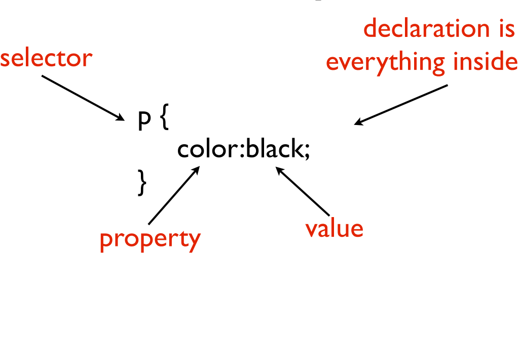
What CSS looks like
Best practice: name with classes (`.heading`)
Don’t fear the internet
Starting from scratch (Part 2)
Naming is hard
-
You can’t use spaces
-
JavaScript uses camelCase
-
I recommend using dashes - CSS uses dashes
(`background-color`, `font-family`, etc).
If you want to look at more complex naming conventions,
check out BEM -
Be consistent! - easier to read and remember what you wrote
Available selectors
-
Name of element
p, div, h1 -
Class name
Prefixed with a period (.)
<div class=‘my-class-name’>This is my class name </div>
.my-class-name -
Element ID
Prefixed with a hash / pound sign (#)
<div id=‘my-id’> This is my id</div>
#my-id
Properties
-
There are lots of them!
-
Two Primary types: Layout and style
(Padding is layout, color is style) -
Style generally inherits, layout doesn’t
-
Sometimes can be combined into one (called "shorthand"):
padding: 10px 20px; = padding-top: 10px; padding-right: 20px; padding-bottom: 10px; padding-left: 20px; -
Layout box properties go clockwise from midnight:
top, right, bottom, left
Values
-
Colors: #fff, #ffffff, rgb(255,255,255), gray, black, red
-
Numbers: 0, 25px, 1.1em, 100%, vw, vh
-
`inherit` is a special property to force inheritence
A cheatsheet!
Remember!
-
Styles are separate from HTML
-
Your CSS should start with a RESET
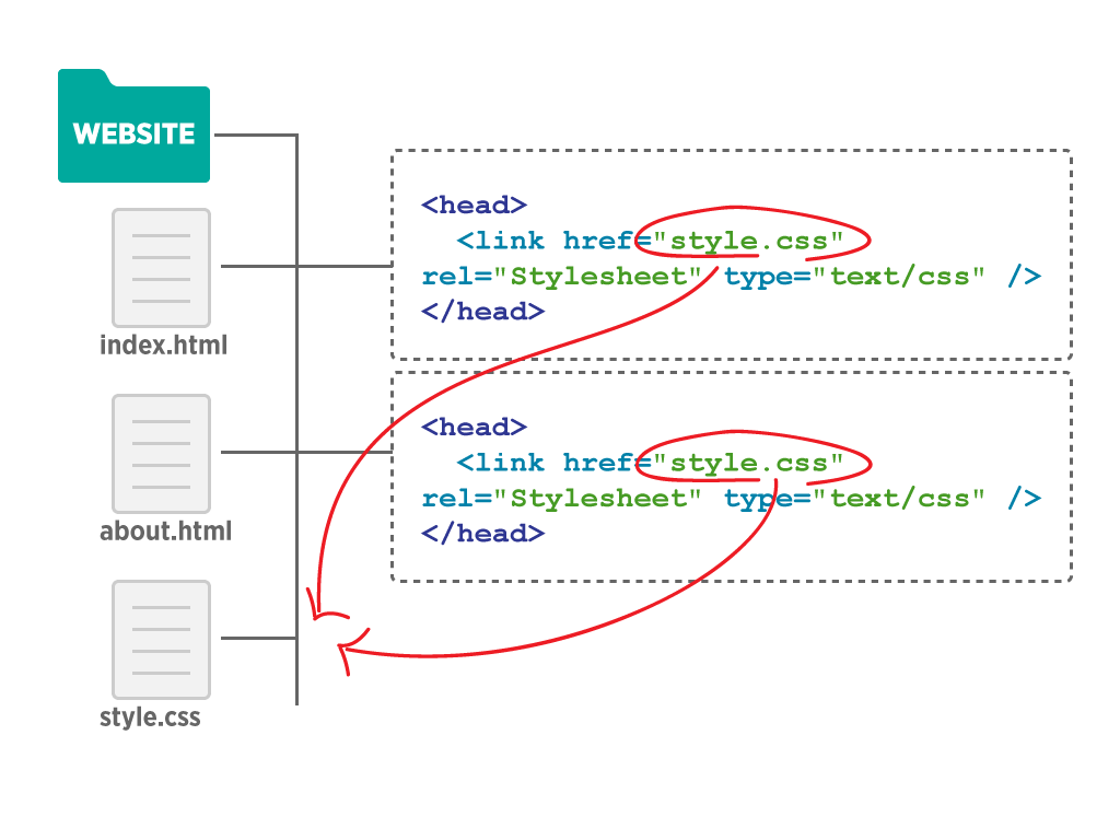
Ways to link up CSS
-
Inline :(
Styles are written as attributes so nothing can be reused and these styles cannot be overridden -
Embedded/Internal :/
Written in one place (ex: bottom) of HTML file. Styles can only be used within that HTML file -
External :)
Written in a separate file and linked. Easiest to maintain
Selectors
-
Apply styles in multiple places
Use a comma
.heading, .description, p { color: red; } -
Apply styles to nested elements
Use a space
.article button { border-radius: 5px; } -
Pseudo-classes / pseudo-elements
a.hover { color: blue; }
article:last-child { border-bottom: 1px solid black; }
article:not(:last-child) { border-bottom: 1px solid black; } -
Apply to elements with a specific attribute
input[type="radio"] { -webkit-appearance: none; }
<header>
  <h1>My Site!</h1>
  <nav><ul>
    <li><a href='#'>Link 1</a></li>
    <li><a href='#'>Link 2</a></li>
  </ul></nav>
</header>

<section>
  <article>
    <h1>Blog Post 1</h1>
    <p>Lorem ipsum dolor sit amet, consectetur adipiscing elit. Sed ac elit at nisl sagittis consequat sed eget tellus. Aliquam gravida, nunc sit amet viverra dictum, nibh justo semper massa</p>
    <p>Lorem ipsum dolor sit amet, consectetur adipiscing elit. Sed ac elit at nisl sagittis consequat sed eget tellus. Aliquam gravida, nunc sit amet viverra dictum, nibh justo semper massa</p>
  </article>
</section>
<footer>
  <a href='#'>Link 1</a> | <a href='#'>Link 2</a>
</footer>
Selector combination
-
Add classes to the header and footer
-
Make both the header and footer have black backgrounds
with white text
Create this in a Codepen (In-class Codepen assignment #4)
Cascade order
-
Inline style (defined directly with a style='....' attribute in the tag)
-
Number of id selectors
-
Number of class selectors
-
Number of tag selectors
-
Order of appearance last to first
-
Style inheritance
DEMO
In depth: A Specificity Battle!
Organizing your CSS
-
Start with a reset
-
Set base element styles (body, p, h1, h2)
-
Set your class styles
Homework
-
Complete Codecademy Unit 5 & 6
-
Start CSS for Dobot shop (Have visual CSS complete by next class. Move on to layout CSS if you want to get ahead and have more time for review)
The box model!
<style>
.box1 {
background-color: teal;
}
.box2 {
background-color: orange;
}
</style>
<div class="box1">I'm a box</div>
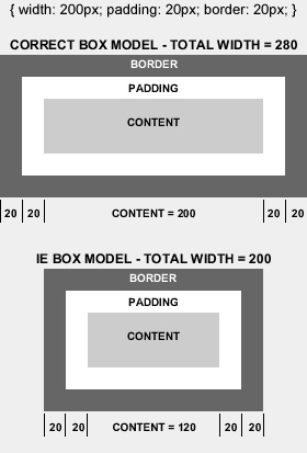
<div class="box2">I'm box 2!</div>Box model exercise
-
Set Box1 to be 100px in width with 24px of padding on all sides, and a red border of 10px.
-
What is the total amount of space it takes up horizontally?
Create this in a Codepen (NOT an In-class assignment)
Layout properties
-
Box model: margin, padding, width, height
-
Top, bottom, left, right
-
Border
-
Position [ static (default), relative, absolute, fixed ]
-
Float [ left, right, none ] (May have to use overflow: auto; or height will collapse. Can also use clears, but this requires an element after)
-
Clear [ left, right, both]
-
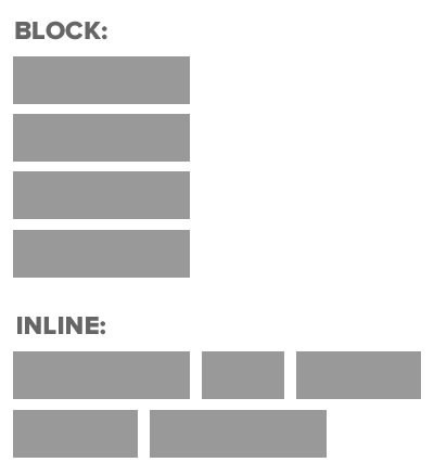
Display [ none, block, inline, inline-block ]
Positioning exercise
Create this in a Codepen (In-class Codepen assignment #6)
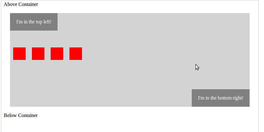
<style>
  .container {
    margin: 20px;
    height: 300px;
    background-color: lightgray;
  }
</style>

<span>Above Container</span>
<div class="container">
  <div class="top-left">I'm in the top left!</div>
  <div class="bottom-right">I'm in the bottom right!</div>
  <ul class="blocks">
    <li class="block"></li>
    <li class="block"></li>
    <li class="block"></li>
    <li class="block"></li>
  </ul>
</div>
<span>Below Container</span>
Positioning exercise
Create this in a Codepen (In-class Codepen assignment #6)
<nav>
  <a href="/">Home</a>
  <a href="/about.html">About</a>
  <a href="/blog.html">Blog</a>
  <a href="/contact.html">Contact</a>
</nav>
body {
  margin-right: auto;
  margin-left: auto;
  width: 960px;
}
Centering content
How can this work within Dobot?
Homework
-
Read Shay Howe’s Opening the Box Model and Positioning Content
-
Finish CSS for Dobot shop
Class 6
-
UX Audit: Pleasure to burn
-
Work on Dobot
-
Intro to UX
-
Intro to Accessibility w/ the other web class
Helpful trick
Put background colors on elements to see what space it takes up.
It may not be what you expect.
.visually-hidden {
  border: 0;
  clip: rect(0 0 0 0);
  height: 1px;
  margin: -1px;
  overflow: hidden;
  padding: 0;
  position: absolute;
  width: 1px;
}
Visually hidden content
What is UX Design?
Wikipedia says: is the process of enhancing customer satisfaction and loyalty by improving the usability, ease of use, and pleasure provided in the interaction between the customer and the product. User experience design encompasses traditional human-computer interaction design, and extends it by addressing all aspects of a product or service as perceived by users. User experience is any aspect of a person's interaction with a given IT system, including the interface, graphics, industrial design, physical interaction, and the manual.
Know your audience
Know your content
Know your medium
You’re designing
for people...
-
With modern browsers
-
With old browsers
-
Who can’t see well
-
Who can’t see at all
-
Who visit your site every day
-
Who are visiting for the first time
-
Who aren’t people, but machines (SEO, access tech)
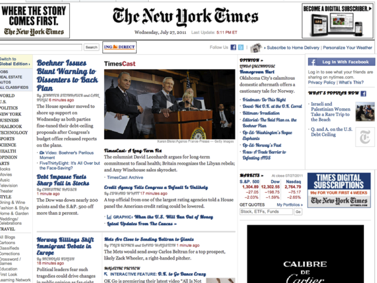
What is this?

Where do you look
to log into a site?
What should clicking
on the logo do?
User expectations
Good conventions
-
Underline signifies a link
-
hi@something.com
-
massart.edu
-
Extra links - like “Privacy Policy”, “Terms of Use” are where?
Consistency & affordances
Hierarchy
Call to action
Perceived performance
Things to think about
- Site navigation - main, social, etc.
- What do users want to see?
- What do users need to see?
- Does the site hierarchy make sense?
- How many clicks deep?
- Think about normal user flow (user stories)
Case study: Restaurants
- They think: I want to show people how amazing the experience here is
- Actual use case
Case study: Universities
User stories & personas
- Who is visiting your site?
- What are their goals?
- How can you help them?
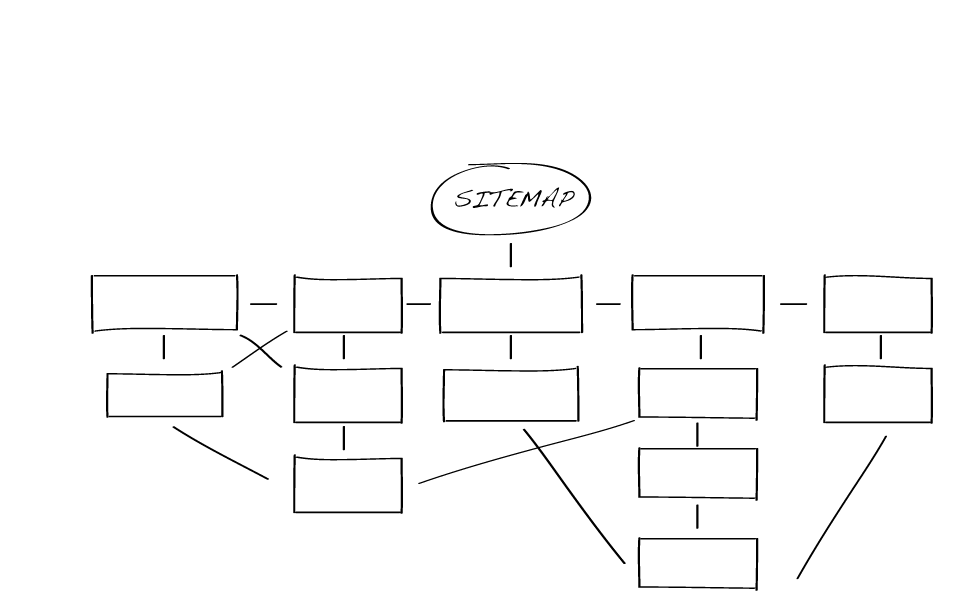
Wireframes & sitemaps
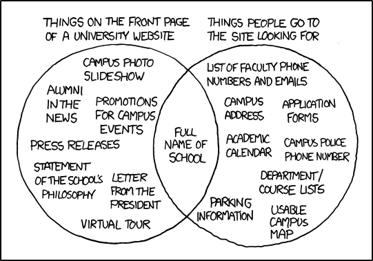
Why make sitemaps?
- Help you define the content on your site
- Force you to break down all the pages and sections of your site
- Help you work out how content will be organized
- Help you create a better hierarchy
Wireframing
Great way to look at the big picture. Start with lower-fidelity mockups.
- Sketch out what the user experience will be like
- Illustrate page layout and functionality
- Demonstrate how a user will navigate the site
- Identify static and dynamically generated content areas
Some tools:
Pen & paper, Balsamiq, Mockingbird, Omnigraffle, And More!
Accessibility
with Andrew Ringler and Kyle Keane
http://massart.andrewringler.com/
web1-f16/materials/slides/6.pdf
Homework
-
Complete Dobot shop (Test for accessibility)
-
Wireframe and sitemap for final project
-
Start collecting content for final project (if portfolio, gather all images of work)
-
Read Shay Howe’s Responsive Web Design
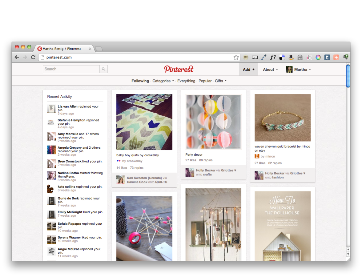
Portfolio inspiration
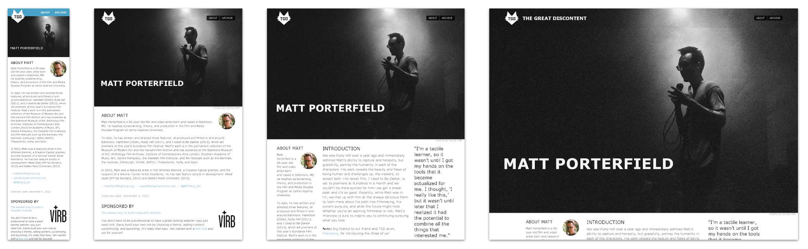
What is responsive design?
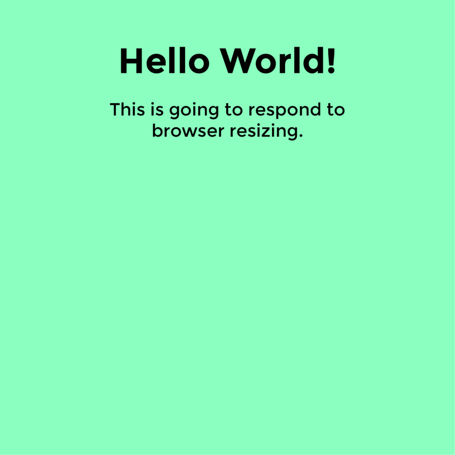
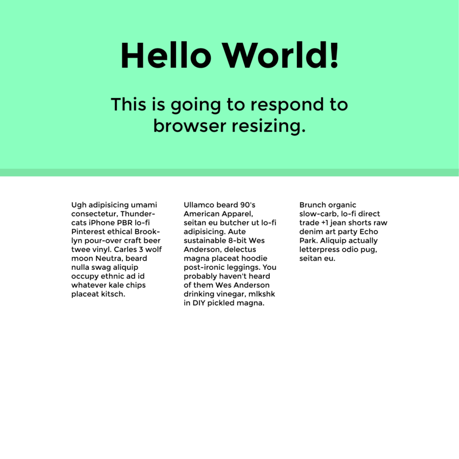
Wikipedia says: Responsive web design (RWD) is a web design approach aimed at crafting sites to provide an optimal viewing experience—easy reading and navigation with a minimum of resizing, panning, and scrolling—across a wide range of devices (from mobile phones to desktop computer monitors)
Example: The Great Discontent
What are other options?
- Fixed: set width, styles do not change depending on resize, no media queries
- Fluid: built using percentages, no media queries
- Adaptive: media queries to target specific devices (mobile, tablet, desktop)
- Native app: can work without an internet connection, higher quailty UX
- Separate mobile site: created only for small screens, lighter and faster
Why do RWD?
Write the code once and have it functional
and legible across many devices.
People are using a wide range of devices to complete their tasks now. Reading on mobile phones, shopping on tablets, etc.
More responsive sites
- What do they think about when implementing?
- Play with height & width of browser to see what is happening
- Did it make sense for the site to be built responsively?
Boston Globe
"The first major, high-traffic, content-heavy website to adopt a responsive design" - Beaconfire Wire
"Raise[d] public awareness of this flexible, standards-based, multi-platform and user-focused web design approach"
- Jeffrey Zeldman
Built by Buffalo
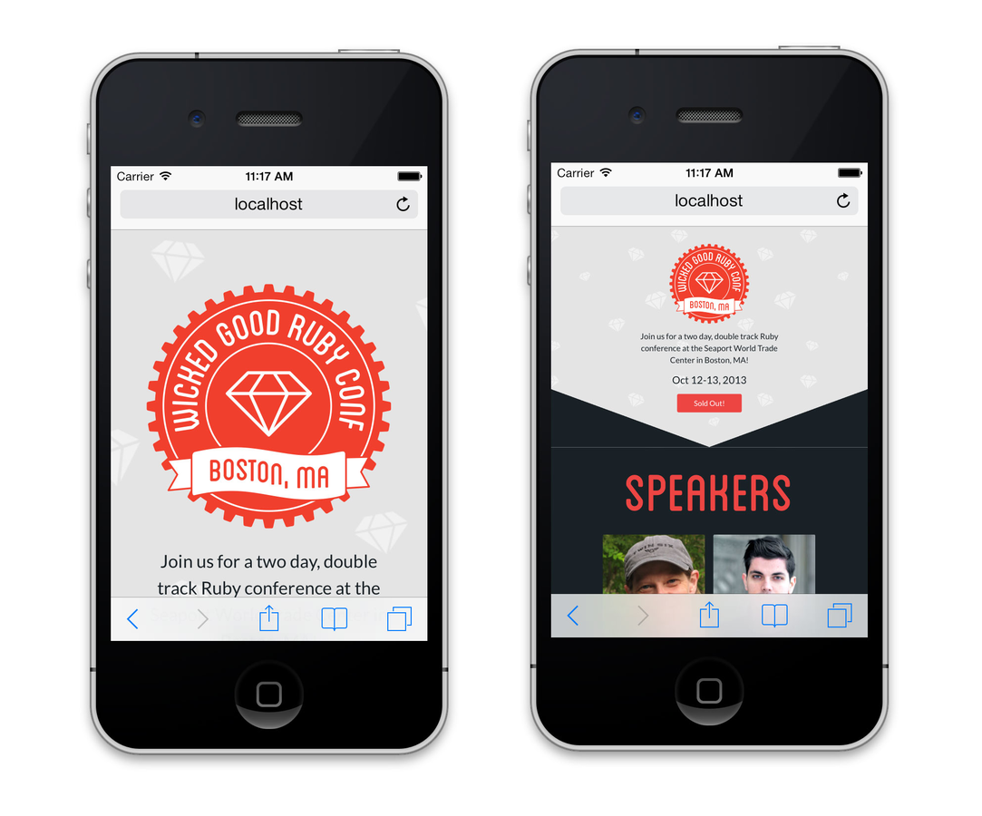
RWD Exercise #1
In-class CodePen assignment:
The font is Montserrat and the teal is #8affbf. Write CSS that changes the font sizes at different media queries.
How I would do it
- Start mobile first
- Move on to bigger widths slowly
Why mobile first?
Take a moment
to refactor!
Homework
-
Responsive Dobot shop (due class after next)
-
Read Ethan Marcotte’s Responsive Web Design
-
Work on design of final project (due class after next)
Class 8
-
Check in on responsive Dobot and final project designs
-
Designing for Mobile
Test responsive Dobot
-
Add at least one media query to Responsive Dobot
-
Test on a device or with a simulator
-
Did anything not appear how you wanted it to?
Don’t forget this meta tag!
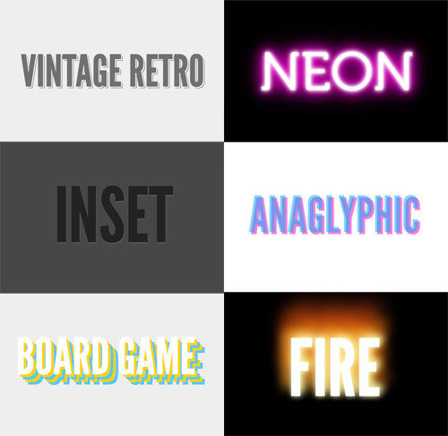
Design for responsive
-
Why we are seeing more flat design
-
Why SVG's are awesome
-
Don't fight the web, work with it!
-
Doing as much of the design with CSS makes it more editable and if images are needed, they must be flexible
-
No hover states for touch screens, so don't hide content that can only be viewed by hover
Think about the experience
-
Touch target sizes (Recommended > 44px by 44px)
Retina
-
Makes text look great, but what happens to images?
-
Need to double height and width for crisp images
-
What does this mean for performance?
Smarter design
Don’t make users to more work than they have to
(Smart keyboards, default values, autocomplete, etc.)

Things to keep in mind
-
Don’t make users pinch to zoom, but allow them to zoom if they need to magnify something
-
How should thing layout at different browser widths? Stacking combined with resizing.
-
Follow good conventions
Mobile navigation
Display all
-
Menu items all fit in a small space at the top of the screen
-
Pros - very scannable, no digging
-
Cons - multiple rows?
Hamburger menu
-
Tapping the hamburger icon shows a list of main menu items
-
Pros - can fit larger menu, scrollable
-
Cons - lower discoverability, less efficient
Responsive inspiration
Homework
-
Responsive Dobot shop due
-
Finish visual design of final project
Class 9
-
Check final project designs and any questions on Dobot
-
Introduction to web typography
Now we have @fontface!
For more on how to use @fontface:
https://css-tricks.com/snippets/css/using-font-face/
@font-face {
  font-family: 'MyWebFont';
  src:  url('myfont.woff2') format('woff2'),
        url('myfont.woff') format('woff');
}
Pros
-
We have more fonts to use!
-
Dynamic, selectable, printable, and easily edited text
-
Easy to implement
Cons
-
Easy to overuse
-
Licensing - if it’s not open sourced and
you don’t have a license - don’t use it -
Can have FOUT (flash of unstyled text)
Where to find fonts
-
Hosted platforms
-
Buying a License
-
Free Fonts
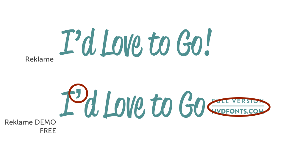
Free problems
-
Quality not guarantee
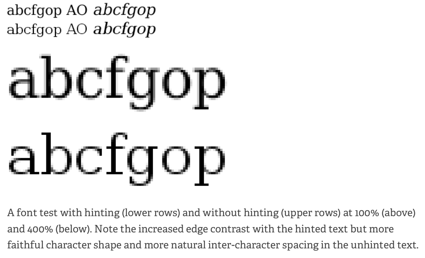
-
Unknown rendering (hinting)
-
Poorly drawn
-
Poorly kerned
-
Incomplete set

Licensing
-
Make sure you own the license
-
Read the End User License Agreement (EULA)
-
Desktop licenses are not the same as web
-
Avoid liability issues
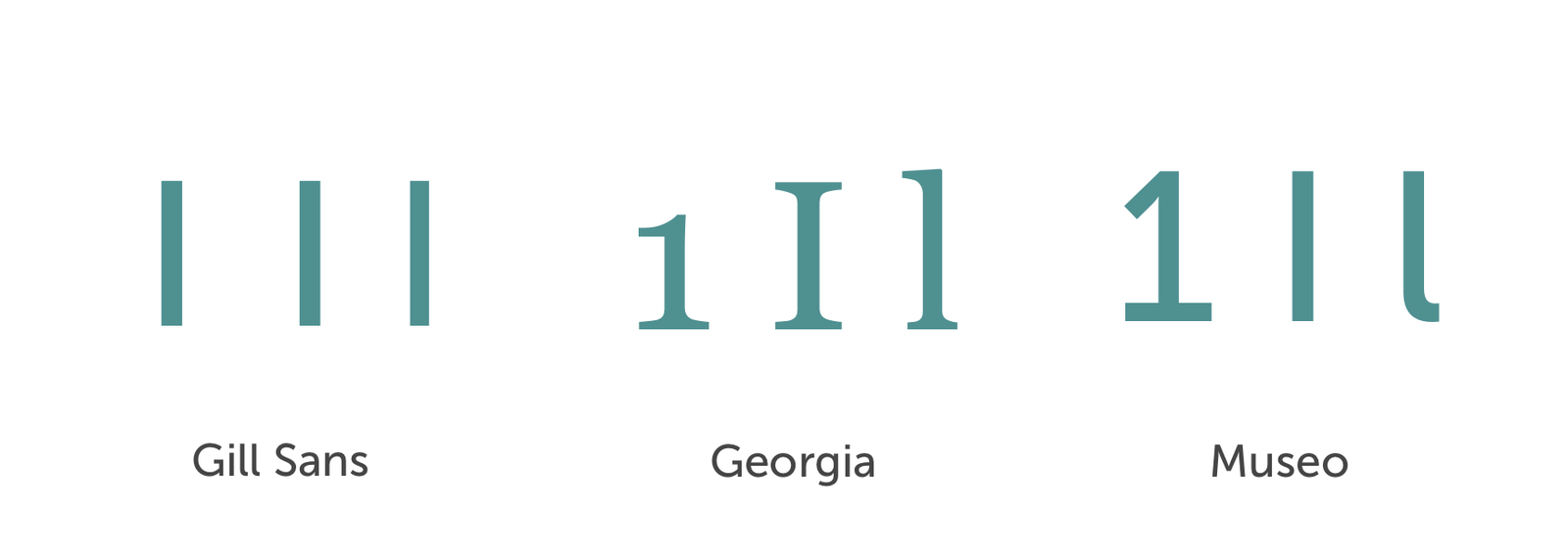
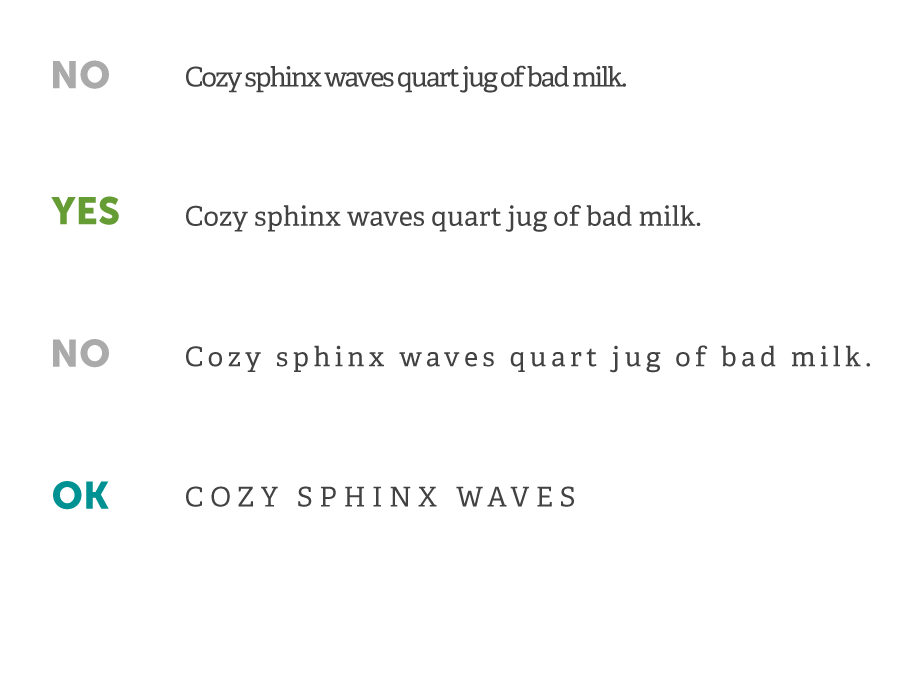
Check your 1, I, and l
Does the number one, capital “i”, and lowercase “L”
need to be distinct?
Readability
At small sizes fonts with larger variation in weights
will be harder to read.
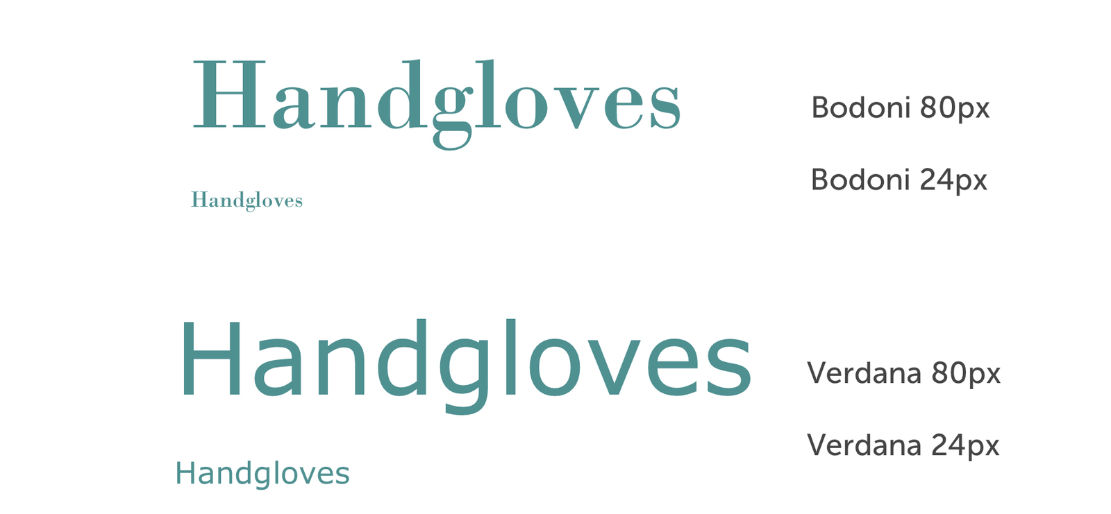
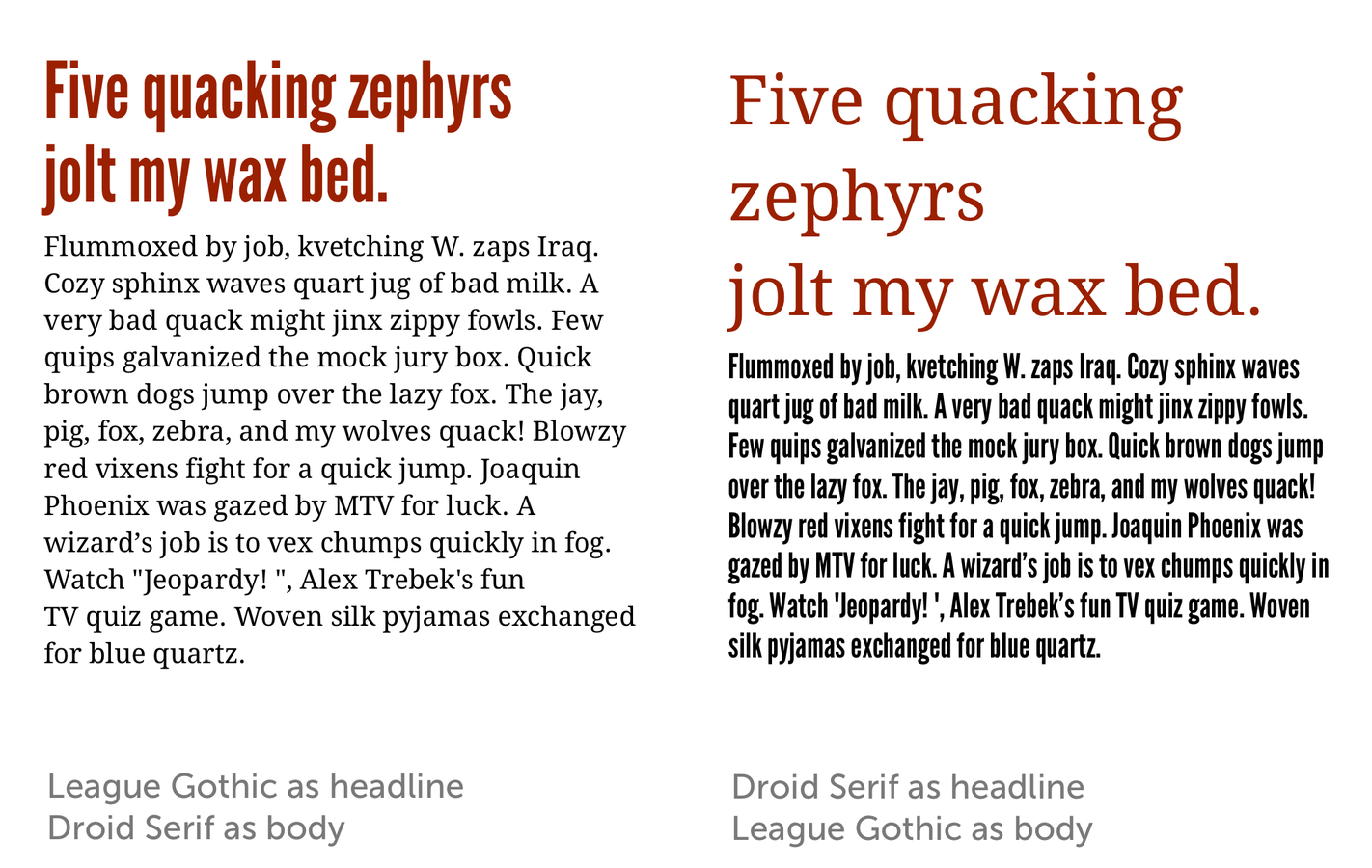
Headline vs Text
Appropriate
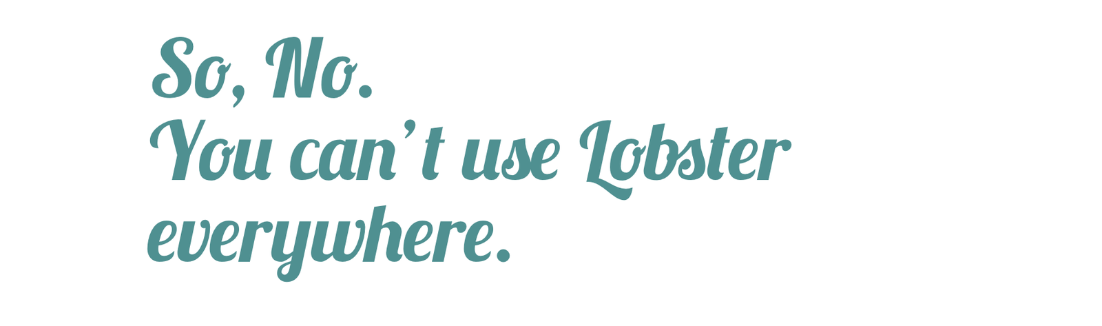
Always honor your content and audience first. Choose fonts that are relevant to your subject before choosing what’s new and trendy.
Type rules
- Size: 16px is the new minimum body text size
-
Space:
- Keep line length readable, not too long or short
- Adjust the line-height to give more space in between rows
-
How many characters per line?
-
According to Robert Bringhurst 45 to 75.
-
Recent web studies show that 66 might be the “web ideal”
-
Line height
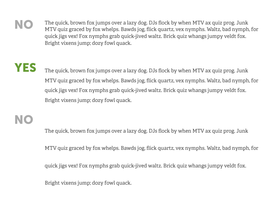
Letter spacing
@font-face {
  font-family: 'quatro';
  src: url('/fonts/quatroslab_regular-webfont.eot');
  src: url('/fonts/quatroslab_regular-webfont.eot?#iefix') format('embedded-opentype'),
       url('/fonts/quatroslab_regular-webfont.woff2') format('woff2'),
       url('/fonts/quatroslab_regular-webfont.woff') format('woff'),
       url('/fonts/quatroslab_regular-webfont.ttf') format('truetype'),
       url('/fonts/quatroslab_regular-webfont.svg#quatro_slabregular') format('svg');
  font-weight: normal;
  font-style: normal;
}

@font-face {
  font-family: 'etica-semibold';
  src: url('/fonts/lft_etica_semibold-webfont.eot');
  src: url('/fonts/lft_etica_semibold-webfont.eot?#iefix') format('embedded-opentype'),
       url('/fonts/lft_etica_semibold-webfont.woff2') format('woff2'),
       url('/fonts/lft_etica_semibold-webfont.woff') format('woff'),
       url('/fonts/lft_etica_semibold-webfont.ttf') format('truetype'),
       url('/fonts/lft_etica_semibold-webfont.svg#lft_etica_sbsemibold') format('svg');
  font-weight: normal;
  font-style: normal;
}

@font-face {
  font-family: 'etica';
  src: url('/fonts/lft_etica_reg-webfont.eot');
  src: url('/fonts/lft_etica_reg-webfont.eot?#iefix') format('embedded-opentype'),
       url('/fonts/lft_etica_reg-webfont.woff2') format('woff2'),
       url('/fonts/lft_etica_reg-webfont.woff') format('woff'),
       url('/fonts/lft_etica_reg-webfont.ttf') format('truetype'),
       url('/fonts/lft_etica_reg-webfont.svg#lft_eticaregular') format('svg');
  font-weight: normal;
  font-style: normal;
}
Custom fonts exercise
In-class CodePen assignment:
Add your favorite Google Fonts font
to an h1 that thickens font-weight upon hover
Web type resources
-
lettering.js
-
typebutter.com
-
fittextjs.com
-
http://kerningjs.com/
-
http://www.kernjs.com/
-
ifontyou.com
-
typedia.com
Linking to pages
Same page link
Same site link (relative)
Different site link (absolute)
https://css-tricks.com/snippets/html/open-link-in-a-new-window/
target="_blank"
Homework
-
Final project: Write all HTML (must validate!), have all pages connected, all images uploaded, begin CSS
Class 10
Final project working session
Class 11
-
Intro jQuery
-
Work on final projects
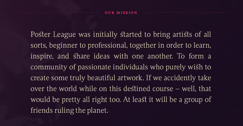
Poster League exercise
In-class CodePen assignment
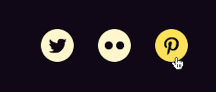
Social icons exercise
In-class CodePen assignment from Poster League’s footer
Awesome if you can use inline SVG’s, but you can
also use images that are in the SVG format.
Inline SVG’s w/ Icomoon
- Select your icon
- Generate SVG
- Get code
-
Copy symbol definition(s) into your <defs> (should be first thing within body tag)
- Copy HTML (SVG<use>) where you want your icon to show up
<body>
  <svg display="none" width="0" height="0" version="1.1" xmlns="http://www.w3.org/2000/svg" xmlns:xlink="http://www.w3.org/1999/xlink">
    <defs>
      Add your symbols here
    </defs>
  </svg>
  ...
</body>
<svg class="icon icon-twitter"><use xlink:href="#icon-twitter"></use></svg>Homework
Final project!
Class 12
Final project working session
Last class :*(
-
Present your projects!
-
<3
Stay in touch!
-
Email: acacheung@gmail.com
-
Twitter: @acacheung