Responsive web design
Andrei ANTAL
QUALITANCE
Tap That JOB 2017


CONTENTS
- Intro
- A bit of context
- Responsive web design features (hands on)
- Assignment
ABOUT ME

ANDREI ANTAL
Frontend Engineer @ QUALITANCE
- Web technologies enthusiast
- Community activist
- Occasional speaker
antal.a.andrei@gmail.com
@andrei_antal
Angular Bucharest

Next meetup - April 24th 2017 - TechHub
A bit of context


A bit of context

Responsive web design

Responsive web design
Definition
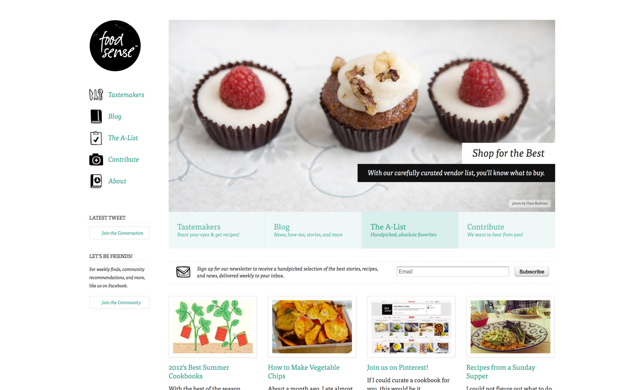
Responsive web design means designing your website so that it responds to your users environment based on screensize, platform and orientation.
Responsive web design
Definition
It looks diferent and things jiggle around, scale, re-order, appear, and disappear so it works well in your browser size or whatever device you’re using to view it...
Responsive web design
Responsive web design

Responsive web design

Responsive web design

Responsive web design

Responsive web design

Responsive web design

Responsive web design
Mobile vs. Adaptive vs. Responsive
Responsive web design
New ways of thinking
- Works on everything - Design for many sizes at once
- Clean design - reduce clutter, essential content only
- Design from the content out - Let content decide breakpoints
- Less Graphic files - CSS gradients, font icons
Design patterns
Layouts

Mostly Fluid
Design patterns
Layouts
Column Drop

Design patterns
Layouts
Layout Shifter

Design patterns
Layouts
Off Canvas

Design patterns
Navigation
Toggle Navigation

Design patterns
Navigation
<select> Navigation

Design patterns
Navigation
Footer Navigation

Design patterns
Navigation
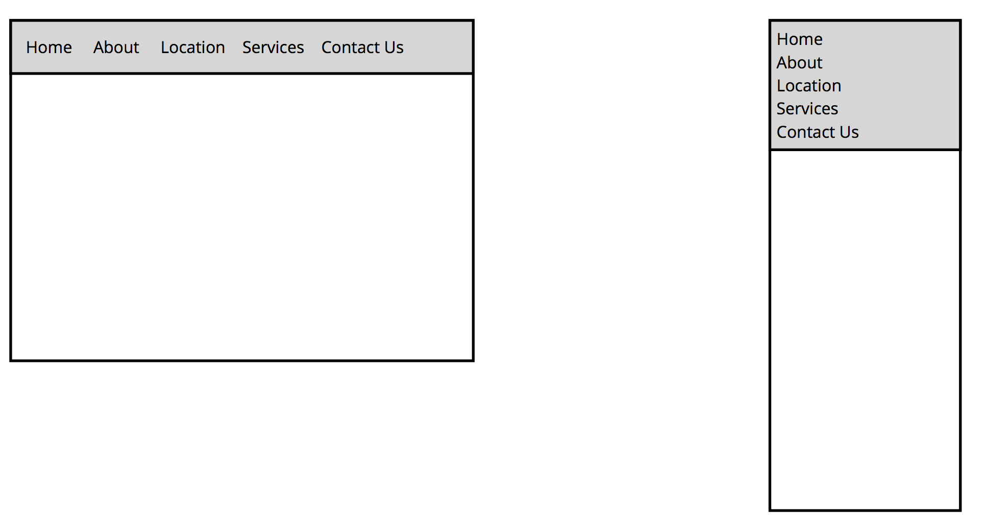
Stacked Top Links Navigation
Design patterns
Navigation
Left Nav Flyout - aka Hamburger menu

Design patterns
Navigation
Priority+ Navigation

Design patterns
Navigation
Priority+ Navigation

Design patterns
Source order shift

Design patterns
Source order shift

RWD Components
-
Flexible, grid based layouts
- % widths and em units, not fixed pixels
-
Flexible images and media
- width/height not fixed
-
CSS3 Media Queries
- @media rule
Flexible layouts
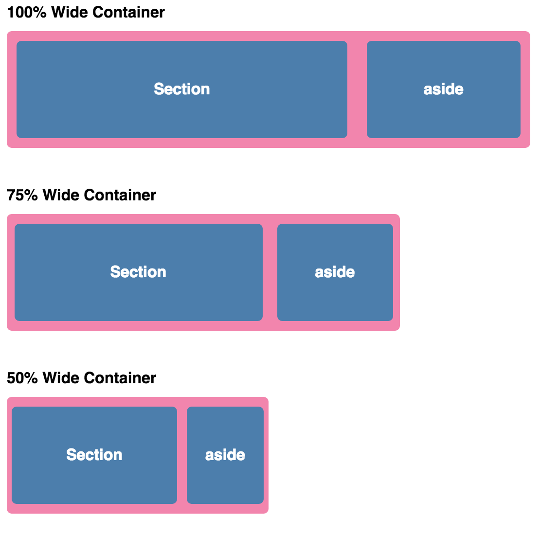
Building the layout of a website with a flexible grid, capable of dynamically resizing to any width


Flexible layouts
Relative Viewport Lengths
- vw - Viewports width
- vh - Viewports height
- vmin - Minimum of the viewport’s height and width
- vmax - Maximum of the viewport’s height and width
.container {
    width: 50vw;
    height: 100vh;
}
Flexible layouts
Flexible grids
// HTML

<div class="container">
  <section>...</section>
  <aside>...</aside>
</div>
// CSS

.container {
  width: 538px;
}
section,
aside {
  margin: 10px;
}
section {
  float: left;
  width: 340px;
}
aside {
  float: right;
  width: 158px;
}

Flexible layouts
Flexible grids
target ÷ context = result
|
Flexible layouts
Flexible grids
section,
aside {
  margin: 1.858736059%; /*  10px ÷ 538px = .018587361 */
}
section {
  float: left;
  width: 63.197026%;    /* 340px ÷ 538px = .63197026 */
}
aside {
  float: right;
  width: 29.3680297%;  /* 158px ÷ 538px = .293680297 */
}
Flexible layouts
Flexible grids
Flexible layouts
DEMO TIME
Flexible layouts
DOWNLOAD SOURCES:
goo.gl/mrbKGN
Flexible layouts
Choose your text editor:


Visual Studio Code
Atom
Sublime
Flexible layouts
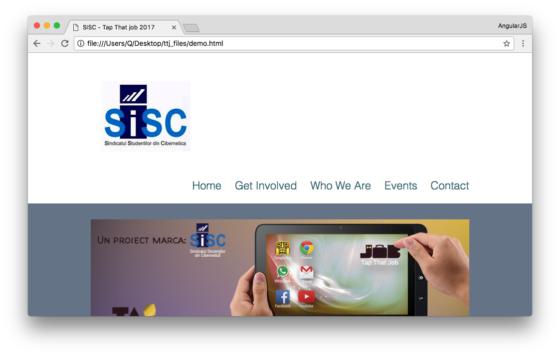
Our application:

Flexible layouts
Flexible typeset
- Font of 100% (generally) corresponds to 16px
.nav li a:link {
    color: #2b737a;
    text-decoration:none;
    font-size: 22px;
    font-weight:100;
}
target ÷ context = result
22px ÷ 16px = 1.375em
|
Flexible layouts
Flexible typeset
.nav li a:link {
    color: #2b737a;
    text-decoration:none;
    font-size: 1.375em;
        /* 22px / 16px */
    font-weight:100;
}
h2 24px ÷ 16px = 1.5em h3 20px ÷ 16px = 1.25em p 14px ÷ 16px = .875em
Flexible layouts
Flexible grid

Flexible layouts
Flexible grid
target ÷ context = result

___px ÷ 1280px = __%
Flexible layouts
Flexible grid
.site {
    width: 100%;
    /* 1280px / 1280px */
}
Flexible layouts
Flexible grid

Flexible layouts
Flexible grid
#heading {
	background-color: #fff;
	width: 960px;
	margin: 1.5em auto;
	text-align:right;

}
#heading {
background-color: #fff;
width: 75%;
/* 960px / 1280px */
margin: 1.5em auto;
text-align:right;
}Flexible layouts
Flexible grid
#promowrapper {
    margin: 0 auto;
    width: 960px;
}
#promowrapper {
margin: 0 auto;
width: 75%;
}Flexible layouts
Flexible grid
#content {
    background-color: #fff;
    width: 960px;
    margin: auto;
}

.contentbox {
    width: 300px;
    float:left;
    padding: 2em 30px 2em 0;
}
#content {
background-color: #fff;
width: 75%;
margin: auto;
}
.contentbox {
width: 31.25%;
float:left;
padding: 2em 30px 2em 0;
}Flexible layouts
Flexible grid

Flexible grids
.contentbox {
    width: 31.25%;
    float:left;
    padding: 2em 3.125% 2em 0;
        /* 30px / 1280px */
}
Flexible layouts
Flexible grids

Flexible layouts
Flexible grids
#footercontent {
    width: 75%;
    margin: auto;
    color: #fff;
}
Flexible layouts
Flexible images

Flexible layouts
Flexible images
#promo img {
    margin: 2em 0;
    max-width: 100%;
}
Flexible layouts
Media queries
Media queries provide the ability to specify different styles for individual browser and device circumstances -
apply uniquely targeted styles
// HTML

<!-- Separate CSS File -->
<link href="styles.css" rel="stylesheet" media="all and (max-width: 1024px)">
// CSS

/* @media Rule */
@media all and (max-width: 1024px) {...}

/* @import Rule */
@import url(styles.css) all and (max-width: 1024px) {...}
Media queries
@media screen and ( min-width: 500px ) and ( max-width: 800px ) {

 /* CSS declarations */

}
This is for screen only (desktops, smartphones, not print)
media_type: all | aural | braille | handheld | print | projection | screen | tty | tv | embossed | speech
Media queries
@media screen and ( min-width: 500px ) and ( max-width: 800px ) {

 /* CSS declarations */

}
The width of the window must be AT LEAST 500px
The width of the window must ALSO be NO MORE THAN 800px
media_feature: width | min-width | max-width | height | min-height | max-height | aspect-ratio | min-aspect-ratio | max-aspect-ratio | color | min-color | max-color | color-index | min-color-index | max-color-index | monochrome | min-monochrome | max-monochrome | resolution | min-resolution | max-resolution | scan | grid
Media queries
@media screen and ( min-width: 500px ) and ( max-width: 800px ) {

    img {
        border: 5px solid #!f;
    }

}
Images will have a white border when the window is from 500px to 800px wide
Media queries
@media all and (max-width: 420px) {

    section, aside {
        float: none;
        width: auto;
    }
}

Media queries
DEMO TIME
Media queries

Media queries
@media screen and (max-width: 1100px) {
    #navbox {
        clear: left;
    }
}
Media queries
@media screen and (max-width: 1100px) {
    #navbox {
        clear: left;
        padding-top: 0;
    }
}
Media queries
@media screen and (max-width: 1100px) {
    #navbox {
        clear: left;
        padding-top: 0;
        text-align: center;
    }
}

Media queries

@media screen and (max-width: 500px) {
    .logo {
    }
    .nav li {
    }
    .contentbox {
    }
}
Media queries
@media screen and (max-width: 500px) {
    .nav li {
        display: block;
    }
}
Media queries
@media screen and (max-width: 500px) {
    .nav li {
        display: block;
        margin-left: 0;
        padding-bottom: 5px;
    }
}
Media queries
@media screen and (max-width: 500px) {

    ...

    .logo {
        float: none;
        text-align: center;
    }
}
Media queries
@media screen and (max-width: 500px) {

    ...

    .contentbox {
        width: 100%;
	float: none;
	padding: 1.5em 0 0 0;
    }
}
RWD approaches
Progressive enhancement
Graceful degradation
ASSIGNMENT
Get the slides:
https://slides.com/andreiantal/ttj_1_responsive/
Link 1
Link 2
Link 3
Link 4
Banner
Article 1
Article 2
Article 3
Article 4
Footer
max 1024px
1. Desktop ( > 900px)
12px
12px
12px
16px
16px
16px
8px
8px
Banner
Article 1
Article 2
Footer
2. Tablet ( between 900px and 500px )
16px
16px
16px
Article 3
Article 4
Link 1
Link 2
Link 3
Link 4
Banner
Article 1
Footer
3. Phone (bellow 500px)
Link 1
Article 2
Article 3
Article 4
Link 2
Link 3
Link 4
NOTE: The assignment is not mandatory for TTJ completion. It is just an opportunity for you to practice what you've learned and get feedback on your work.
Send assignments (and any other questions) to:
andrei.antal@qualitance.com
SUBJECT: [TTJ] Assignment (Your name)
DEADLINE: Friday, 7 april 2017