Responsive Images

WHat Are We Talking About?
Responsive design puts a lot of demand on images
Mobile, Tablet, Desktop
Portrait, Landscape
Low, Med, High DPI displays
We want to deliver the fastest, best-looking
user experience
Retina means Twice the pixels
Original iPad is 768x1024
Retina iPad is 2024x1536

The Browser Lies
On Apple hardware, the browser tells itself that
the resolution is 1/2 actual.
On Android, things get more complicated...
DEVICE PIXEL RATIO
The ratio between actual pixels
and
what the browser thinks it has.
getting started: EASY FIX
<img src="http://example.com/image1.jpg"
width="250" height="250" />
-
Create a 500x500 px image
-
Heavy JPEG compression looks ok
-
Can match the bytesize of a 250px image
Demo
We can do better
- Improve image quality
- Load only the best images for the platform
CHALLENGES
- Deciding which image to load
- Performance! Speed of First Load
- Race conditions with JS and images
- Caching and CDNs
CSS Media Queries
Write 'em by hand or use SASS
Bourbon has a nice mixin for this.
@media only screen and (-webkit-min-device-pixel-ratio: 1.3), only screen and (min--moz-device-pixel-ratio: 1.3), only screen and (-o-min-device-pixel-ratio: 1.3 / 1), only screen and (min-resolution: 1.3dppx), only screen and (min-resolution: 125dpi) {#myElement {background-image: url('/images/highDpiImage.png');}}
PictureFill
A popular JS-based approach
 <div data-picture data-alt="Kittens!">
    <div data-src="sm.jpg"></div>
    <div data-src="med.jpg" data-media="(min-width: 400px)"></div>
    <div data-src="lg.jpg" data-media="(min-width: 800px)"></div>
    <div data-src="xl.jpg" data-media="(min-width: 1000px)"></div>
    <!-- Fallback content for non-JS browsers. -->
    <noscript>
        <img src="external/imgs/sm.jpg" alt="Kittens!">
    </noscript>
</div>-
data-media can be any media query selector
- works with min-device-pixel-ratio
- IE polyfill
Fixing HTML
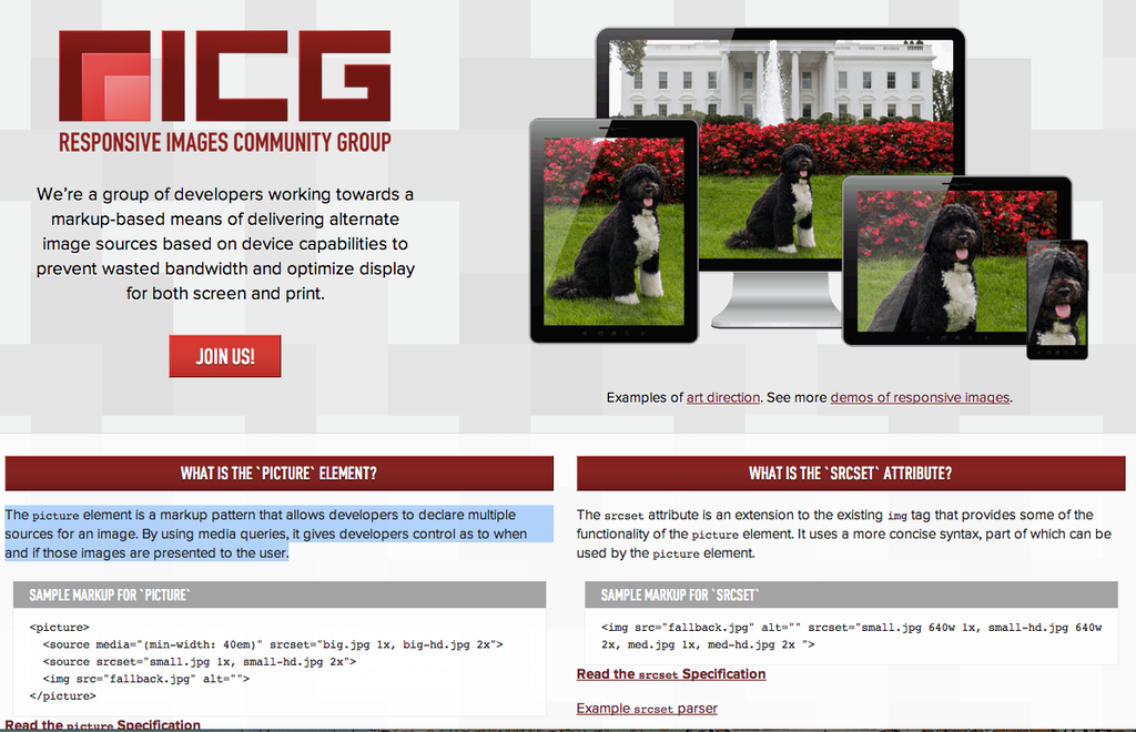
Responsive Images Community Group

<PICTURE>
Verbose syntax, granular control
Uses CSS Media Queries style
 <picture>
  <source media="(min-width: 40em)" srcset="big.jpg 1x, big-hd.jpg 2x">
  <source srcset="small.jpg 1x, small-hd.jpg 2x">
  <img src="fallback.jpg" alt="">
</picture>
<IMG SRCSET>
Concise syntax, less code
<img src="fallback.jpg" alt=""srcset="small.jpg 640w 1x, small-hd.jpg 640w 2x,med.jpg 1x, med-hd.jpg 2x"/>
Apple Runs With It
-webkit-image-set()
Only for CSS background-image
#test { background-image: url(assets/regular.png); background-image: -webkit-image-set(url(assets/test.png) 1x,url(assets/test-hires.png) 2x);width:200px; height:75px; }
Better Images:
SERVER-SIDE PROCESSING
Sencha.io Src service
<img src="http://src.sencha.io/320/http://sencha.com/files/u.jpg" />
WEBP
- A new lossless image format
-
Detectable with Modernizr
-
35% smaller than PNG
SVG
-
Text-based vector format
-
No IE8 support
-
Lots of tooling
- Looks great at all resolutions

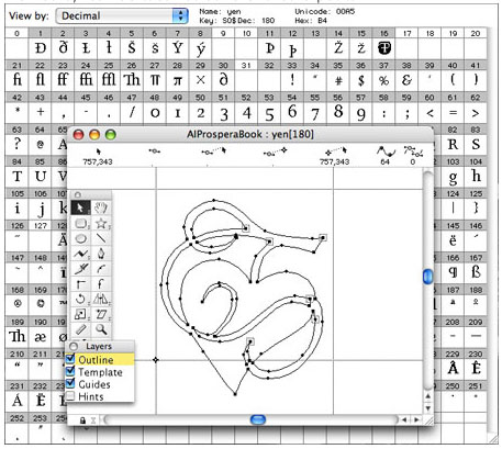
WebFont
-
Tooling can be a hassle
-
Positioning can be tricky
-
Lots of pre-made ones
- Sometimes widely cached

