Possible Magazine Ad Designs
Research
To get an idea as to how other artists advertise there music successfully, I think its best to research into other Ad campaigns to get inspiration.
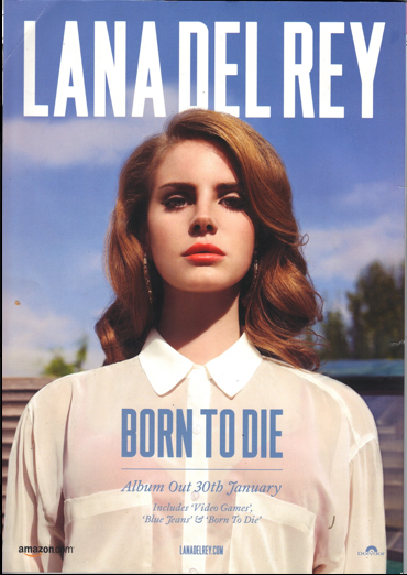
This magazine advert for Lana Del Reys album Bon to die. It features the cover of the album, the singers face the centre to frame, selling the singers image. Her name in the biggest font but in the background, and then the title of the album in smaller print but in the foreground; both selling what the album is about. Under title is a line, smaller print is bellow featuring information about the music from the date of release to were you can buy it.
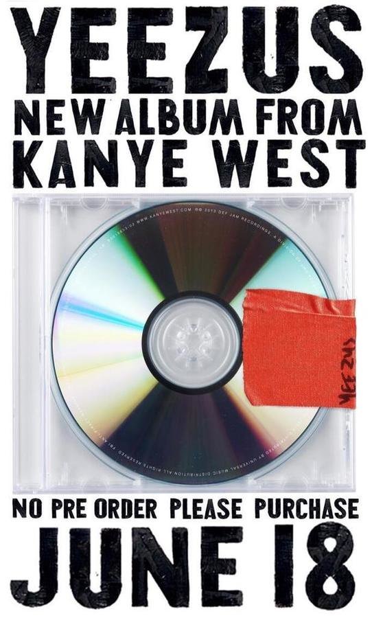
This magazine advert for Kanye West album Yeezus. It features the cover of the album, a blank CD that is enclosed in a naked case. There's no identification as to who the artists is and what they look like, maybe they want to set an image of being laid back and easy or maybe its a reflection of the music itself. Much like the ad before the title and the information are all in capitals and a bold font, catching the eye of the target audience.
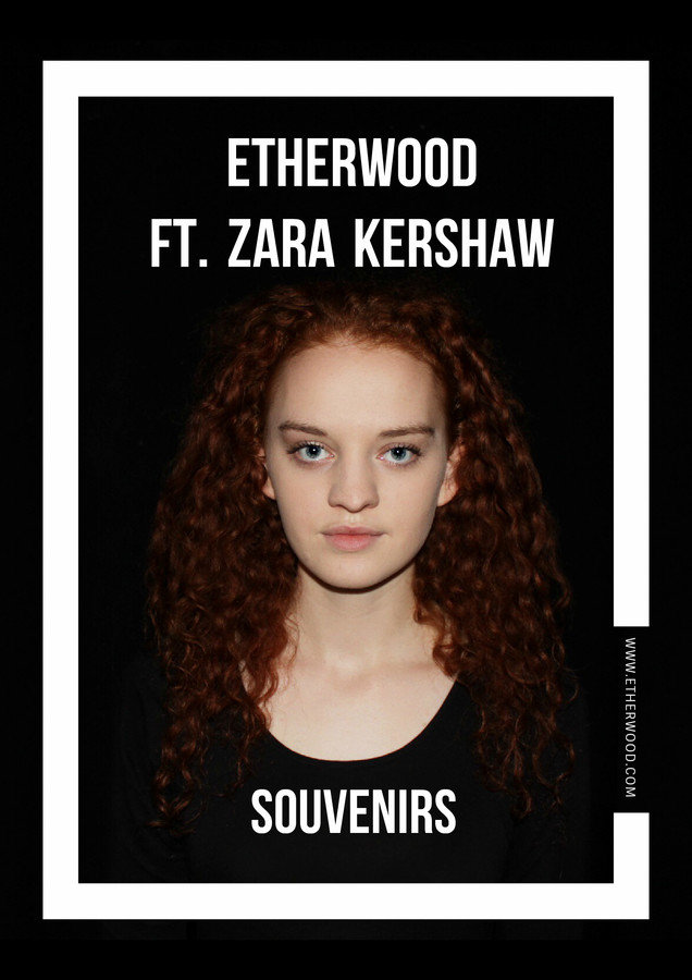
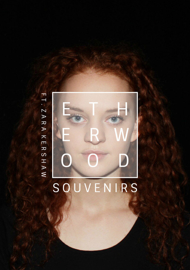
Our chosen AD
Here we have created two different ADs that may be suitable for a magazine. Both are similar but have different characteristics. We were inspired by research and choose to go with what you may usually associate with a music magazine advert. The bold writing and image was the main focus for both. I made all of them using fotor.com
I think that my favourite advert overall is the first one. I think this because it has a clear representation of the music artists clearly states the name of the artists and song. The rectangle frames the face making it centre of attention, the white colour scheme helps to create a great contrast between the black background.