Magazine Advert Process
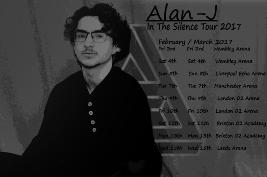
Idea One
Reasons why I did not think it was effective:
- The text size of the album and the artist's name were not big enough to capture the audience's attention
- Even though the image of the artist was the only subject in colours, I felt it was still not clear enough that the photograph was of Alan-J.
- The black and white filter were supposed to give a taste of vintage and therefore create a relation with Alternative Rock genre but it was not obvious.
- It did not look like a Magazine Advert
Final Idea
I decided to make the name of the album and the artist bigger adding a line underneath the artist's name so it would stand out more. I decided that this layout would capture better the attention of the audience for all the details from the artist's name.
I added my artist's logo in transparent, over some of the letters and his image because it is his mark, what everyone's knows him for and recognise which is a very necessary detail.
As soon as I finished this advert I knew this was going to be the final one as I was very happy about it and all the alternative rock genre references were still very clear.
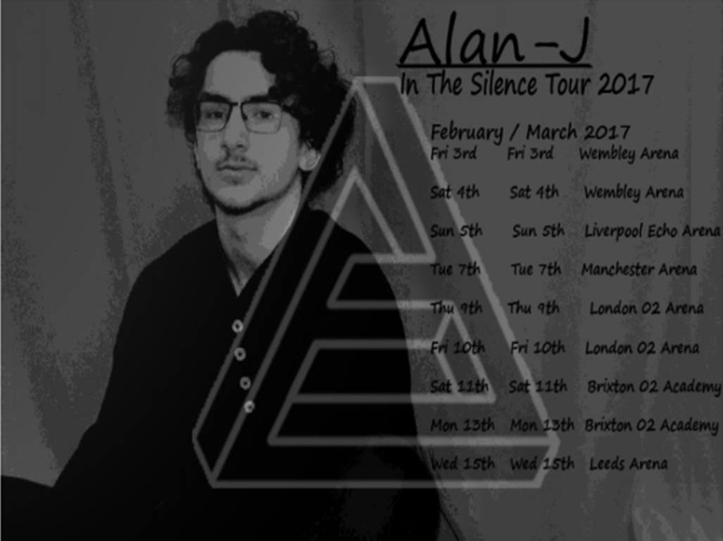
Conclusion
I am very happy with the turn out of my magazine advert as I believe that I have covered all the necessary details to make it look as real as possible.