HOW DOES YOUR PRODUCT USE OR CHALLENGE CONVENTIONS AND HOW DOES IT REPRESENT SOCIAL GROUPS AND ISSUES?
CHALLENGING CONVENTIONS:
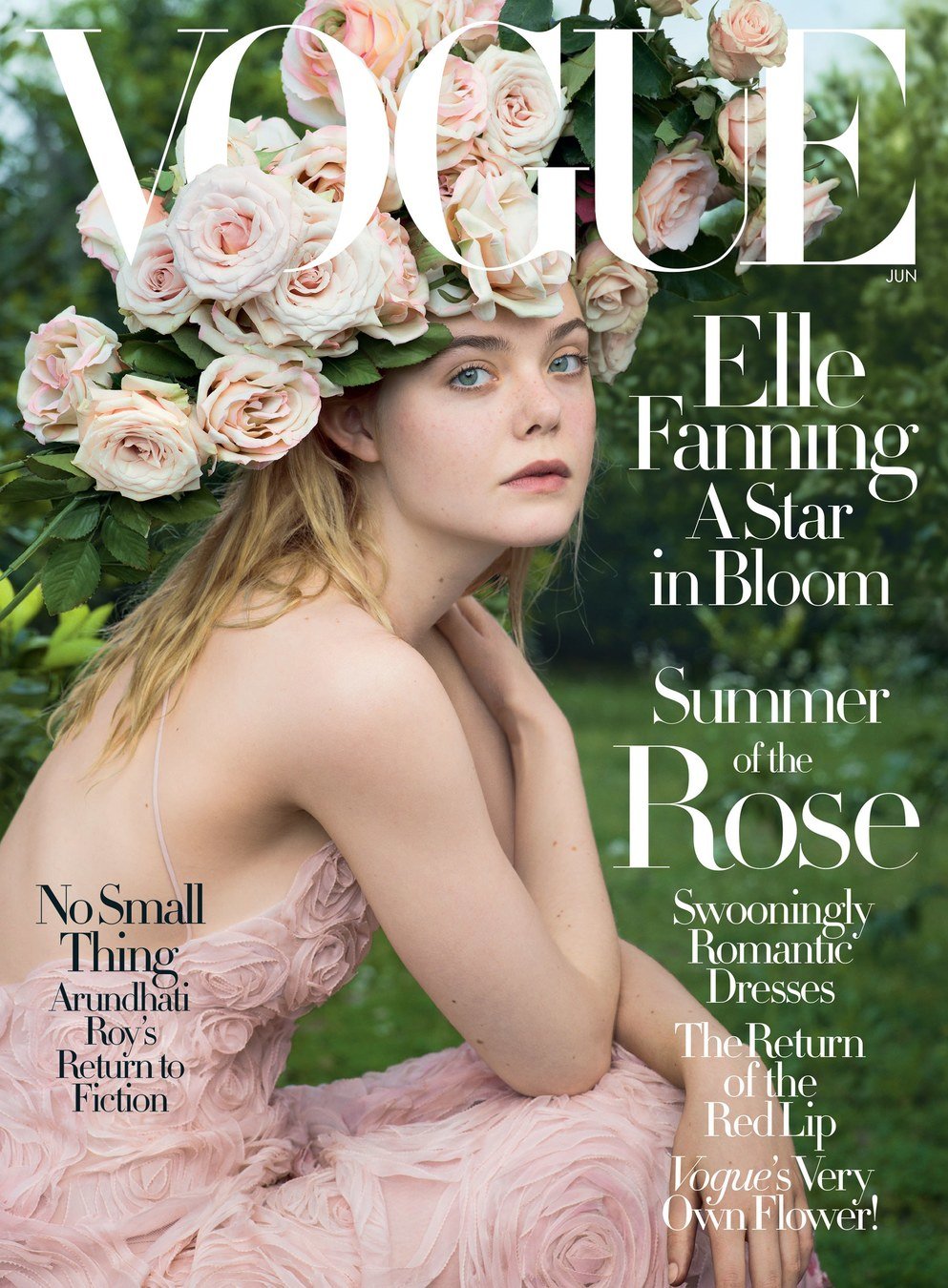
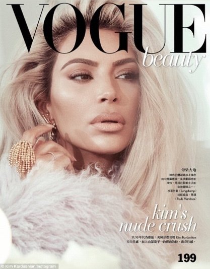
I believe I have challenged conventions rather than actually using them. The way I have dressed my model up in a way that is not usually common in todays day using vintage props and bold makeup. When magazines are usually viewed, it is clearly seen that models are dressed in very girlish and usually pastel hues. The main focus goes on their faces and their clothes are usually not as bold as you would expect. many established magazines like Vogue USA and Elle USA usually do not take that many risks and maintain their audience of women looking for classy fashion advice.
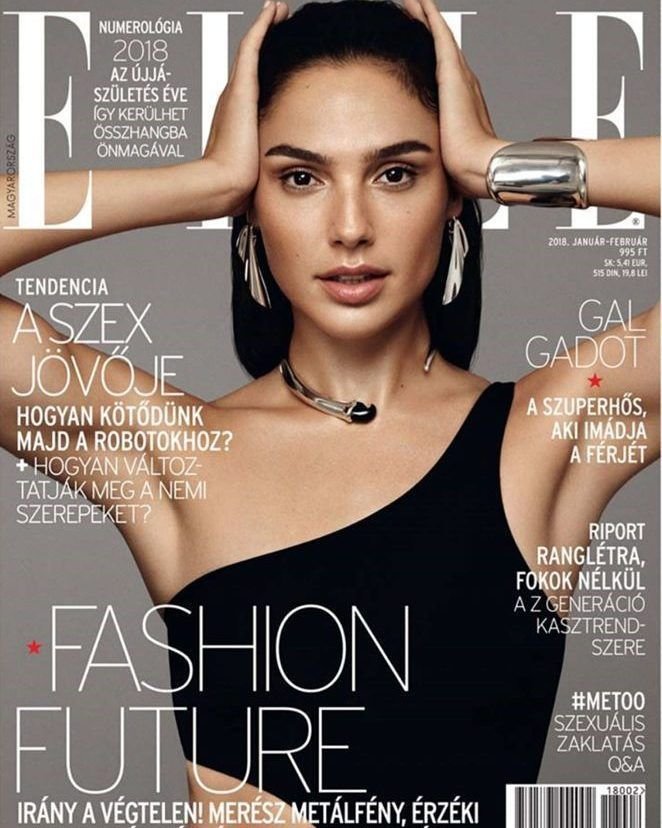
Gal Gadot is seen wearing a plain black off shoulder blouse showing conventional magazine looks. The magazine backdrop is pastelish and nude further proving my theory.
This cover also shows nude pastel vibes. The magazine is a little bolder than the one prior to this with the flowers but no bright colours are used. Vogue plays it safe once again highlighting femininity.
This cover highlights Kim Kardashian as the main cover star. As evident, her outfit is not seen in detail except a slight tingue of pastel fur. The reason why this is that the cover is from Vogue beauty so the focus goes on the face however even with the emphasis on her face, her makeup is light and not bold. Nude shades highlight her face keeping it simple and classy for the women looking for inspiration.
How I challenged conventions:
On the contrary to what I mentioned earlier, the way I broke conventions was to use magazine covers as an inspiration that are not considered stereotypical. The established magazine brands like Vogue and Cosmopolitan are the usual magazine covers women read. However i wanted to branch out to both women and teenagers to read my magazine. 90s would remind women of their teenage years and young girls will tend to get inspired by the the tween superstar.
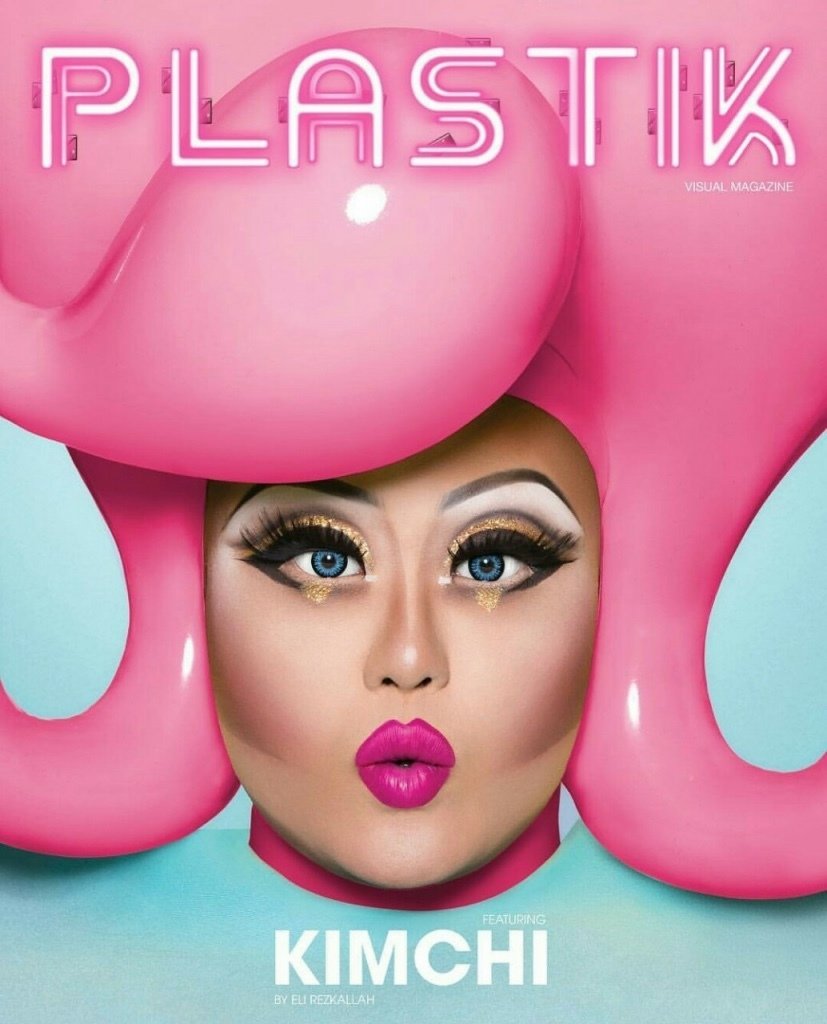
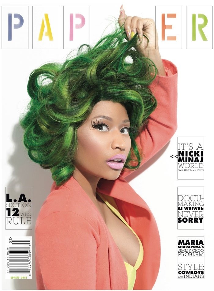
This cover caught my eye because of the bright colours and bold makeup. The era of social media has greatly made this generation increasingly impressed with makeup and the drag queen concept is becoming very popular. many men are now also interested in makeup looks and bold fashion choices. The purpose of using this unconventioinal magazine cover was the inspiration to make something as bright and bold as this.
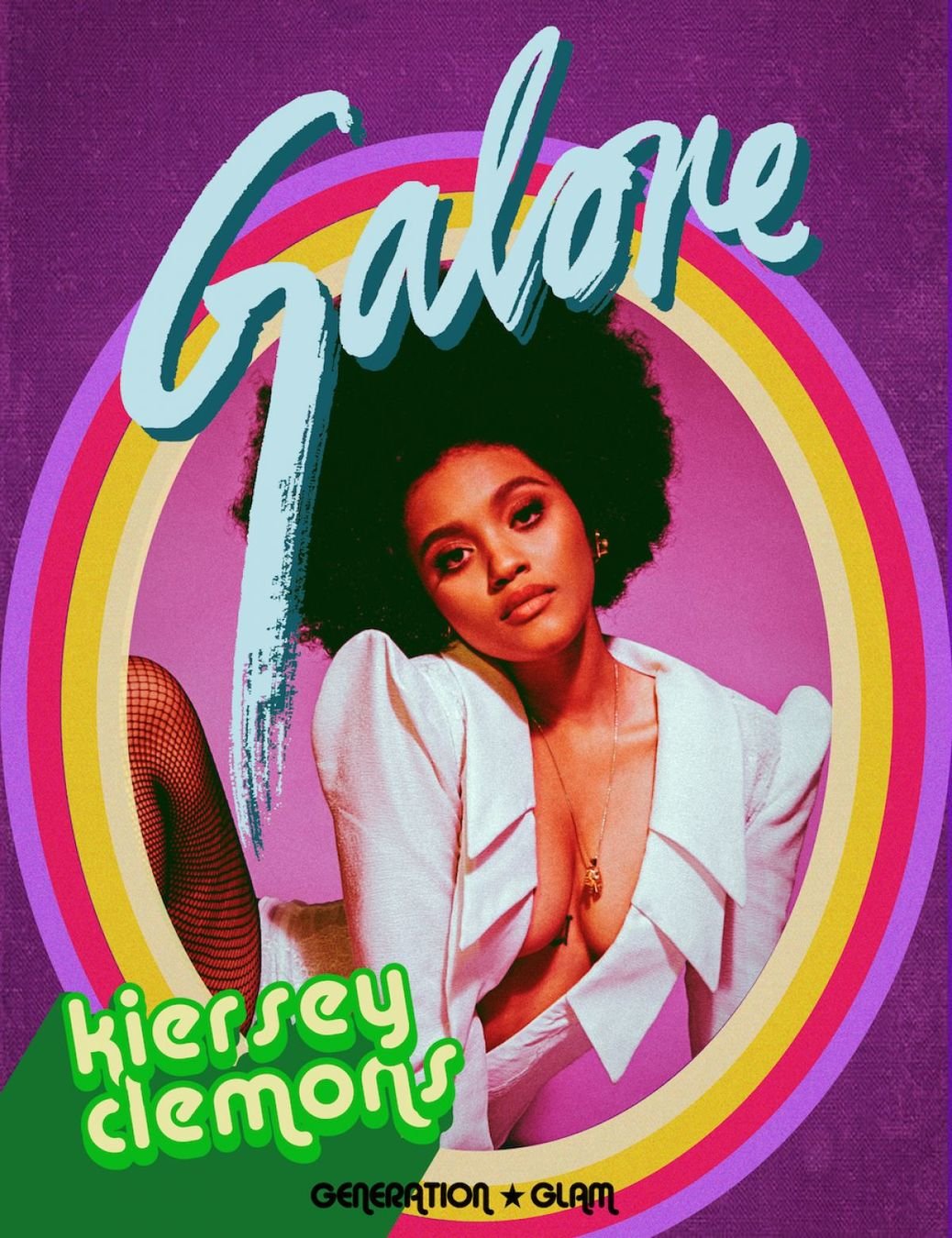
Galore is an increasingly popular visual arts magazine that is becoming extremely popular amongst teenagers because of their teen icon cover stars like Madison Beer, Noah Cyrus and Shay Mitchell alongside many more. This cover is very fascinating and the colours are drawing attention. My previous double spread idea of using a neon portal in my work is somehow similar to this.
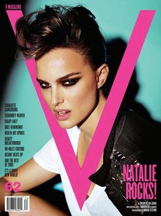
V magazine is another very popular neon themed magazine that focuses on huge stars like Natalie Portman, Penelope Cruz and Lady Gaga as well as many more. All these magazines helped me break conventions and create something that would automatically attract people towards it unlike boring colours and pastel hues.
My work in relation to the unconventional inspirational magazines:
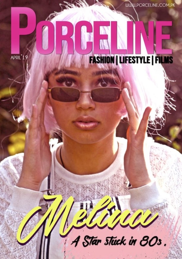
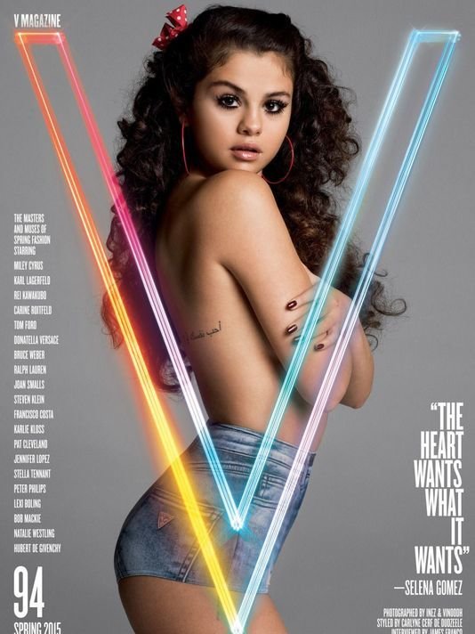
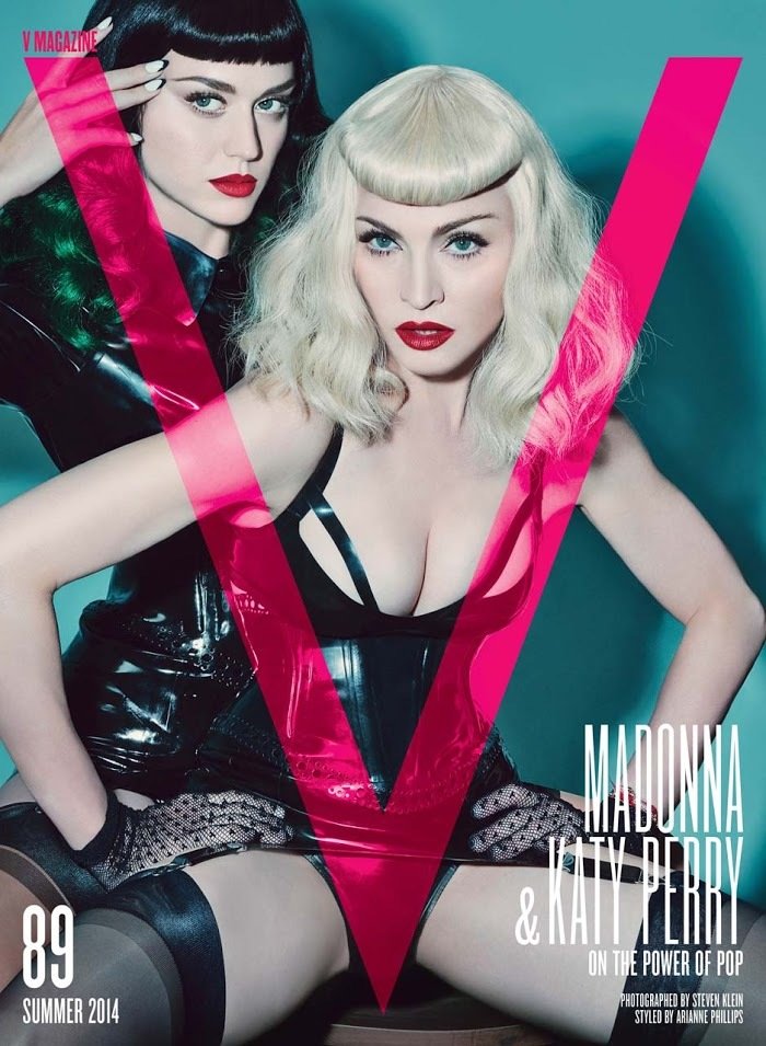
Although the pink used in the font of 'v' magazine is slightly more neon and bright, it proved as an inspiration for me to use a similar colour tone, although differnt in its own way.
I took inspiration from this magazine that is yet another magazine known for its bold and unconventional fashion choices and the mesmerizing way they gain attention.
The second magazine cover seen used in this presentation for inspiration consists of a 'V' magazine cover with Selena Gomez as the main cover star. The simple cover that only focuses on the star and the neon pop of colour was very fascinating for me.
How my product deals with social groups and issues:
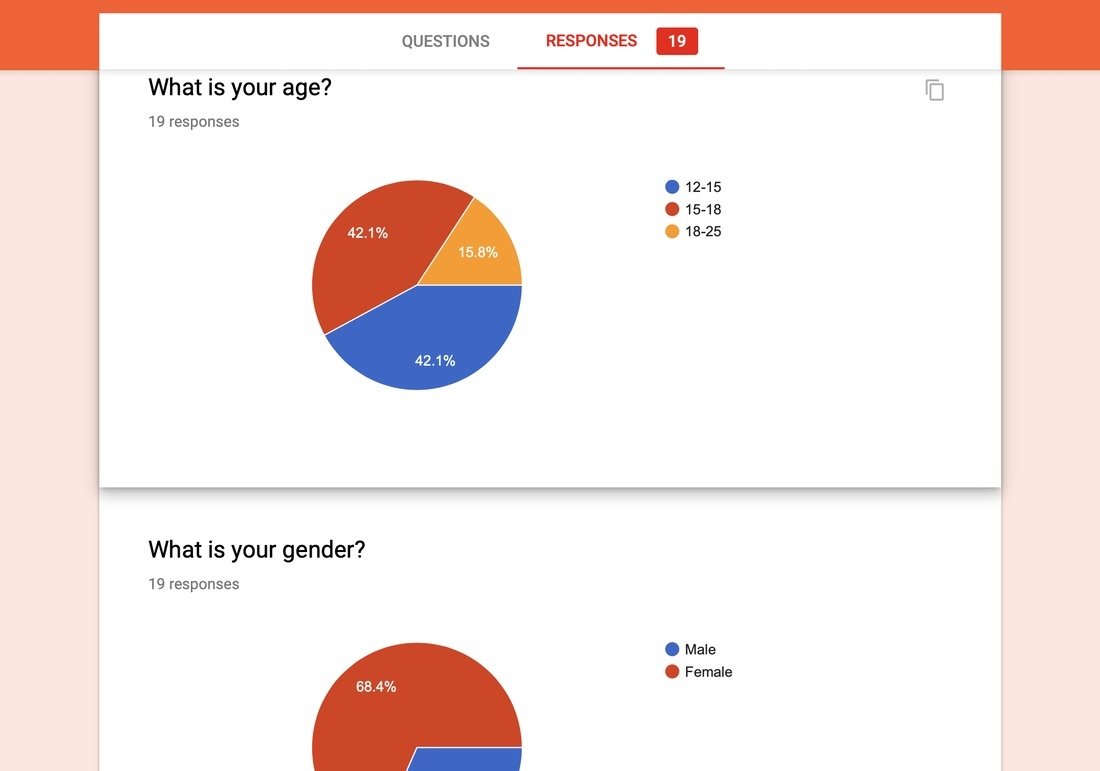
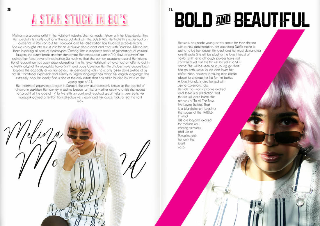
This survey I conducted shows that the audience of the magazine will be around the age of about 13-18. The teenage population of pakistan is increasingly full of a large amount of teenagers reason being high birth rates in the past. With such a vast majority of teenagers and young adults, my magazine is sure to attract mass audience.
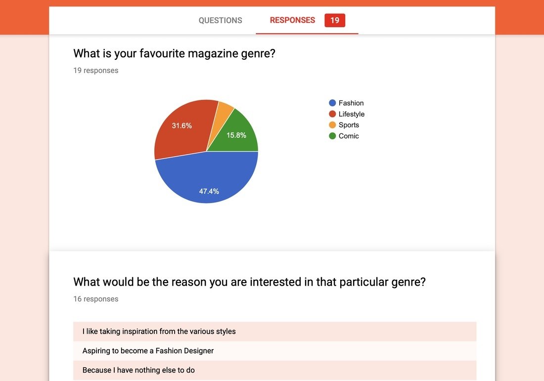

The double spread clearly mentions that the cover star is 21, and mentioned in my blog, I did a profile on my model who is 17. The young age of the cover star and her being a teen influencer shows the sort of audience the magazine will attract.
Audience:
On average, the peak age at which women read the most magazines is from 35-50. In my magazine as per the survey shows my readers will mostly be teenagers but I did not give an option in the age bracket above 18 years. The women that are 35-50 in todays age were teenagers during the 80s and 90s which makes it evident that fashion from their youth will attract them and make them buy the magazine.
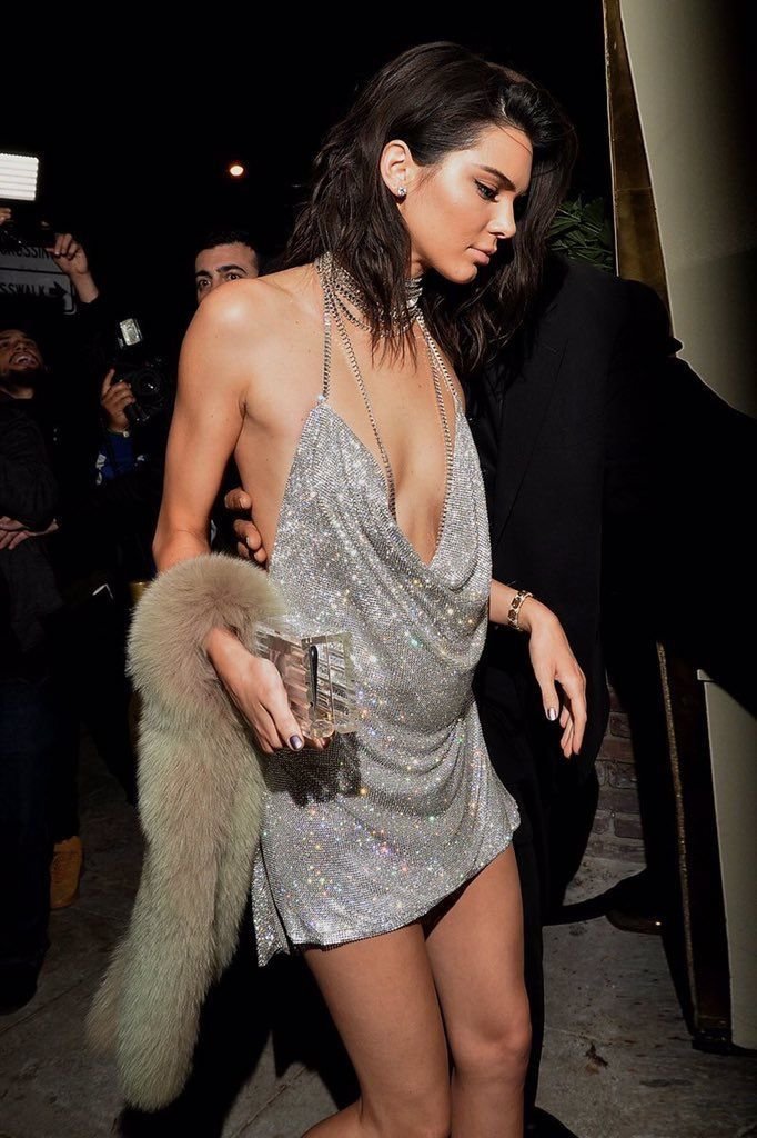
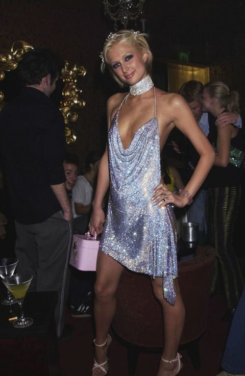
One image is from the 2010s and one is from the early 2000s. this shows how fashion ideals from such a long time ago are coming back. [fashion trends were almost similar in the 90s and 2000s]
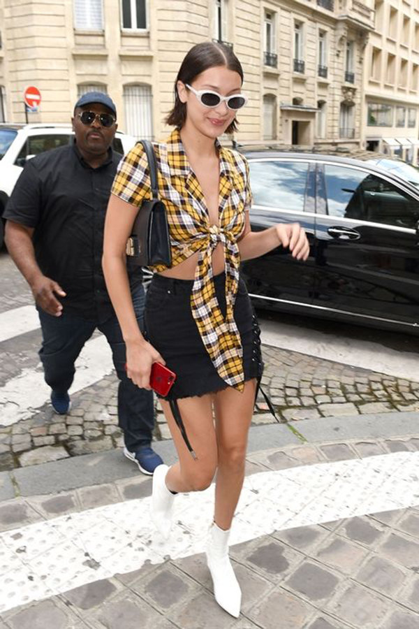
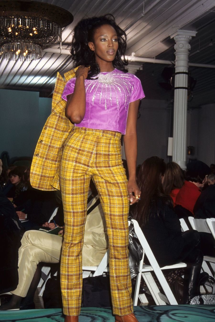
Plaids and srtipes are making a comeback.
Issues:
The stereotype of women being extremely girlish, wearing pastel colours and and having their long hair down their backs in magazines is being broken by my work. My cover star has short hair, rugged facial expressions and serious look. She is showing minumum skin and she looks empowered, not like a damsel in distress. Her strength shows how she is self made and her femininity is at bay, although the colour pink is used. The colour is only used because of an aesthetic look. My magazine is dealing with gender issues and showing a different look not usually associated with the 'beauty standards'.

Breaking gender norms and the stereotypical ideal of a 'pretty woman'.